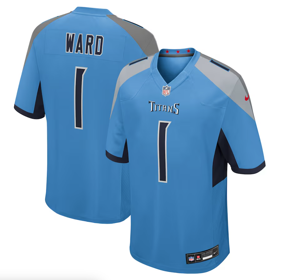
— Washington Commanders (@Commanders) July 9, 2024
The gold is coming back to the Burgundy & Gold in a big way during the 2024 season. In a nod to the franchise's storied history, the Washington Commanders are reintroducing their signature gold pants as part of their uniform combinations this year. This decision comes after numerous fans expressed their desire to see the iconic look return.
While the specific games in which players will don the gold pants have yet to be determined, the excitement among the fan base is palpable. The gold pants, matching the solid color design of the burgundy and black pants already in the team's wardrobe, will be a regular part of the color combination for the first time since 2018. The last appearance of these pants was in Week 17 of the 2018 season against the Philadelphia Eagles.
Historically, Washington's gold pants have been a cornerstone of the franchise's identity since the team moved from Boston to the DMV in 1937. The franchise enjoyed some of its most successful years while wearing them, including two NFL championship seasons in 1937 and 1942.
After the 1978 season, the Commanders moved away from the gold pants, opting for either burgundy or white for the next 31 years. There were a few exceptions in 1994, 2002 (to honor the team's 70th anniversary), 2003, and 2007. The gold pants made a more consistent return as a primary uniform color in 2010, starting with a memorable Week 1 home win over the Dallas Cowboys on Sunday Night Football, and remained a staple for the next eight seasons.
The revival of the gold pants is not just a fashion statement; it is a tribute to the team's rich legacy and a way to honor the memories of past triumphs. As the Washington Commanders gear up for the 2024 season, fans can look forward to seeing their team shine in the classic gold pants once again, bringing a touch of history back to the field.
Stay tuned for more updates on which games will feature the gold pants, and get ready to cheer on the Commanders as they blend tradition with the future.
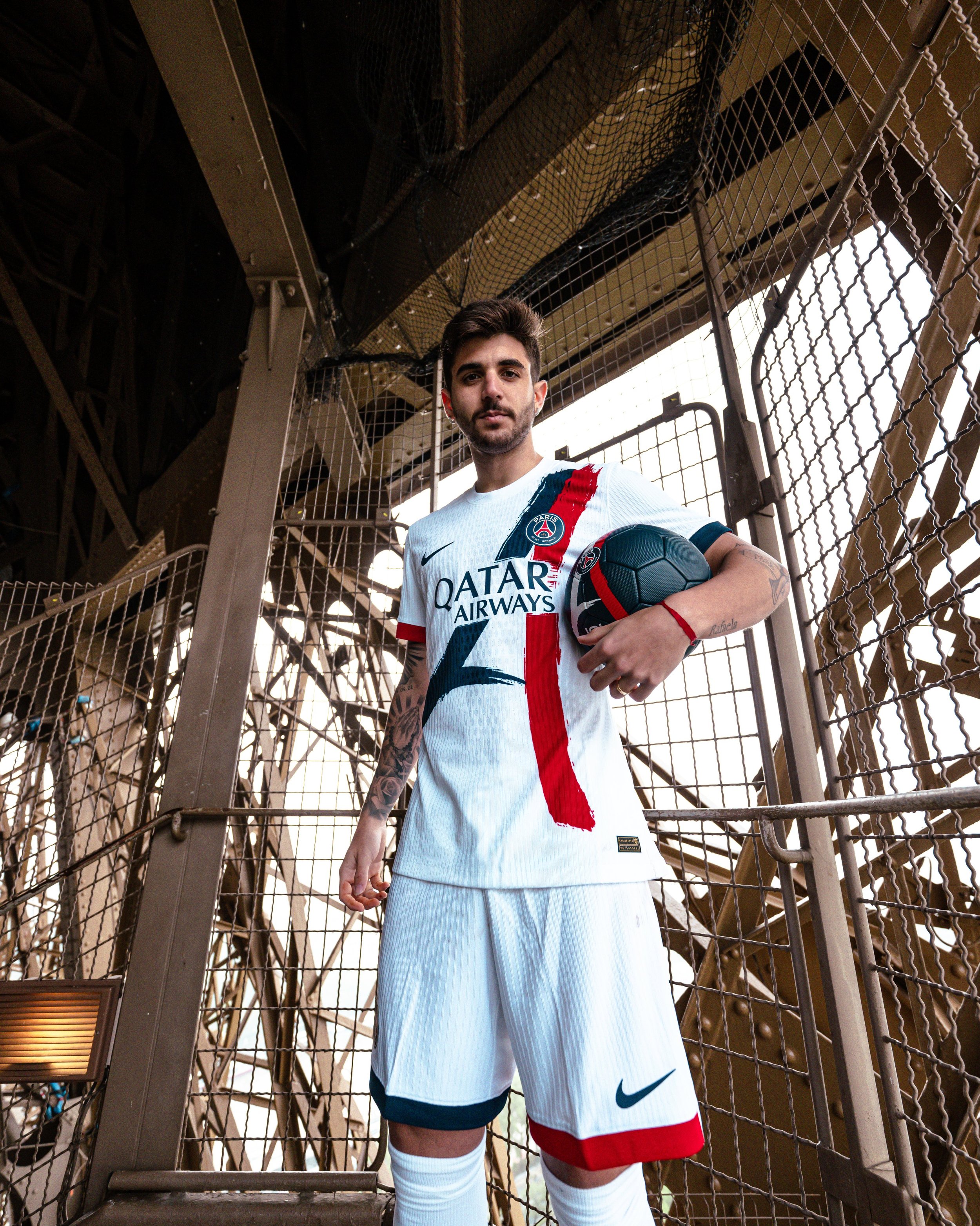
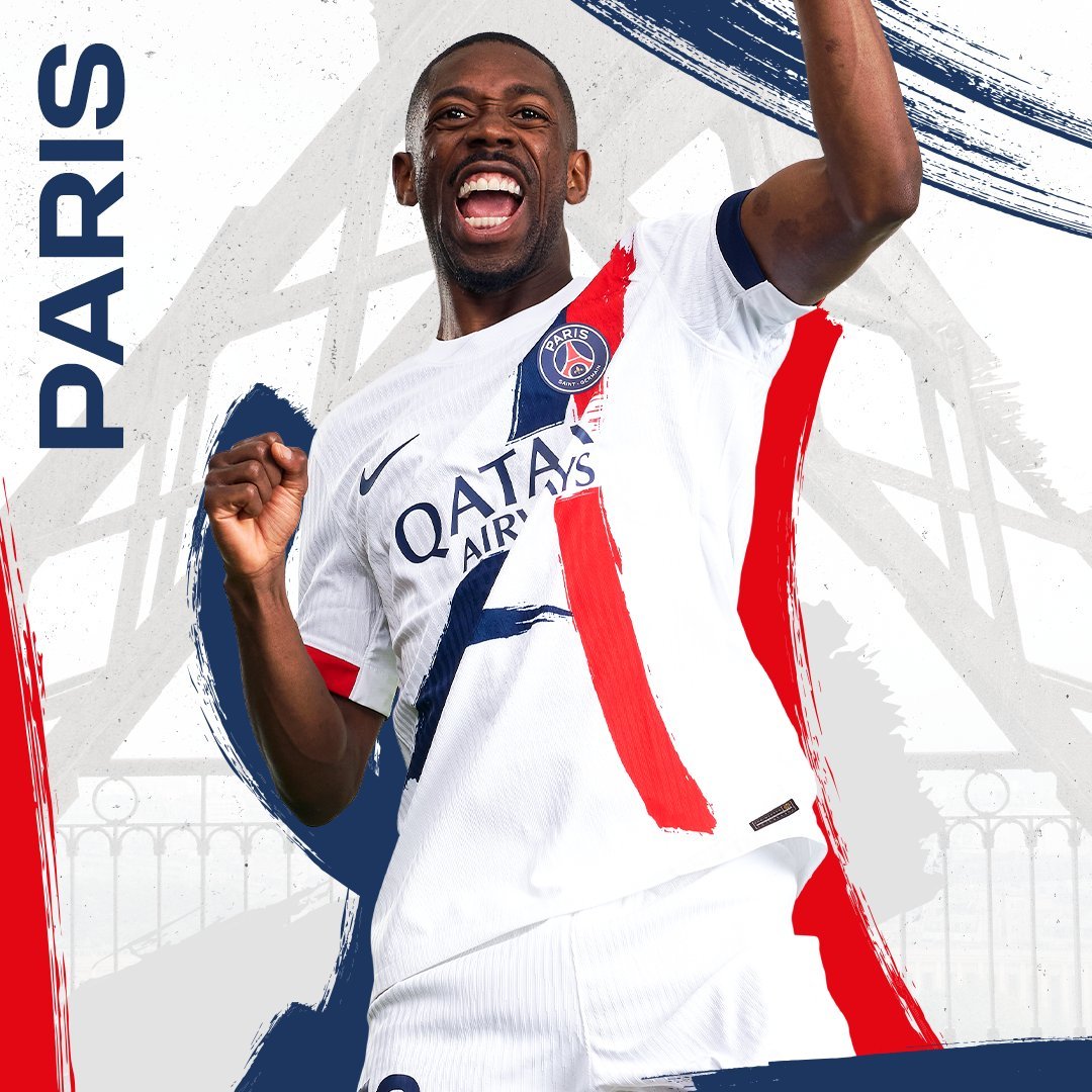
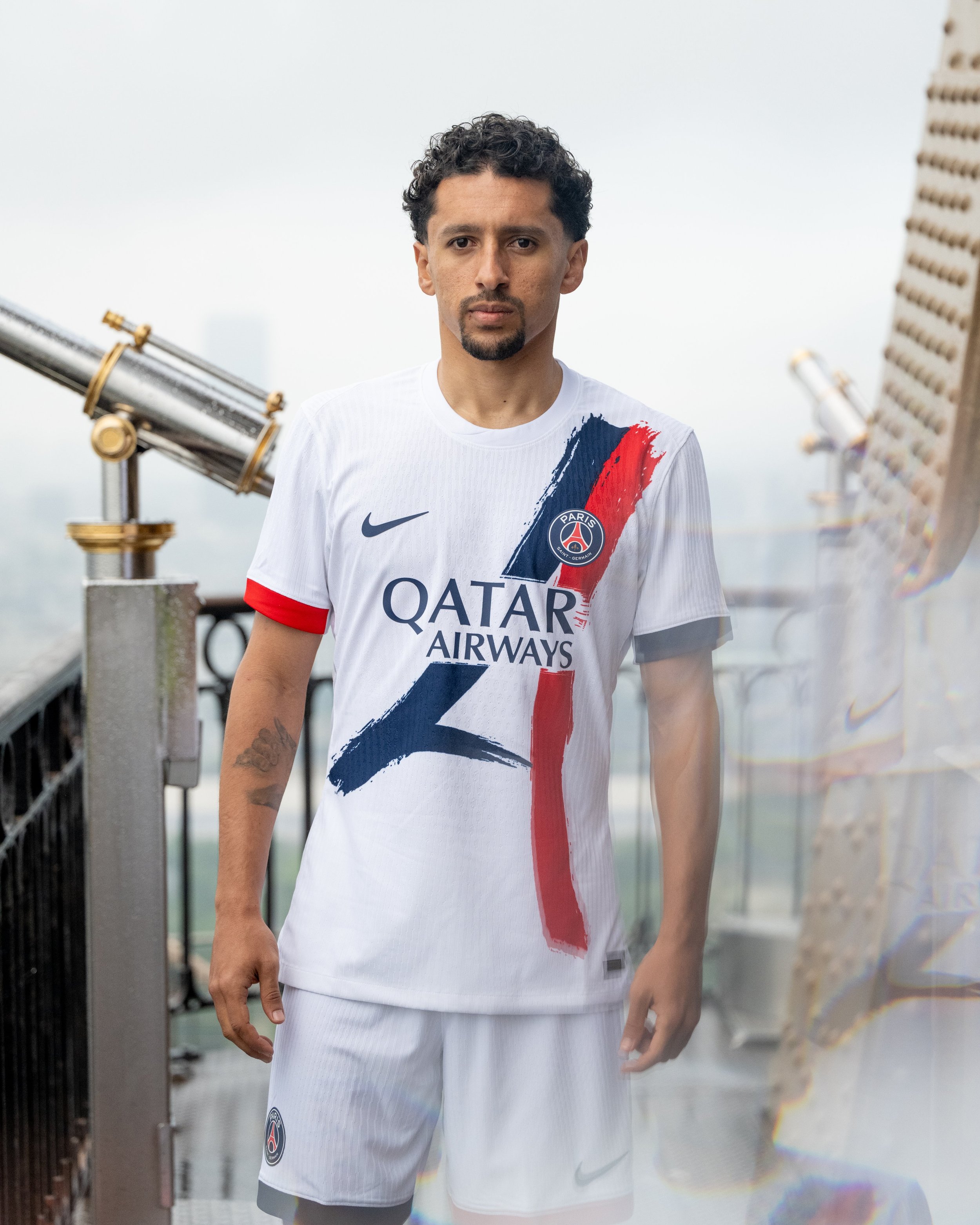
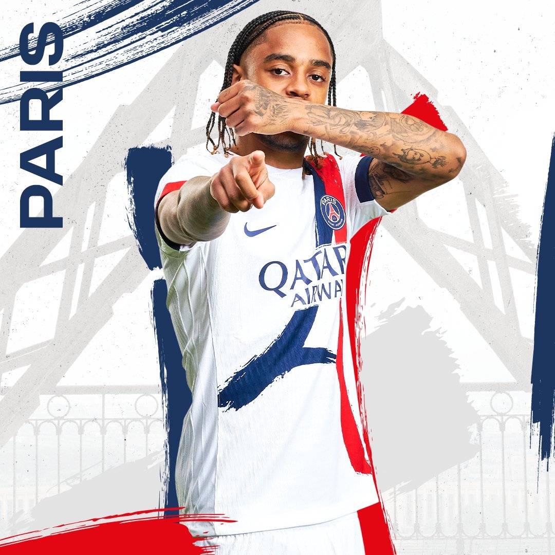
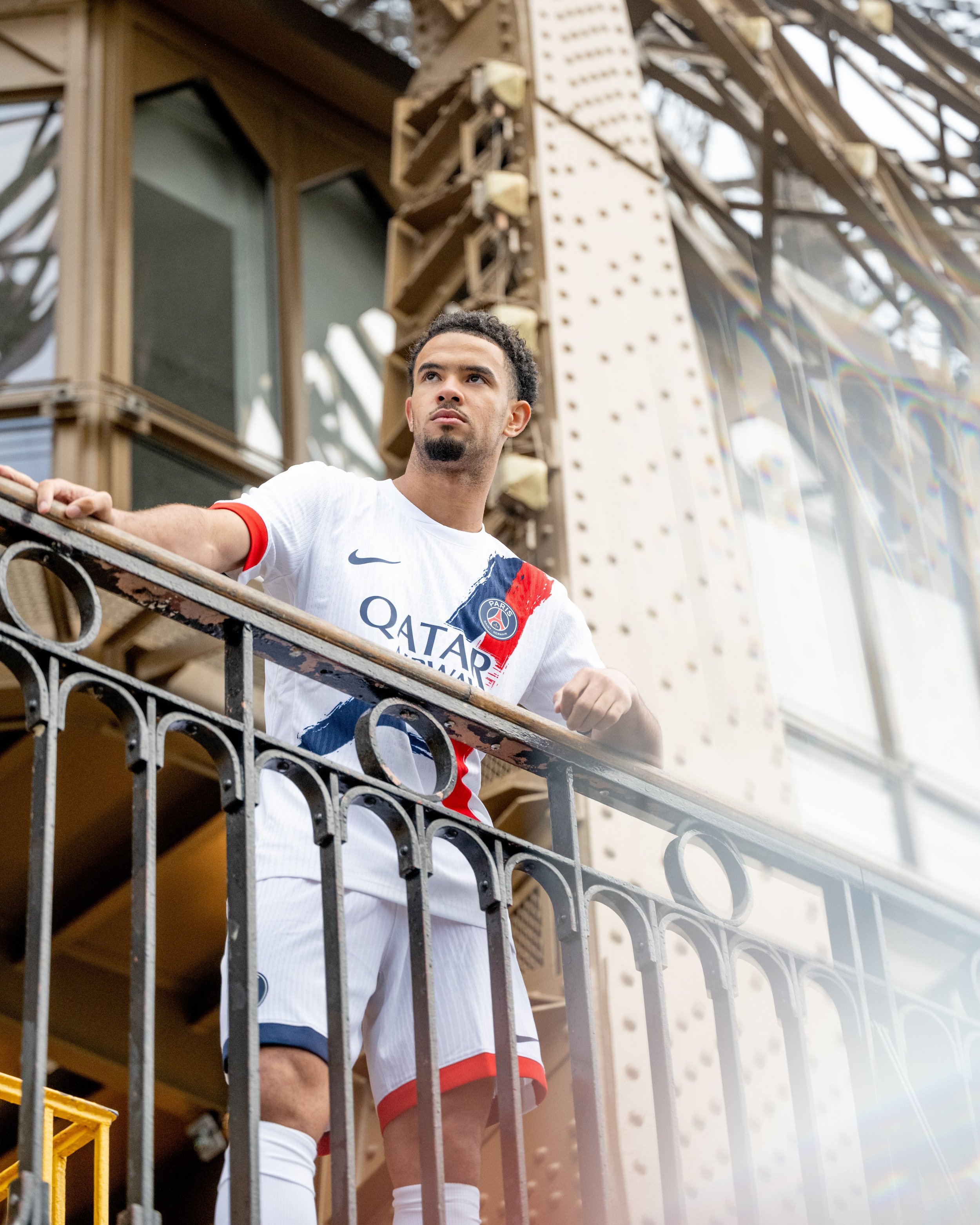
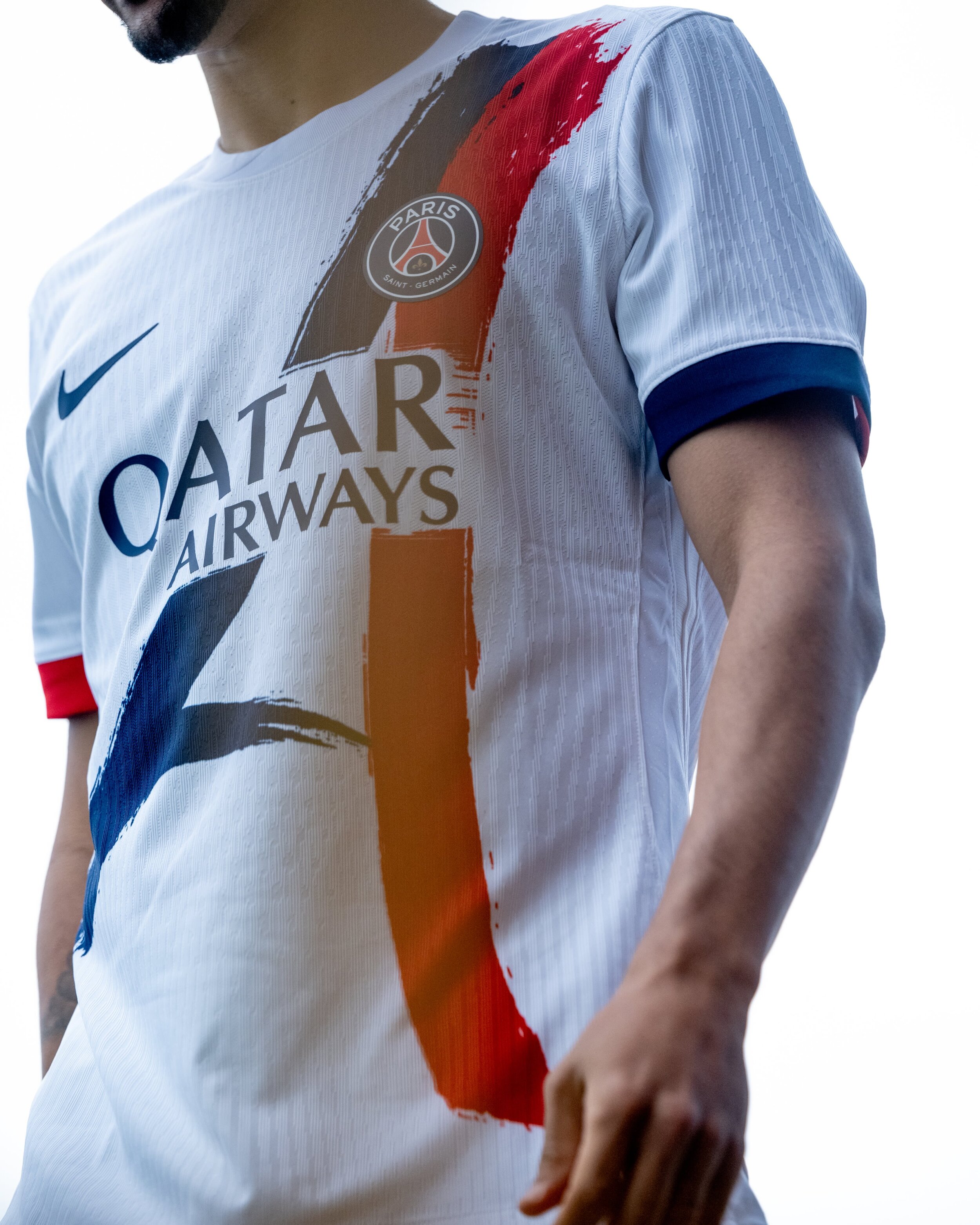
Paris Saint-Germain and Nike have officially unveiled the club’s new away kit for the 2024-2025 season. As Paris gears up to become the sports capital of the world, this new kit pays homage to a classic PSG shirt worn during the 1990-91 and 1991-92 seasons, while also embracing the innovative spirit of the club's new generation.
The 2024-2025 away kit features two bold red and blue stripes set against a pristine white background, drawing inspiration from the iconic silhouette of the Eiffel Tower. This design seamlessly blends PSG's storied history with the forward-thinking ethos of the club. The kit will be worn by all PSG teams, including the men’s and women’s professional squads as well as the academy teams.
The new kit is equipped with Nike’s Dri-FIT ADV technology, representing the pinnacle of performance apparel. Developed through extensive research at the Nike Sport Research Lab (NSRL), this advanced body-mapping technology enhances movement, breathability, and ventilation in targeted areas, ensuring players can perform at their best.
PSG’s new 2024-2025 away kit is a perfect fusion of tradition and modern innovation, capturing the essence of Paris and the forward-thinking nature of the club. As the city prepares to take center stage in the world of sports, PSG fans can proudly wear their new kit, reflecting both their love for the club and the rich heritage of Paris. Don't miss out on this exclusive collection—get yours today and join PSG in celebrating this new era.
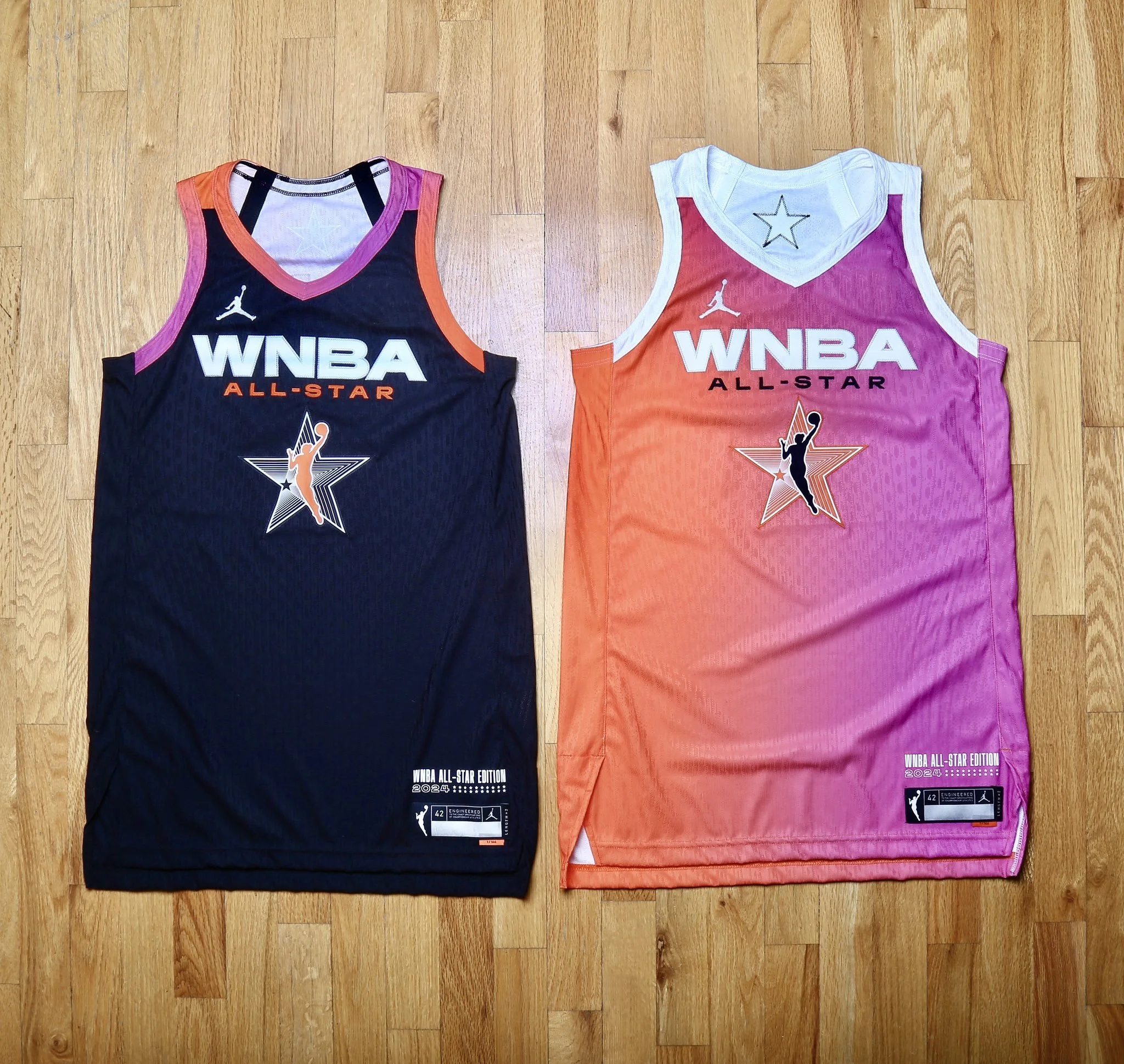
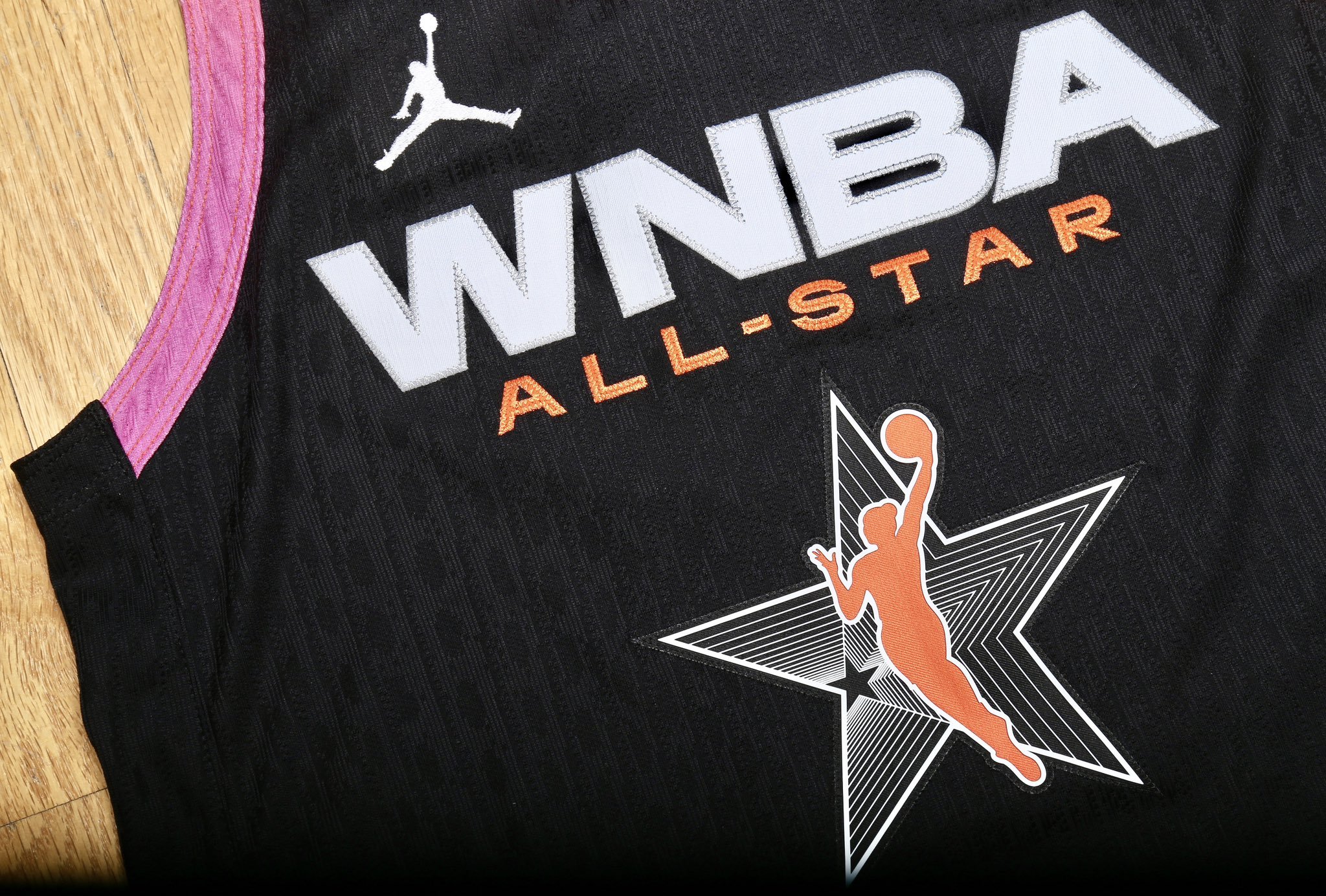
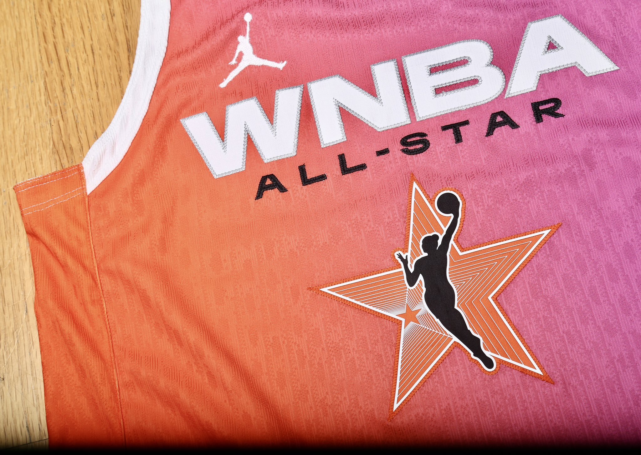
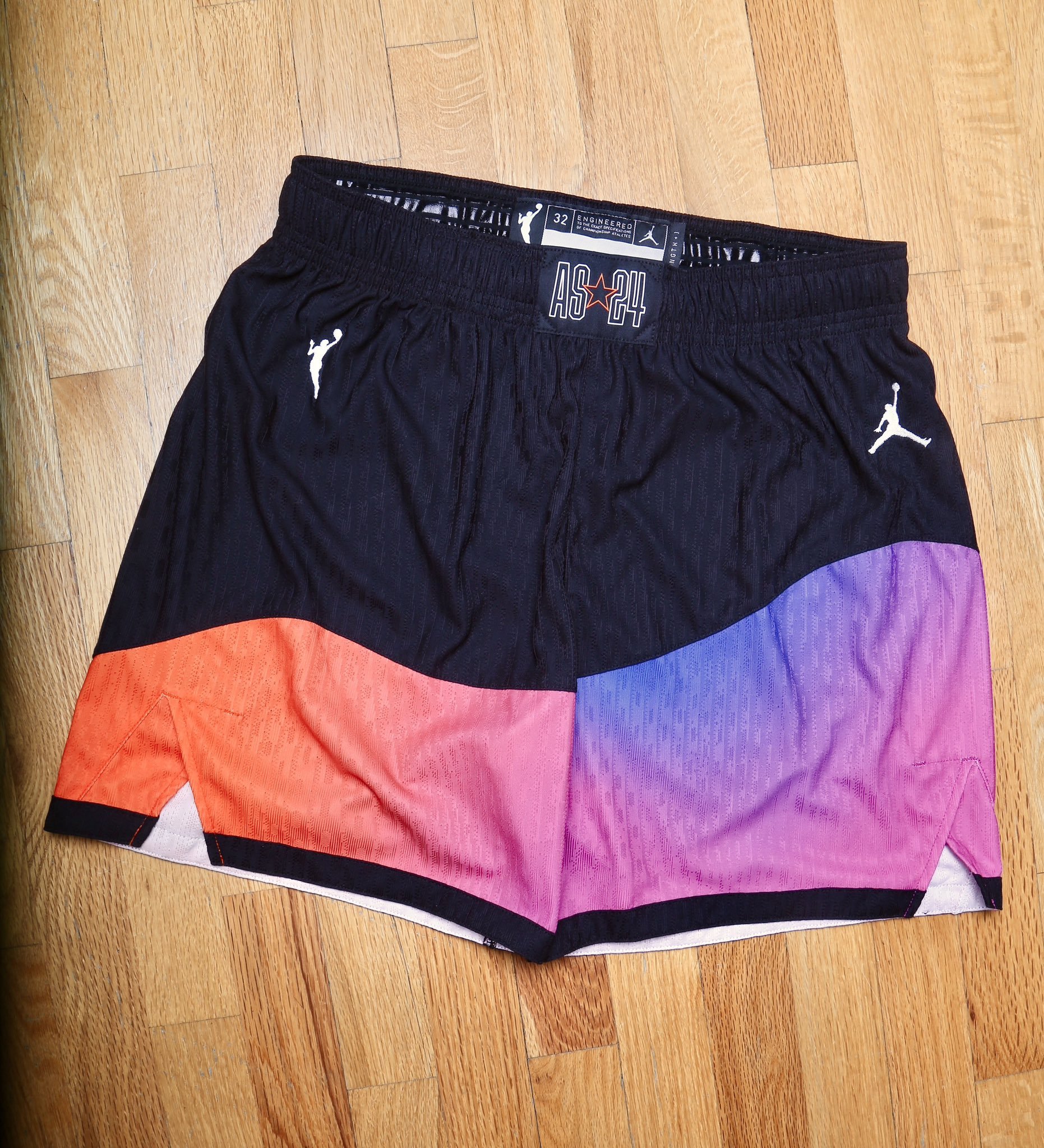
The WNBA has revealed the uniforms for the 2024 All-Star Game, reflecting the league's continuous evolution and commitment to innovation. The 20th edition of this event introduces a fresh format: Team WNBA vs. Team USA, featuring the full Olympic team roster against 12 WNBA All-Stars on July 20 in Phoenix.
This year's format change has inspired a unique twist in the uniforms. According to Boardroom, Team USA will wear their classic white USA uniforms, while Team WNBA will showcase two distinct sets of uniforms, worn during separate halves of the game.
For the first half, Team WNBA will don vibrant pink-and-orange ombré jerseys emblazoned with "WNBA All-Star" across the chest, accompanied by the league's All-Star emblem. These jerseys symbolize the dynamic and colorful spirit of the WNBA.
In the second half, the uniforms will shift to a striking black version, maintaining the same design elements. The ombré hues from the first-half jerseys will reappear as alternate colors along the V-neck of the second-half jerseys, creating a seamless transition between the two halves.
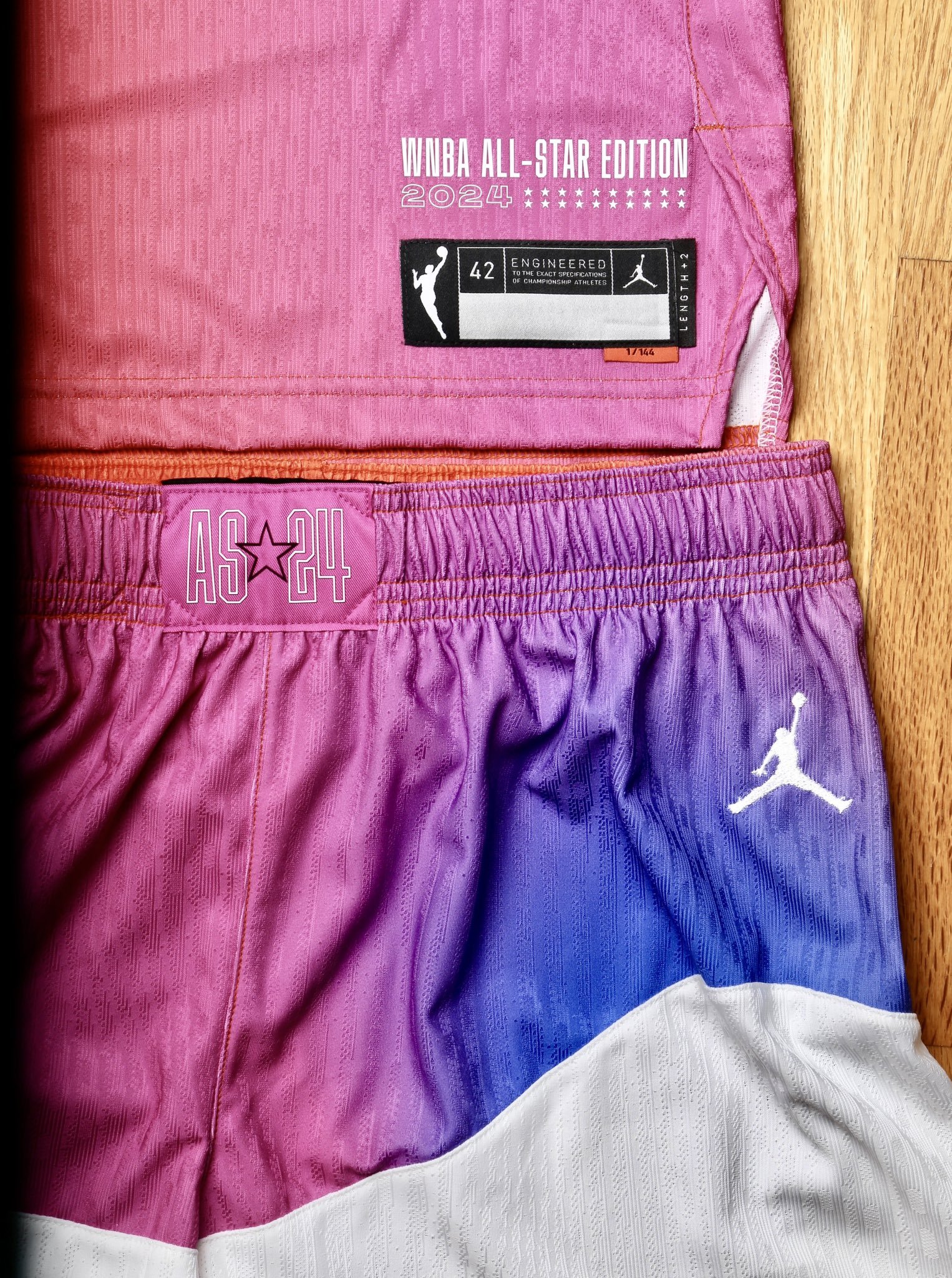
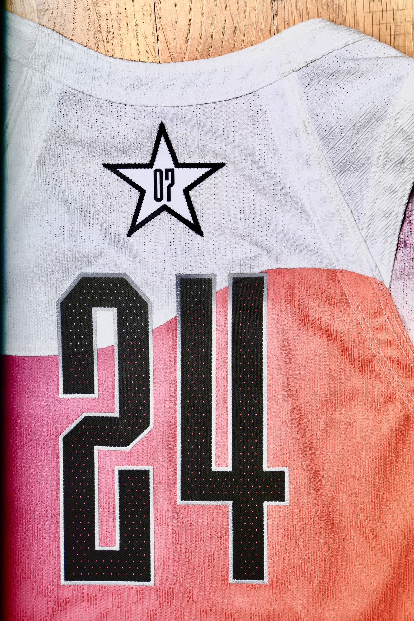
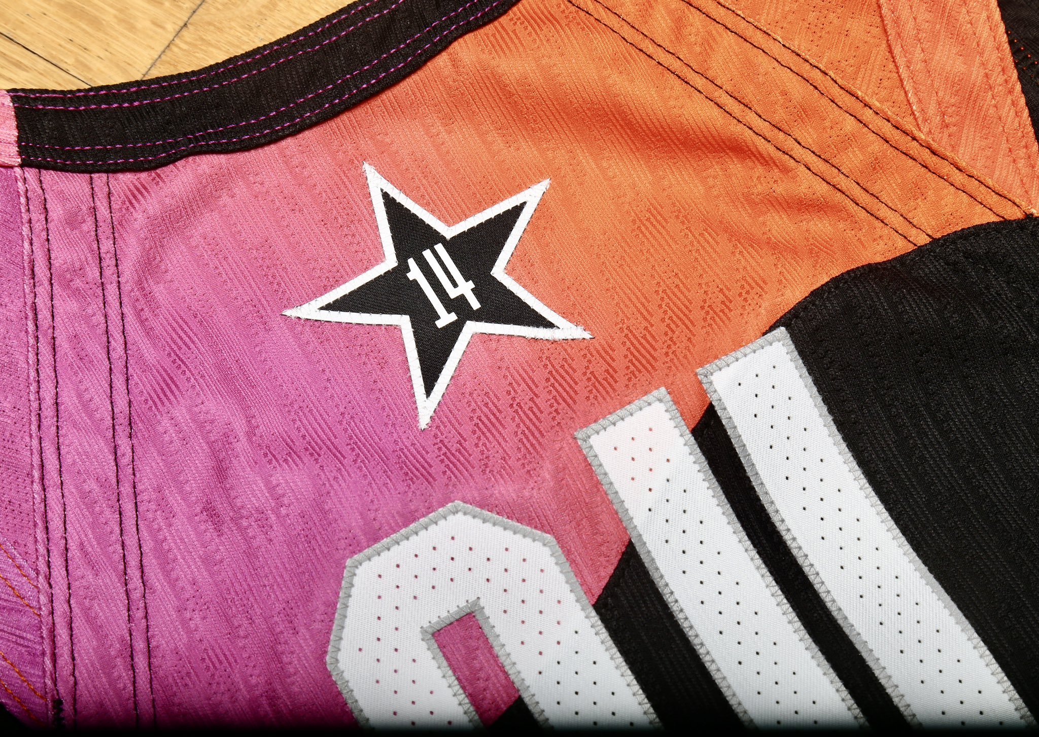
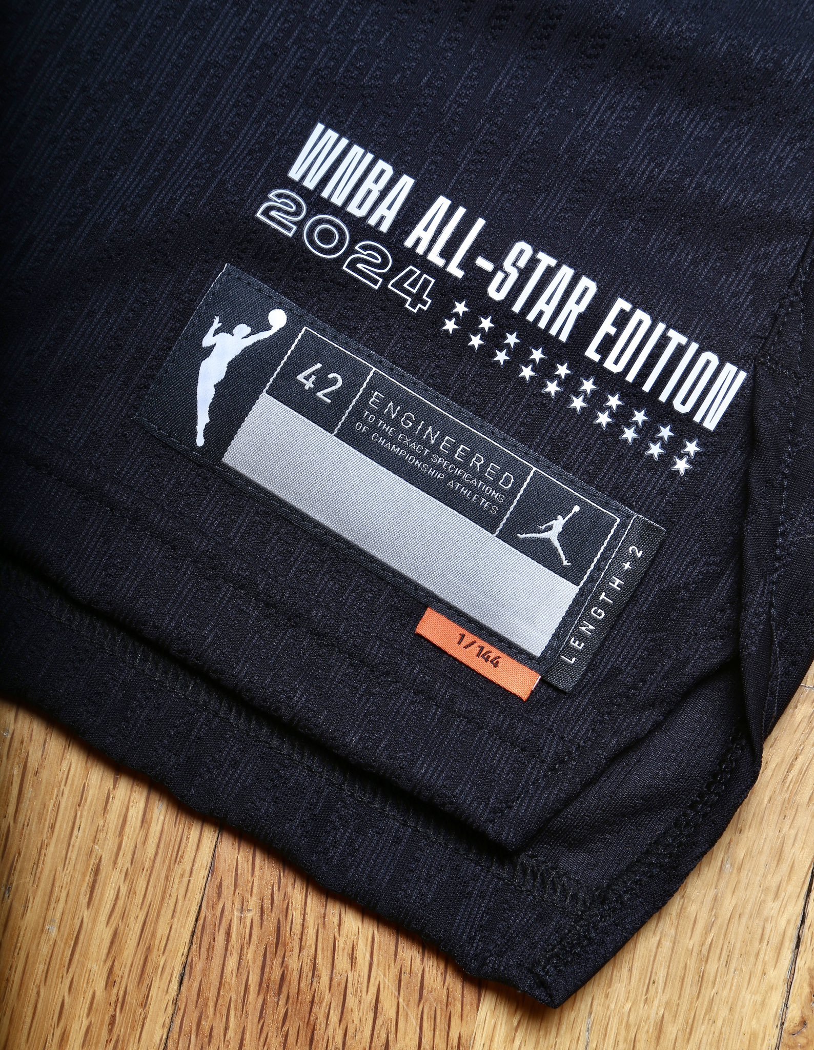
Every aspect of the uniform has been meticulously designed to celebrate the league's history and the players' achievements. The jerseys feature the inscription "WNBA All-Star Edition 2024" and 20 stars to commemorate the game's 20th anniversary. Beneath the size tag, a smaller orange tag reading "1/144" nods to the 144 players in the league, highlighting the exclusivity and competitive nature of being a WNBA player.
Adding a personal touch, the back of each Team WNBA jersey will display a star indicating how many All-Star Games the player has participated in. The shorts mirror the ombré hues of the first-half uniforms, featuring a wavy slanted design at the bottom and a front patch with "AS24."
As the WNBA continues to evolve, the 2024 All-Star Game uniforms stand as a testament to the league's vibrant history and promising future. Fans can look forward to seeing these stunning uniforms in action on July 20 in Phoenix, celebrating two decades of excellence in women's basketball.
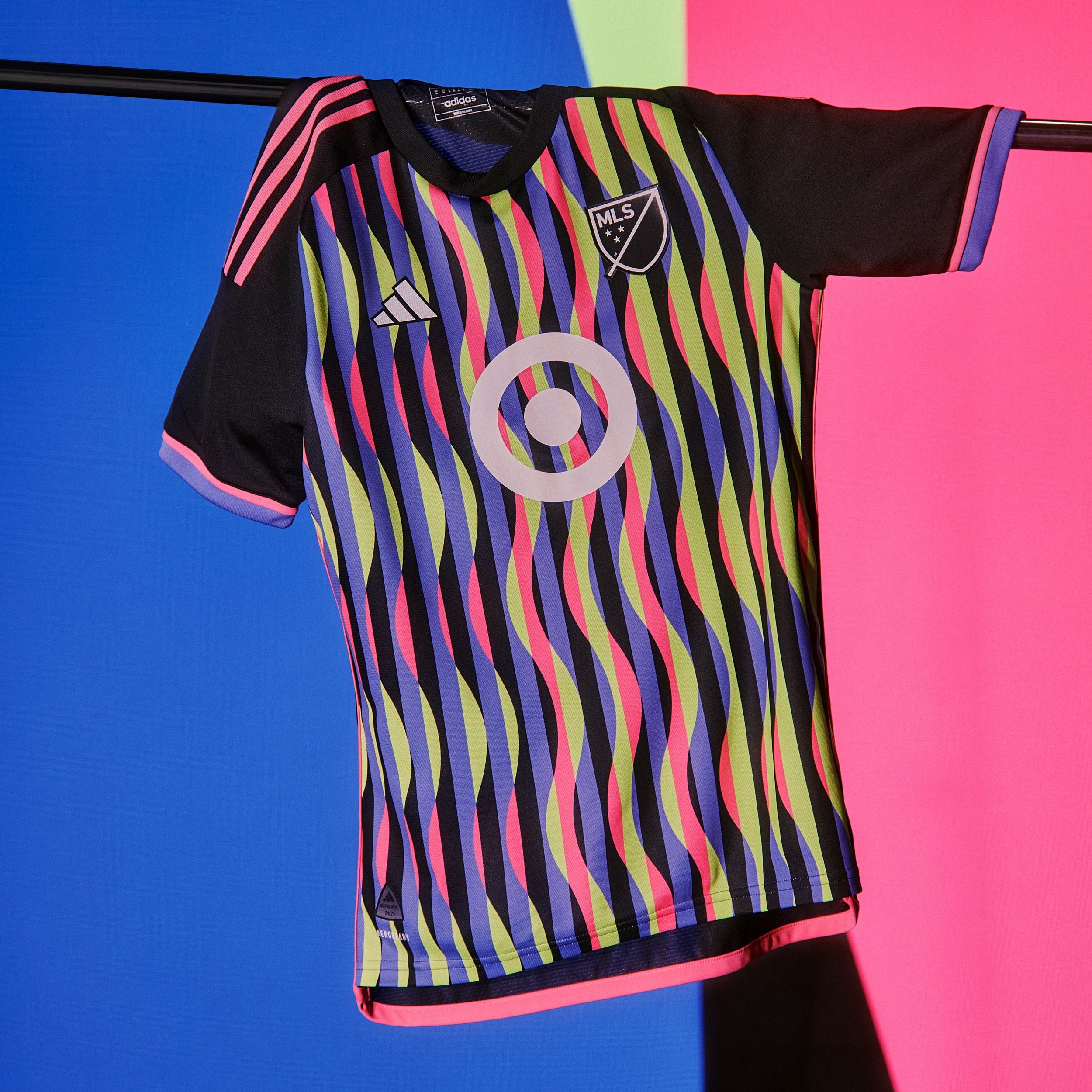
When the MLS All-Stars face the LIGA MX All-Stars on July 24 at Columbus Crew's Lower.com Field, they will do so in the eye-catching 2024 MLS All-Star jersey. This year's design celebrates the best MLS has to offer and honors the iconic style and flash of '90s soccer, commemorating the 30th anniversary of the last time the United States hosted the World Cup.
The jersey merges contemporary flair with nostalgic elements, creating a look that stands out on the field. As fans gather to watch this thrilling matchup, they'll also witness a nod to soccer history, encapsulated in the bold design of the new All-Star jersey. Stay tuned for an exciting game and a trip down memory lane with this tribute to the golden era of soccer.
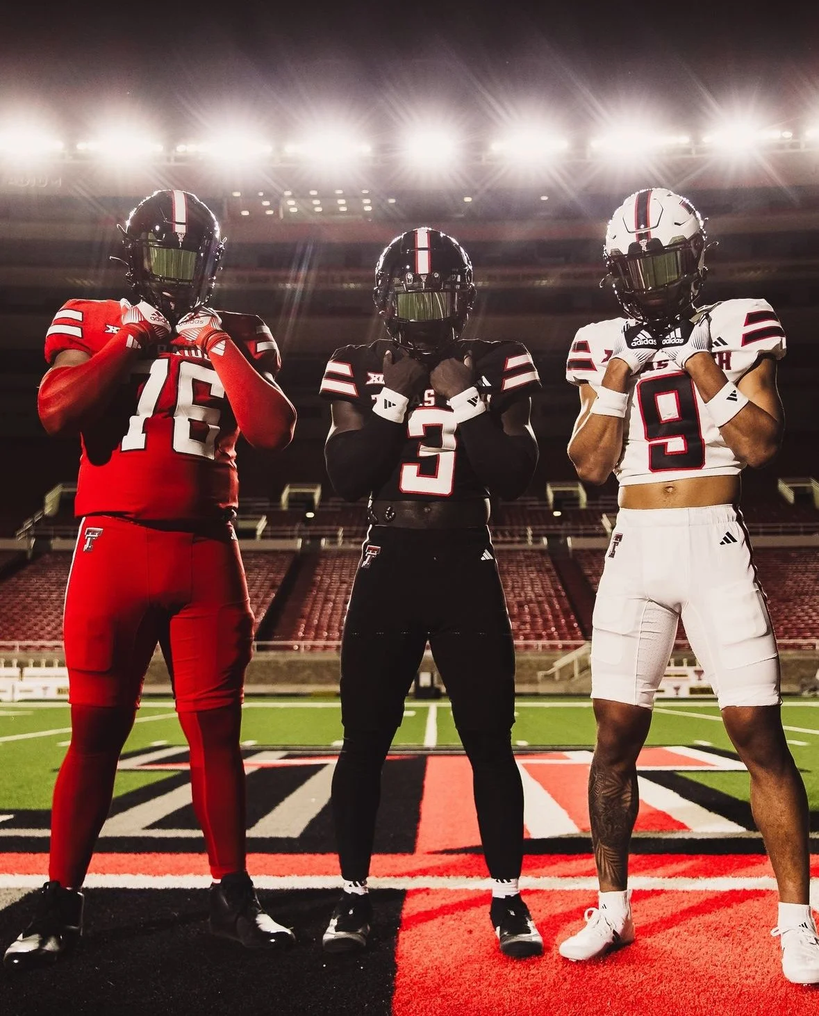
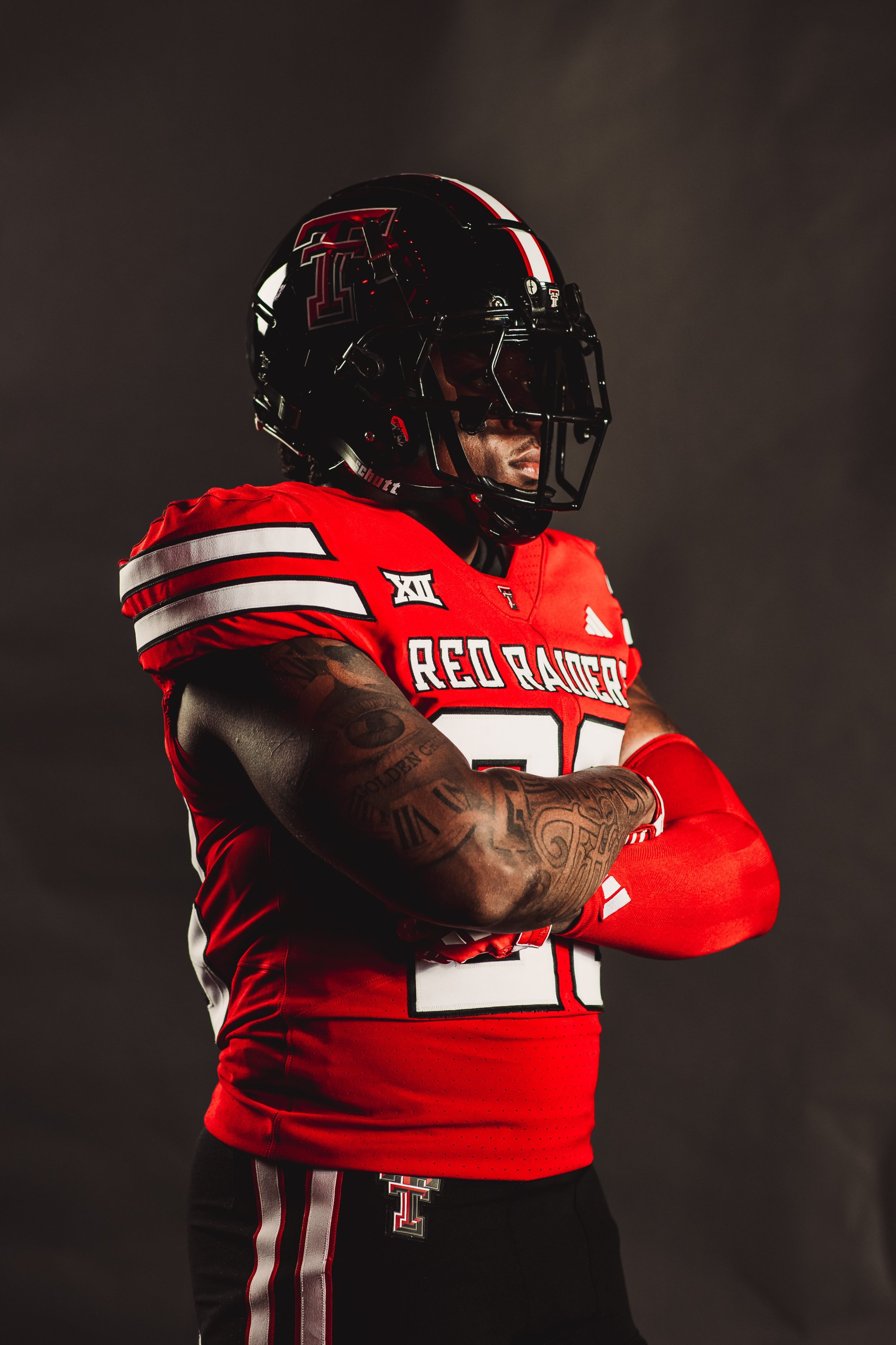
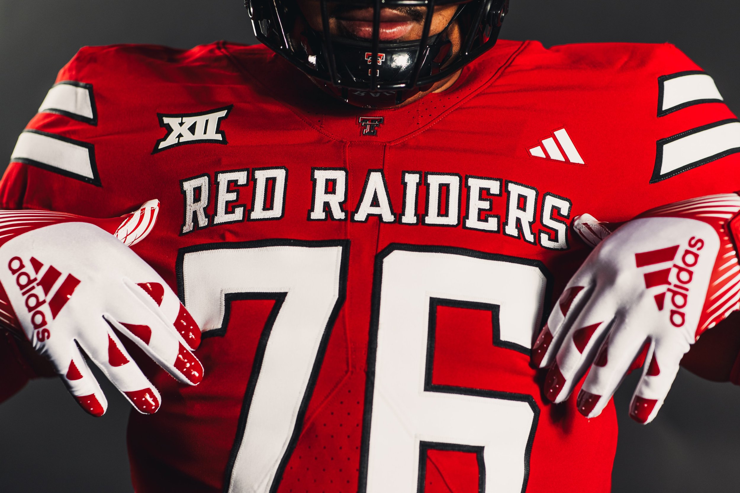
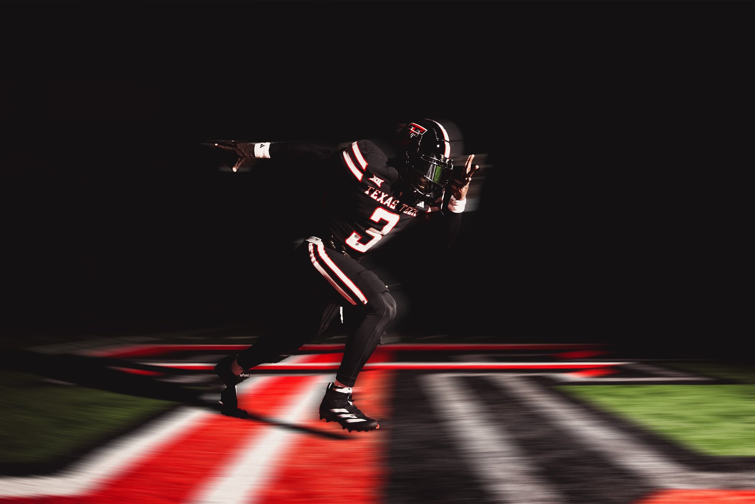
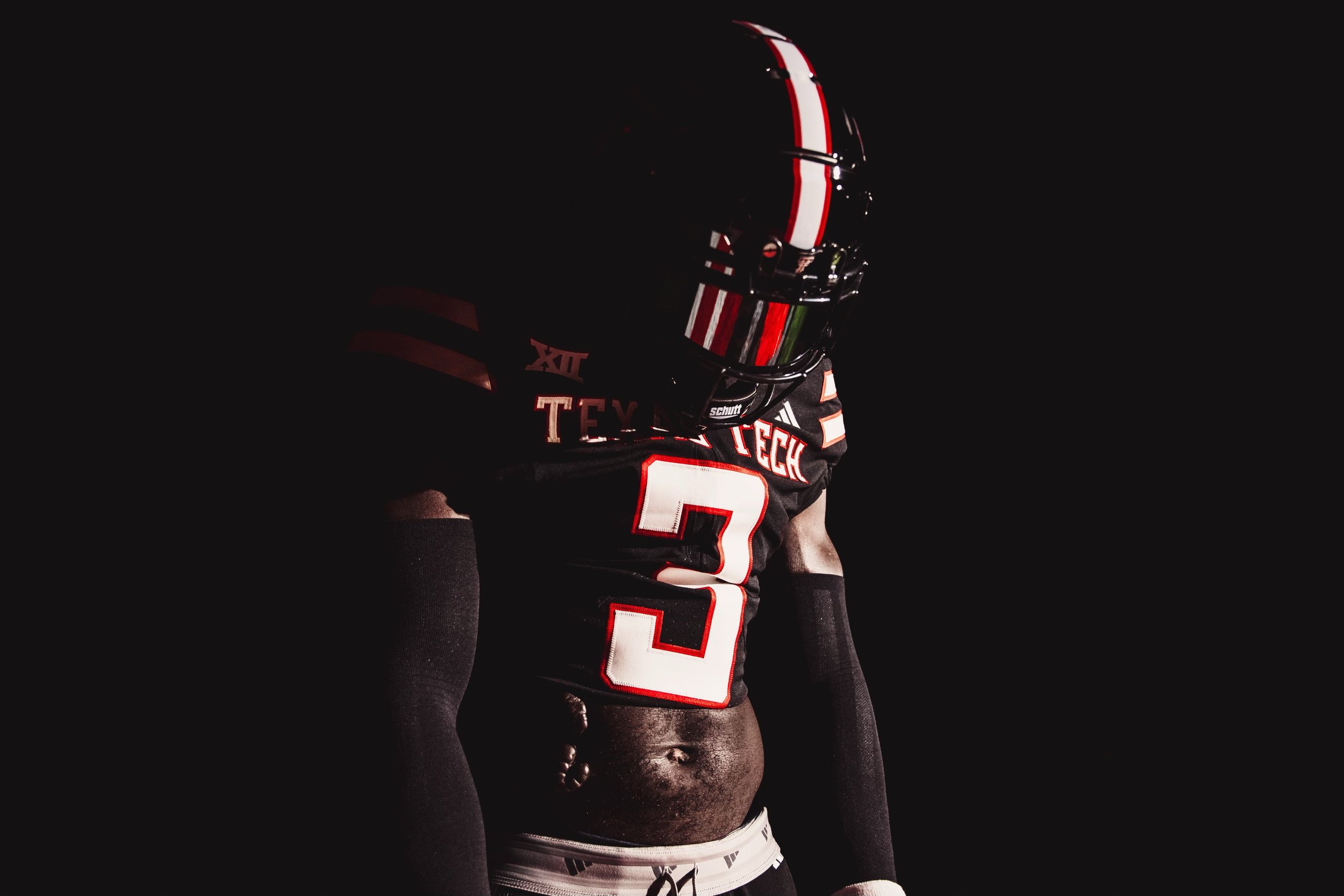
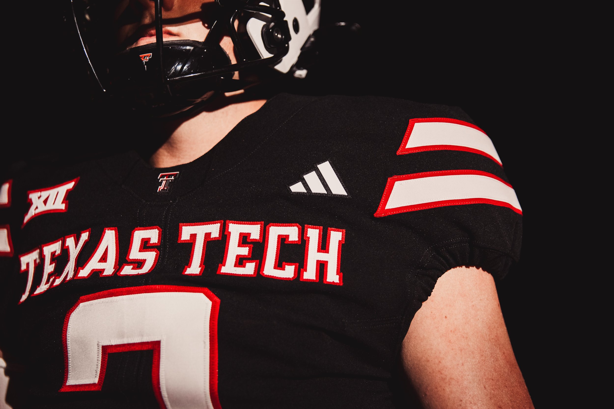
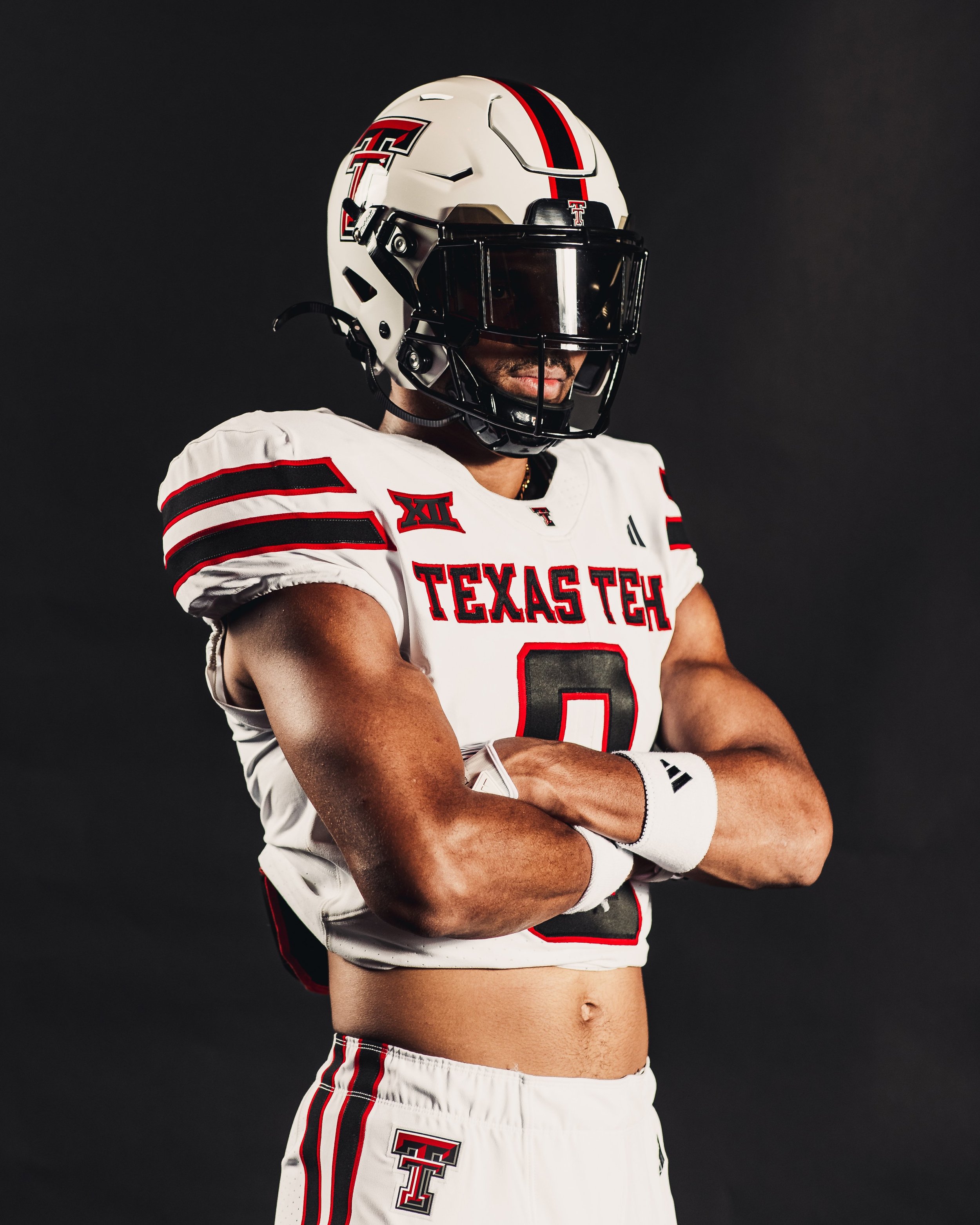
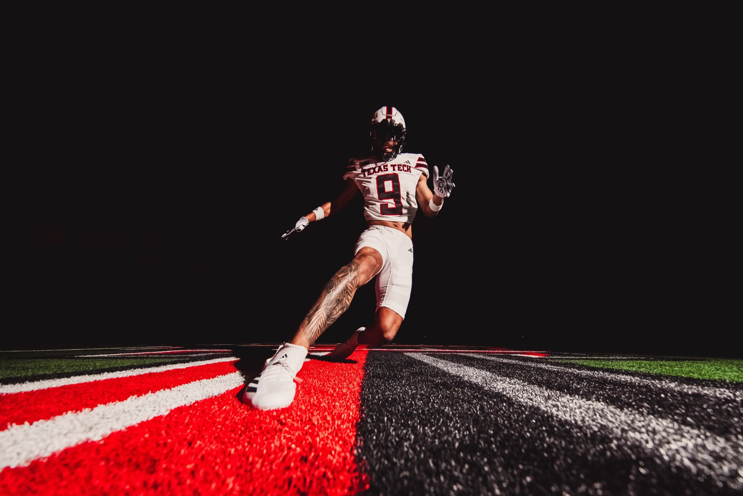
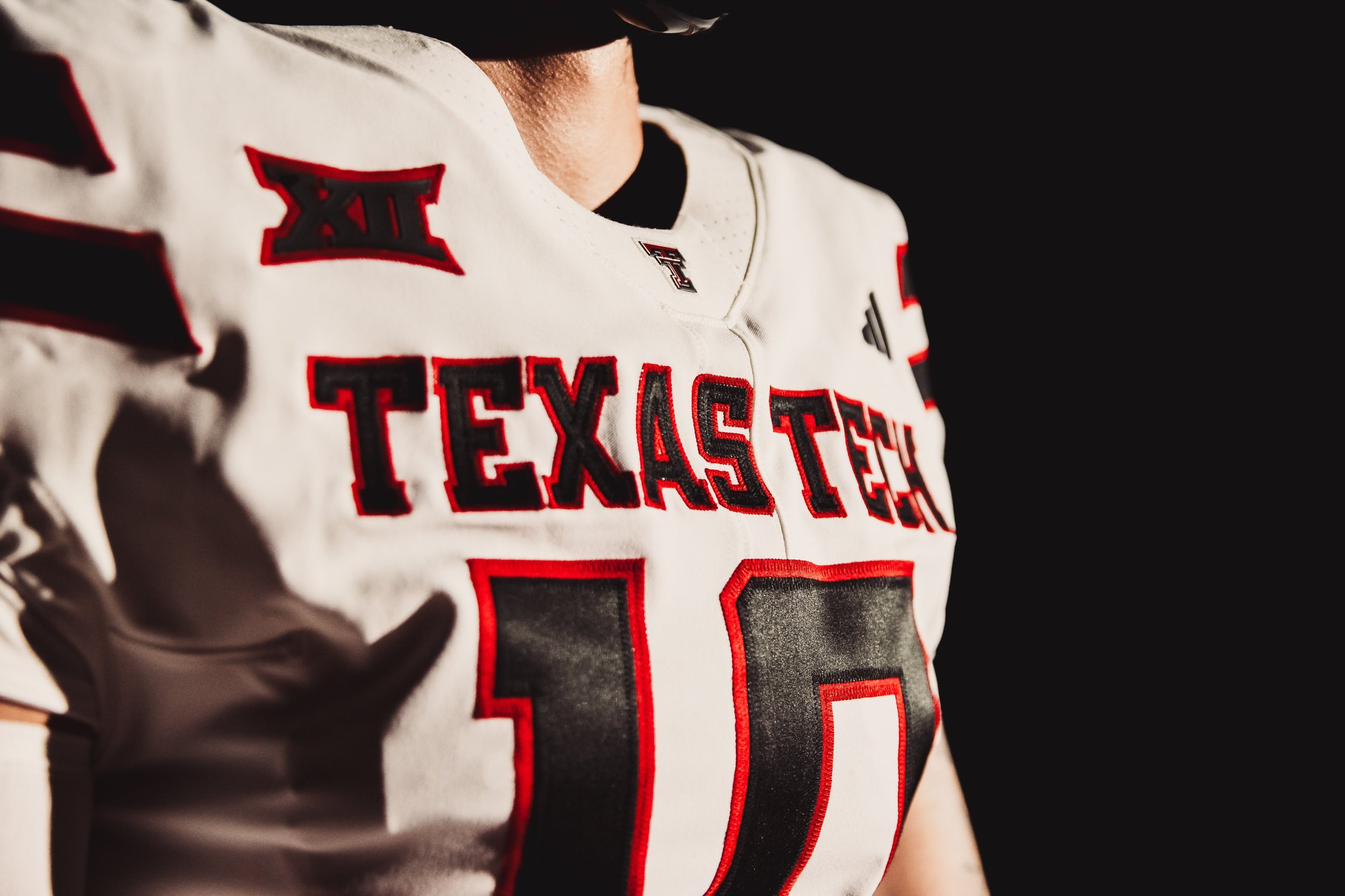
The wait is over. The Texas Tech Athletics department's apparel deal with adidas has officially begun, and the Texas Tech football team has unveiled its new uniforms. This marks a new era for the Red Raiders as they step onto the field with a fresh look and a new partnership.
Over the weekend, Texas Tech's athletic programs began teasing the adidas unveils. The excitement reached its peak on Monday morning when the football team officially revealed the new uniforms, much to the delight of their fans.
Much like the previous Under Armour uniforms, Texas Tech will offer a variety of combinations. The Red Raiders will sport black, red, and white jerseys and pants, along with white and black helmets. These options will allow for a mix-and-match approach, keeping the team’s appearance dynamic throughout the season.
The most noticeable changes to the uniforms include bigger numbers on the front of the jerseys, making player identification easier for fans and commentators. The shoulders now feature two stripes—white stripes on the black and red jerseys, and black stripes on the white tops—replacing the single line and Texas Tech logo that adorned last year's attire.
The helmets also have a new design element: white stripes down the middle, a shift from the previous red line. This subtle change adds a classic touch to the overall sleek design of the new uniforms.
The new adidas uniforms mark a significant step for Texas Tech football, symbolizing a fresh start and a renewed partnership. Fans can look forward to seeing their team take the field in these striking new uniforms, blending tradition with modern design elements.
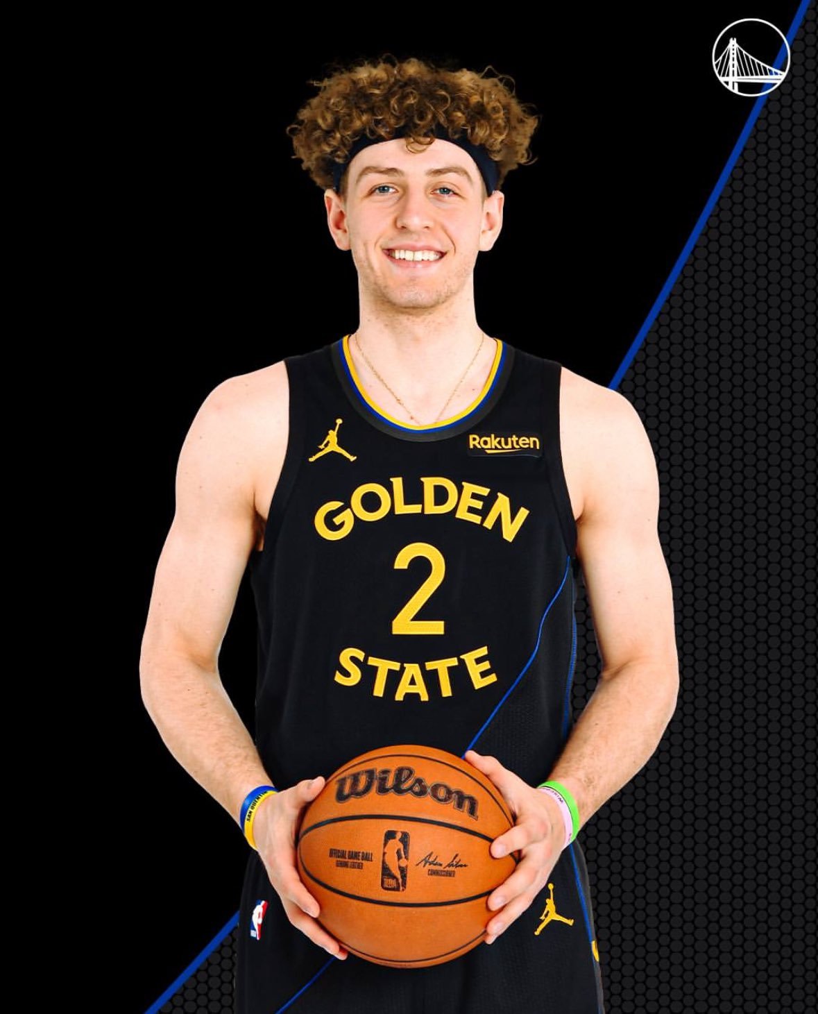
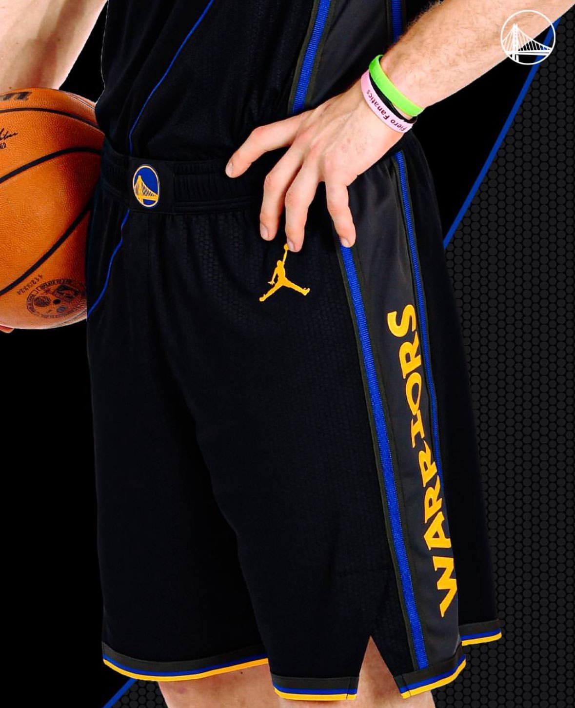
The Golden State Warriors have unveiled a new secondary logo and Statement Edition uniform ahead of the 2024-25 season, marking an exciting update to the team's visual identity.
The new logo features a stylized "W" mimicking a basketball net after a ball has gone through. This design captures the essence of the Warriors' renowned shooting prowess. "The monogram is designed to resemble a basketball net and rim, with the slight arch in the 'W' giving the impression of a ball dropping through the net," explained Gold. This innovative logo will be prominently displayed on the Warriors' Statement Edition uniforms and on the belt buckle of the team’s Association and Icon uniforms.
Golden State’s new Statement Edition uniform showcases a bold black and gray colorway, accented with hints of Warriors' blue and gold. The design pays homage to the Bay Bridge, with a sloping cable motif connecting the jersey to the shorts. The textural elements of the uniform mimic the inner wires of the cables that support the iconic bridge, reinforcing the connection between the team and the Bay Area. The newly unveiled secondary logo is prominently featured on the shorts, tying the design together.
“We have the ability to redesign our Statement Edition uniform every three years, and we wanted to take full advantage of this unique opportunity,” said Amanda Chin, Warriors Senior Vice President of Marketing. “Aligning the launch of our new secondary logo with our 2024-25 Statement Edition uniform allowed us to highlight a new part of our core identity in a bold and exciting way.”
The Golden State Warriors’ new secondary logo and Statement Edition uniform embody the team's innovative spirit and deep connection to the Bay Area. By combining a fresh design with symbolic elements, the Warriors continue to set the standard for creativity and style in the NBA. As the team gears up for the 2024-25 season, fans can look forward to seeing these bold new uniforms on the court, representing both the rich history and the exciting future of Warriors basketball.
Orange isn't just a color for the Anaheim Ducks; it's the essence of who they are. It represents the vibrant community of Orange County and the pride they take in their home. The Ducks' new uniforms for the 2024 season embrace this bold identity, blending classic elements with modern design to create a powerful and cohesive look.
The new uniforms feature a dominant orange hue, symbolizing the heart of the Anaheim Ducks and their deep connection to Orange County. Complementing this bold color are classic black and white tones, which provide sharp contrast and a sense of elegance. Gold accents complete the look, reflecting the golden, sandy beaches that define the region.
Every aspect of the new design has been crafted with intent, seamlessly merging tradition with modernism. The sharper angles and striking presence of the uniforms reflect the team's ambition. The logo's determined expression embodies the Ducks' evolution, while Wild Wing's "WW" remains a foundational element on the stick blades. The former primary mark has been refined and now serves as the secondary logo, preserving the team's rich heritage.
The meticulous attention to detail in every stitch and hue showcases the Ducks' philosophy and commitment to excellence. The new uniforms are not just about aesthetics; they represent the unity and spirit of the Anaheim Ducks and their fans. Each distinctive element comes together to build a powerful identity that resonates with the community.
The Ducks' new identity is a fusion of heritage, spirit, and vision. From the sleek new typeface to the streamlined representation of their past on each shoulder, the new uniforms at home and on the road symbolize the team's journey and aspirations. The Ducks are proud to be Orange County’s team, a place known for its warm, sunny weather and passionate fans who stand by their team through thick and thin.
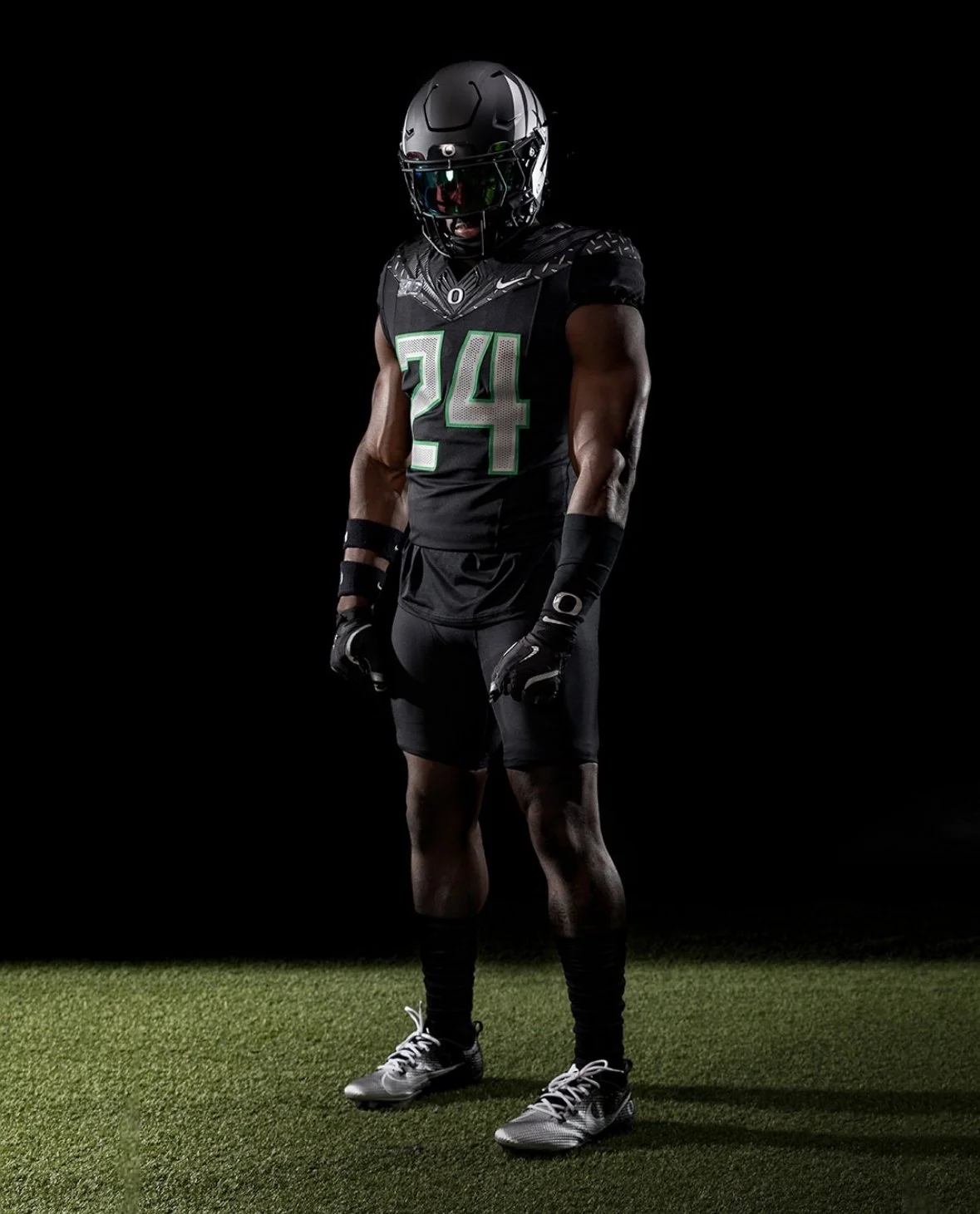
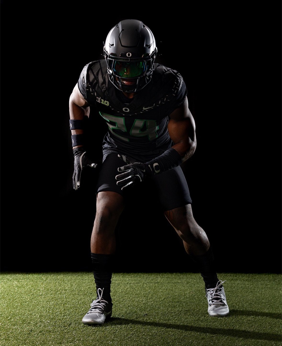
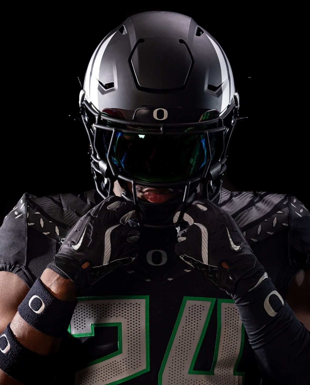
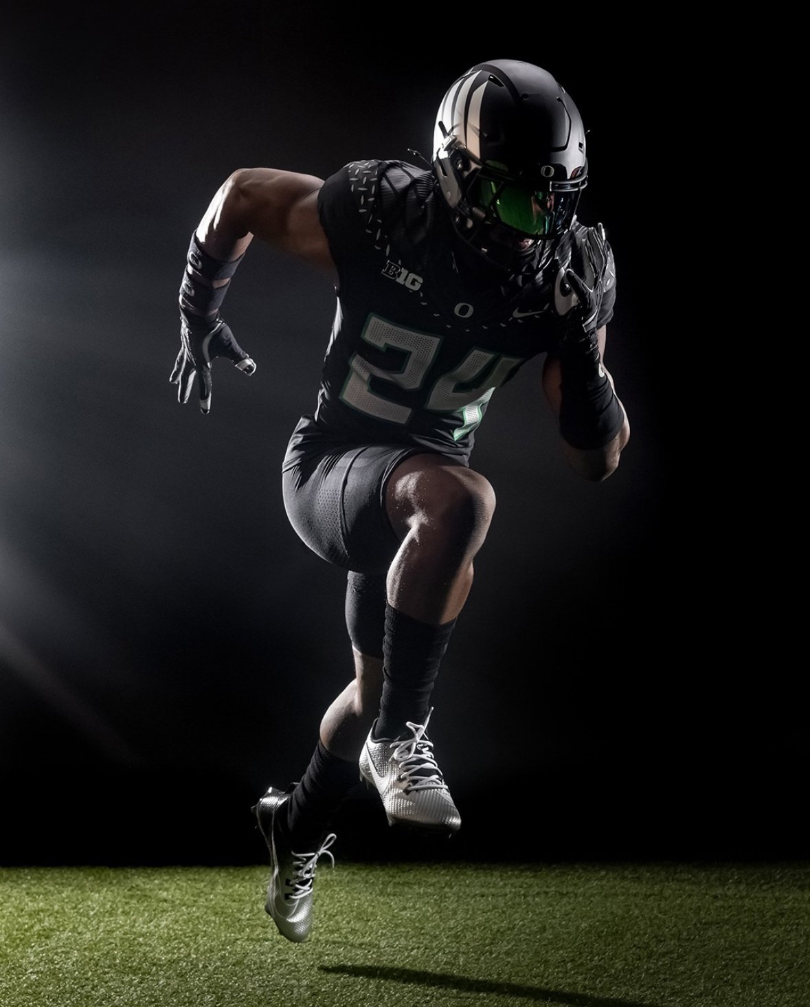
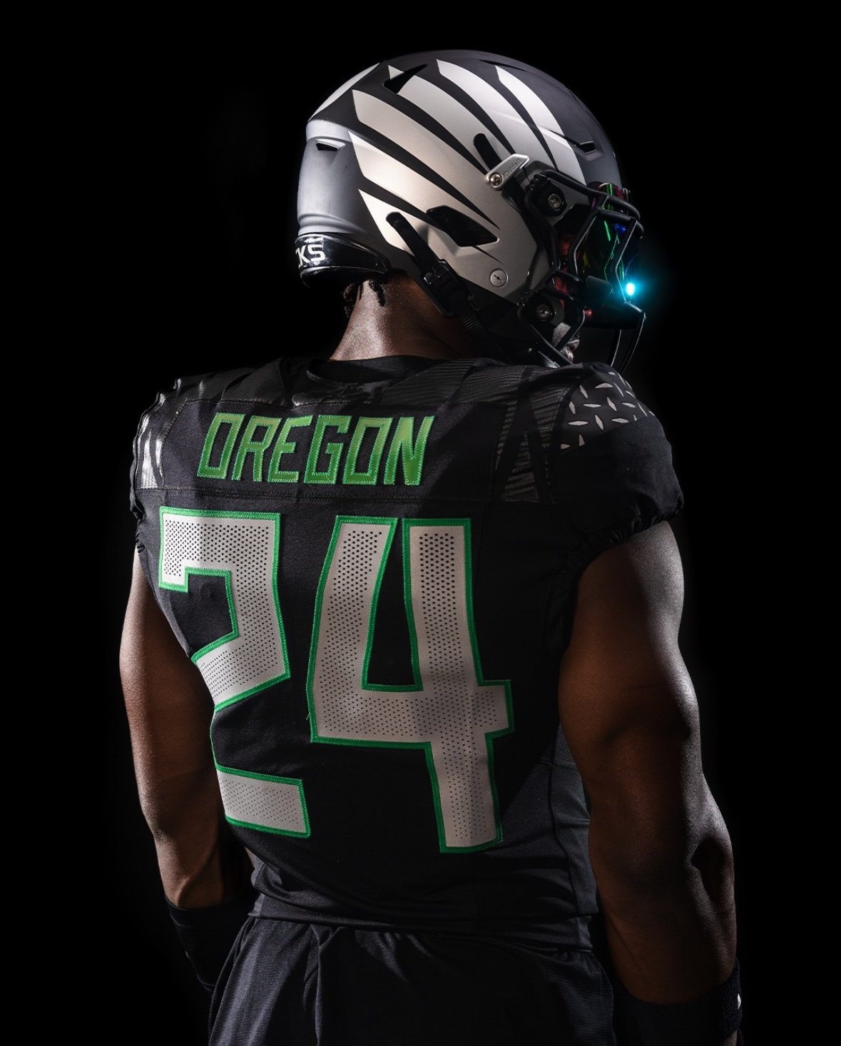
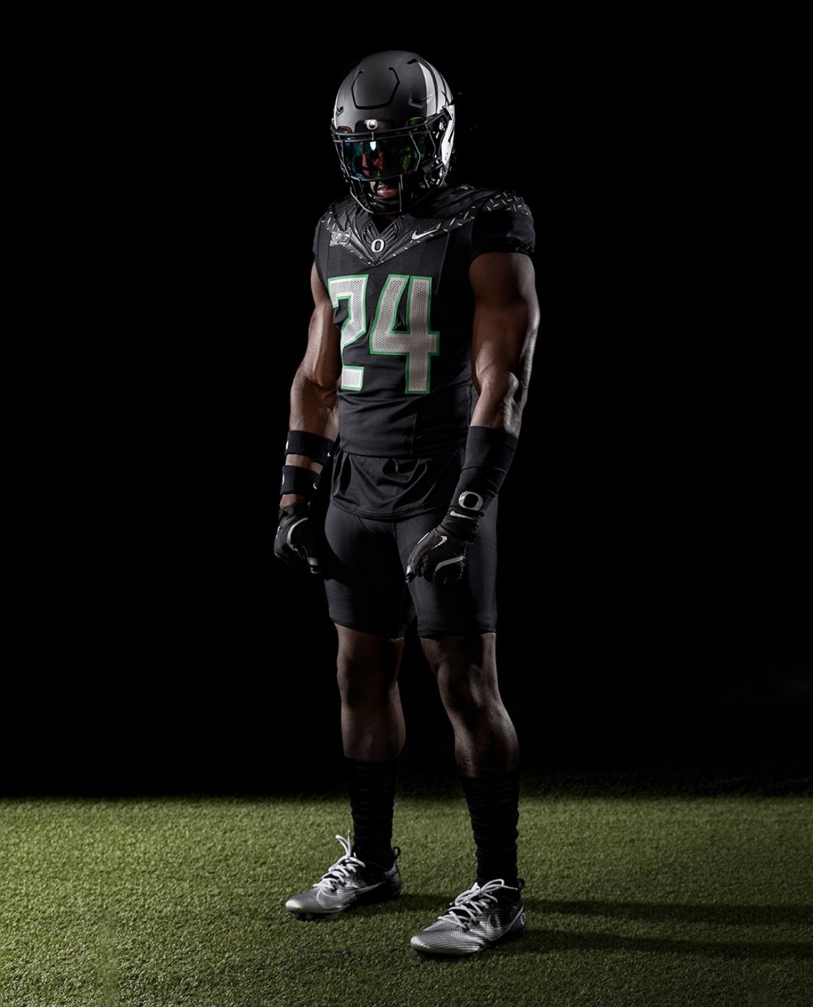
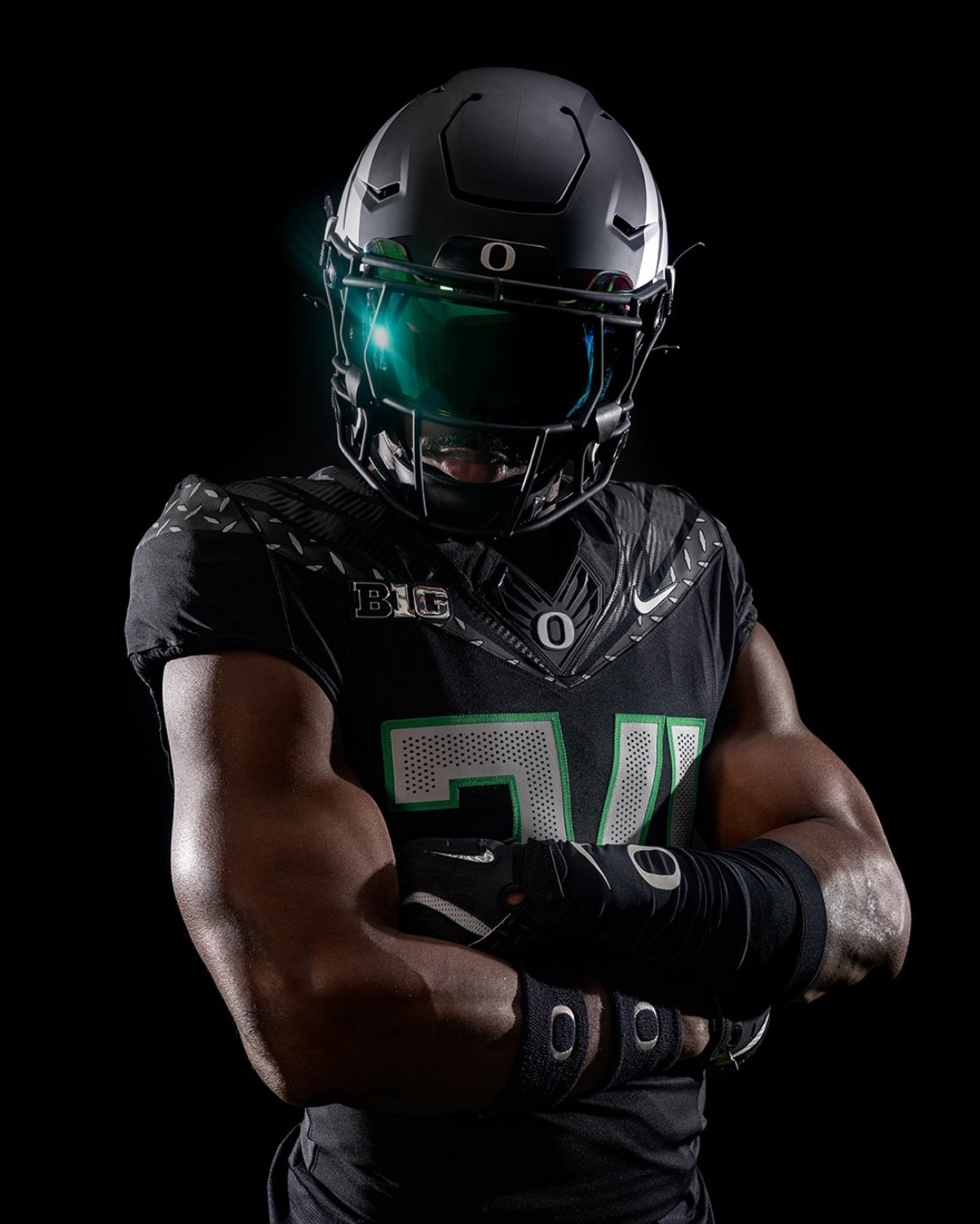
Months of waiting and eager anticipation have finally come to an end for Oregon Ducks fans. the Ducks revealed the first glimpse of their new "Generation O" uniforms, and the excitement is palpable.
The debut of the "Generation O" uniforms showcases an all-black jersey that pays homage to iconic designs from past Oregon uniforms. The classic wings, a staple of Oregon’s football identity, make a triumphant return on the helmet. The collar area features diamond plating reminiscent of the 2005 era, complemented by wings that echo designs from the past decade.
The "Generation O" series is expected to include a total of five different jerseys, although the timeline for the remaining unveilings has yet to be announced. This new series represents a blend of tradition and innovation, celebrating the Ducks' rich history while introducing fresh elements to keep the look dynamic and modern.
The unveiling has been met with widespread excitement within the college football community. Fans and analysts alike are buzzing about the striking design and the thoughtful nods to previous eras. The all-black jersey not only stands out visually but also symbolizes a new chapter in Oregon football, one that honors the past while looking boldly to the future.
The "Generation O" uniforms are more than just a new look for the Ducks; they are a celebration of the program's storied past and a bold step into the future. As fans eagerly await the remaining unveilings in the series, the excitement surrounding Oregon football continues to build.
Stay tuned for more updates on the "Generation O" uniform series and all things Oregon Ducks football. The next chapter of Oregon's football legacy is just beginning, and it promises to be as thrilling as ever.
The Los Angeles Kings have officially unveiled their new home and road jerseys, reigniting a wave of nostalgia among their fan base. Announced on Wednesday, these jerseys mark a significant rebrand for the franchise, one that harks back to the glory days of the late 1980s and early 1990s.
For fans who closely followed the Stanley Cup playoffs, the new direction might not come as a surprise. During their three road games against the Edmonton Oilers, the Kings sported their alternate white sweaters featuring the iconic "chevron"-style logo. This logo, originally introduced in 1988 with the arrival of Wayne Gretzky, has made periodic appearances over the years. The angular design of the chevron logo, reminiscent of the automobile brand Chevrolet, has now officially replaced the "shield"-style logo that the team adopted in 2011-12.
Despite the success the Kings enjoyed with the shield logo, including two Stanley Cup victories, the allure of nostalgia proved too strong to ignore. "We’ve seen years of fans wearing that jersey, whether they had bought it recently through Mitchell & Ness or any of the other heritage brands, or had it back from the ’80s and ’90s when they first bought it and they still wear it," said Kings chief operating officer Kelly Cheeseman. "When you come to a Kings game, for better or for worse, you see a plethora of jerseys out there from all the different eras."
The decision to revert to the chevron logo was influenced by the fans' continued affection for the design. The Kings tested the waters with their heritage jersey in the 2019-20 season, incorporating the chevron logo with a "Forum blue" and gold scheme, which received strong reviews. "We started utilizing companies that have gone undefeated as brand partners to sell new merchandise with that inspiration in it," Cheeseman explained. "You started seeing the popularity and also new generations and new fans from different areas of the city going, ‘That’s cool if you want to be a part of it.’"
The Los Angeles Kings' latest rebrand taps into the powerful sentiment of nostalgia, reviving a beloved era in the team's history. By reintroducing the chevron-style logo, the franchise honors its past while appealing to both long-time supporters and new fans. As the Kings gear up for the 2024 season, these new jerseys symbolize a bridge between their storied history and a promising future.
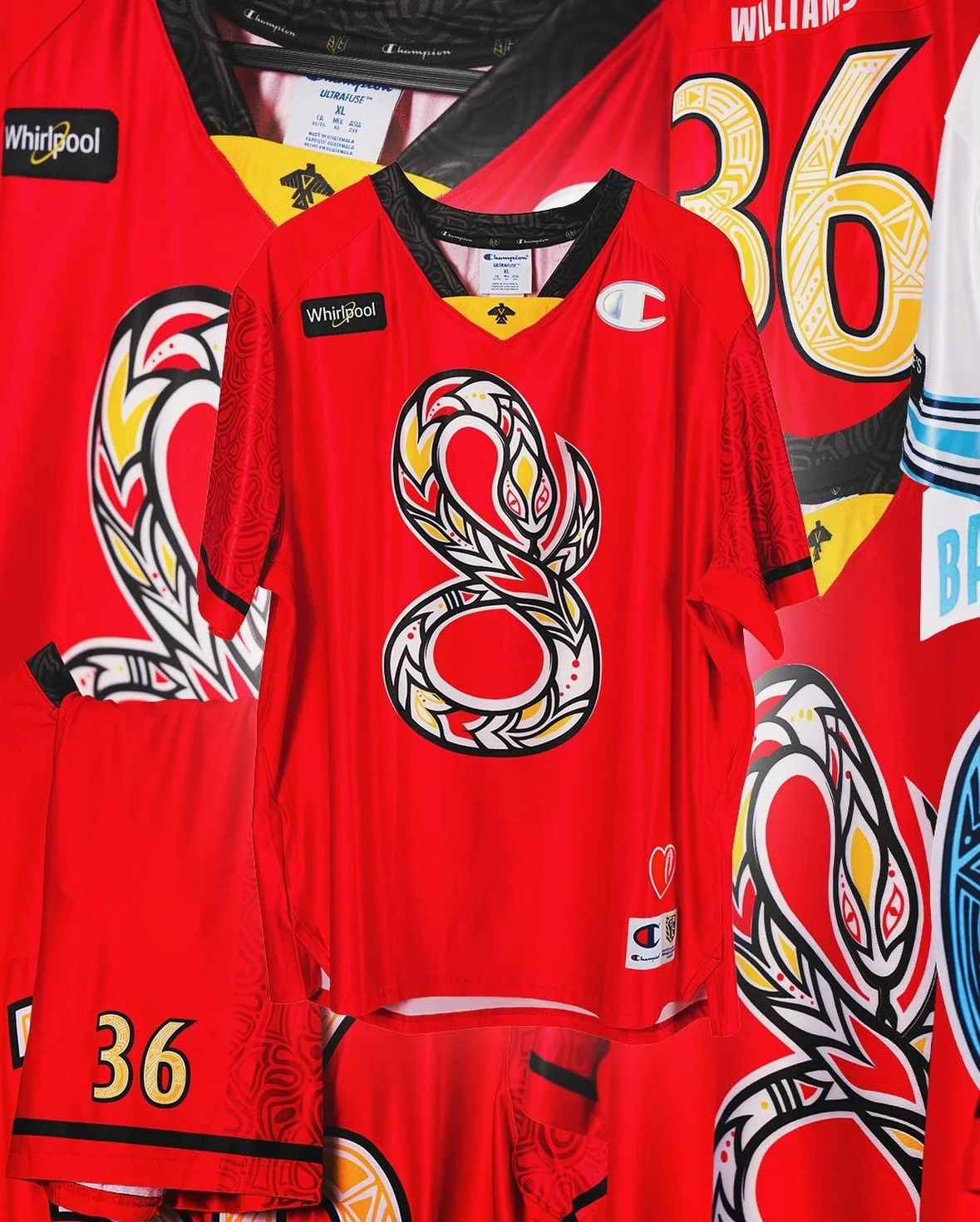
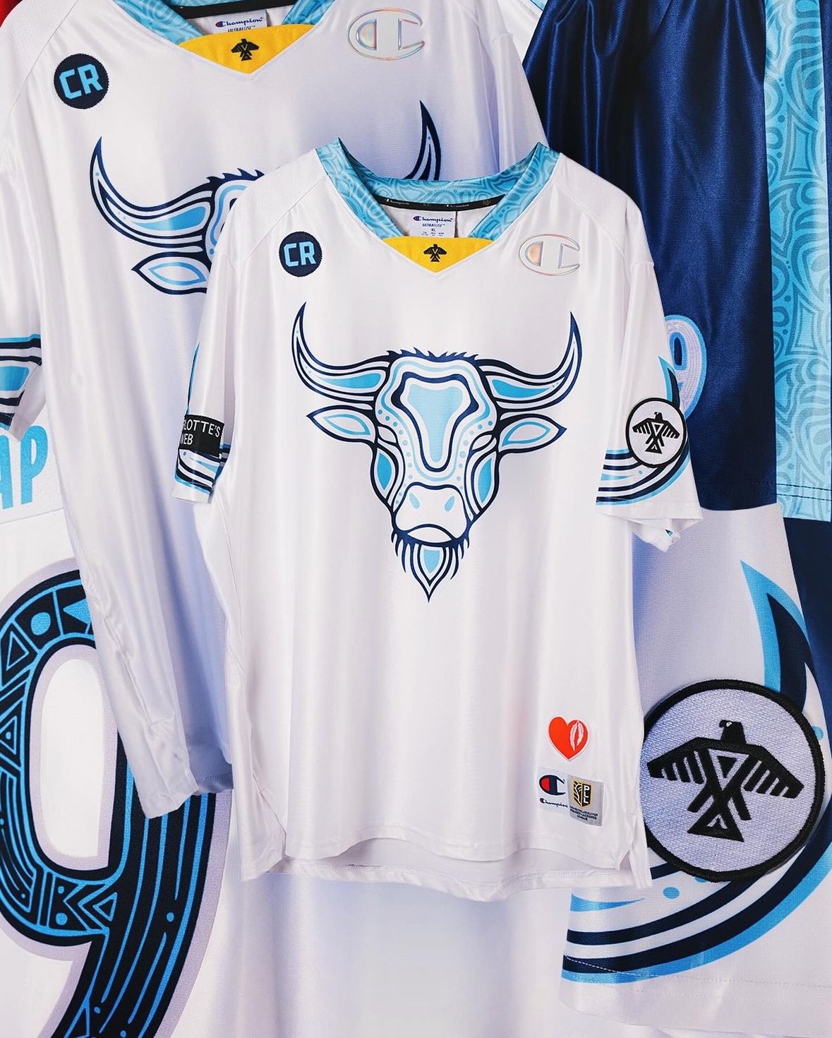
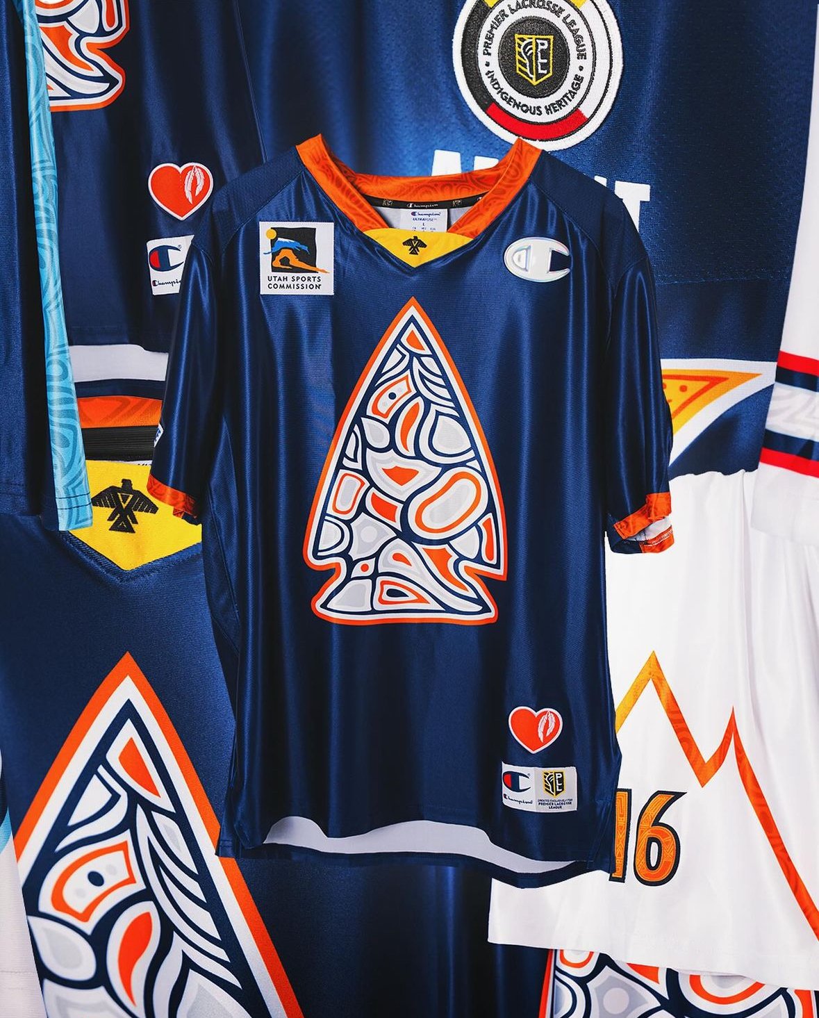
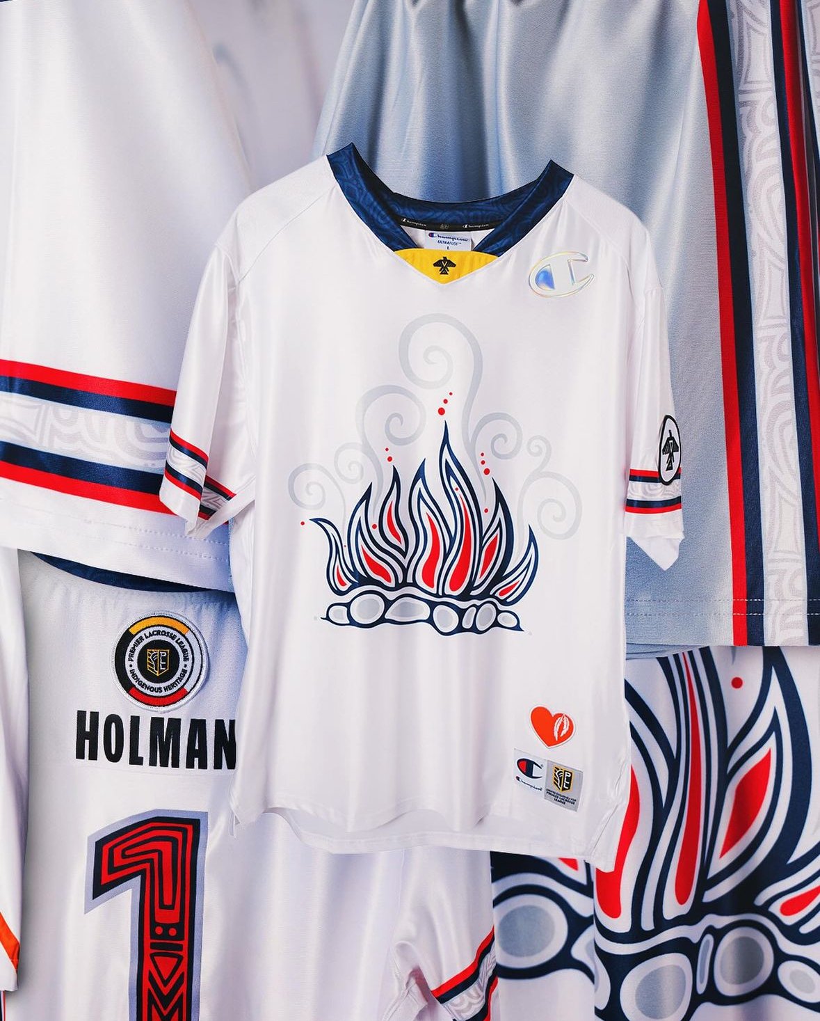
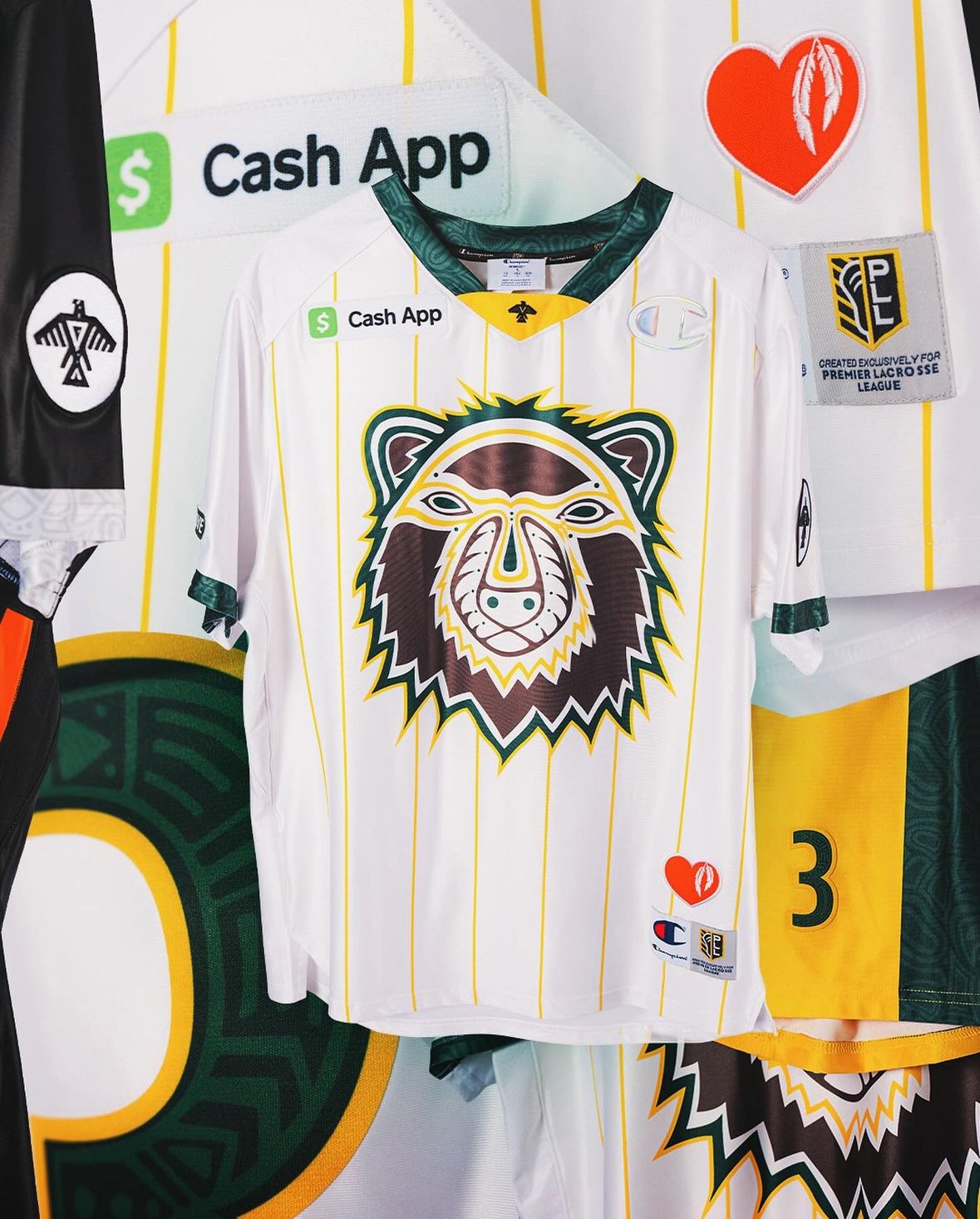
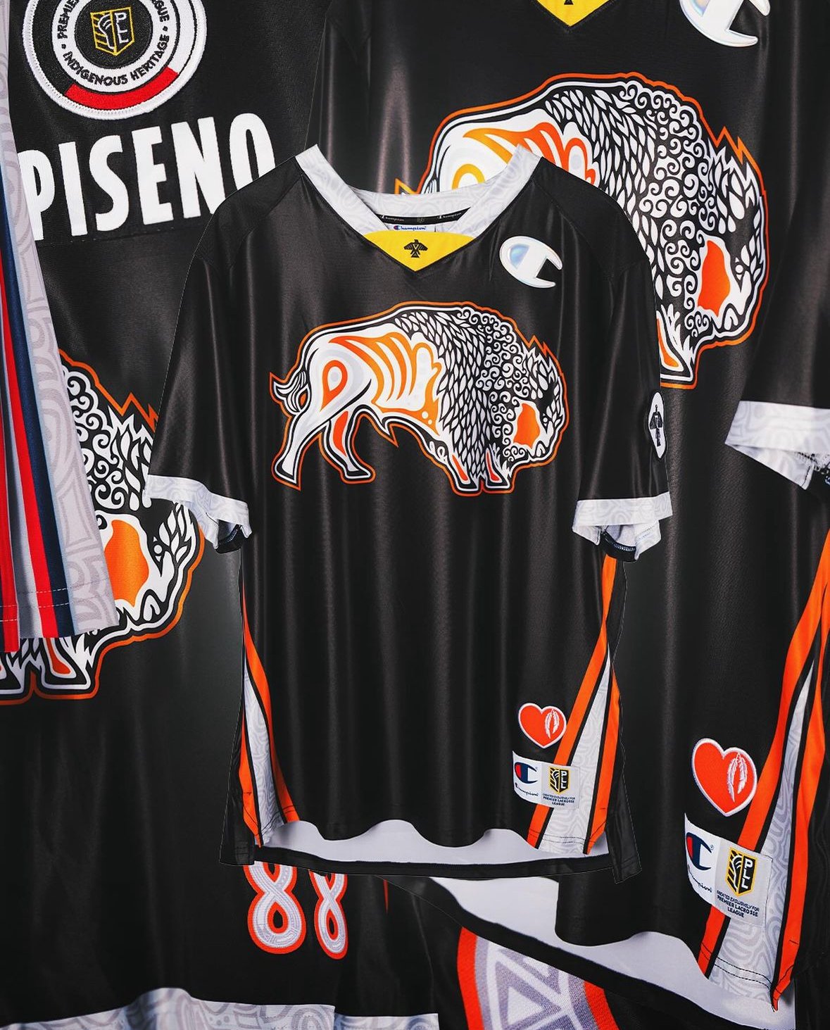
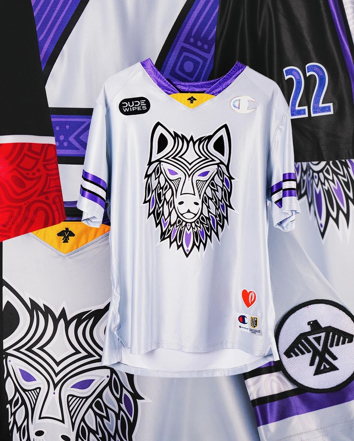
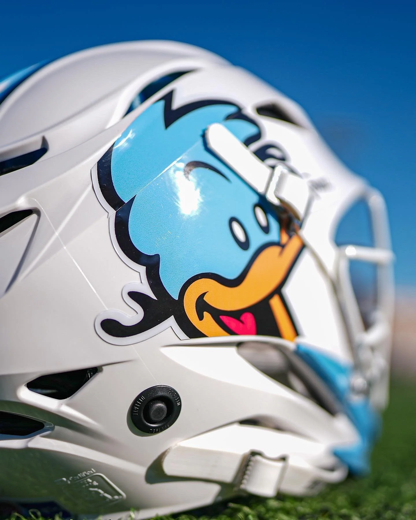
The Premier Lacrosse League has unveiled special uniforms for all eight teams in honor of Indigenous Heritage weekend. This marks the fourth annual celebration of Indigenous Heritage by the PLL, highlighting the deep-rooted connections between lacrosse and Native American culture.
Lacrosse holds the title of the oldest team sport in North America, with origins tracing back to various Native communities. The PLL's special uniforms serve as a tribute to these Native American roots. The designs were crafted by Patrick Hunter, an Indigenous artist and designer, and draw inspiration from woodland art. This style of Native art is rooted in the "Ojibwe traditions of petroglyphs—drawings or carvings on rocks—and images made on birchbark scrolls," as described by the Minneapolis Institute of Art. The Ojibwe tribe is the most populous in North America.
"Woodland art began in the 70s in Ontario, Canada, made famous by artists like Norval Morrisseau and Daphne Odjig," Hunter explained. "When looking at woodland artwork... You can see the life force, soul, vibe, or spirit of what it is you're looking at." This vibrant and meaningful art style is reflected in the PLL uniforms, making each piece not only a sports uniform but a work of cultural significance.
Each team’s uniform is a reflection of the rich tradition and spirit of woodland art. Below, you can see the designs that will be showcased during Indigenous Heritage weekend:
These unique uniforms are a testament to the PLL's commitment to honoring the cultural heritage of lacrosse while supporting Indigenous communities. Tune in to ESPN+ to see these vibrant uniforms in action and celebrate the legacy of the sport.