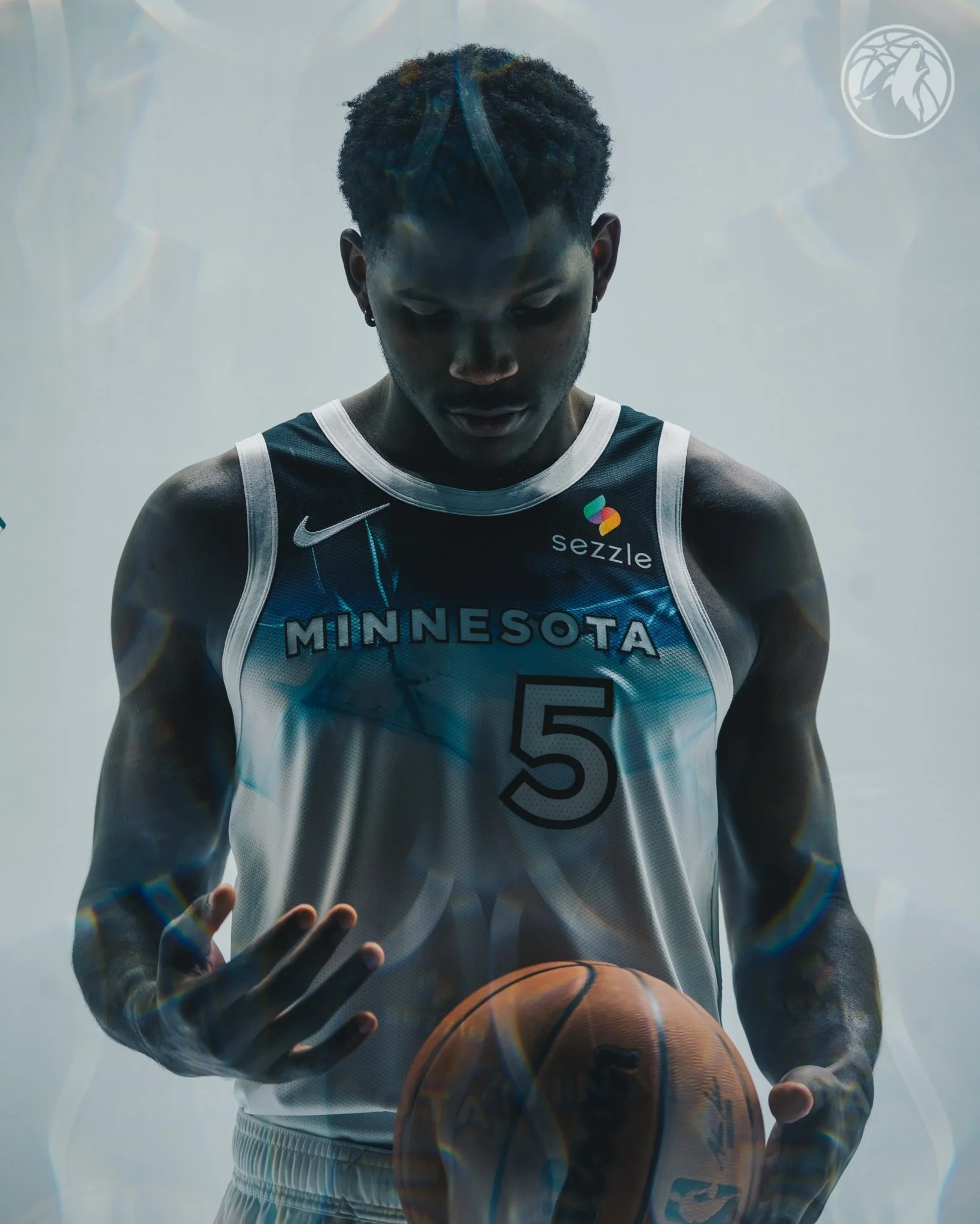
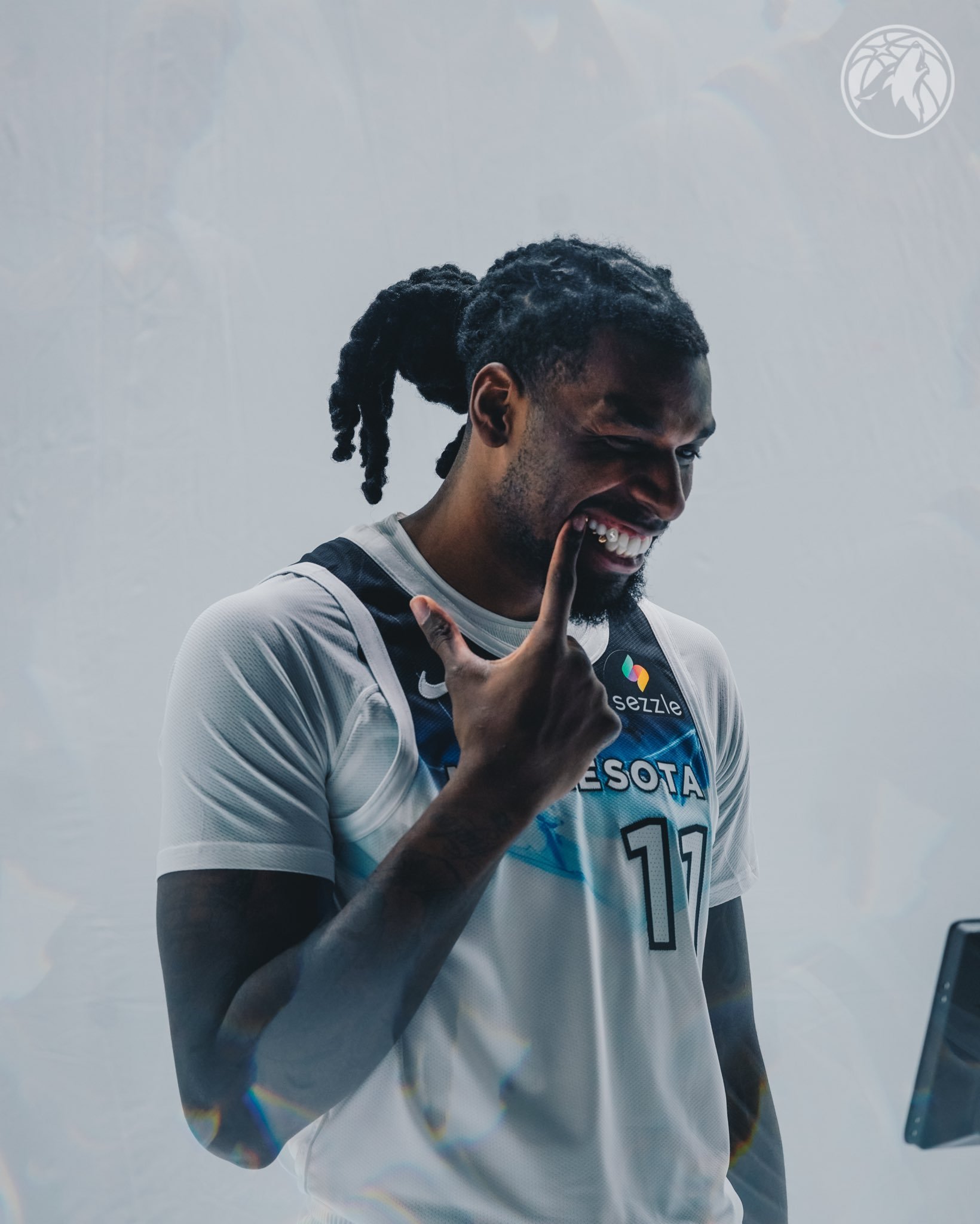
The Minnesota Timberwolves have revealed their 2024-25 NBA City Edition uniform, a tribute to the frigid elegance of Minnesota’s winters and the spirit of “lake life” that defines the state. In collaboration with Nike, this uniform is the culmination of a two-year story arc celebrating Minnesota’s deep connection to its natural landscape, particularly the iconic lakes that freeze over during the winter months. The design captures the serene beauty of snow-covered terrain under a moonlit sky, inviting fans to embrace the season’s stark yet captivating charm.
"Here in Minnesota, we don’t just survive the cold; we thrive in it," said Timberwolves Chief Marketing Officer Mike Grahl. "Completing Nike and the NBA’s two-year City Edition story, this uniform is a tribute to Minnesota’s lake life in ice-cold style." The design blends a crisp white and bold black palette, evoking the icy calm of a Minnesota winter. At the core of the uniform is a custom-crafted ice pattern, meticulously designed in Bloomington, Minnesota, to reflect the layered textures of ice-covered lakes.
The “MINNESOTA” wordmark remains across the chest, serving as a proud reminder of the team’s roots and the close-knit bond between the Timberwolves and their community. Encasing the primary Timberwolves logo on the shorts, the icy black-and-white color scheme features a frozen pattern, symbolizing the powerful seasonality of winter in Minnesota. The trim on the uniform bears the phrase “Land of 10,000 Lakes,” with a debossed white finish designed to look like tracks pressed into freshly fallen snow, adding a tangible sense of wintry texture.
The waistband of the shorts features a white silicone emblem of Minnesota, creating a tone-on-tone effect that keeps the focus on the state’s snowy landscape. The phrase “Land of 10,000 Lakes” is also displayed along the baseline, flanked by the North Stars, reinforcing the team’s connection to Minnesota’s natural beauty and resilient character.
This City Edition uniform will be worn by the Timberwolves throughout the season, debuting in their game against the Phoenix Suns on November 17. Alongside the uniform, the Timberwolves will unveil a custom City Edition court that brings the wintry theme to life with an apron painted a deep black to resemble the night sky. The icy gradient lanes blend from black to frosty white, mimicking the look of frozen lakes, and the Timberwolves logo at center court reflects the icy texture of the jersey design. “Land of 10,000 Lakes” is proudly displayed along the sideline, reminding fans of the state’s defining landscapes.
The Timberwolves’ 2024-25 City Edition uniform is more than just a seasonal design; it’s a celebration of Minnesota’s iconic winter landscape and the resilient spirit that its people embody. The uniform and the custom court embody the essence of “lake life,” showing that for the Timberwolves and their fans, winter is a time not only to endure but to celebrate.
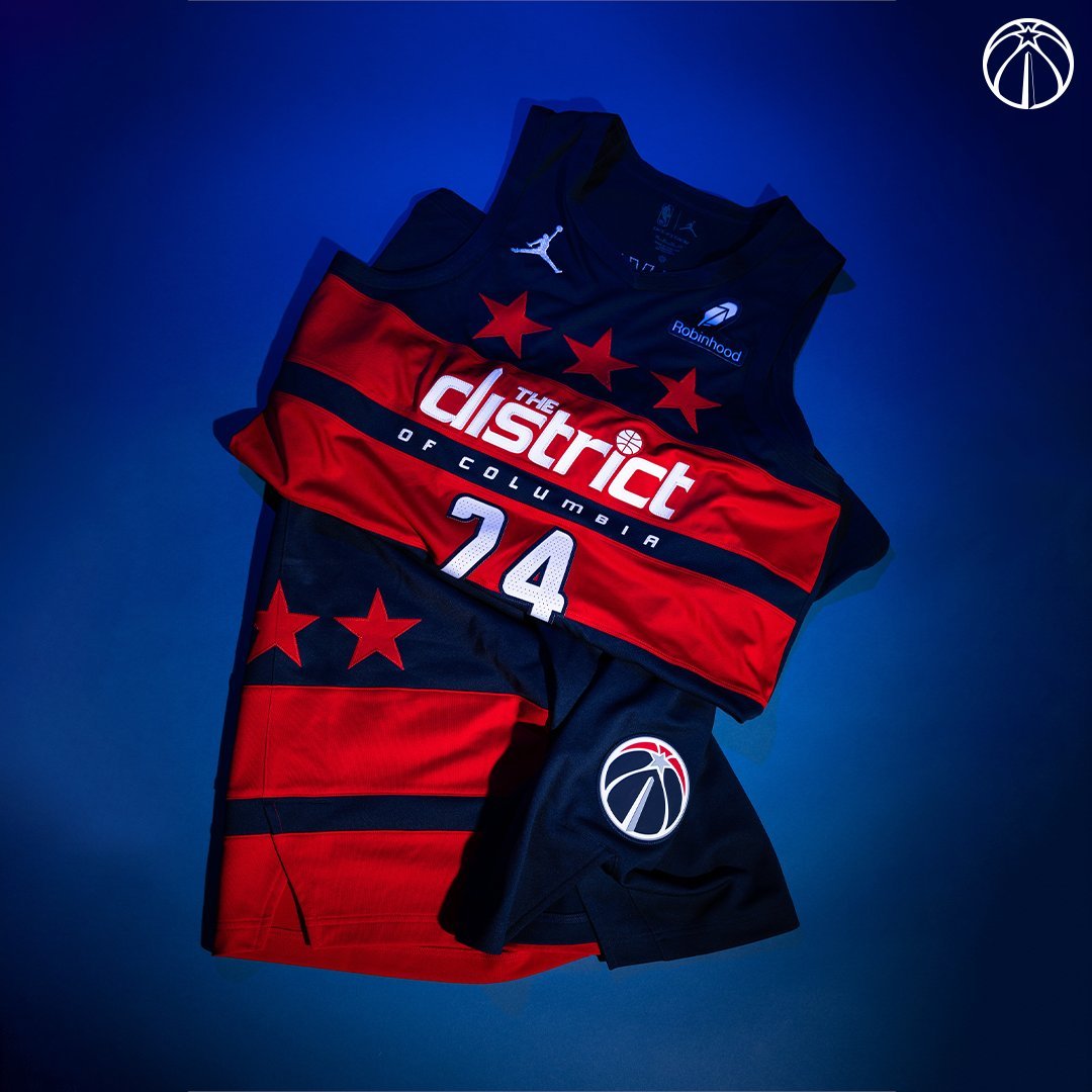
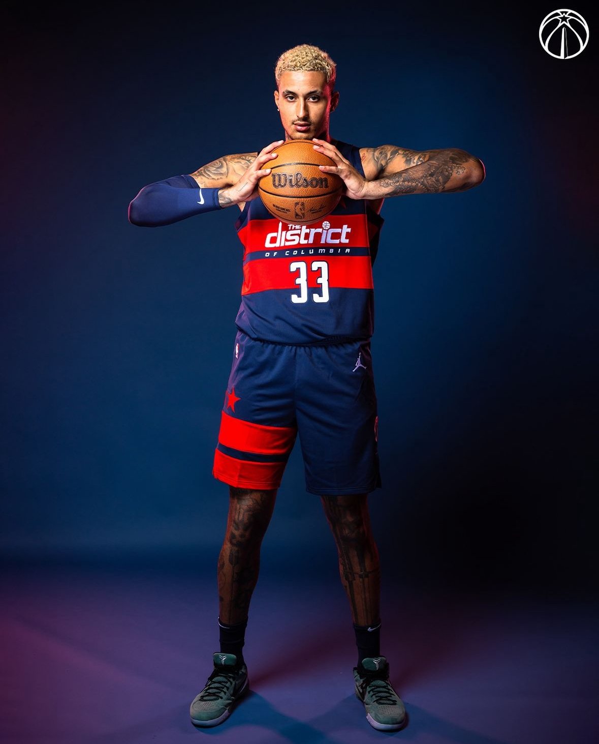
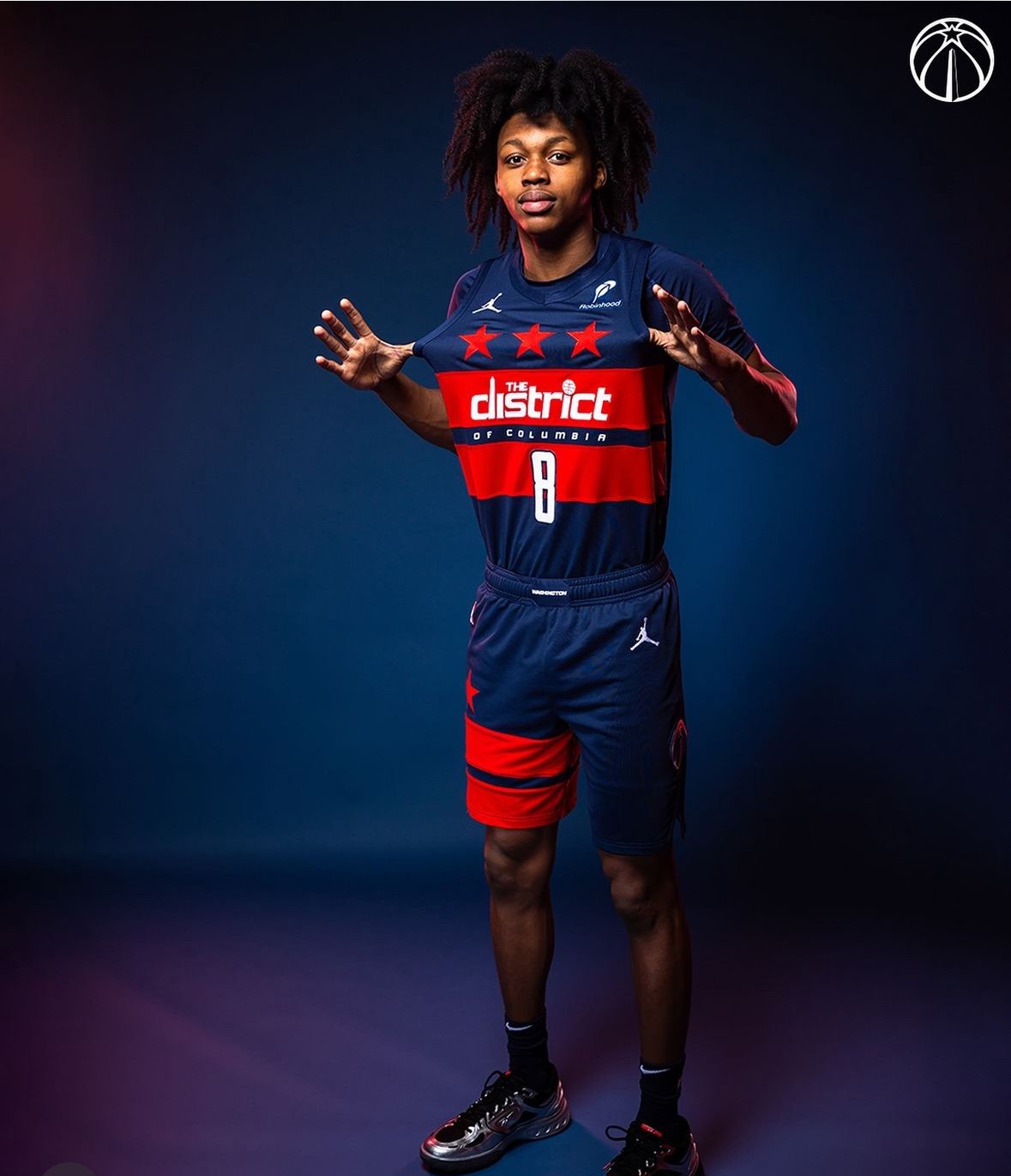
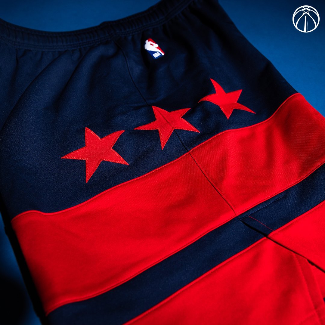
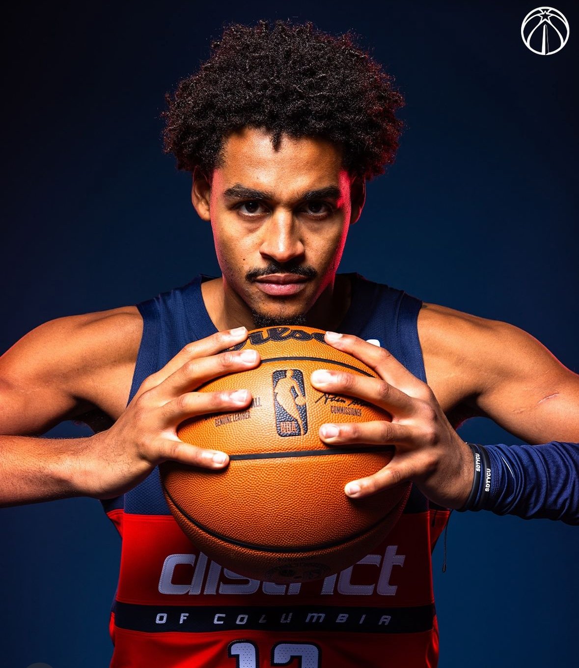
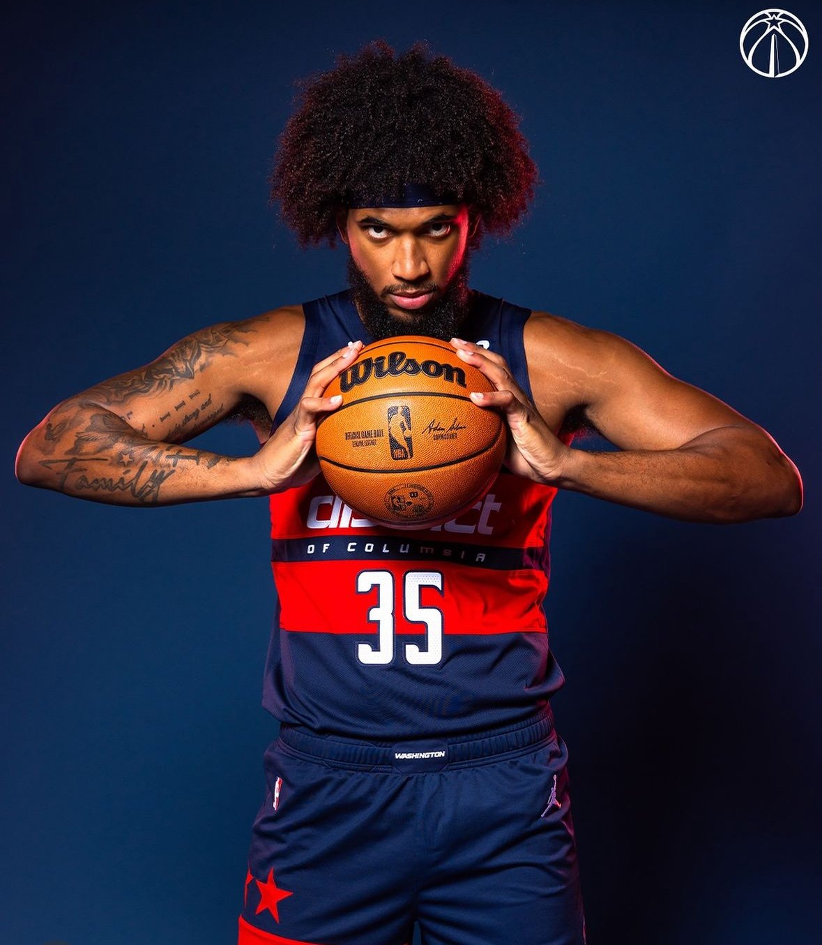
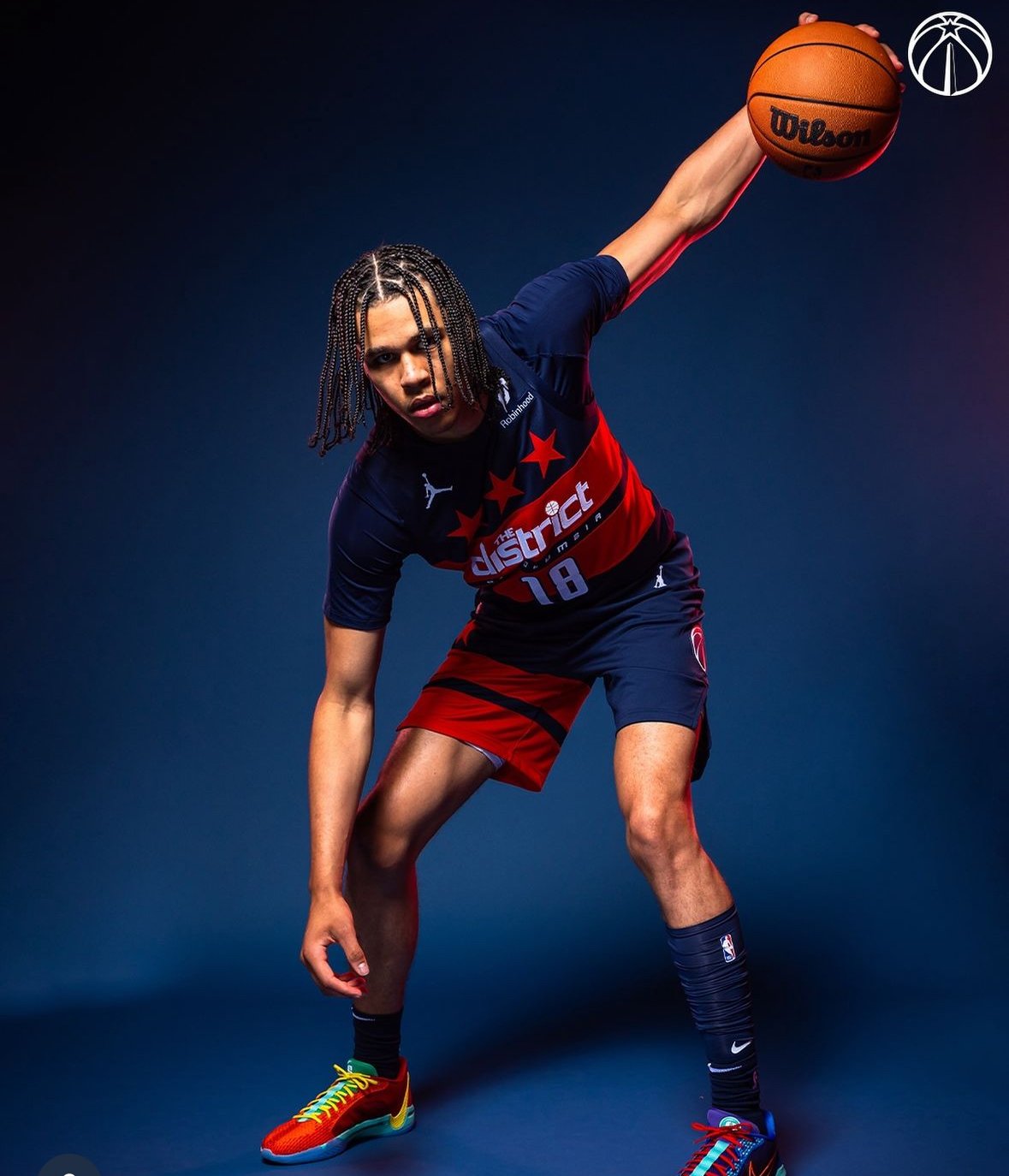
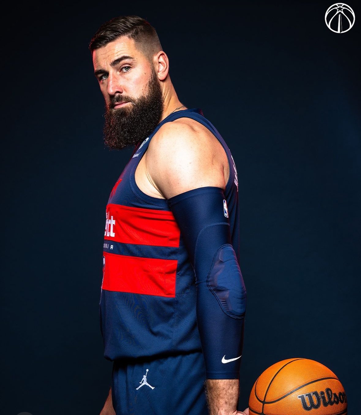
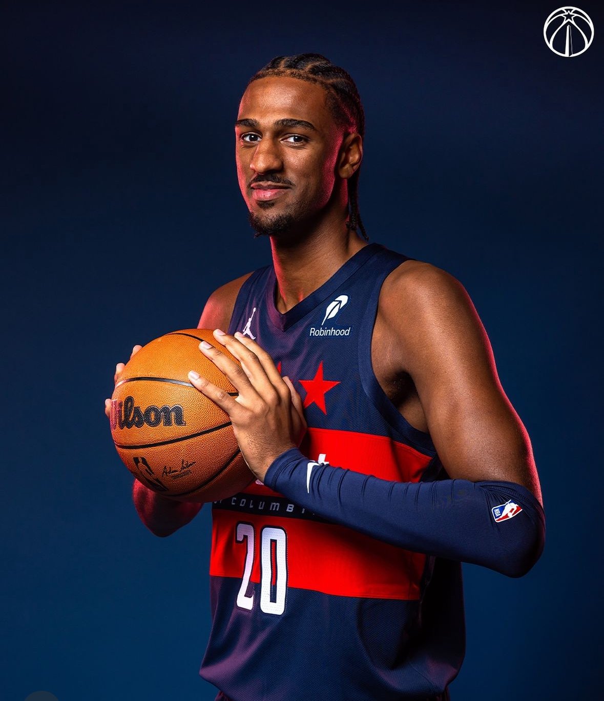
The Washington Wizards have introduced a fresh new look for the 2024-25 season with their “Beyond Boundaries” City Edition uniforms. Building on the “boundary stone” theme introduced last season, this new uniform celebrates Washington, D.C.'s historic legacy and boundary-breaking spirit, with an emphasis on a future without limits. With a bold "hydrogen blue" base and thoughtful details that connect the past and the present, the Wizards’ latest threads have both a compelling story and a striking appearance.
The “Beyond Boundaries” uniform pays homage to Benjamin Banneker, the African American mathematician and astronomer who, in the 18th century, placed 40 stone markers around Washington’s original boundary. Last season’s uniform honored Banneker’s work, and this year’s design extends the theme with updated colors and patterns. The timing of the uniform’s unveiling on Banneker’s birthday highlights the Wizards’ commitment to honoring his legacy.
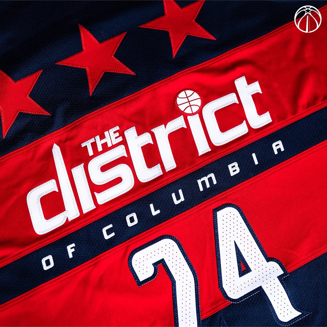
Six stars appear down the side of the jersey, with three representing Banneker’s triangulation of the first boundary stone, tying back to his mathematical contributions. The blue ripple effect on the trim further symbolizes the movement and energy that defines D.C., radiating out to the greater DMV area.
One of the most noticeable elements is the unique “hydrogen blue” color—a shade that has never before appeared on an NBA uniform. According to the Wizards, the color represents the energy and flow that D.C. brings to the region, capturing the city’s vibrant and evolving character. This “hydrogen blue” is complemented by the ripple effect pattern along the trim, creating a visual link to the powerful impact that Washington has had and continues to have on the surrounding areas.
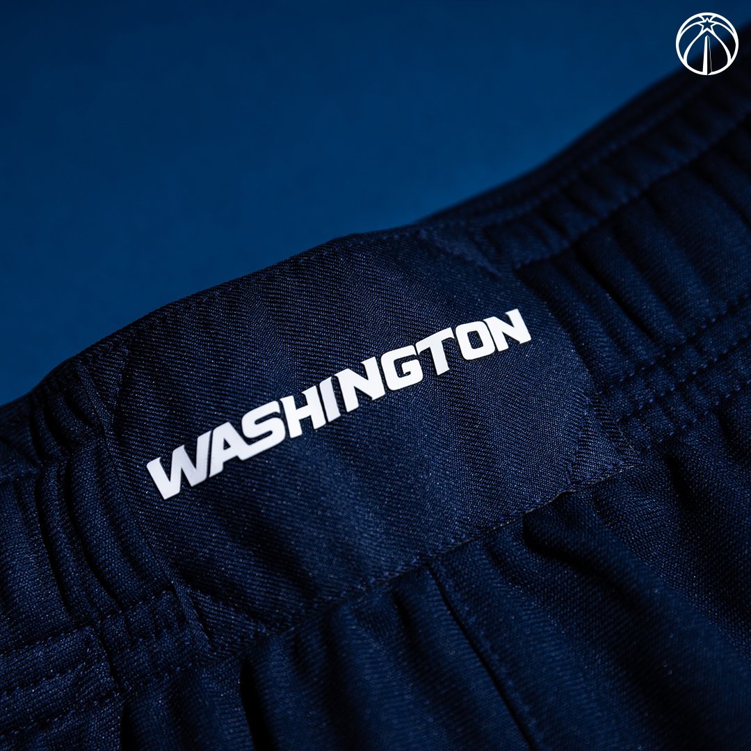
The jersey’s typography also connects to history. “District of Columbia” is written across the chest in a typeface inspired by 18th-century map lettering, echoing the city’s historical roots. The same font style is used for “DMV” on the buckle of the shorts, grounding the uniform in both city and regional pride.
A remix of the Wizards’ City Edition logo, featuring a boundary stone replacing the Washington Monument, appears on the shorts and connects the uniform’s theme back to the team’s identity. With their new City Edition threads, the Wizards emphasize that "no boundaries can contain us,” merging the city’s groundbreaking history with a modern look for a team that represents the heart of D.C.
The Wizards will showcase the “Beyond Boundaries” uniform 19 times this season, debuting the look on December 1 in a home game against the Dallas Mavericks on a themed court. Fans can look forward to seeing the Wizards celebrate the energy, resilience, and history of Washington, D.C., every time they take the court in these powerful new uniforms.
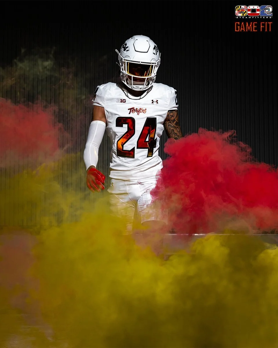
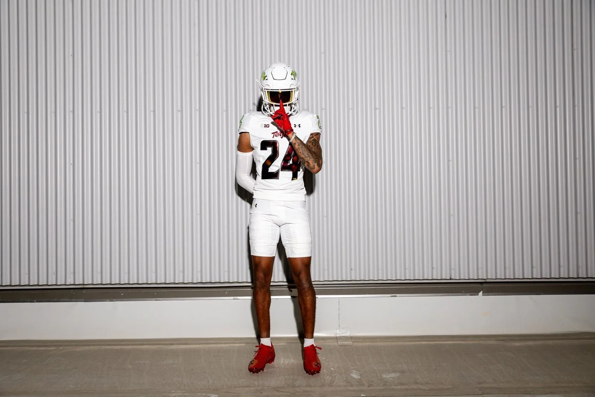
Maryland, the original Under Armour school, is wearing exclusive special edition uniforms for Saturday’s game at No. 1 Oregon. @UnderArmour | @UAFootball
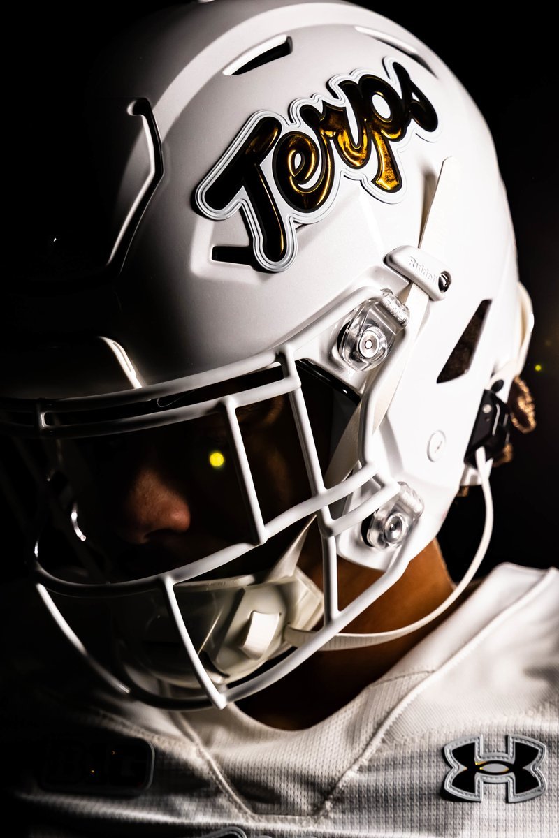
Maryland Football is set to take the field in a bold new look for their upcoming clash against No. 1 Oregon, debuting exclusive special edition uniforms created in collaboration with Under Armour. Known as the original Under Armour school, Maryland has been pioneering cutting-edge uniforms since the early 2000s. This innovative partnership, rooted in UA founder and CEO Kevin Plank’s own legacy as a former Maryland special teams captain and 1996 graduate, continues to drive Maryland’s bold and distinct visual identity in college sports.
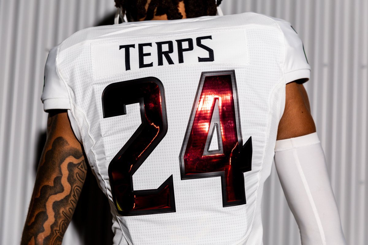
The new uniforms feature a pristine, icy white base with eye-catching iridescent numbers and the iconic Script Terps logo on all-white helmets. The iridescence delivers a stunning mix of red and gold hues that shift dynamically under the lights, offering a striking interpretation of Maryland’s colors. Black and white elements add contrast to create a minimalist silhouette, accentuating the bold colors and emphasizing Maryland’s clean, powerful look.
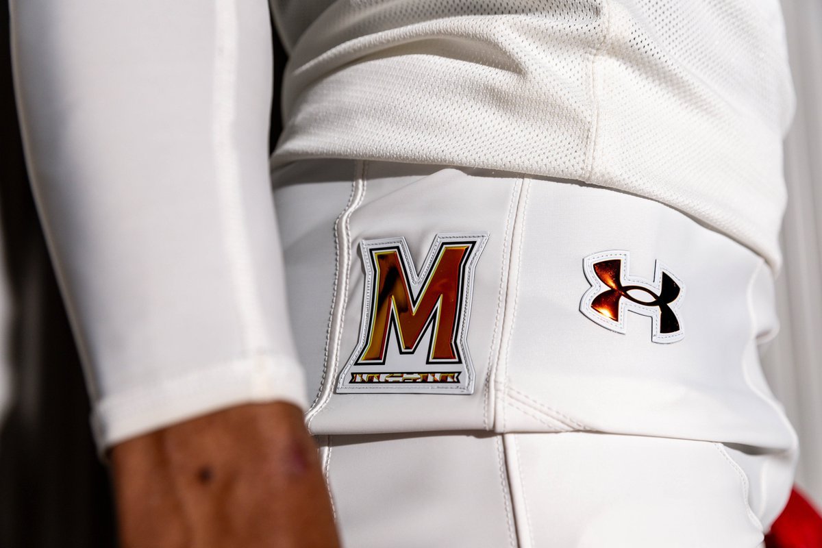
Adding a unique twist to Maryland’s iconic state flag, this design reimagines the four-quadrant pattern in a refined, reproportioned format that offers a sophisticated take on Maryland’s brand identity. Each detail, from the Script Terps to the custom iridescence, reflects the program’s commitment to both tradition and boundary-pushing design.
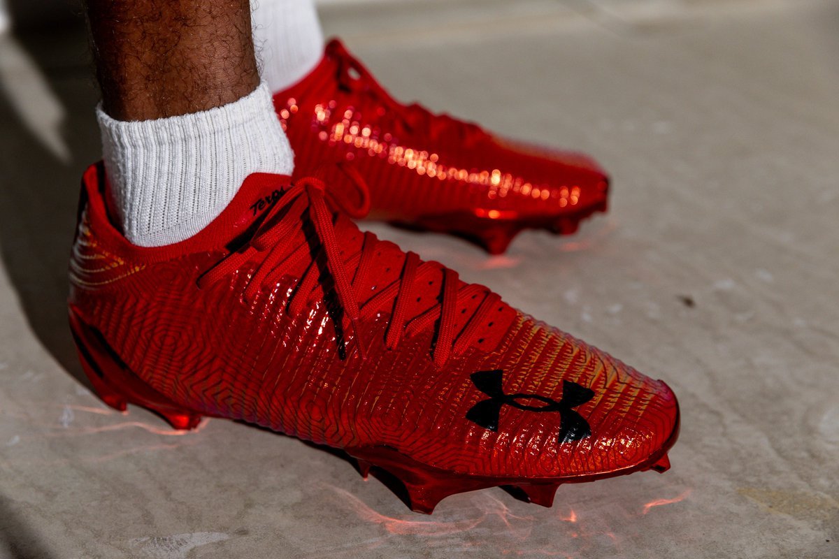
Maryland’s players won’t just be suited up in innovative uniforms; they’ll also debut Under Armour’s latest cleated models: the UA Blur Pro, UA Spotlight Pro, and UA Spotlight Pro Mid. Featuring a striking red base with color-shifting effects, these cleats blend perfectly with the uniform’s dynamic look. Each cleat also showcases a tonal Terrapin print on the upper, celebrating the university’s beloved Terrapin nickname.
Completing the look are matching gloves, flooded in red and featuring the same color-shifting TPU Under Armour logo. The gloves, like the cleats, carry the tonal Terrapin print, ensuring a cohesive look that ties all aspects of the uniform together.
Maryland, the original Under Armour school, is wearing exclusive special edition uniforms for Saturday’s game at No. 1 Oregon. @UnderArmour | @UAFootball
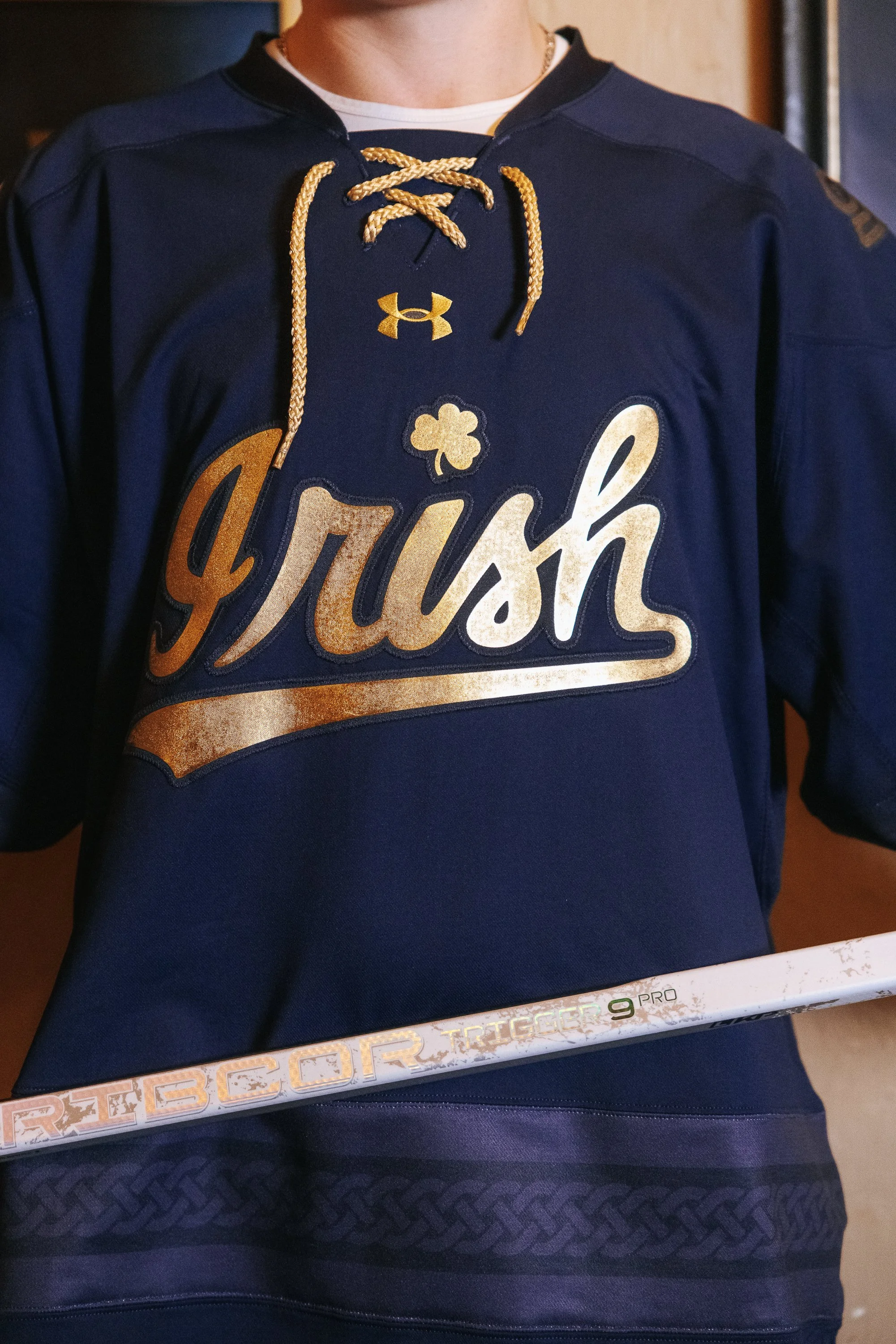
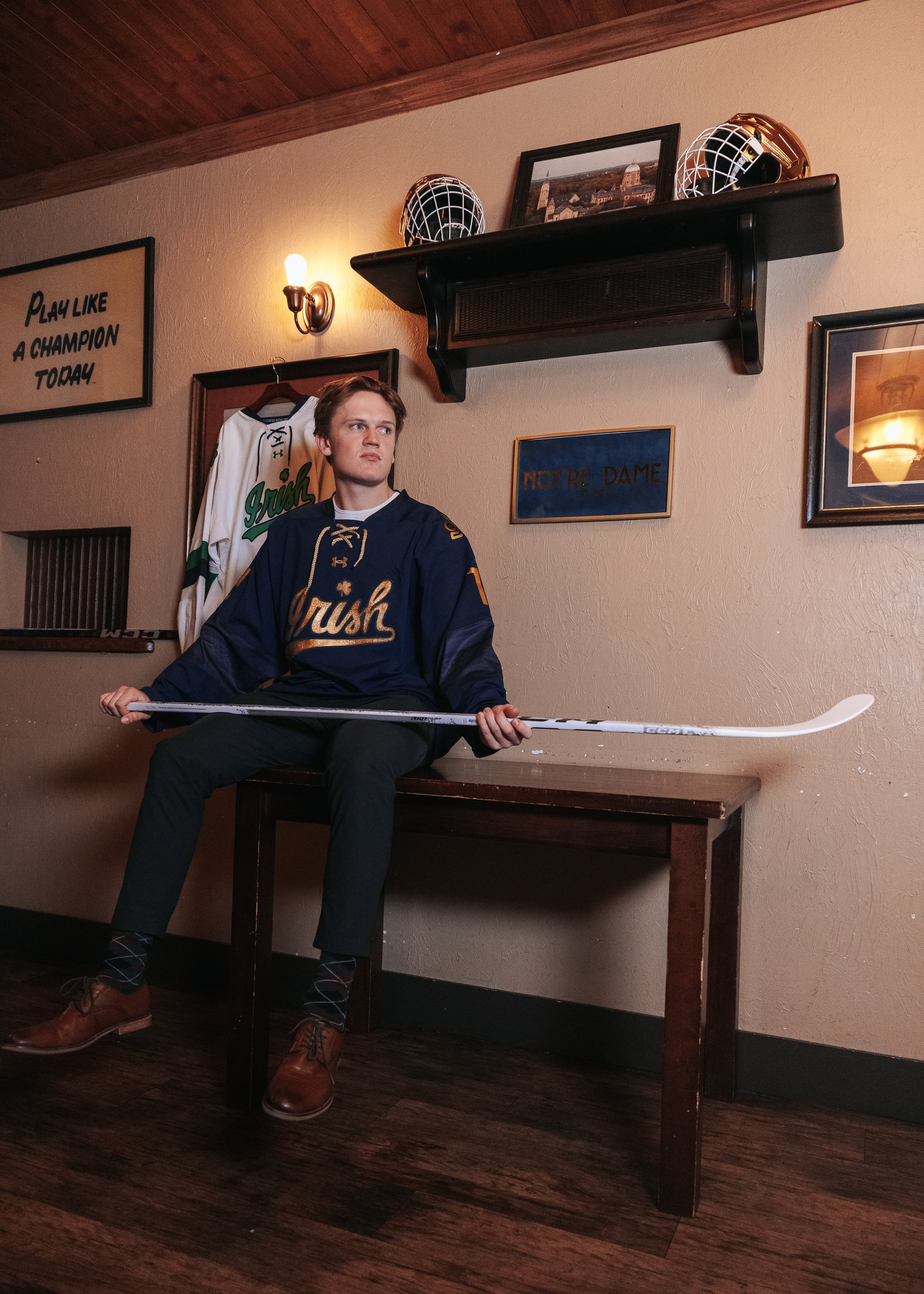
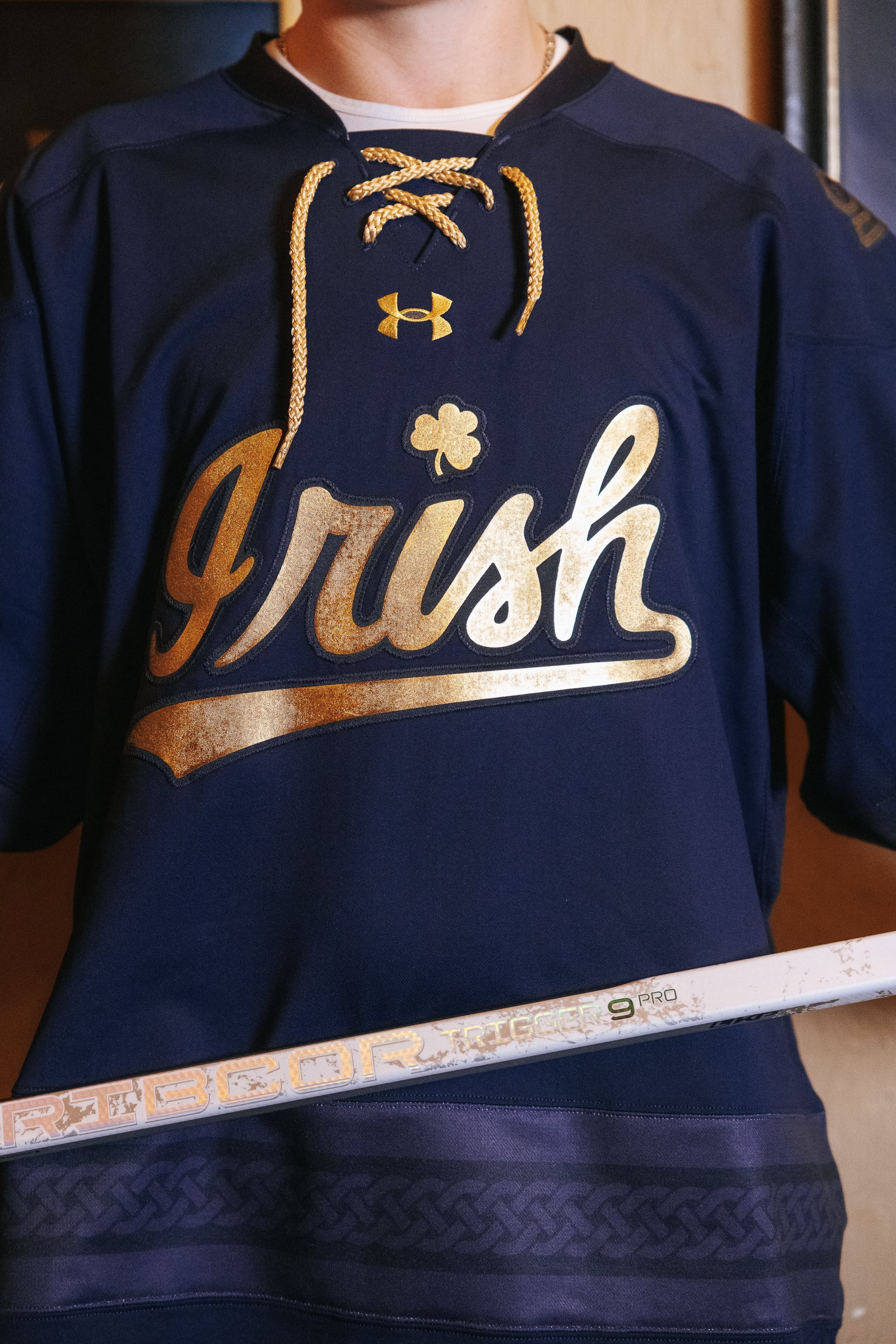
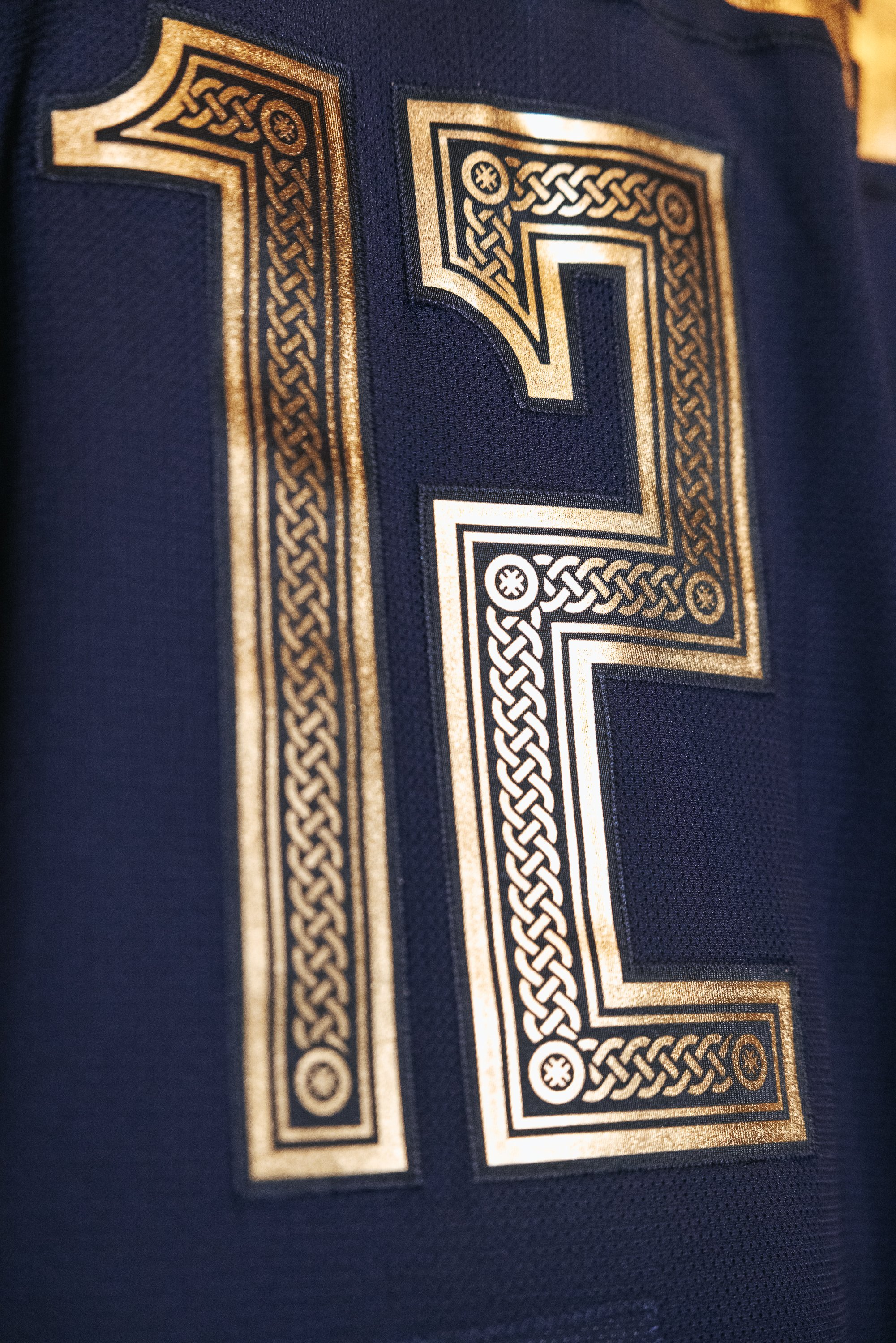
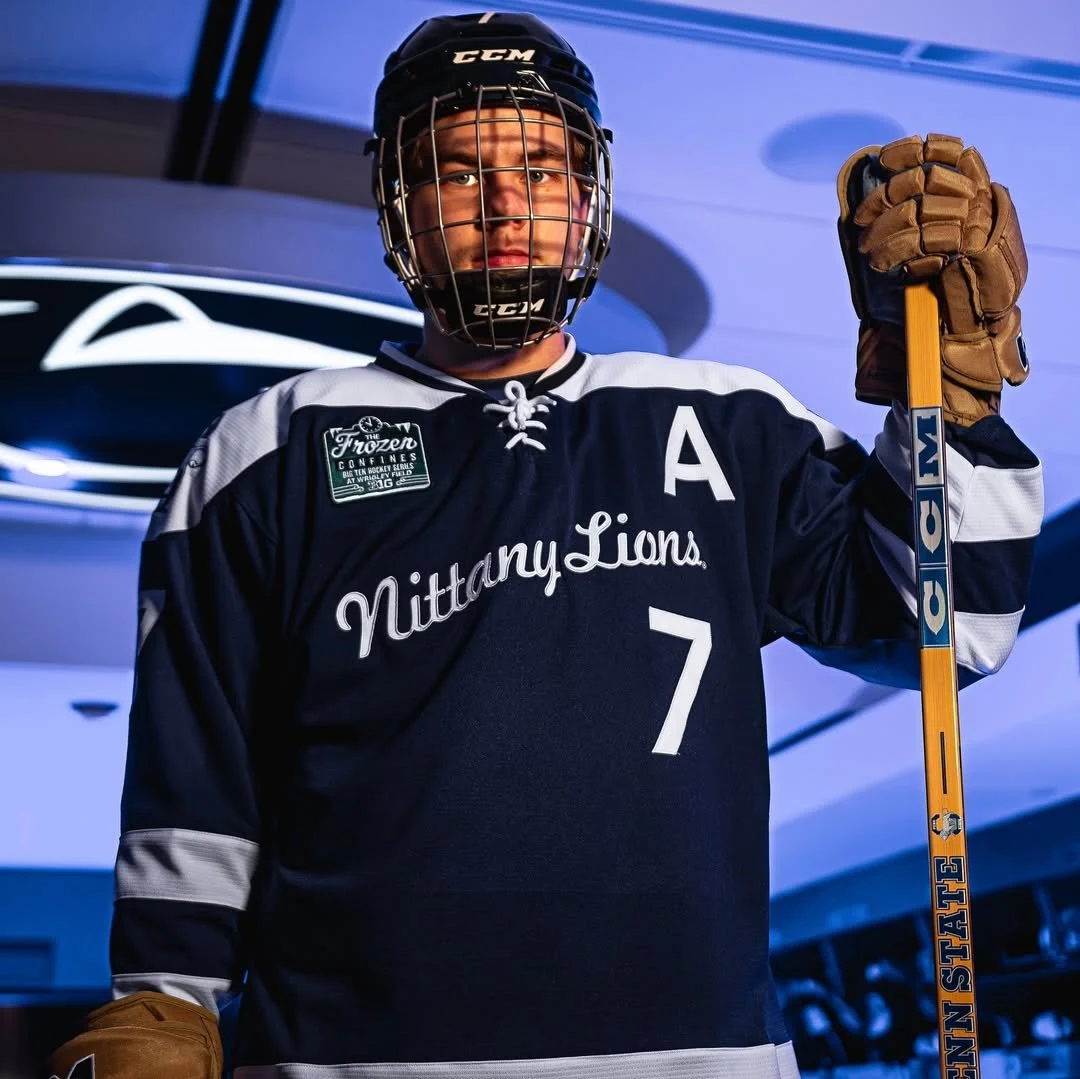
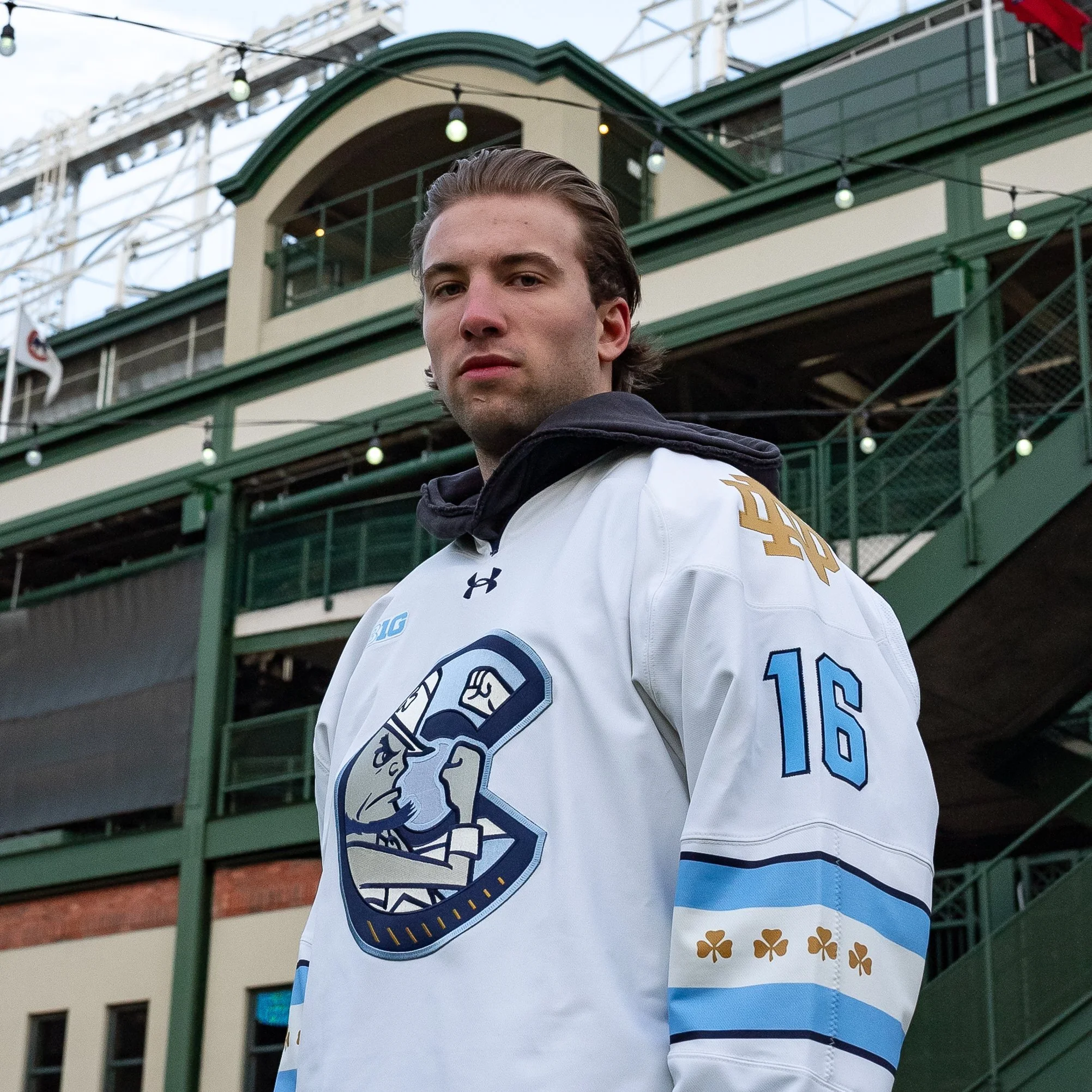
As the University of Notre Dame hockey team prepares for its first-ever international competition at the Friendship Four tournament in Belfast, Northern Ireland, the Irish are embracing the occasion with a unique new look. Notre Dame has released a specialty jersey that celebrates both the team’s heritage and the cultural richness of their host country.
The new navy jersey captures the spirit of Notre Dame’s connection to Ireland, with a striking gold script “Irish” across the chest. In a thoughtful nod to the country’s storied history, the design incorporates elements inspired by the Book of Kells—a renowned medieval manuscript known for its ornate and intricate lettering. This influence is reflected in the stylized nameplate font, where each letter mirrors the distinctive forms from the historic text.
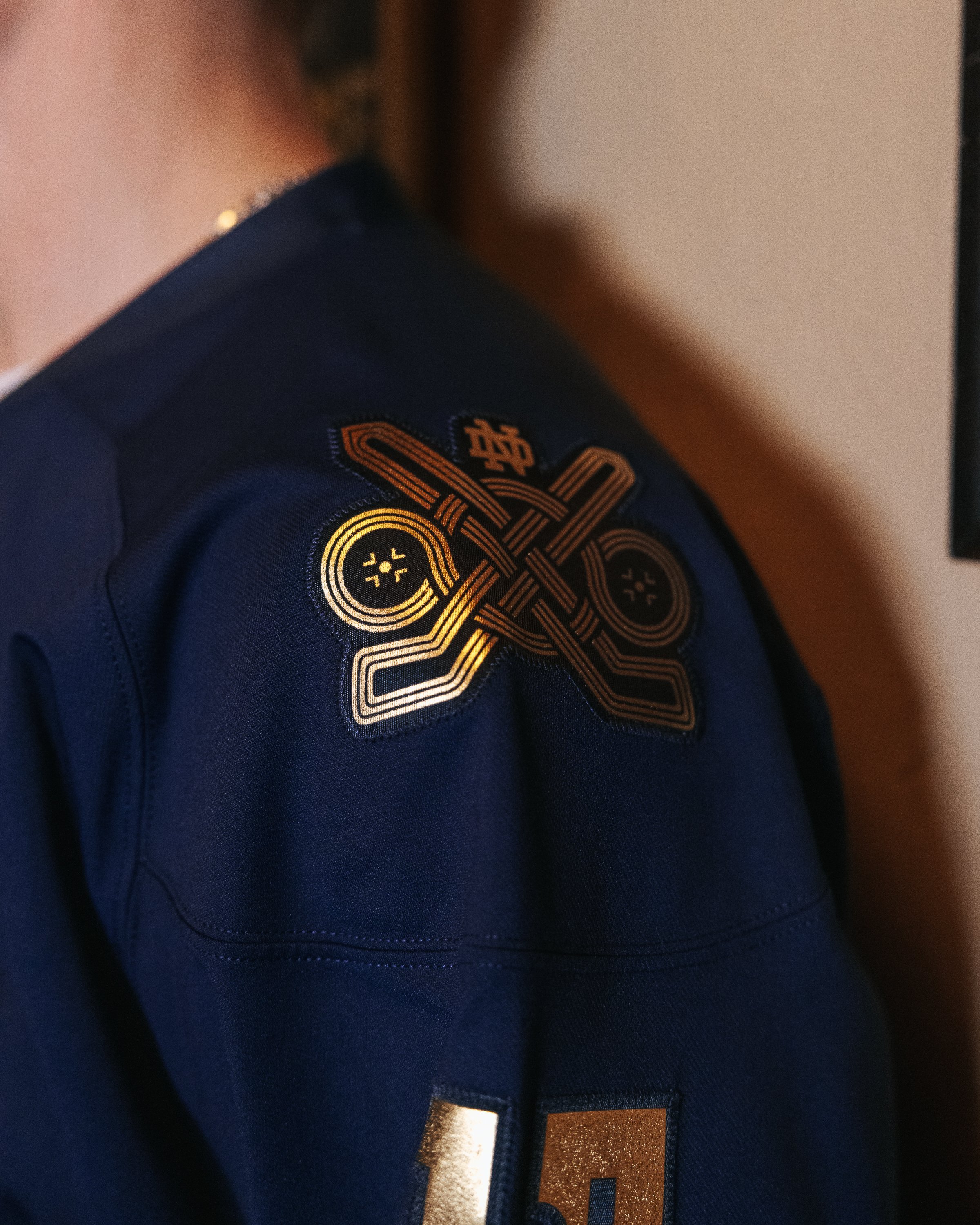
The back of the jersey continues this artistic homage, with numbers inspired by the Book of Kells that feature Notre Dame’s iconic Celtic Knot running through the center. This touch ties the jersey design back to Notre Dame’s identity while honoring the intricacy of Irish art and craftsmanship.
The shoulders showcase exclusive patches created specifically for the Friendship Four tournament. Woven into each patch is a Celtic knot that forms the shape of two hockey sticks and face-off circles, symbolizing the two games the Irish will play in Belfast. This design brings together traditional Irish symbols with the team’s competitive spirit, highlighting the cultural bridge Notre Dame will build through sport.
This specialty jersey marks a historic moment for Notre Dame hockey and gives fans a unique piece of memorabilia that represents not only the team’s trip abroad but also the deeper connection between Notre Dame and Ireland. The Friendship Four tournament provides a chance for the Irish to compete internationally while paying tribute to the rich heritage that both the university and the host country share.
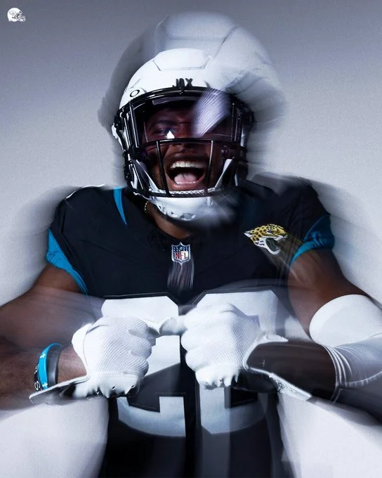
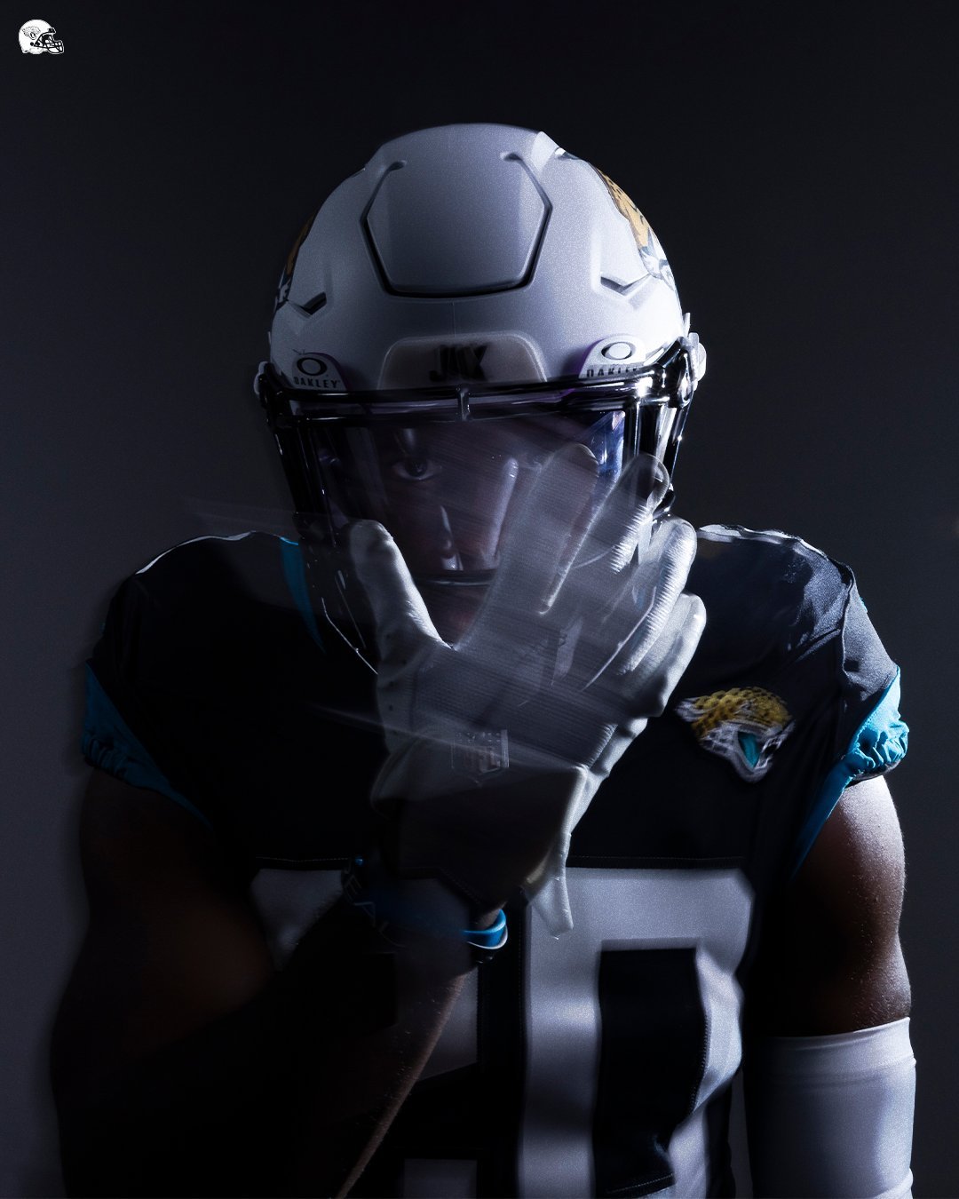
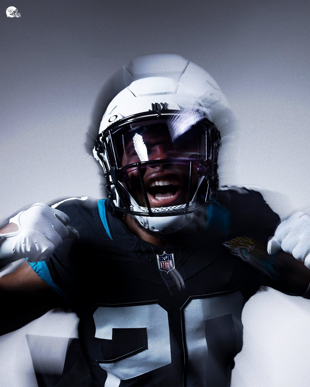
Just a week after exciting fans with the return of the Prowler Throwbacks for the 2024 season, the Jacksonville Jaguars have once again surprised their supporters with another uniform update. This time, the team introduced the official "Shell White" Alternate Helmet, featuring a sleek, all-white, matte shell. The highly anticipated helmet is set to debut during the Week 10 matchup against the Minnesota Vikings.
Head Equipment Manager, George Pellicer, shared the inspiration and significance behind this new addition to the Jaguars' uniform lineup.
The inspiration for the new helmet stems from a desire to celebrate the Jaguars' 30th season in Jacksonville. Pellicer explained, “One of the best parts of my job here at the Jaguars is mixing up uniform color combinations to see what looks cool. For this helmet, and to honor our 30th season here in Jacksonville, we wanted to pay homage to our diverse fan base, unifying the power of sports, our location, and a vital component of our community—the military.”
Pellicer highlighted that "Shell White" connects three primary pillars that define Jacksonville: the beach, the military, and football. “Shell White connects three primary pillars that make the city of Jacksonville what it is today. These three pillars—the beach, the military, and football—are all protected by or made beautiful by some variation of shells: seashells, jacket shells, and football shells,” he explained.
Pellicer expressed his excitement about the new design, noting that it represents a significant departure from the team’s traditional black helmets. “My favorite element is that it is something completely different from anything we have ever worn. The Jacksonville Jaguars have always worn some form of black helmets, so this will be a creative twist that we have not done yet. Plus, it will be fun to see the fans' reactions,” Pellicer shared.
Fans eagerly await the debut of the new helmet in Week 10, ready to embrace this fresh and meaningful addition to the Jaguars' gear. As George Pellicer hinted, the reactions are sure to be memorable as the Jaguars continue to celebrate their legacy with style and creativity.
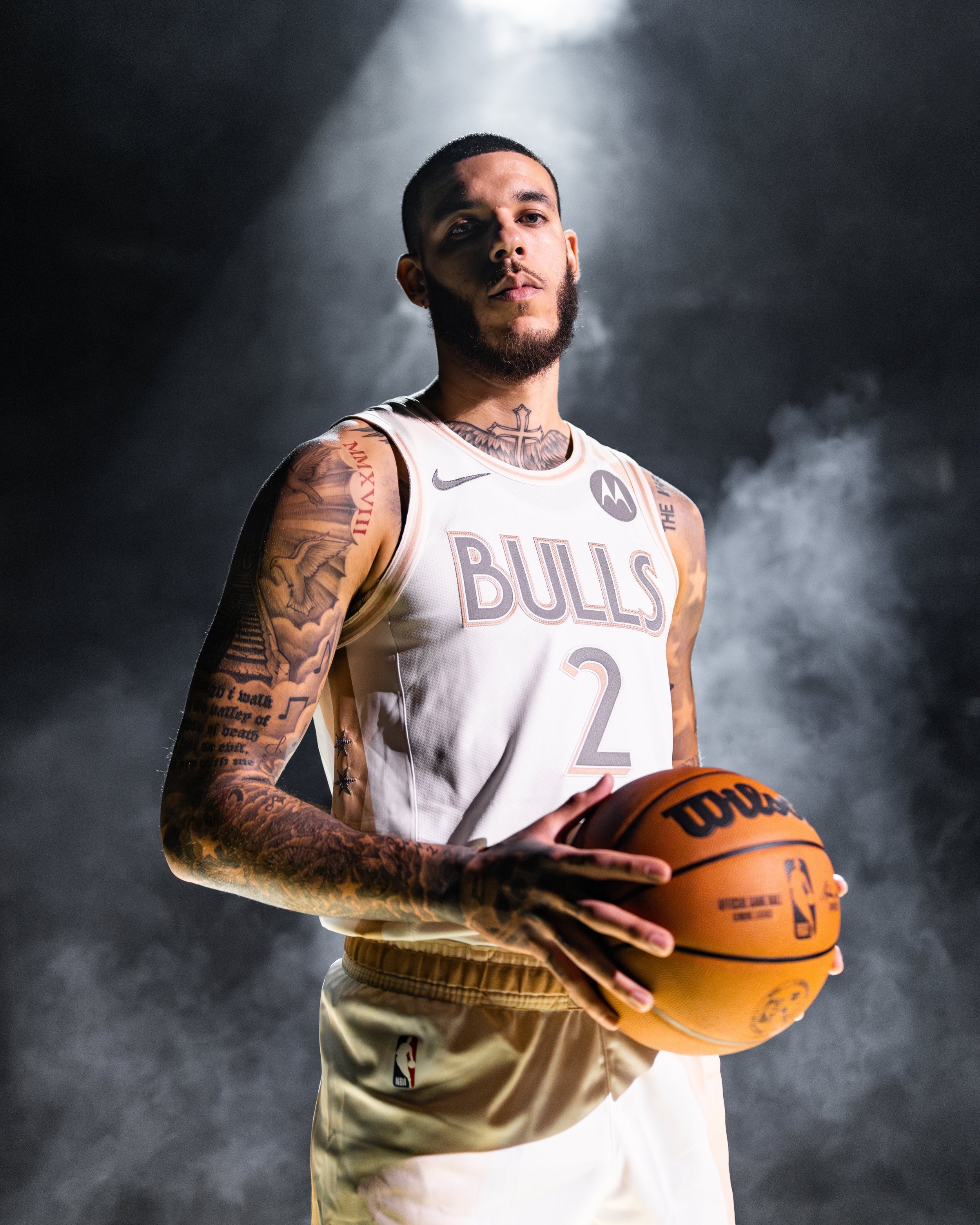
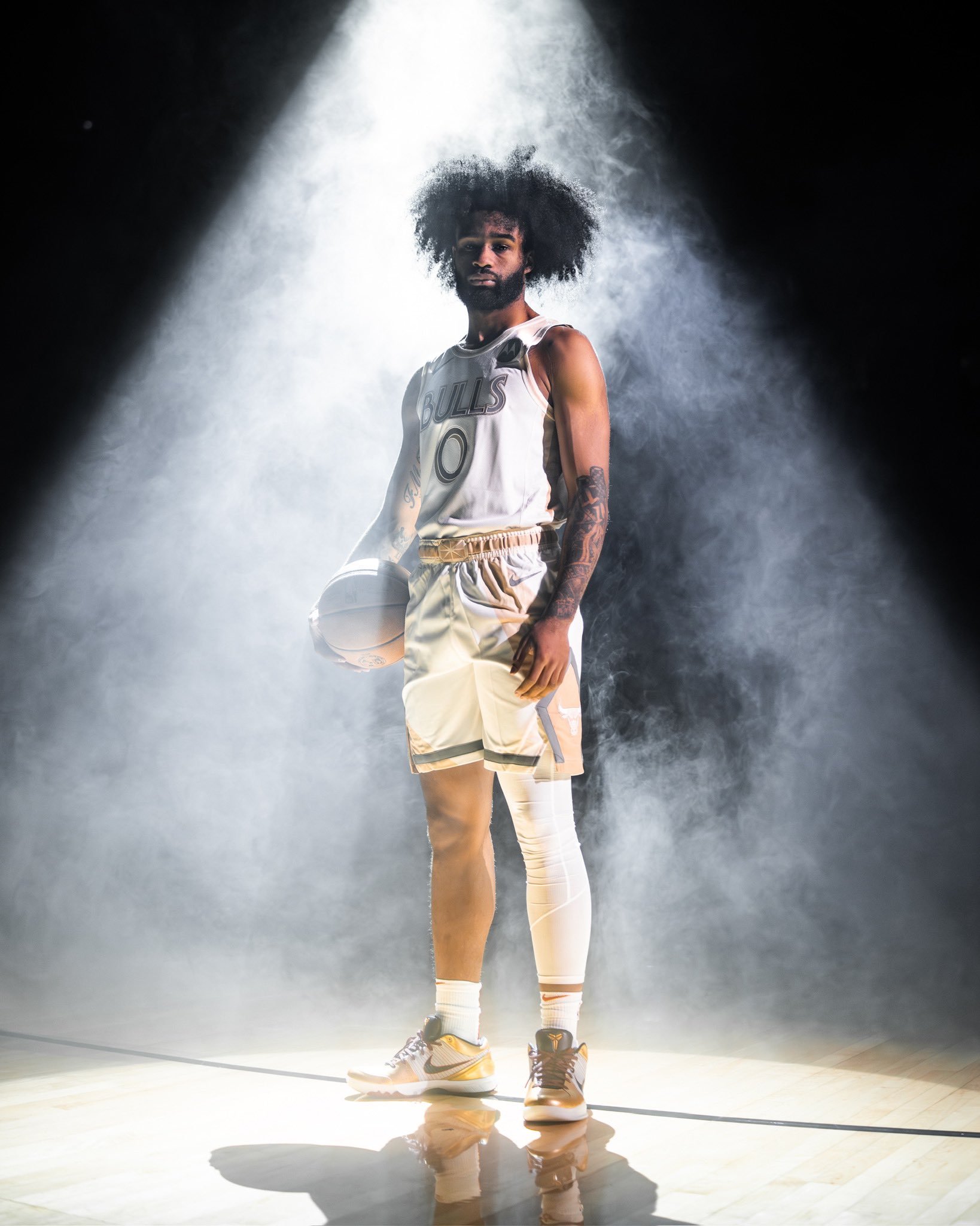
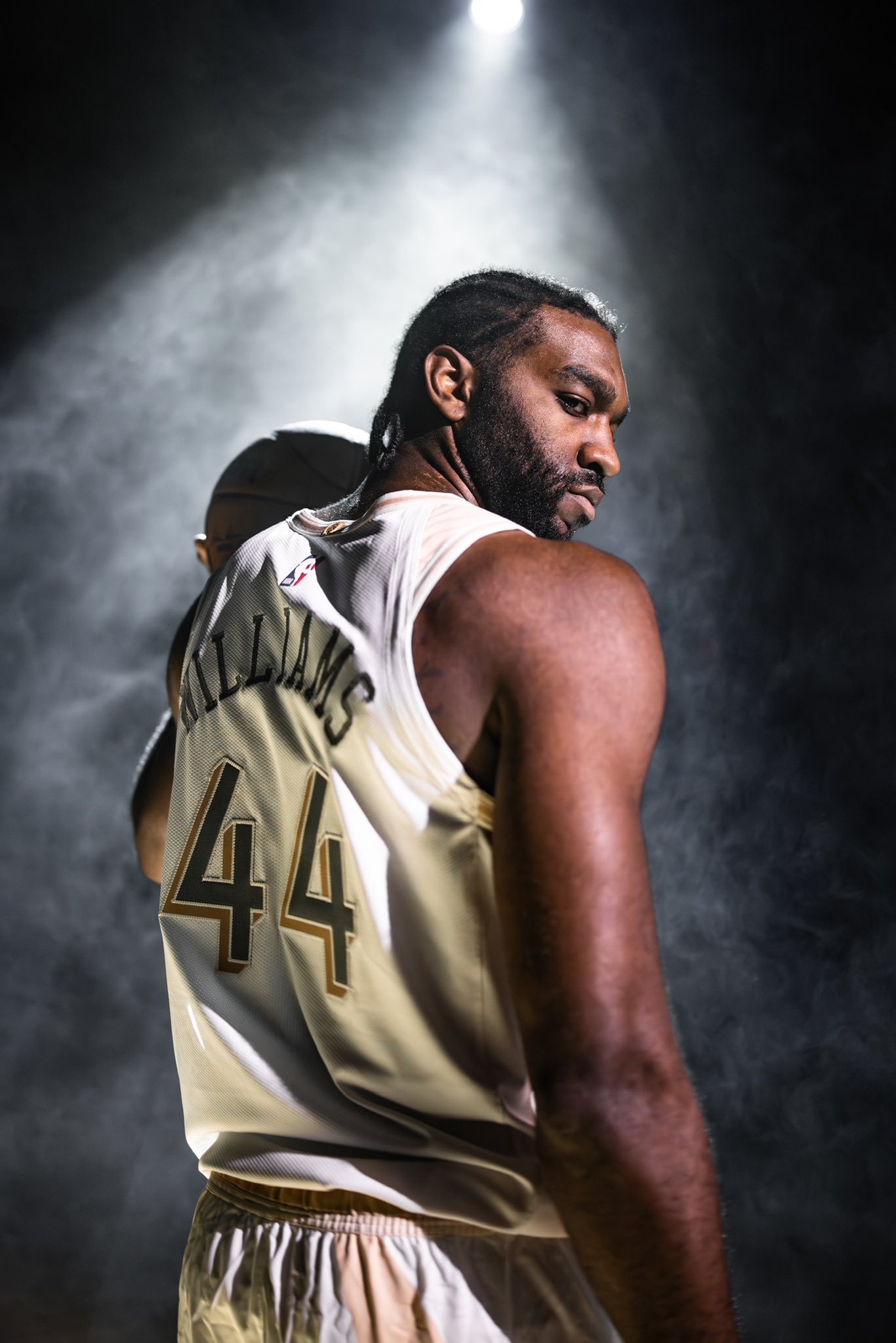
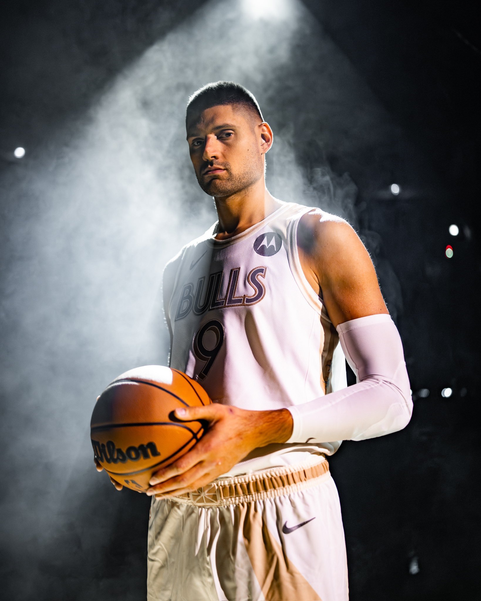
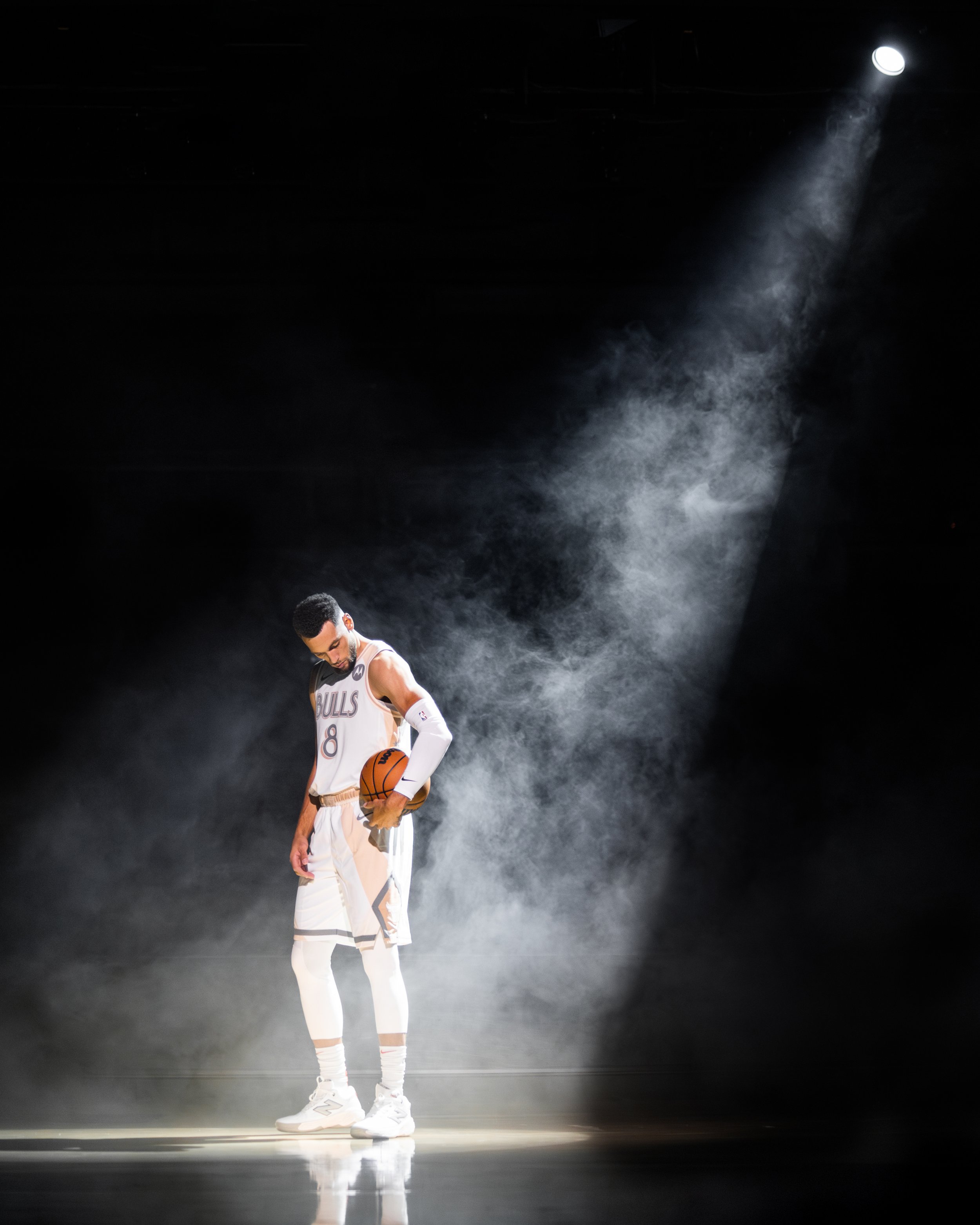
As the Chicago Bulls gear up for the 2024-25 NBA season, they’ll be hitting the court in a City Edition uniform that pays homage to their beloved home arena, the United Center. Celebrating its 30th anniversary, the United Center has been a fixture in Chicago sports culture, and this new uniform is designed to honor the arena’s legacy and architectural details, making it a true fan favorite.
The City Edition uniform captures the United Center’s distinct style, with design elements that connect to the venue’s iconic features. The jersey itself is a crisp white, with brownish-tan and gray accents drawn from the United Center’s exterior color scheme. The wordmark “BULLS” and player numbers are styled in the exact fonts seen in the arena’s signage, grounding the design in the UC’s aesthetic.
One standout detail on the jersey is the front tag, a nod to the famous marquee outside the arena, which originally read, “Home of The Bulls.” This marquee was a significant feature when the arena opened and has become part of its identity. The uniform’s look is classic and timeless, mirroring the enduring appeal of the United Center itself.
The side panels of the jersey feature stripes in brownish-tan hues, and the shorts have a similar striping pattern in homage to the Bulls’ unforgettable starting lineup introductions at the United Center. The shorts are adorned with the Bulls logo in a pentagonal shape, representing the spotlight that hits each player during pre-game intros, creating a powerful visual connection to that electric moment before tip-off.
Another notable feature is the waistband of the shorts, a tan design that subtly references the architectural style of the arena’s windows. The light and dark tan colors resemble a Union Jack pattern but are a direct tribute to the United Center’s unique structural elements, adding an unexpected yet meaningful touch to the uniform.
With its clean lines, classic color scheme, and thoughtful nods to the architecture and history of the United Center, the Bulls’ 2024-25 City Edition uniform stands as a tribute to both the team’s home and its fans. Every design choice, from the font to the colors and the side panels, has been crafted to honor the arena that has hosted countless iconic moments in Bulls history.
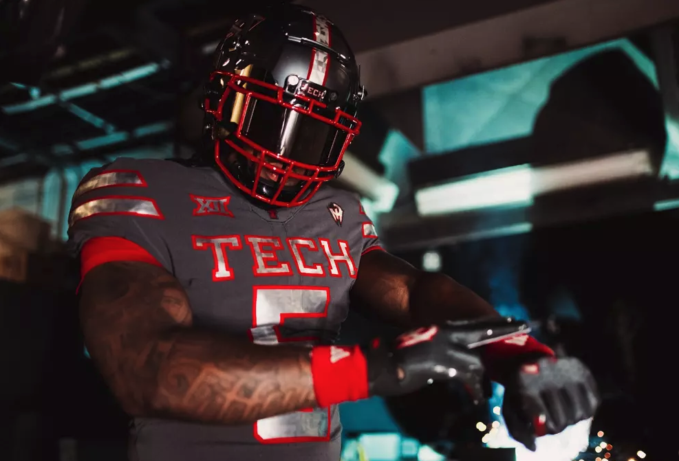
In a groundbreaking move adidas and Patrick Mahomes have unveiled a stunning new football uniform for Texas Tech University. This exciting collaboration features Mahomes’ signature “Gladiator” logo, marking one of the rare occasions in history where an athlete’s personal brand has been incorporated into official on-field Uniform.
The new uniform, aptly named the Mahomes Strategy uniform, boasts a sleek Dark Grey tackle twill with striking Power Red accents. Its design is inspired by the 45-degree bevel found across Texas Tech’s campus, as well as the angular nature of Mahomes’ logo. The helmet, logos, and numbers are adorned with a metallic film that features galvanized finishes, creating a modern and dynamic look. Texas Tech’s football team is set to debut this innovative uniform at home against Colorado on November 9.
Mahomes, a Texas Tech alum and three-time Super Bowl champion, expressed his pride in this unique achievement: “Seeing my own logo on the Texas Tech uniform I put so much blood, sweat, and tears into is one of the most meaningful off-field accomplishments of my career. I want to thank the three-stripe family for giving me this one-of-a-kind opportunity.”
The partnership between adidas and Mahomes has consistently pushed the envelope in athlete-brand collaborations. This relationship began back in 2019, when Mahomes famously taped a handwritten adidas logo over a competitor brand while cheering for Texas Tech basketball. The Mahomes Strategy uniform is just the latest milestone in their ongoing partnership, which has already established numerous firsts in collegiate athletics and NIL initiatives.
“The unveil of the adidas Strategy uniform by Patrick Mahomes further amplifies the power of this partnership,” said Kirby Hocutt, Director of Athletics at Texas Tech University. “We are proud to be the first collegiate adidas partner to utilize an athlete partner’s logo. There is no more powerful brand in sports than Patrick Mahomes. We look forward to debuting this uniform in front of a sold-out Jones AT&T Stadium on November 9 against Colorado.”
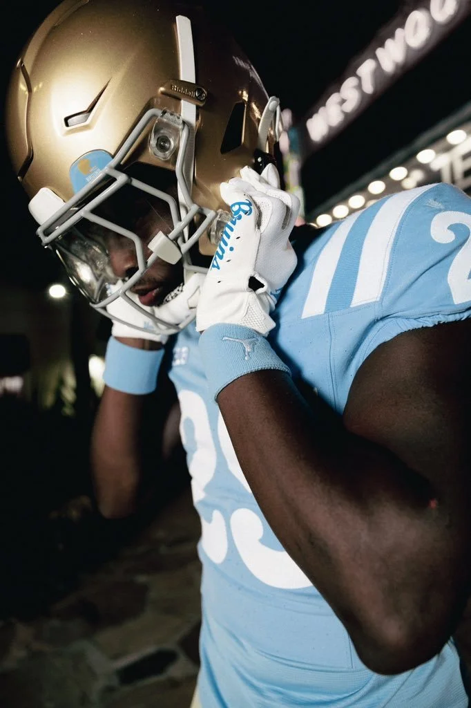
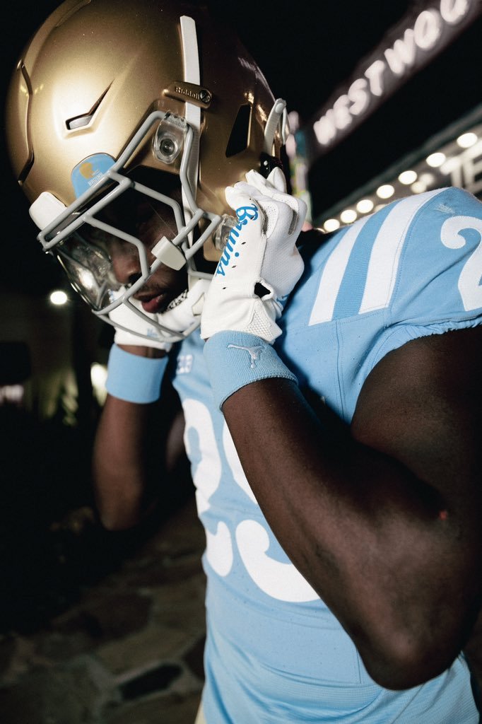
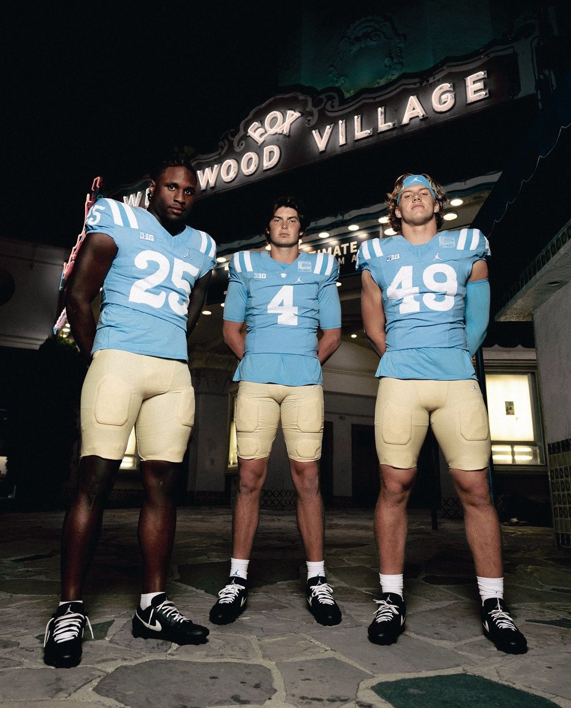
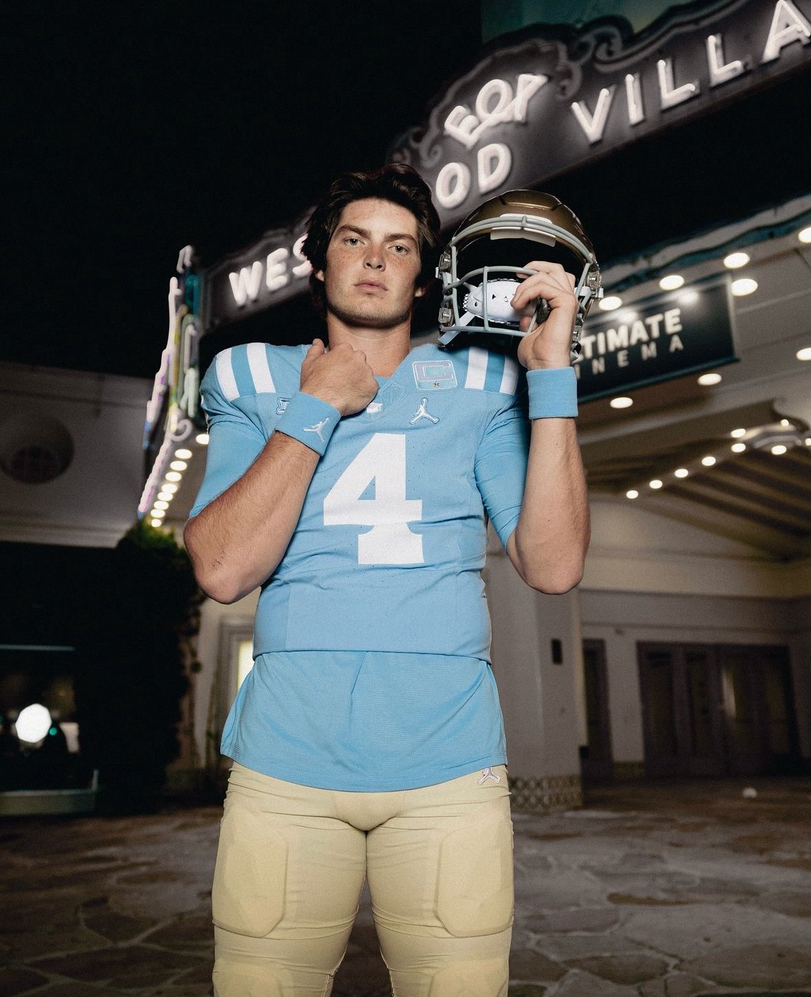
UCLA Football is taking fans back in time with a special uniform tribute to the Bruins' 1954 national championship team. the team will wear the same iconic powder-blue jerseys that became synonymous with UCLA greatness from 1954 to 1970. These throwback uniforms feature the unique white stripes across the shoulders, a striking detail that sets them apart from the more familiar gold-accented jerseys Bruins fans know today.
The powder-blue jerseys, with their curled, white-striped shoulder pads, pay homage to an era when UCLA was a powerhouse in college football. The uniforms are a tribute to legendary head coach Red Sanders and his incredible 1954 team, which went 9-0 and claimed a share of the national title alongside Ohio State. That season was not only a high point for the Bruins but also marked the first year they debuted this now-classic jersey.
The decision to bring back the 1954-inspired uniforms goes beyond aesthetics. These jerseys symbolize a golden era for UCLA Football, a time when the Bruins were setting the standard in college athletics. As the team hits the field in powder blue, they’ll not only look the part but also bring a renewed sense of pride and tradition, honoring a team that set the foundation for UCLA's success.