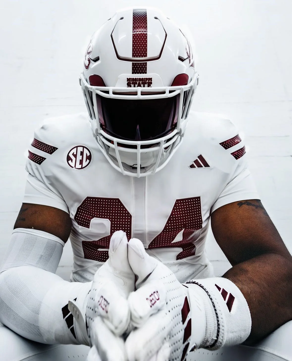
Mississippi State has unveiled a sleek new “icy white” uniform combination for the 2024 season, adding a fresh look to their game-day apparel. The new uniform features a combination of modern design elements and classic team colors, with a particular emphasis on maroon and white.
The highlight of the new design is the introduction of a fresh helmet decal. The decal showcases the word "State" in a script maroon font, accented by white perforations.
The uniform itself is a clean, all-white ensemble, comprising a white helmet, jersey, and pants. The jersey features two maroon stripes on the sleeve caps, which also include the same perforated detailing seen on the helmet decal. The helmet sports a medium-thick maroon stripe running from front to back, also adorned with simulated perforations.
Adding to the distinct look, the front jersey numbers are in a university block style, rendered in maroon with the same perforated effect. The SEC patch and Adidas maker’s mark are also in maroon, maintaining a consistent color scheme throughout. A small “M State” logo is positioned at the base of the collar, offering a subtle nod to the team’s identity.
An intriguing feature of the new jersey is the back design. A mesh insert runs down the middle, shaped in a modified hourglass pattern—narrower at the top and wider at the base. Above this insert is a nameplate in semi-narrow block maroon font, with rear numbers mirroring the front in style and perforations. Additionally, at the top of the collar on the back, there is a Mississippi State logo, which outlines the state with a white star marking Starkville, the home of the university.
The pants that complete the uniform are solid white and notably stripeless, keeping the overall look streamlined and focused.
While the team has yet to announce when they will debut this new “icy white” combo, it’s clear that Mississippi State is ready to make a bold statement on the field this season with their refreshed look.
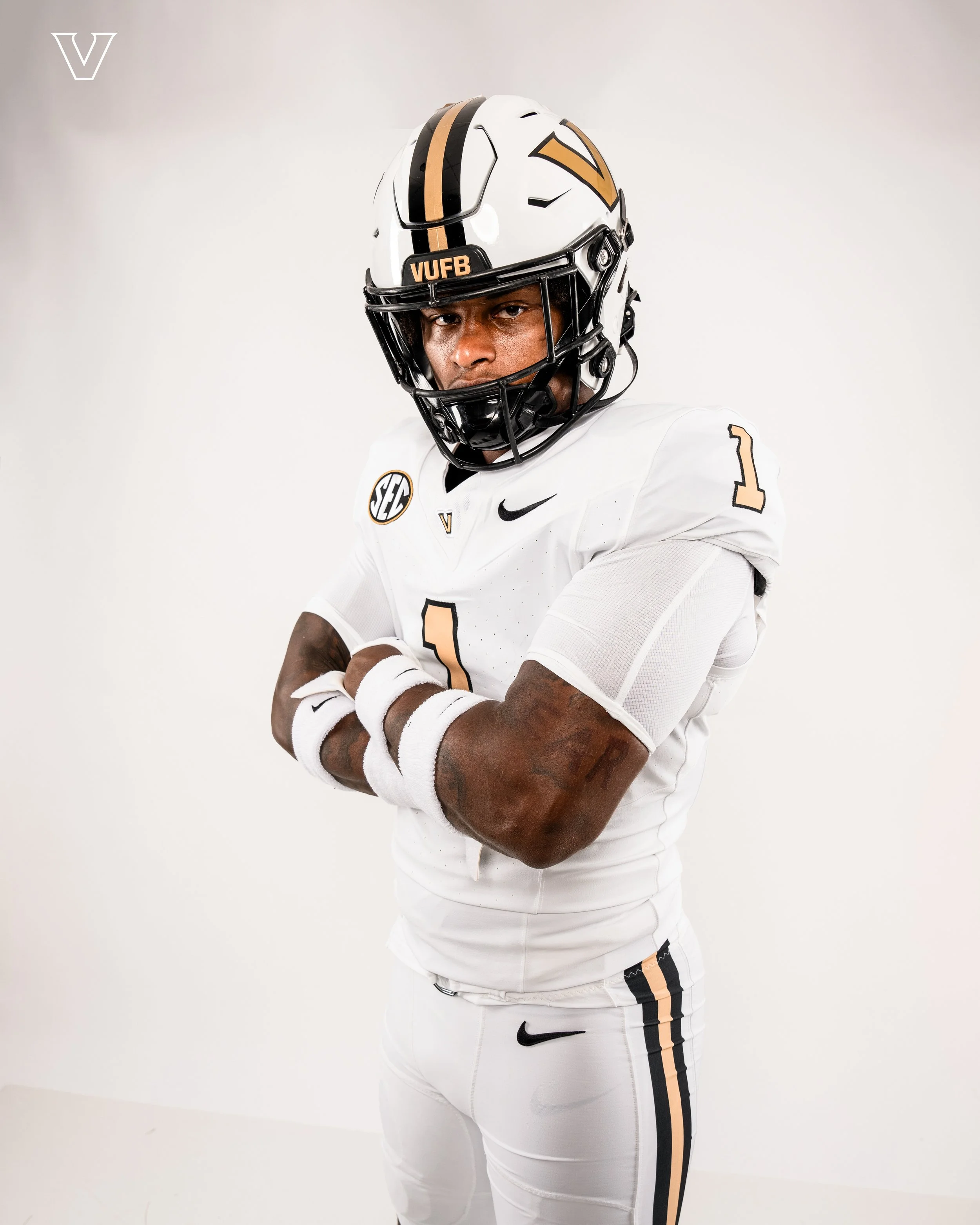
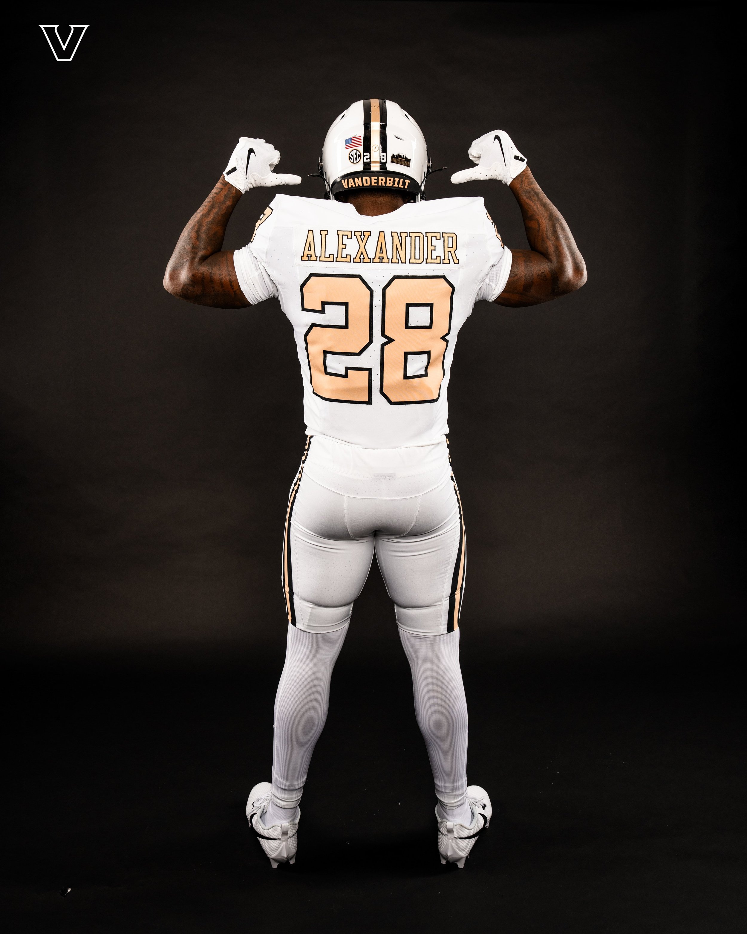
The Vanderbilt Commodores have officially revealed their new all-white uniform set for the upcoming season, a clean and striking look that’s sure to turn heads on the field.
The uniform starts with a crisp white helmet, accented by a bold black/gold/black stripe running from front to back. The classic “V” logo, synonymous with Commodores football, is proudly displayed on both sides of the helmet, complemented by a black facemask that adds a sharp contrast to the overall design.
The jersey and pants continue the all-white theme, offering a minimalist yet powerful aesthetic. The jersey is notably plain, featuring only gold numbers outlined in black on both the front and back. TV numbers are placed on the sleeve caps, keeping the focus on the simplicity of the design. Apart from the essential makers' mark and SEC patch, the only additional detail is a small “V” logo at the base of the collar, also in gold with a black outline. The name on the back (NOB) follows suit, with gold lettering outlined in black.
The pants mirror the helmet’s design with a thick black/gold/black stripe running down the sides, maintaining a cohesive look throughout the uniform. If players opt for socks or compression pants, those will be white as well, ensuring the all-white theme remains consistent from head to toe.
This new uniform set follows last year’s introduction of uniforms that brought back the old gold shade, a color that holds historical significance for the team. The new all-white uniforms retain this classic gold, seamlessly blending the old with the new.
Vanderbilt’s latest uniform release showcases a clean, understated design that exudes confidence and tradition.
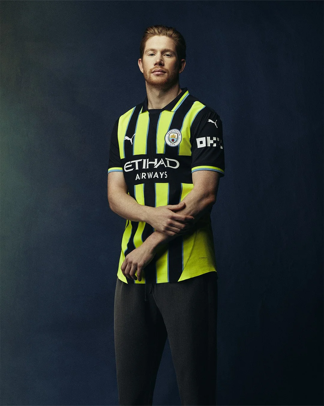
Manchester City has unveiled their highly anticipated away kit for the 2024-25 season, and it's already creating a buzz among fans and football enthusiasts alike. This vibrant, neon design is more than just a bold fashion statement; it's a tribute to one of the most iconic moments in the club's history, harking back to the 1998-99 season when City was a far cry from the powerhouse they are today.
The new kit is a near-perfect replica of the fluorescent yellow and navy blue stripes that the team wore during their 1998-99 campaign. While the design may seem like an eye-catching choice to the uninitiated, long-time supporters know that this jersey holds a special place in the hearts of City fans. Back then, City was battling in the third tier of English football, a world away from the dominance they enjoy today under Pep Guardiola and with the backing of Abu Dhabi.
The 1998-99 season is remembered for its drama, particularly the unforgettable Second Division playoff final against Gillingham at Wembley. With City trailing 2-0 as the clock ticked into the 89th minute, it seemed their hopes of promotion were dashed. However, in a legendary comeback, Kevin Horlock scored to give City a lifeline, and then, in the 95th minute, Paul Dickov netted the equaliser, sending the match into extra time and the City fans into euphoria. The game was ultimately decided by a tense penalty shootout, where goalkeeper Nicky Weaver became the hero with a crucial save that secured City’s return to the First Division.
Fast forward 25 years, and Manchester City has transformed into a footballing giant, having just made history by becoming the first team to win four consecutive Premier League titles, along with completing a treble of their own. To celebrate this remarkable journey from underdogs to champions, City has once again embraced the neon and navy kit that symbolized their dramatic rise.
Puma, the manufacturer of the 2024-25 kit, has stayed true to the original design, retaining the vivid colour combination and even the thin sky blue borders between the stripes that were present in the 1998-99 version. The kit's launch was made even more special with Paul Dickov, the hero of that famous Wembley match, modeling the reimagined strip—a fitting tribute to a day that remains etched in City folklore.
This isn't the first time Manchester City has revisited this iconic design. In the 2018-19 season, they marked the 20th anniversary of their playoff triumph with a similar kit, blending nostalgia with modernity. However, the 2024-25 version feels particularly poignant as it celebrates a quarter-century since that pivotal moment in the club's history, and acknowledges the extraordinary transformation City has undergone since then.
For Manchester City fans, this kit is more than just a jersey; it’s a symbol of resilience, a nod to the past, and a celebration of the journey from the depths of English football to the pinnacle of the sport. As the new season approaches, expect to see these neon stripes lighting up the terraces once again, reminding everyone of where City has come from and the incredible heights they have reached.
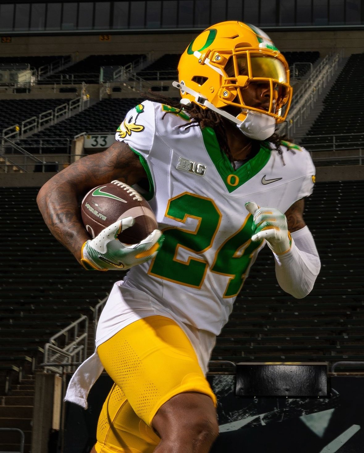
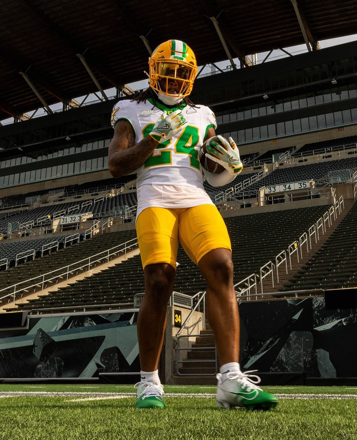
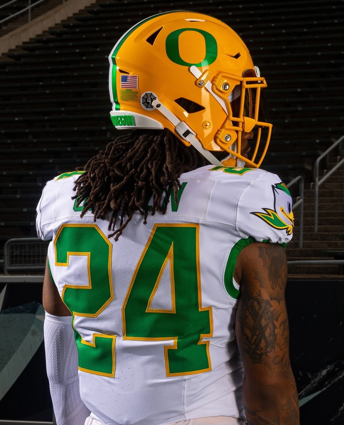
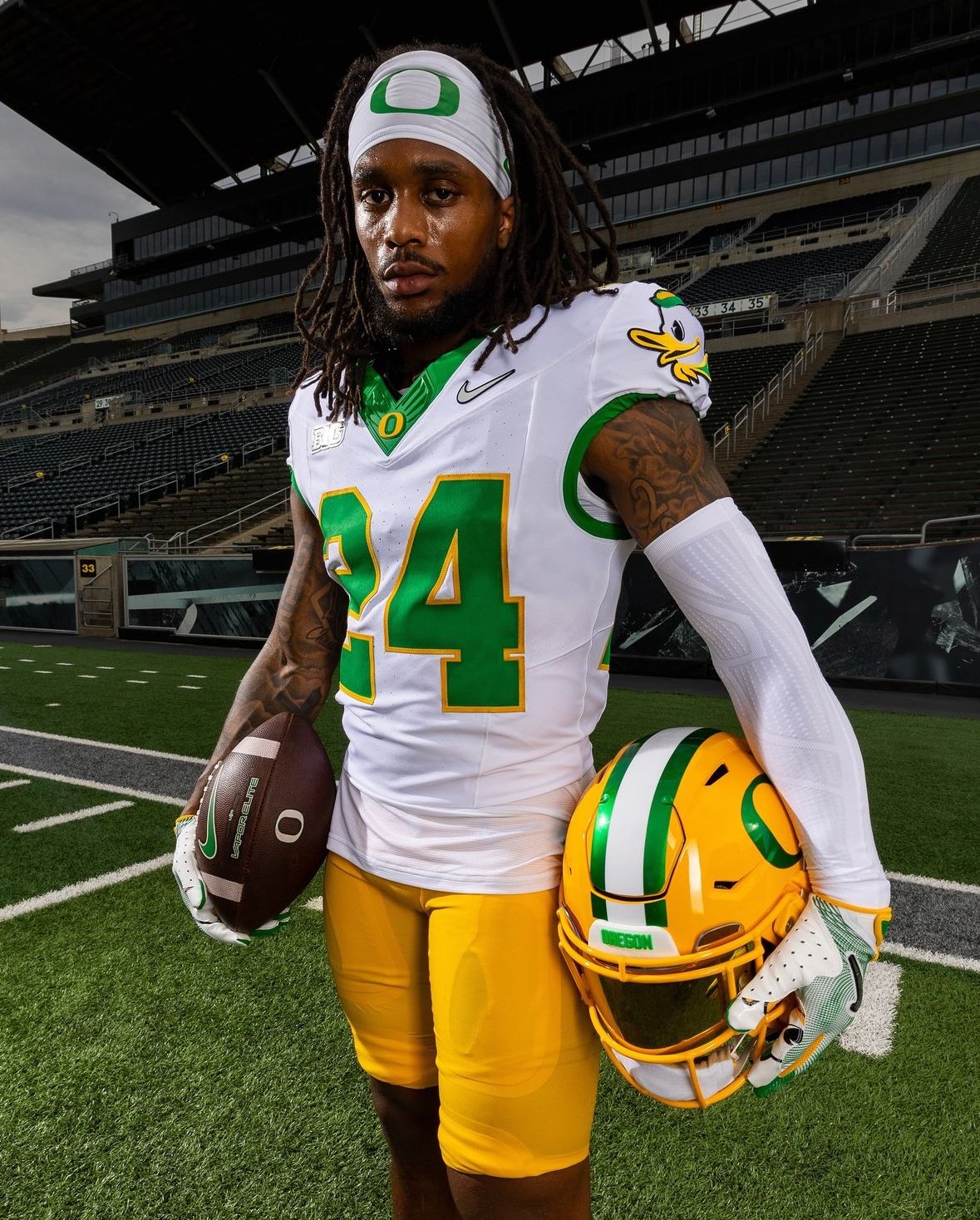
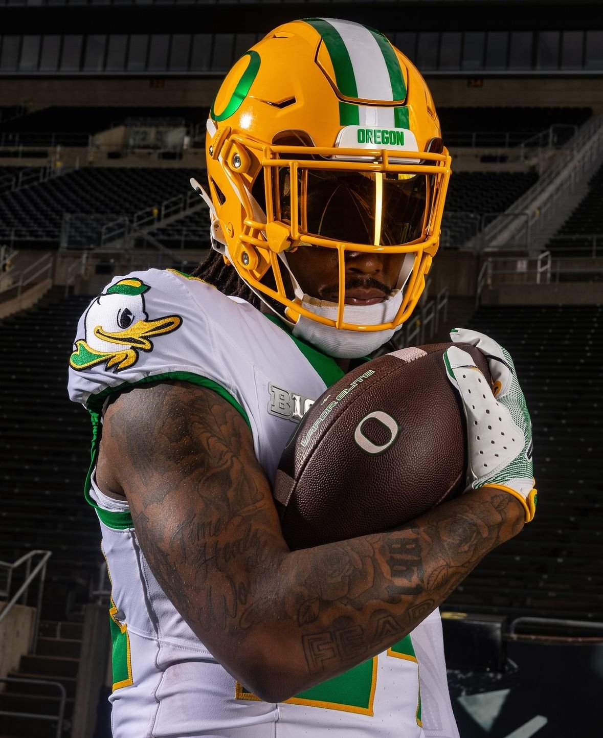
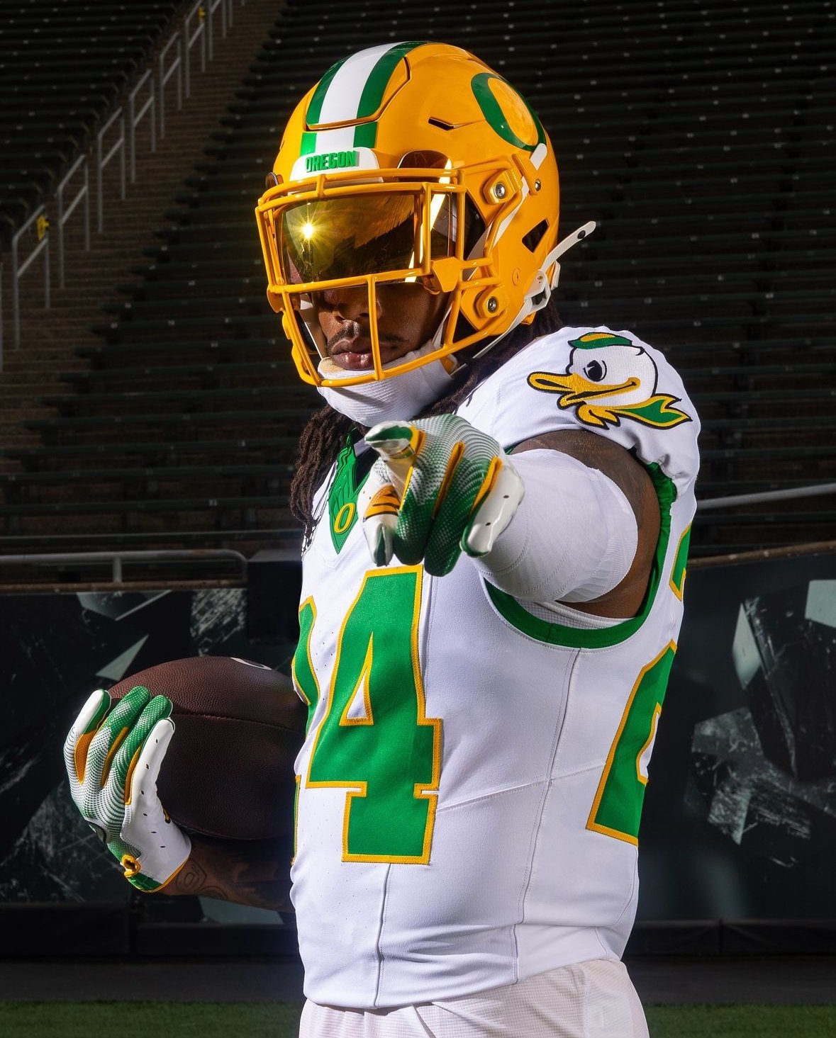
In a nod to one of the most iconic moments in Oregon football history, the Ducks have unveiled their third uniform combination for the upcoming season, aptly named "The Catch." This new road uniform pays homage to Pat Johnson's legendary touchdown catch against Washington in 1997, blending tradition with modern design elements.
The uniform’s white jerseys are a masterful mix of old and new, capturing the essence of Oregon’s rich football heritage. The base of the jersey features a throwback look, highlighted by Oregon’s signature Kelly Green on the numbers and trim, which harkens back to the classic styles that Ducks fans have long cherished. the duck logo proudly adorns the shoulders, further connecting the team’s past with its present.
Complementing the jersey is a helmet that features the iconic "O" logo, now rendered in a new color called University Gold. This bold new hue not only adds a fresh twist to the traditional design but also extends to the pants, creating a cohesive and striking look that is sure to stand out on the field.
Oregon has always been at the forefront of uniform innovation, and "The Catch" continues this legacy by honoring a memorable moment while introducing fresh elements that resonate with both longtime fans and new supporters. As the Ducks take the field this season, they’ll do so in a uniform that celebrates the past while paving the way for future victories.
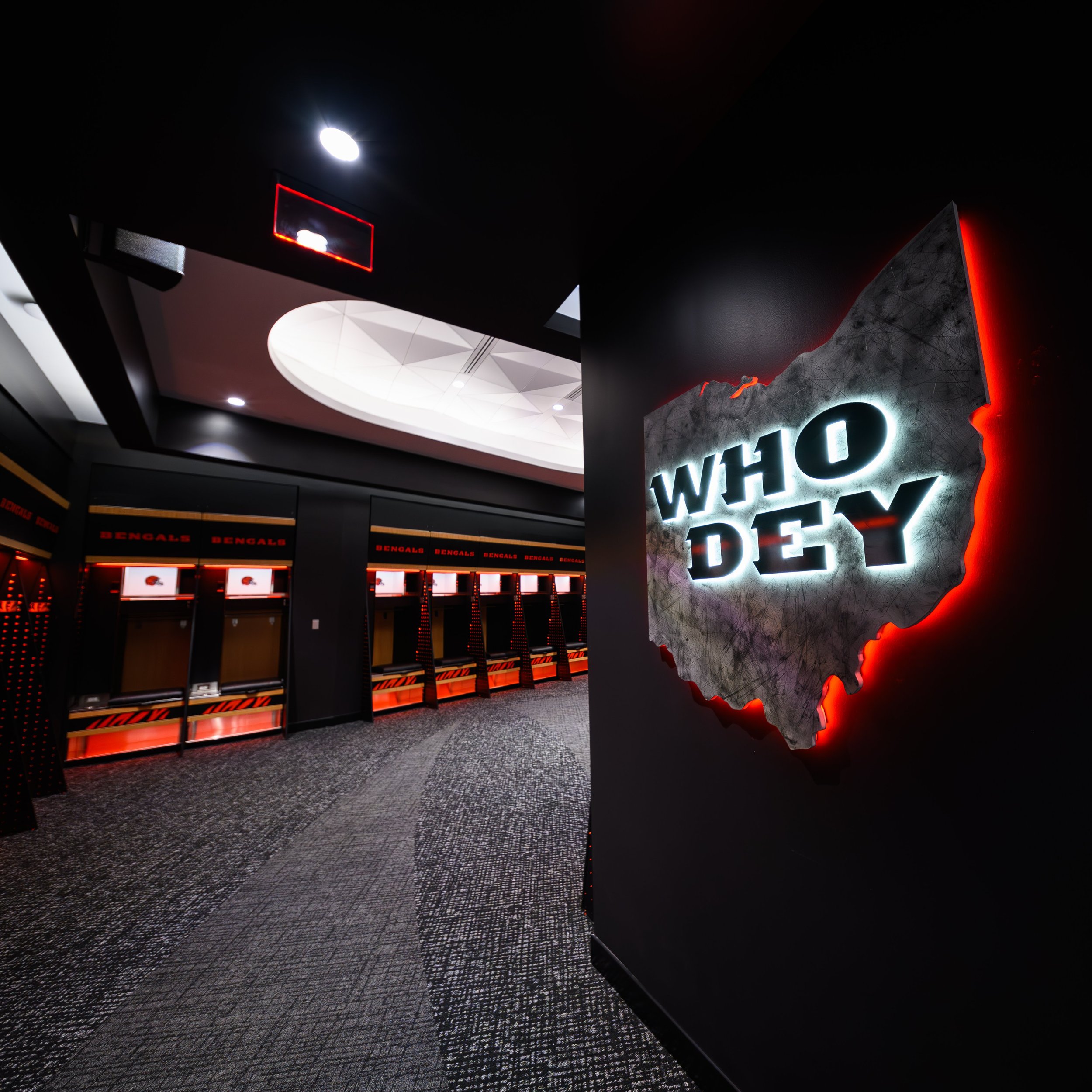
The Cincinnati Bengals have unveiled a new locker room at Paycor Stadium, blending cutting-edge technology with a nod to the team’s rich history. Bengals founder and pro football pioneer Paul Brown, who introduced innovations like the playbook and the radio helmet, would likely be impressed with the modern updates and historical touches that define this new space.
Following a busy offseason of renovations, the Bengals' locker room has been transformed into a state-of-the-art facility. Joe Burrow and his teammates moved in before Tuesday's practice to find their space radically updated, combining the latest technology with design elements from the Bengals' origins in the 1960s.
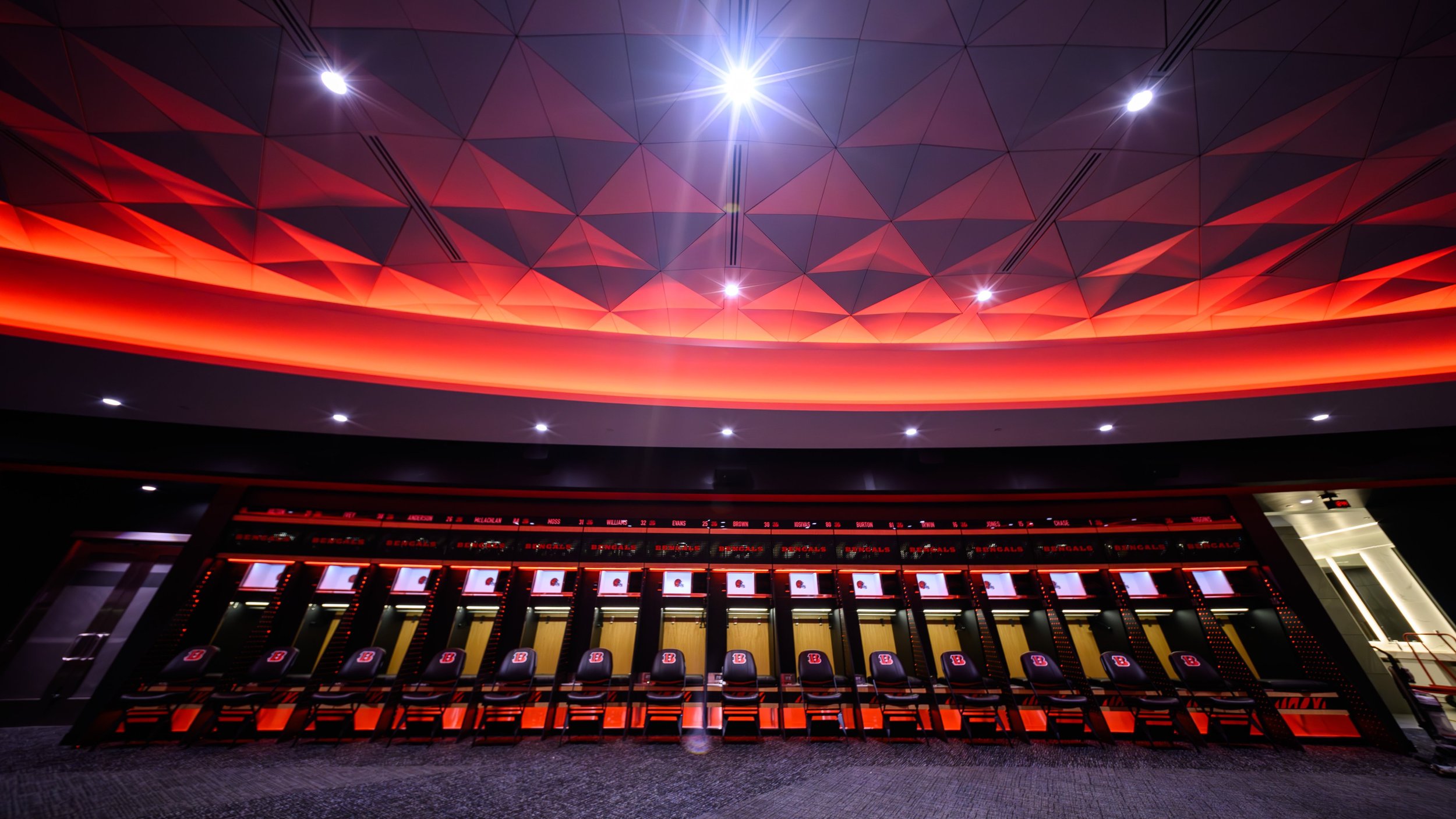
A sophisticated lighting system, capable of mimicking the nuances of natural daylight throughout the day, is one of the standout features. The system's complexity rivals that of a small city’s, adjusting to suit the time of day and the mood of the team.
The new locker room boasts 93 "beast lockers," each weighing about 800 pounds and equipped with a 24-inch electrical panel. These panels power everything from wireless phone chargers to Bluetooth lockboxes. These lockers are not only functional but also a testament to innovation, featuring internal lighting from eight LEDs certified by a national safety standard and nine drying fans for helmets, shoulder pads, and cleats. Each locker includes a lift-up footlocker storage compartment stamped with Paul E. Brown’s laser-engraved autograph.
“There’s nothing like it in the world. It’s a locker designed only for them,” says Sam Allen, owner of the Texas-based Longhorn Locker Company, the firm behind the project. “What the Bengals have is cutting-edge. This is the most intricate, most expensive, most involved project, requiring the greatest number of hours.”
Elizabeth Blackburn, part of the Bengals' ownership group, spearheaded the renovation project. The redesign aimed to modernize the locker room with advanced technology while maintaining a connection to the team’s storied past.
“We aimed to modernize the locker room with technology and a clean, cool design,” Blackburn explains. “This renovation built upon the locker room's original football shape but increased the ceiling height and made several other modifications to further open up the space to create a connected feeling for the team. We hope it’s an energizing, high-end, professional setting for our players every day.”
The new locker room is rich with historical elements. Blackburn ensured that the lockers feature subtle tributes to the team’s legacy. The lyrics “And win this game for Cincinnati,” from the team fight song composed in 1968, are placed above the door leading to the field. Patented shelving units in each locker display lines from the “Who Dey Think Gonna Beat Them Bengals?” chant. The compartments for drying shoulder pads are lined with the "Established 1968" logo, and the iconic running tiger logo leaps through the lockbox.
The reaction from the players has been overwhelmingly positive. “It’s amazing,” says wide receiver Tee Higgins. “A lot more space. The lockers are nice. I think the guys will love it. They really outdid themselves. They took it to another level for sure.”
Joe Burrow, who had a sneak peek last week, was equally impressed. “The more we continue to invest in stuff like this, the more comfortable the players are going to be. We’re going to love coming into work. I’m really happy with it. It’s quite an upgrade. Credit to ownership for putting this all together.”
The Bengals' new locker room is more than just a place to change and store gear. It’s a modern, luxurious space designed to foster team unity and enhance player performance, all while honoring the rich history of the franchise. As Joe Burrow says, “It’s open to any and all,” capturing the welcoming spirit of this impressive new facility.
With these upgrades, the Bengals are poised to not only meet the needs of today’s players but also adapt to the demands of the future, ensuring that they remain at the forefront of innovation in the NFL.
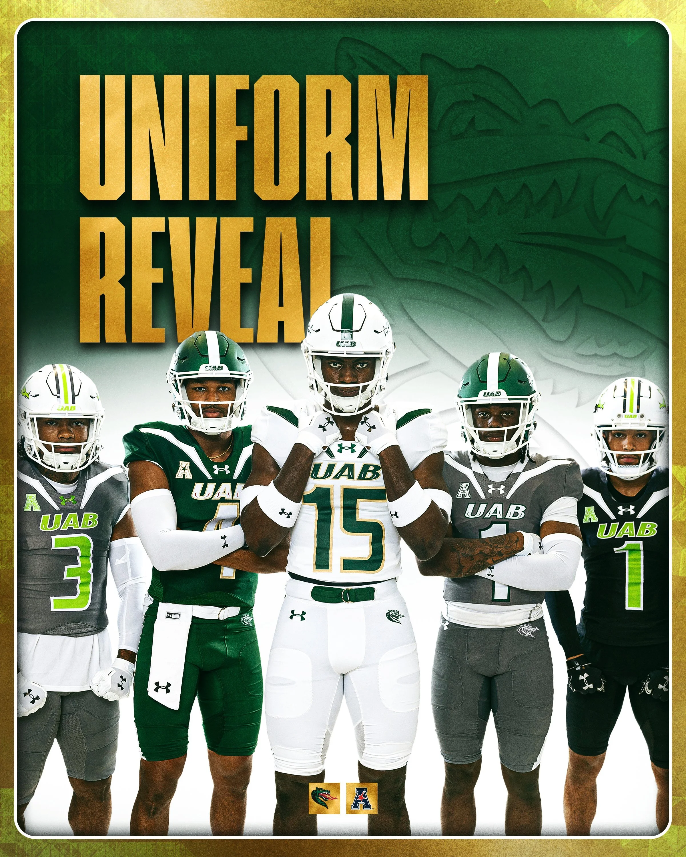
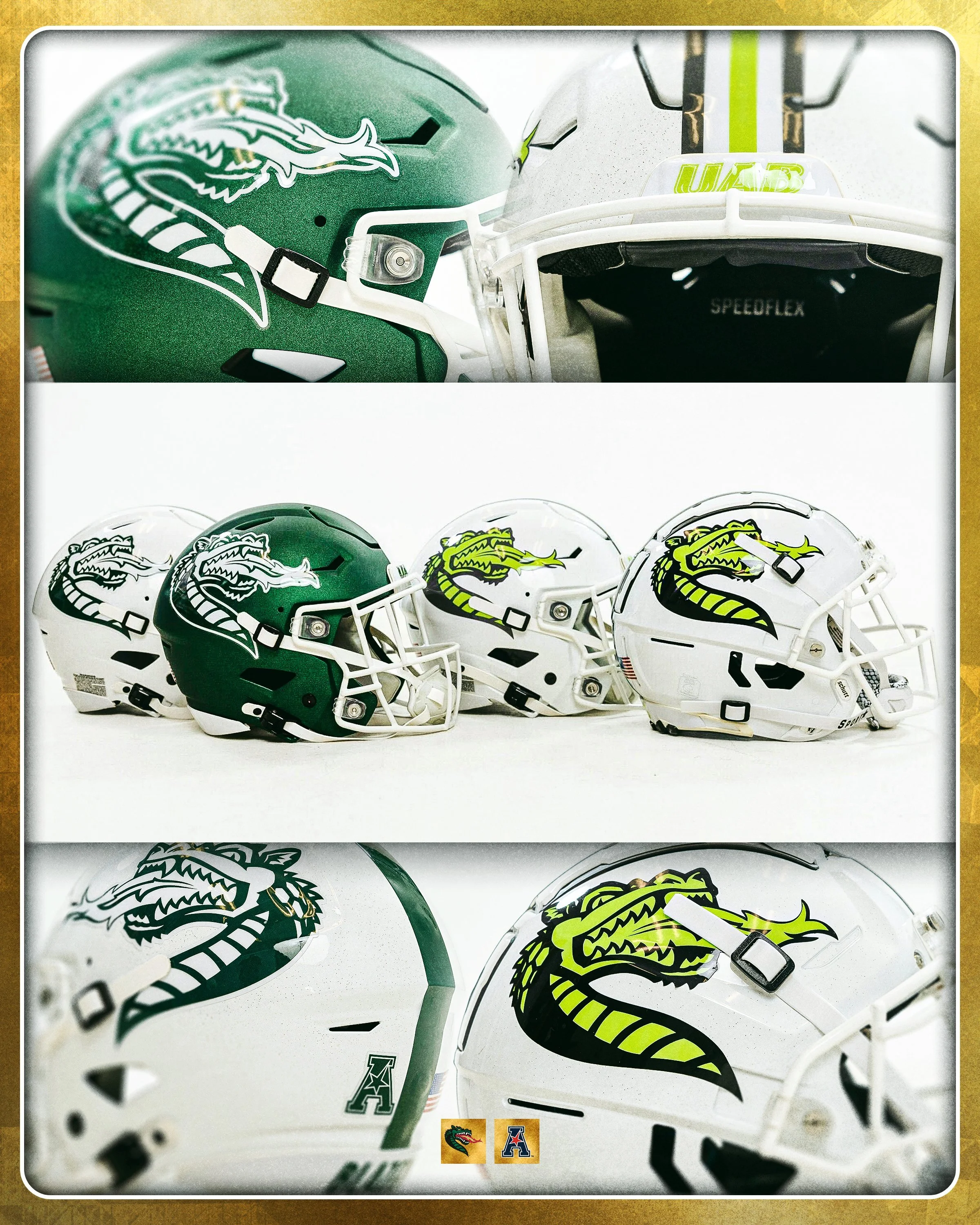
As the countdown to the college football season begins, fans and players alike are buzzing with anticipation. This offseason has been particularly exciting, marked by a flurry of uniform reveals across the country. Among the latest to join the trend are the UAB Blazers, who unveiled their new look for the 2024 season.
One of the most striking changes in UAB's new uniform lineup is the absence of the gold helmet, a staple of the Blazers' identity for much of their history. Last season, the gold helmet was already showing signs of decline, making appearances in only two out of twelve games. This year, the gold accents on the white uniforms, such as the numbers and 'UAB' lettering, have been replaced with a bold green, signaling a significant shift in the team’s aesthetic.
Perhaps the most notable addition to UAB’s uniform arsenal is the green helmet. Not seen since 1994, the green helmet is making a comeback, featuring a striking white dragon logo. This addition is part of a trio of helmets introduced for the season:
Green Helmet: Featuring a white dragon logo.
White Helmet: Showcasing a green dragon logo, worn five times in the previous season.
White Helmet with Lime Green and Black Dragon Logo: A fresh design that has yet to make its on-field debut.
The UAB Blazers have unveiled a range of uniforms for the 2024 season, each designed for specific occasions. The Home uniform features an all-green ensemble, while the Away uniform presents a clean, all-white look. For the Birmingham Series Alternate, the team sports a green helmet paired with a gray jersey and pants. The Smile-A-Mile uniform, which supports children diagnosed with cancer, includes a white helmet with a black jersey and pants. Finally, the Children’s Harbor uniform, honoring seriously ill children and their families, consists of a white helmet with a gray jersey and pants.
Two of UAB’s uniform sets underscore the team's dedication to charitable causes. The Smile-A-Mile uniforms, introduced last season, feature jerseys without player names, instead displaying the names of children diagnosed with cancer. These uniforms are worn during select games and donated to the patients at the end of the season, with the black jerseys previously showcased in games against Louisiana and Memphis. The Children’s Harbor uniforms, now in their eighth year, include gray and lime green jerseys adorned with the names of Children’s Harbor patients.
These special uniforms were worn in last year’s games against South Florida and Florida Atlantic, and the Blazers will continue this meaningful tradition on November 2nd when they host Tulsa.
While it's unclear if UAB will experiment with additional uniform combinations beyond the five main categories, the possibilities are exciting.
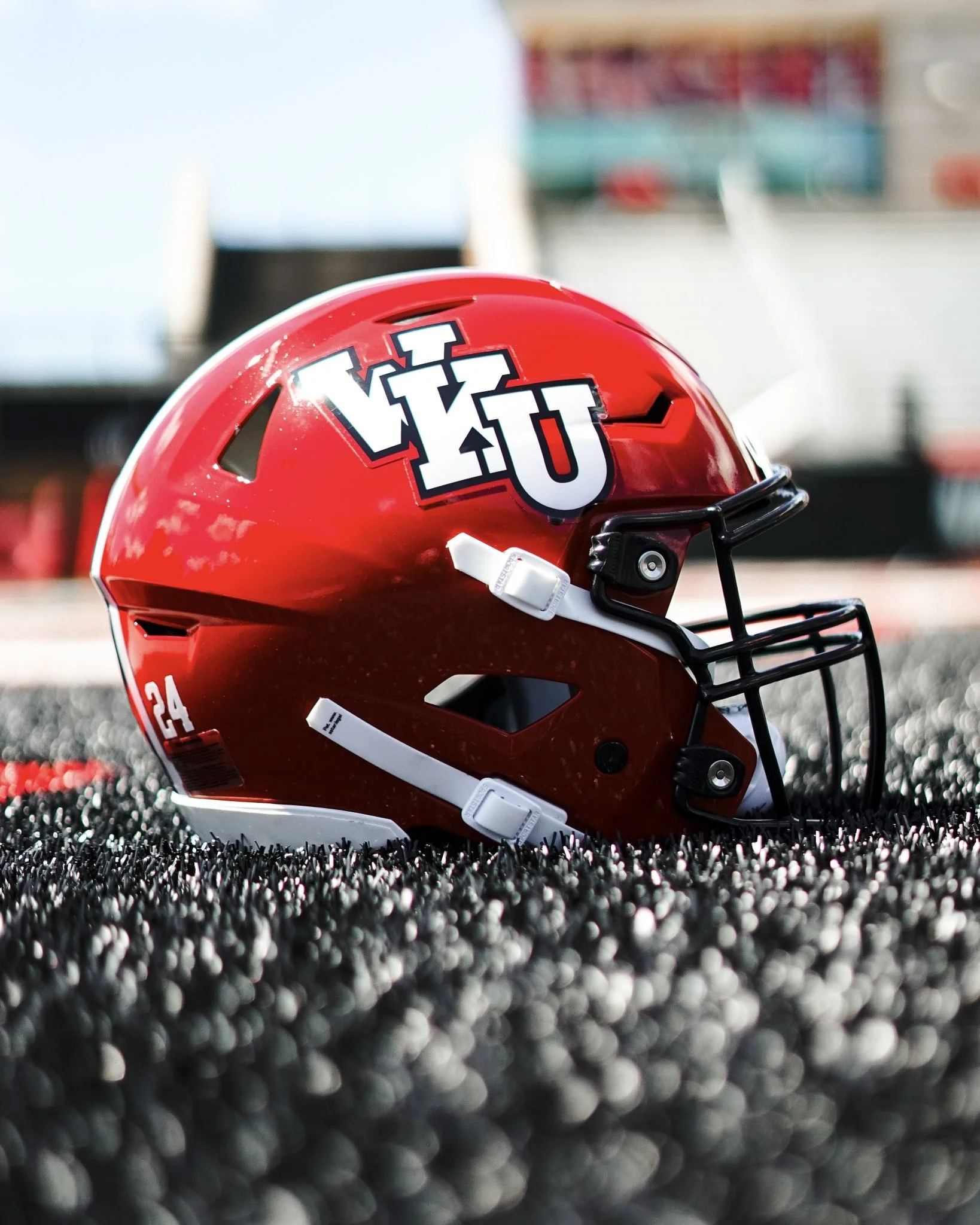
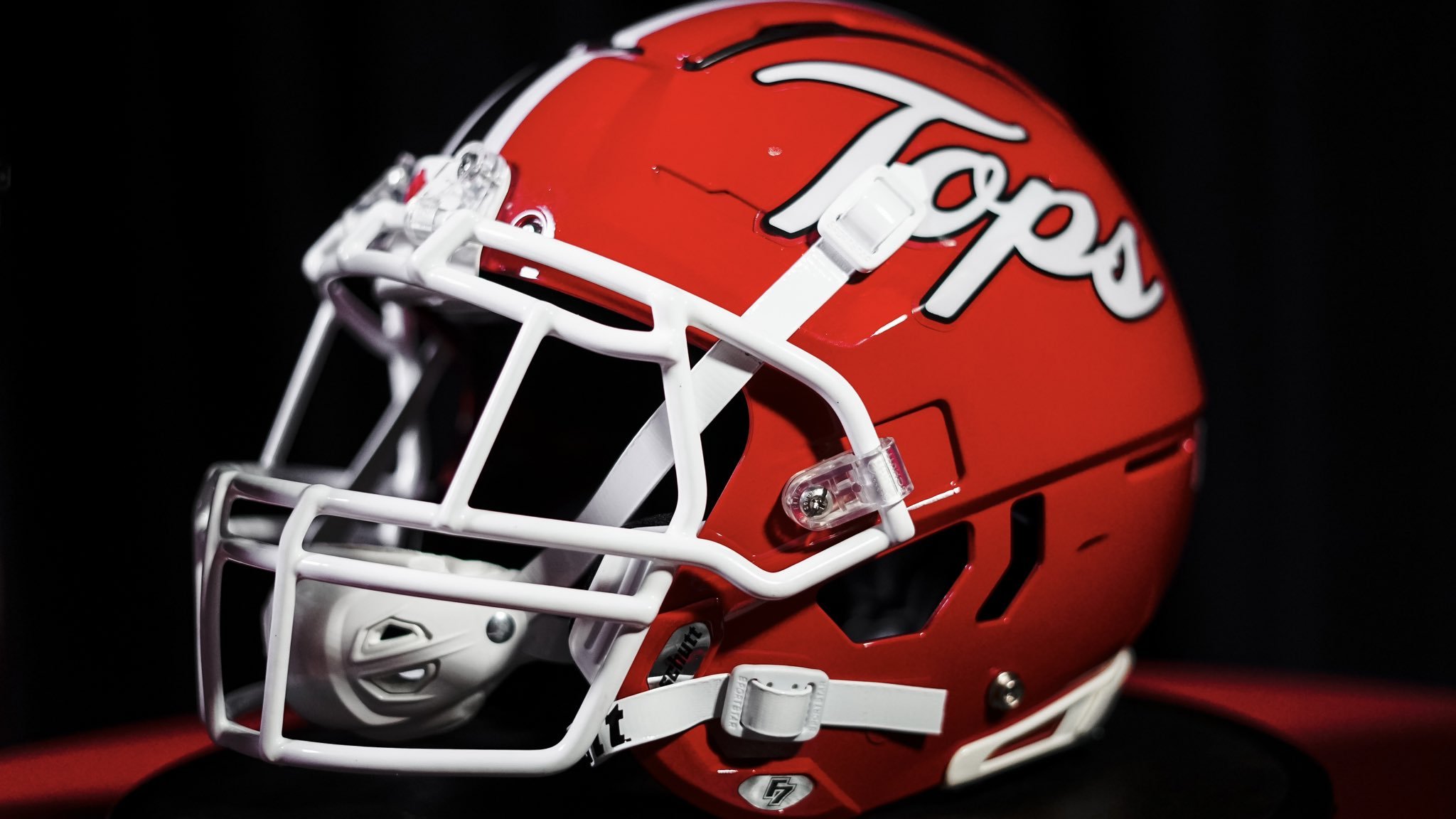
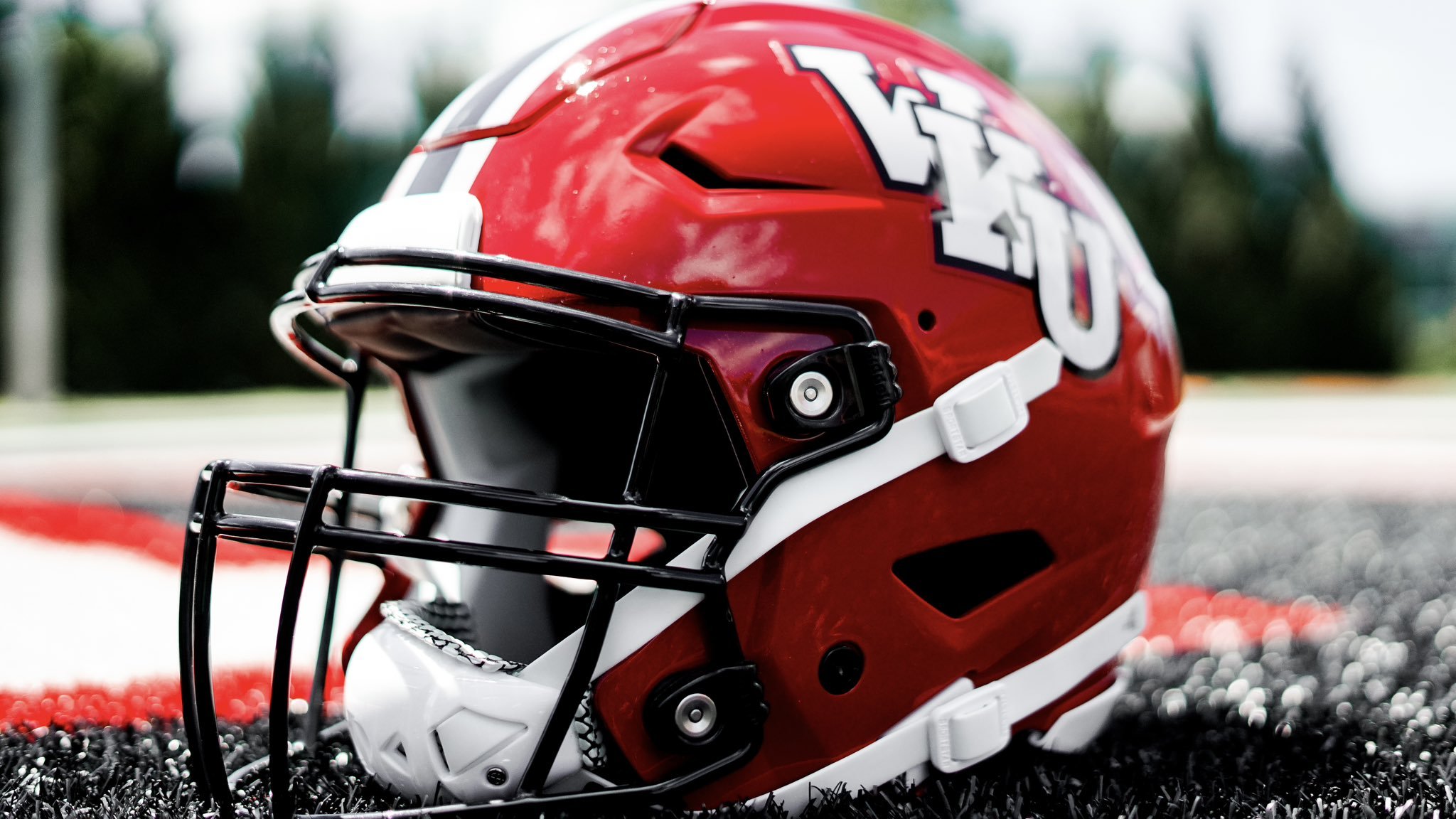
Western Kentucky University has excited football fans and alumni alike with the unveiling of two new helmets that pay homage to the program's rich history. The announcement, made on Thursday, revealed that both helmets are throwbacks to the red helmets the team wore in the past, evoking a sense of nostalgia and pride.
One of the newly introduced helmets features the classic "WKU" lettering on both sides. This design is complemented by a striking black facemask and a bold center stripe in white and black.
The second helmet showcases the word "Tops" in elegant cursive script on both sides, creating a stylish and distinct appearance. This helmet features a white facemask, which contrasts beautifully with the red helmet, and a prominent black and white center stripe. The design captures the essence of the Hilltoppers' identity, providing a fresh yet familiar look for the team.
These throwback helmets are more than just a change in gear; they represent a bridge between the past and the present. By revisiting the red helmets that were once a staple of the program, WKU is honoring its history while also invigorating current players and fans with a sense of continuity and tradition. The nostalgic designs are a tribute to the legacy of Western Kentucky football and a celebration of the community’s enduring spirit and support.
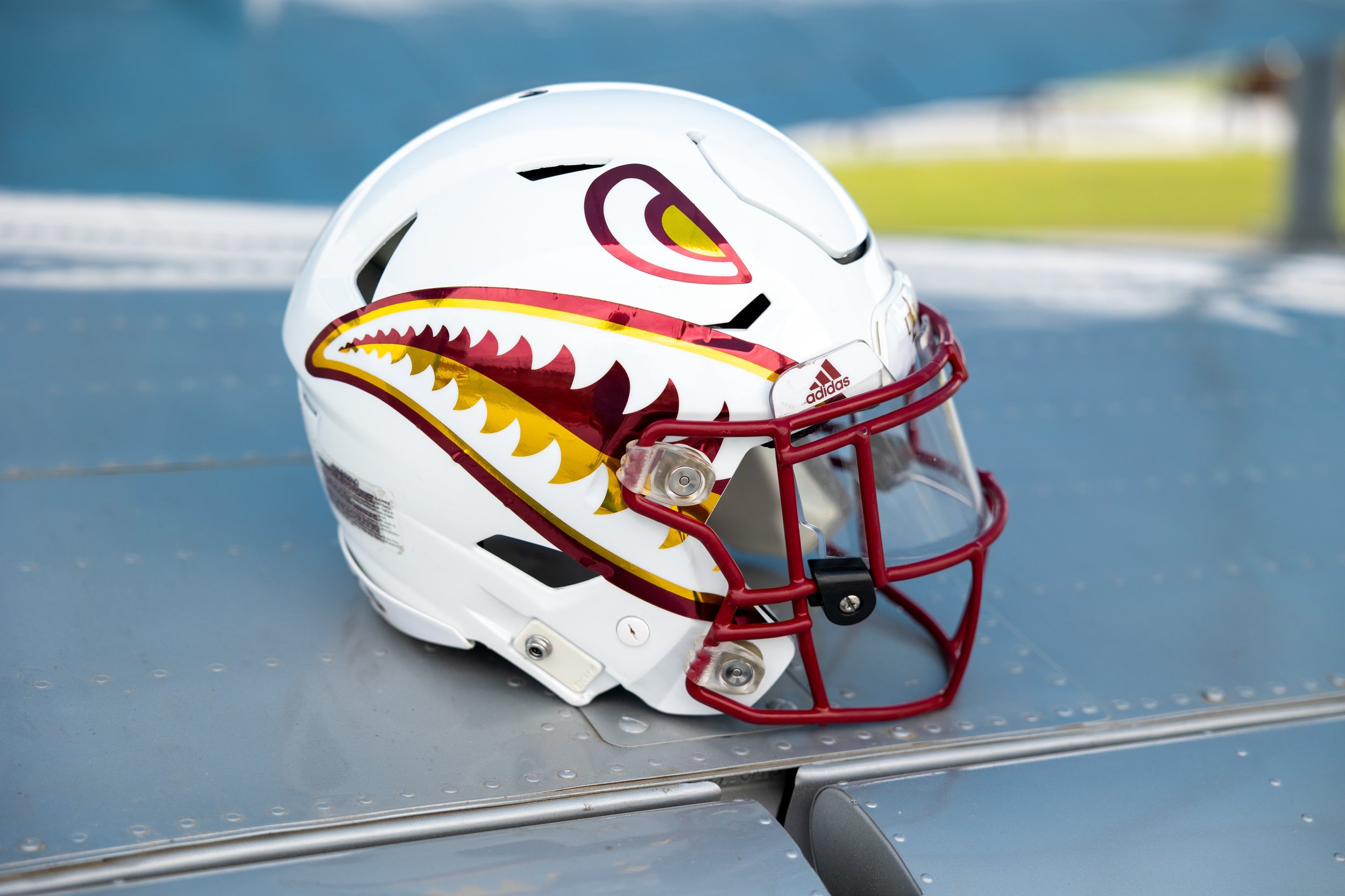
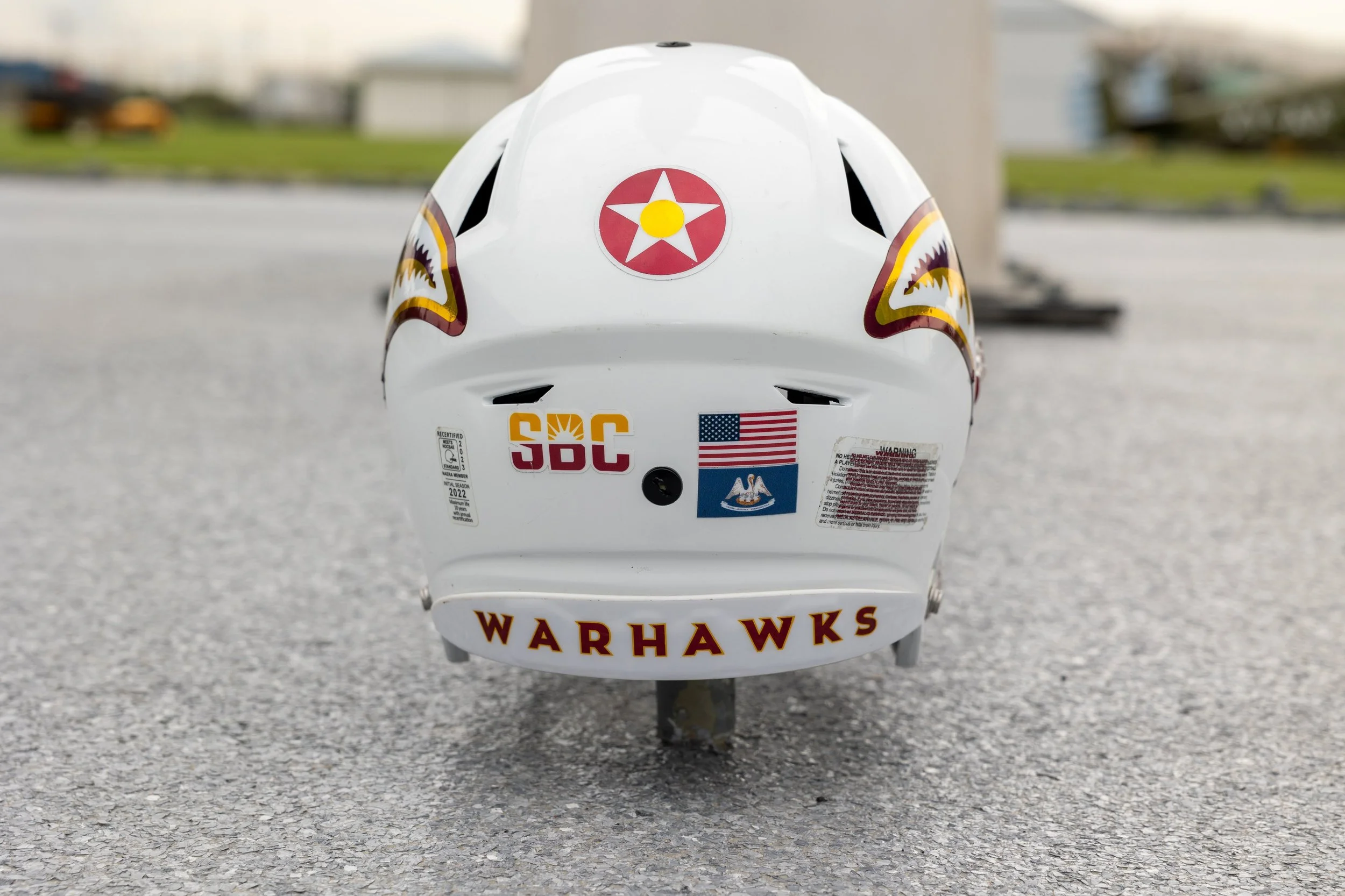
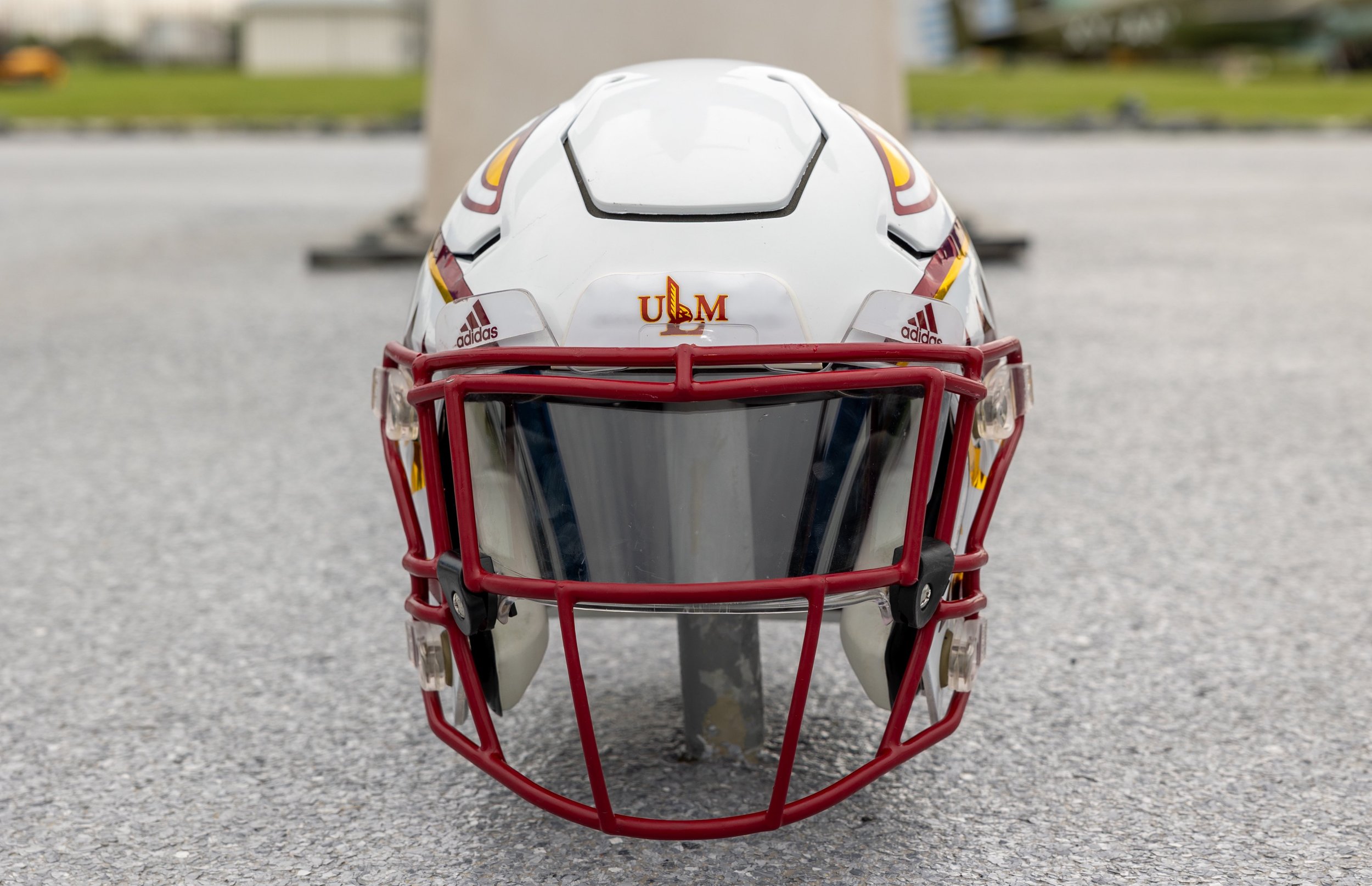
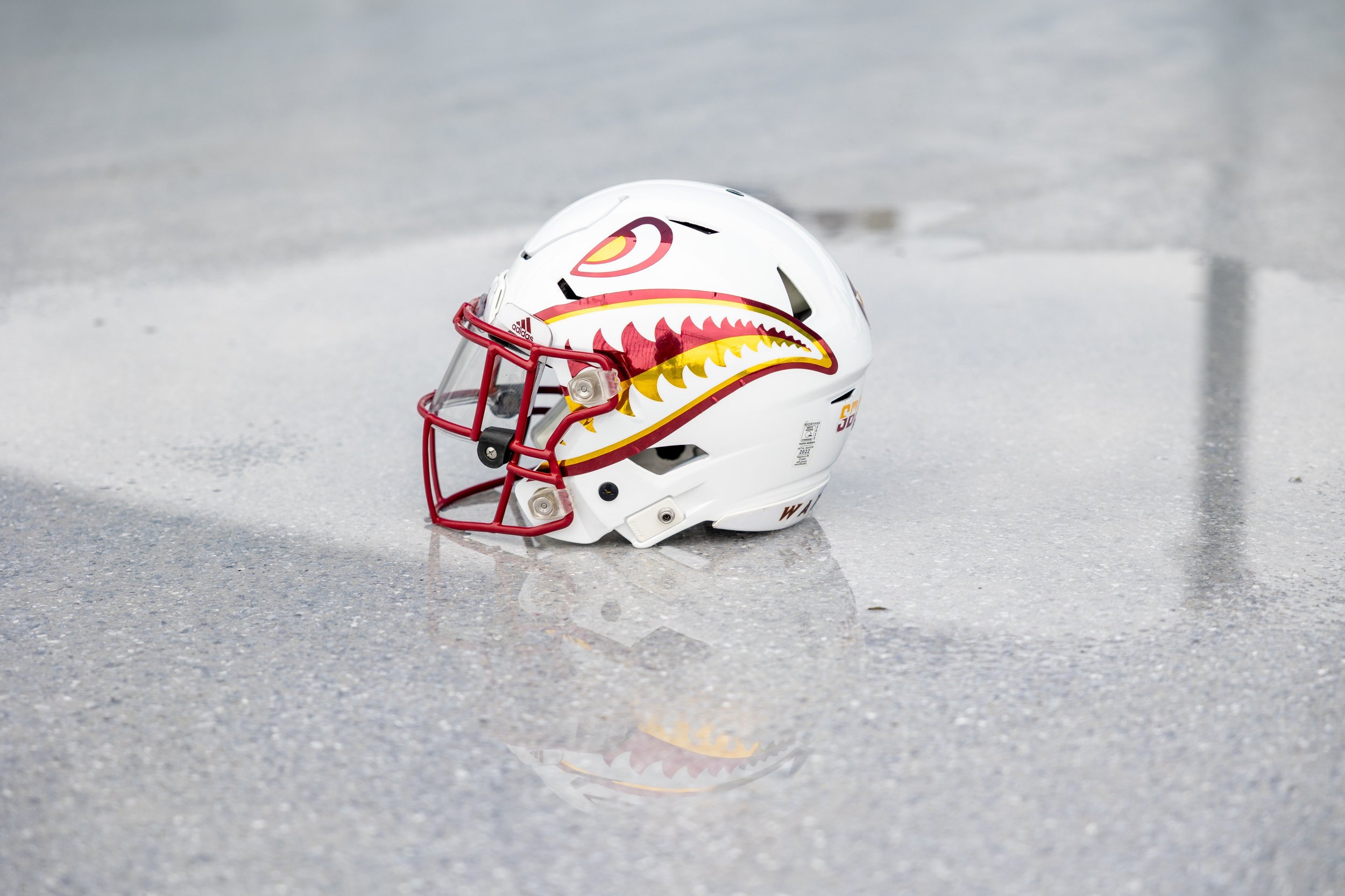
The ULM Warhawks are gearing up for the 2024 football season with a fresh and exciting change to their on-field look. This year, the team will debut a new primary helmet inspired by the iconic P-40 Warhawk aircraft, symbolizing a blend of tradition and innovation.
The P-40 Warhawk was a formidable fighter plane during World War II, known for its distinctive design and valiant service. By incorporating elements of this legendary aircraft into their helmet design, ULM is paying homage to the past while looking forward to a new era of football excellence.
The new helmet features bold graphics reminiscent of the P-40 Warhawk, including sharp, aggressive lines and a fierce, determined look that embodies the spirit of the Warhawks. The helmet's design aims to inspire players and fans alike, serving as a symbol of strength, resilience, and the relentless pursuit of victory.
As the Warhawks prepare for the upcoming season, the introduction of the P-40 inspired helmet adds an extra layer of excitement and anticipation. The new helmet is more than just a piece of equipment; it's a statement of identity and pride for the team and its supporters.
With the new helmet set to make its debut, the Warhawks are ready to take on the 2024 season with renewed vigor and a sense of purpose. Fans can look forward to seeing their team don this striking new gear as they strive for success on the gridiron.
Stay tuned for more updates and get ready to support the ULM Warhawks as they soar to new heights this season with their P-40 inspired helmets!
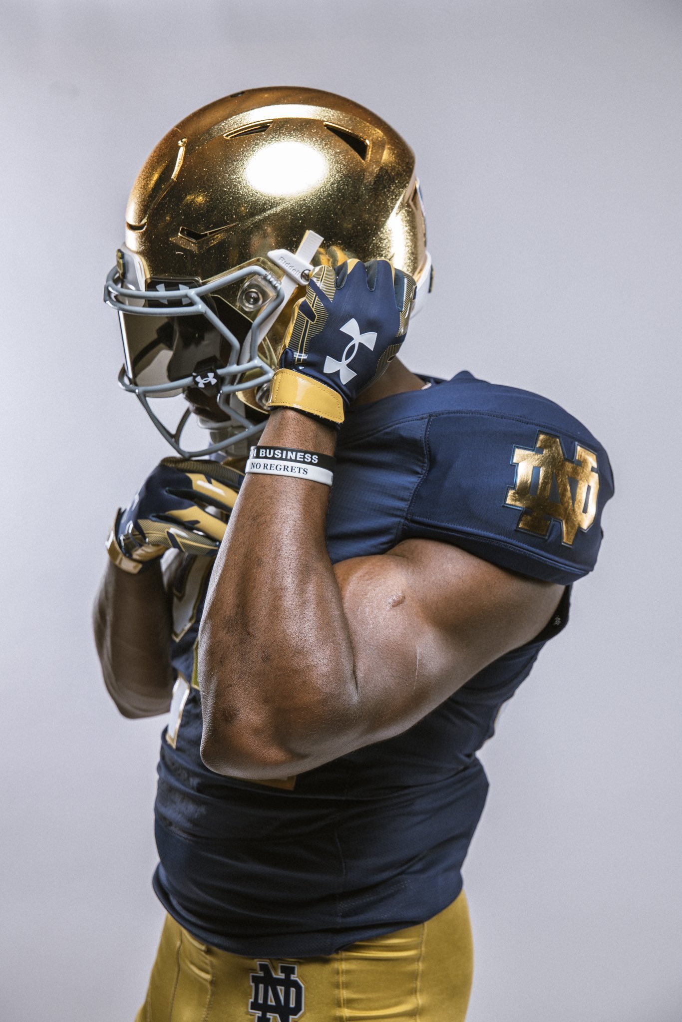
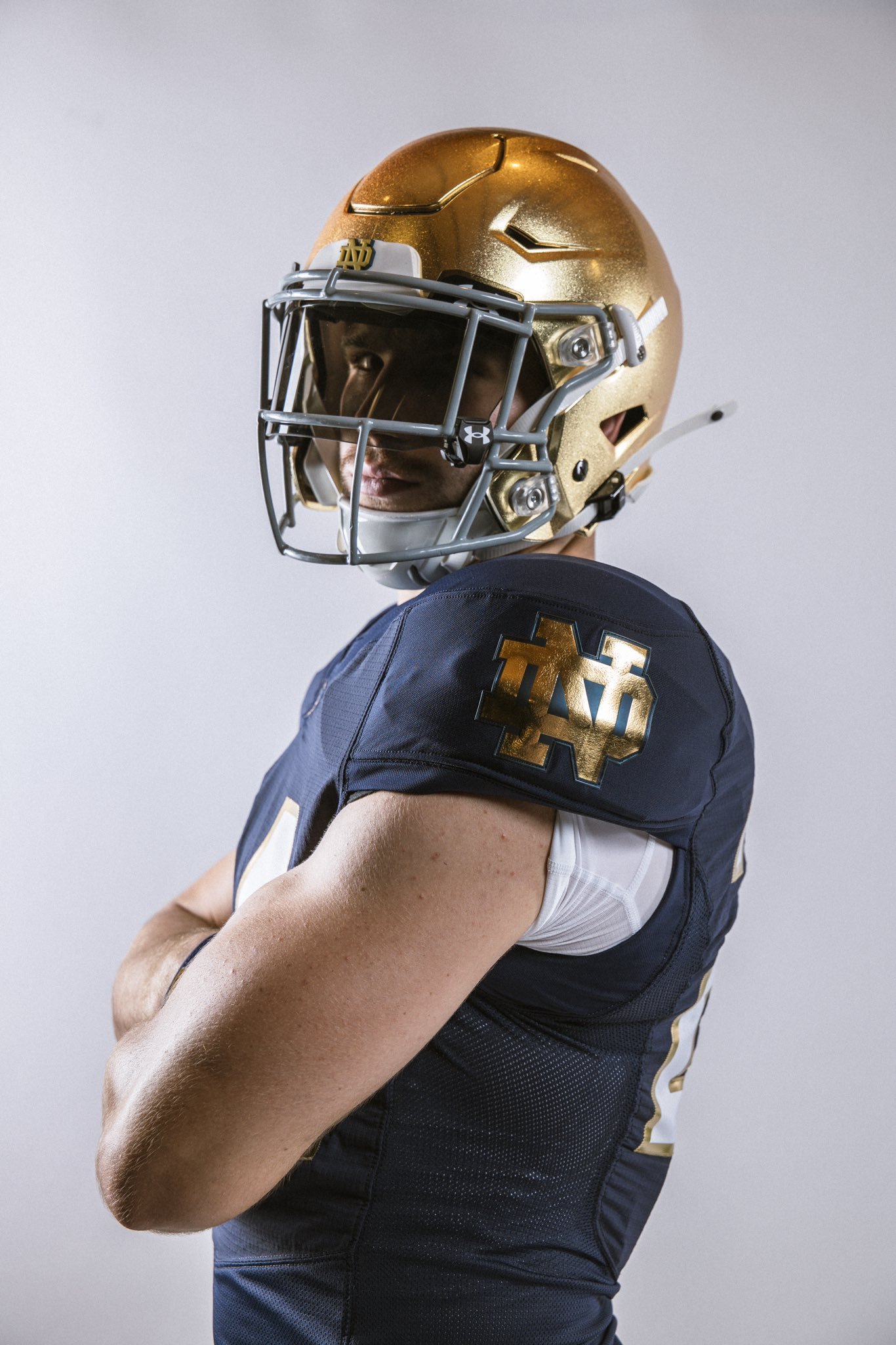
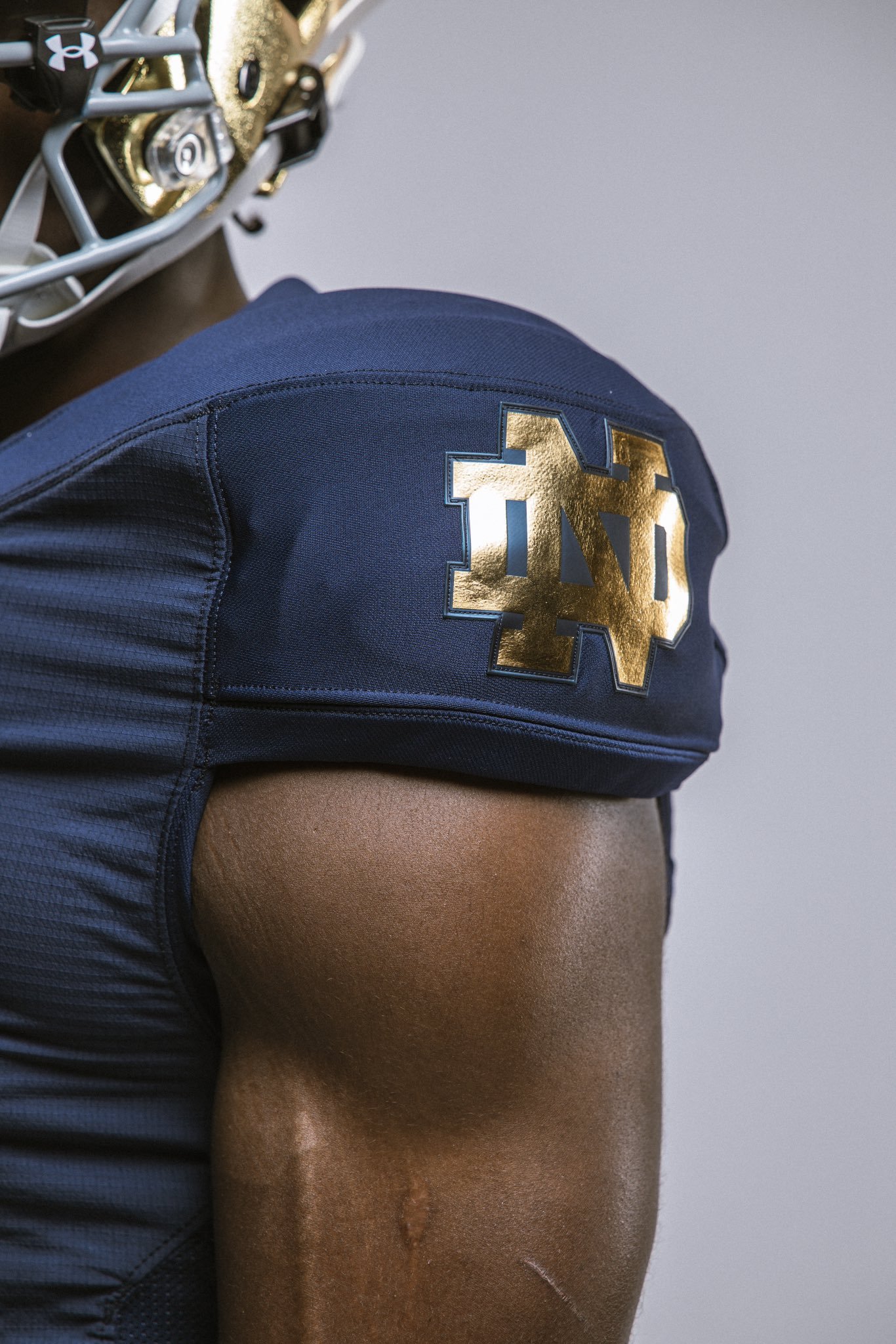
Notre Dame football revealed their 2024 home football jerseys, that now feature arm sleeve patches of the interlocking “ND” logo in gold. This metallic hue is designed to match the iconic gold helmet, with the logo trimmed in blue for an added touch of elegance.
The home blue jerseys will also sport white numbers with metallic gold trim, creating a cohesive and visually appealing look.
Notre Dame has yet to announce its 2024 green jersey game. Over the past two seasons, the Irish have donned green jerseys against California (2022) and Ohio State (2023). Fans are eagerly awaiting news on which game will feature this color scheme for the upcoming season.
A special unfirom typically accompanies Notre Dame's Shamrock Series contests. This year's game, set for November 23 at New York's Yankee Stadium against Army, is sure to be a highlight of the season. Fans can expect another unique and memorable uniform design to mark this special occasion.
With these exciting updates, Notre Dame continues to blend tradition with innovation, keeping their look fresh while honoring their storied history. Fans and players alike can look forward to a season of not just thrilling football, but also standout style on the field.
Major League Soccer and adidas have launched the highly anticipated "adidas x MLS Archive Collection," featuring third jerseys for five clubs that will be worn throughout the remainder of the 2024 season. This collection brings a nostalgic twist to the modern game, combining retro aesthetics with contemporary design.
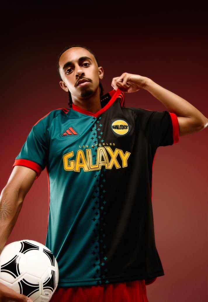
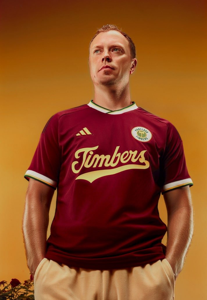
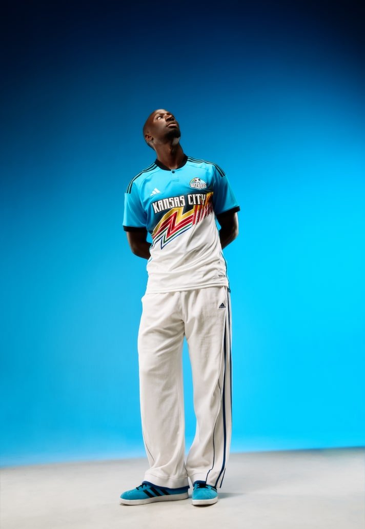
The first five clubs to debut the adidas x MLS Archive Collection are the LA Galaxy, Los Angeles FC, Inter Miami CF, Portland Timbers, and Sporting Kansas City. Each club's kit draws inspiration from different eras and aspects of their city's cultural and sporting history, creating a unique narrative for fans to enjoy. MLS and adidas plan to expand this throwback-inspired series to include more clubs in 2025 and beyond.
LA Galaxy
The LA Galaxy's archive kit pays homage to their original jersey from the inaugural 1996 MLS season. This design captures the essence of the club's early days and celebrates their long-standing legacy in the league.
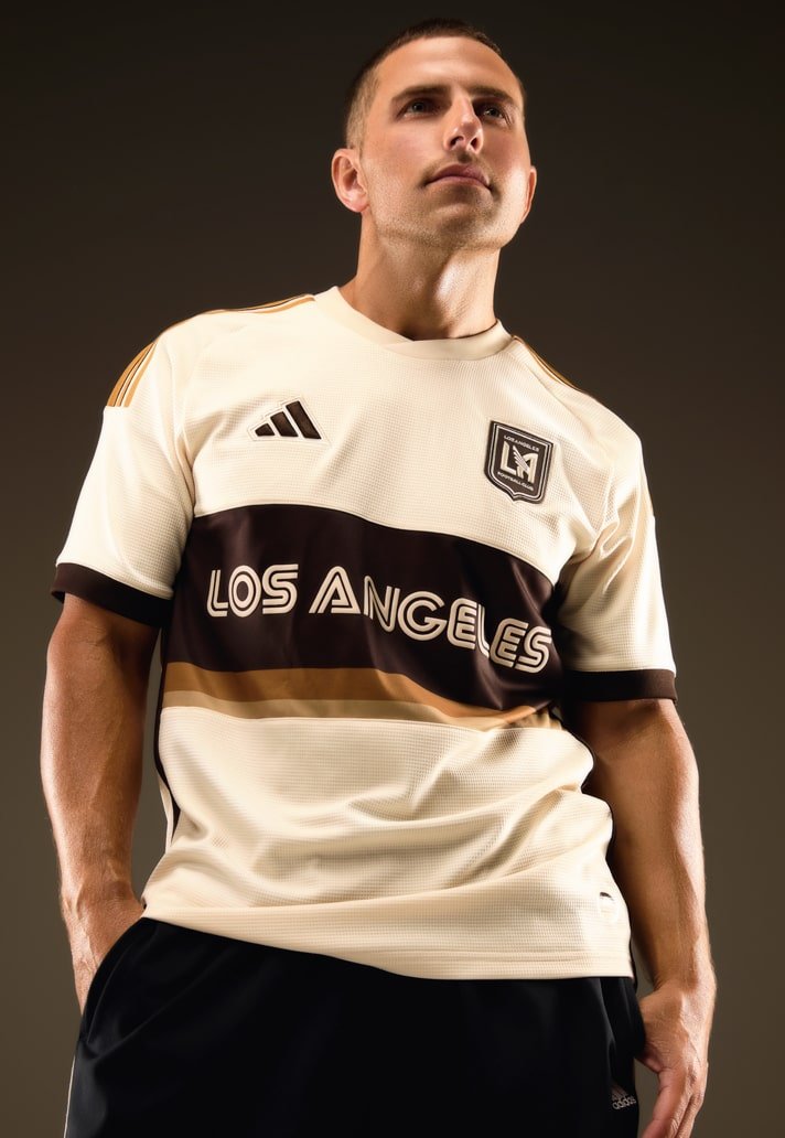
LAFC
LAFC's archive kit is inspired by 1970s-era SoCal iconography, capturing the golden hues of the setting sun and the diversity of the region's people. The kit expands on the club's primary gold color, reflecting the vibrant and dynamic culture of Los Angeles.
Inter Miami CF
Inter Miami's archive kit taps into the vibrancy of 1980s Miami, incorporating the bold and colorful styles that define the city's fashion and culture. This design brings a lively and energetic feel to the pitch, reminiscent of vintage Miami style.
Portland Timbers
Portland Timbers' archive kit honors Clive Charles, a trailblazer in soccer and one of the first Black players in England’s Premier League. Charles joined the Timbers in 1978 and became a significant figure in Portland sports. This kit pays tribute to his enduring legacy and contributions to the game.
Sporting Kansas City
Sporting Kansas City's archive kit is a modern re-imagining of the rainbow kits worn by the Wizards in the 1990s. This design celebrates the club's history while bringing a fresh and contemporary look to their iconic colors.
The adidas x MLS Archive Collection offers a fresh take on classic designs, celebrating the history and culture of Major League Soccer's clubs. As the throwback-inspired series kicks off, fans can look forward to seeing their favorite teams don these nostalgic kits on the field.