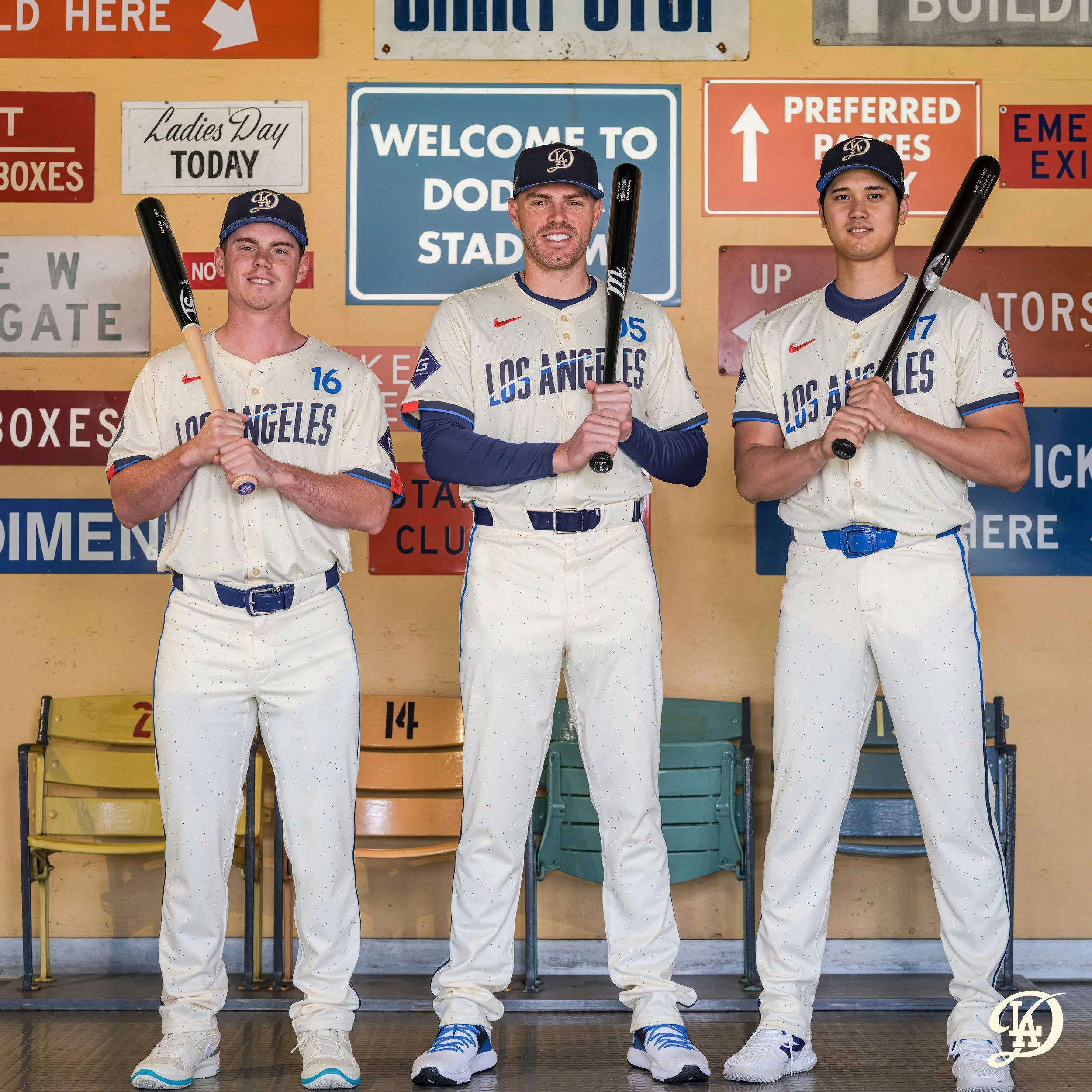
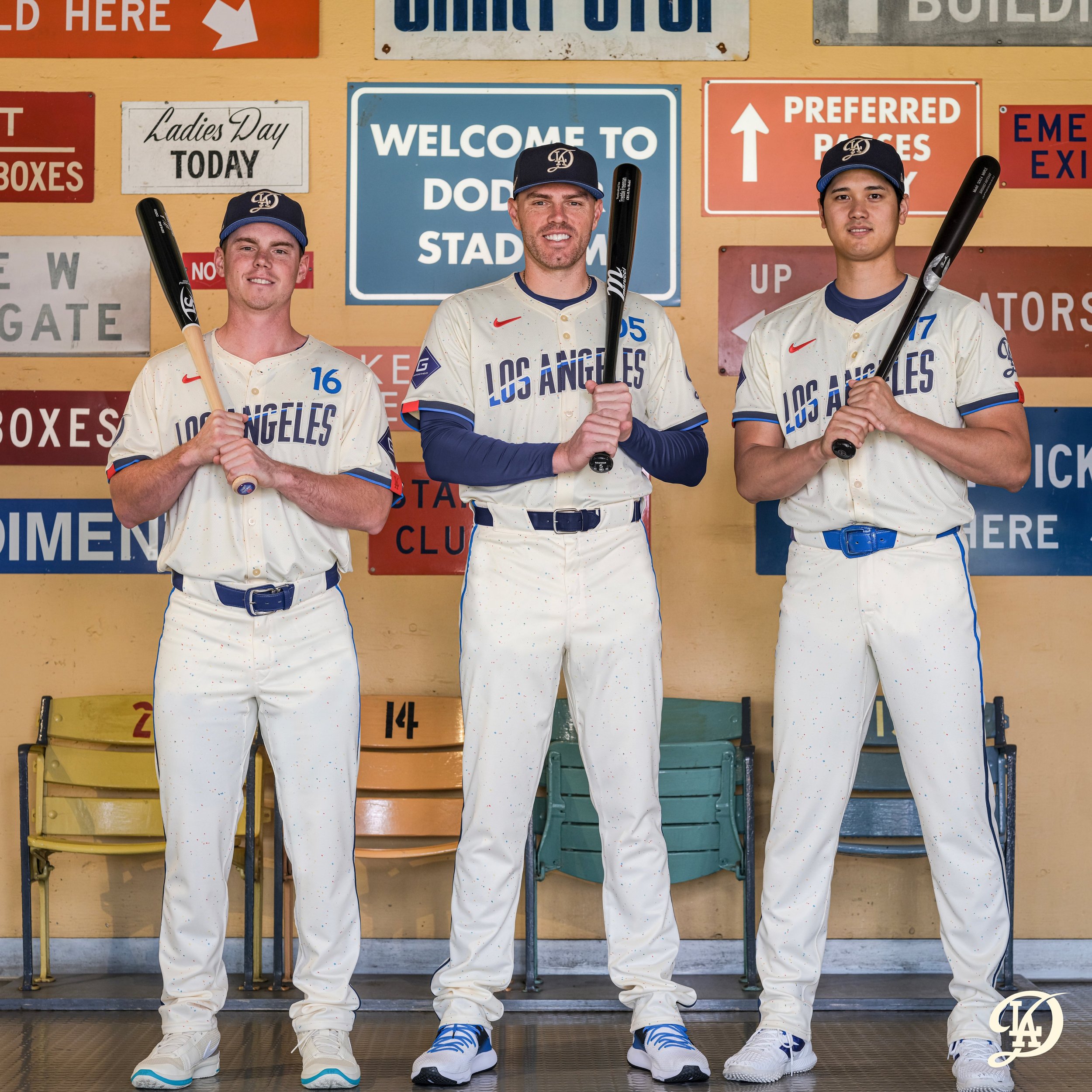
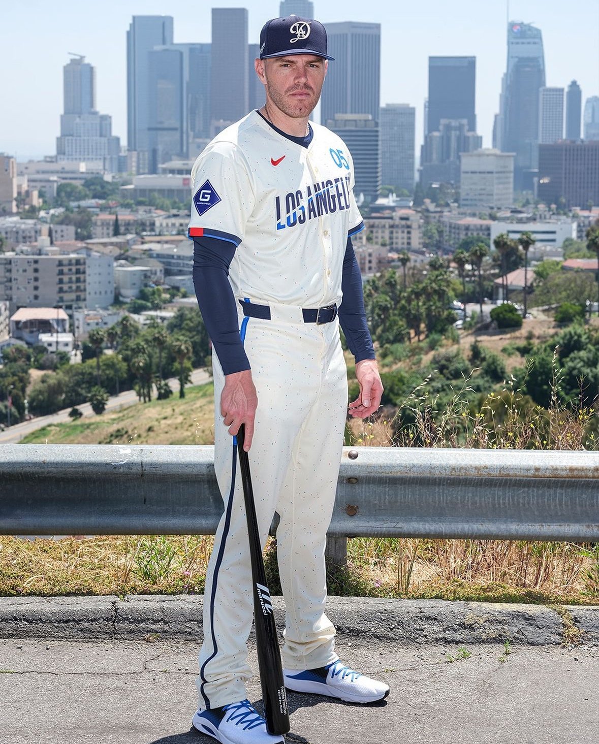
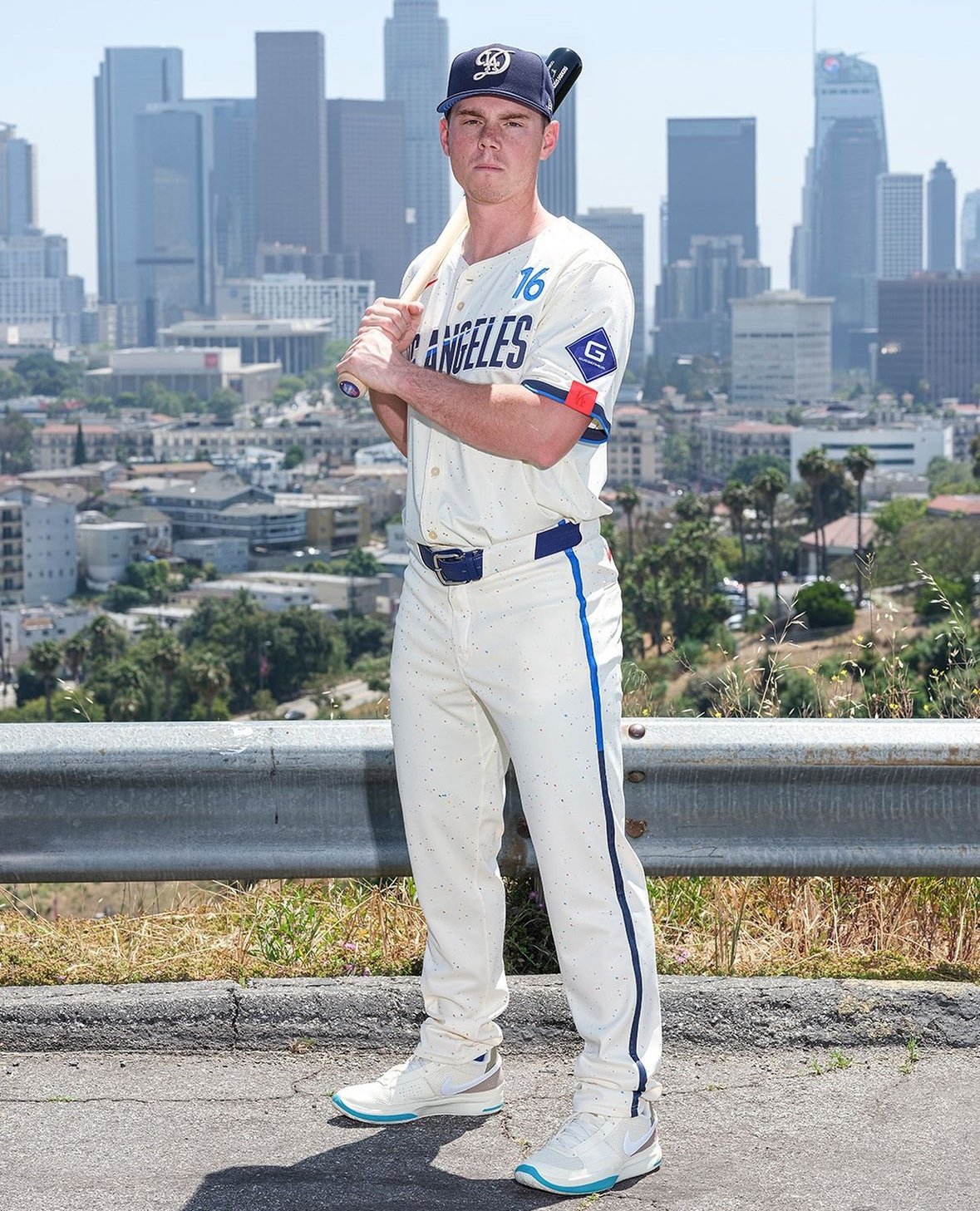
The Los Angeles Dodgers have revealed their second City Connect design, set to debut on Saturday against the Los Angeles Angels. This new design features cobalt and electric blue hues with a hint of chili red, paying homage to the iconic red numbers on the Dodgers' primary uniforms.
“The new jerseys for 2024 are a nod to the city's longstanding connection to being a city of dreams and dreamers,” the Dodgers stated in their press release. “A city filled with those shooting for the stars where impossible dreams can turn into reality.”
This latest design marks the Dodgers as the first team to unveil a second uniform in the City Connect series. Their original look, released in August 2021, featured "Los Dodgers" on both the cap and jersey. The new uniform continues this trend of celebrating the city’s unique culture and history.
One of the standout features of the new design is the "Los Angeles" front watermark, inspired by the signage at the Los Angeles Memorial Coliseum, where the Dodgers played from 1958 to 1961 after moving from Brooklyn. This watermark includes a contrail with an upward trajectory, symbolizing the city's relentless pursuit of what lies beyond.
The Dodgers have also updated their iconic interlocking "LA" logo on the cap. The new design retains the prominent "LA" but now features a swooping "D" behind it, representing the "LAD" team code. This abbreviation also appears as a sleeve patch, further integrating the team’s identity into the new look.
The uniform numbers, positioned above the "Los Angeles" watermark, draw inspiration from the mid-century typeface popular during the Dodgers' move from Brooklyn. This element, along with the electric blue and red dots scattered throughout the fabric, creates a "galaxy of stars" effect, symbolizing the brilliance and diversity of Los Angeles.
Each jersey also includes the acronym "#ITFDB" in the bottom corner, standing for "It's time for Dodger baseball," a phrase made famous by the legendary Dodgers broadcaster Vin Scully. This tribute to Scully underscores the Dodgers' deep connection to their storied past and their beloved fans.
The Dodgers' new City Connect uniform beautifully blends modern design with historical and cultural references, celebrating Los Angeles as a city of dreams and dreamers. This unveiling concludes this year’s series of City Connect uniforms, with the Dodgers' innovative and thoughtful design setting a high standard for future releases.
Fans can look forward to seeing the Dodgers sport these striking new uniforms on Saturday, as they continue to honor their past while boldly stepping into the future.
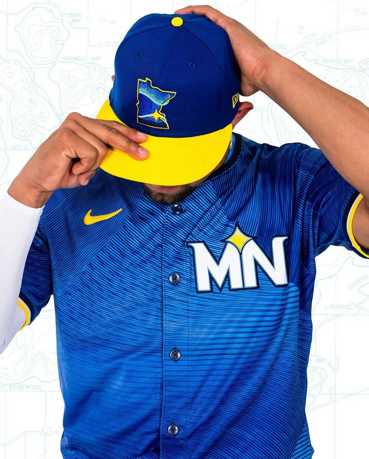
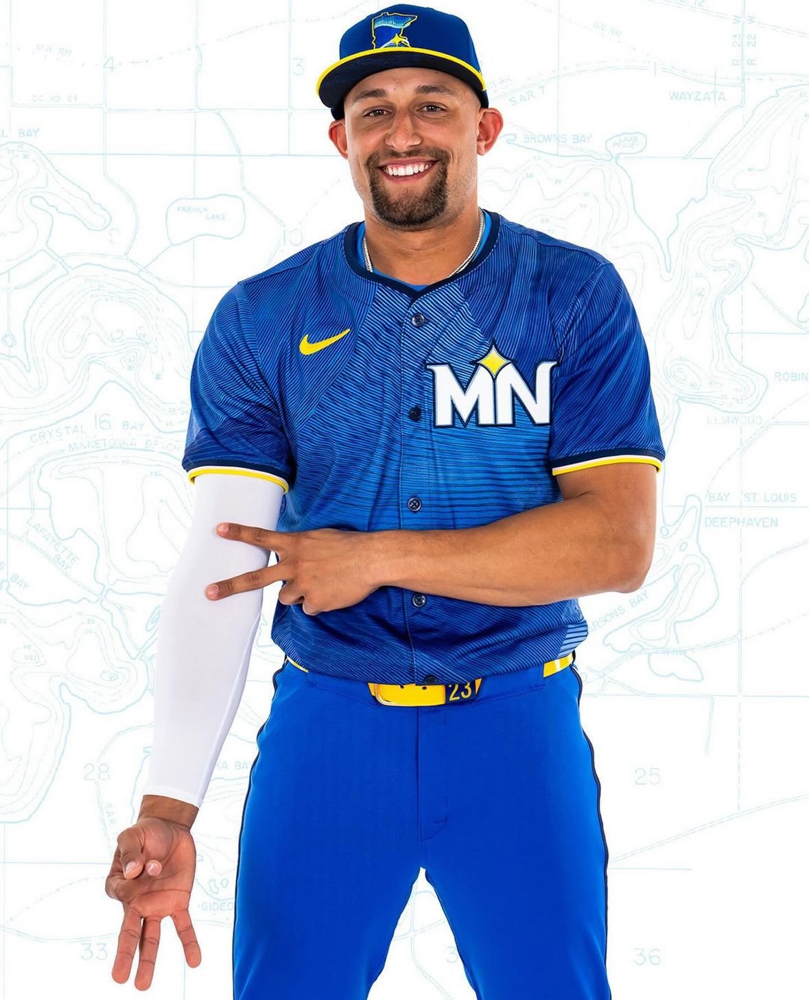
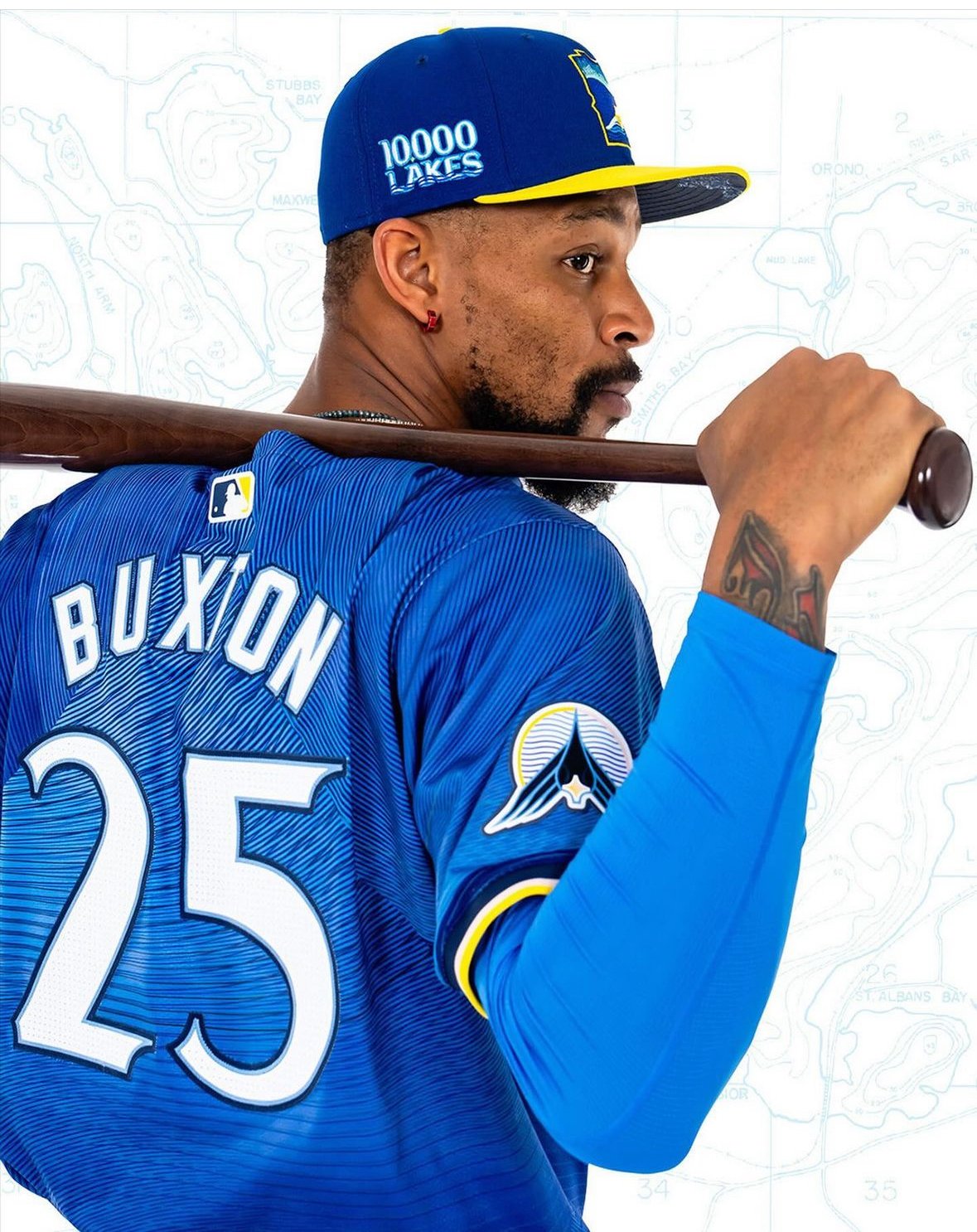
The Minnesota Twins have a legacy of representing their entire state rather than just their home city, and their new "City Connect" jerseys take this tradition to heart. The Twins' latest uniforms embrace a "State Connect" concept, paying homage to the Land of 10,000 Lakes.
The new uniforms, unified around an azure blue hue, reflect the central role of water in Minnesota. Accented with yellow belts and cap brims, the design evokes the sun shining over a lake. These uniforms will debut this Friday and be worn 10 more times throughout the 2024 regular season, primarily on home game Fridays.
"It's cool that they're different," remarked Joe Ryan. "It's cool to get away from what our normal uniforms look like. They did a good job with that. It will be fun to see what works and doesn't work with cleats and have a little bit of our own personal flair in there."
The design, developed over two years, embodies the "Ripple Effect" tagline. The intention was to go beyond a simple visual representation of lakes and to capture the serene, ripple-like impact lakes have on Minnesotans' lives.
"We really feel like that’s what the Twins do: We create positive action and we hope that that ripples out throughout the community," said Heather Hinkel, the Twins’ vice president of brand marketing. "So that’s the story we’re going to be telling, along with the jersey."
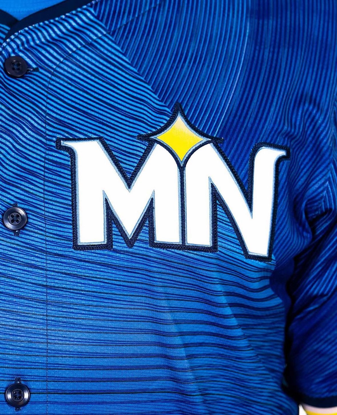
The dark blue caps with yellow brims feature a new insignia in the shape of Minnesota, outlined in yellow. The logo includes a North Star motif placed at the Twin Cities’ location, with the Northern Lights reflected in a lake’s water line.
"Really honing in on kind of what Minnesota stands for, where the water reflects the sky," Hinkel explained. "It doesn’t necessarily say Twins, but it really speaks to Minnesota."
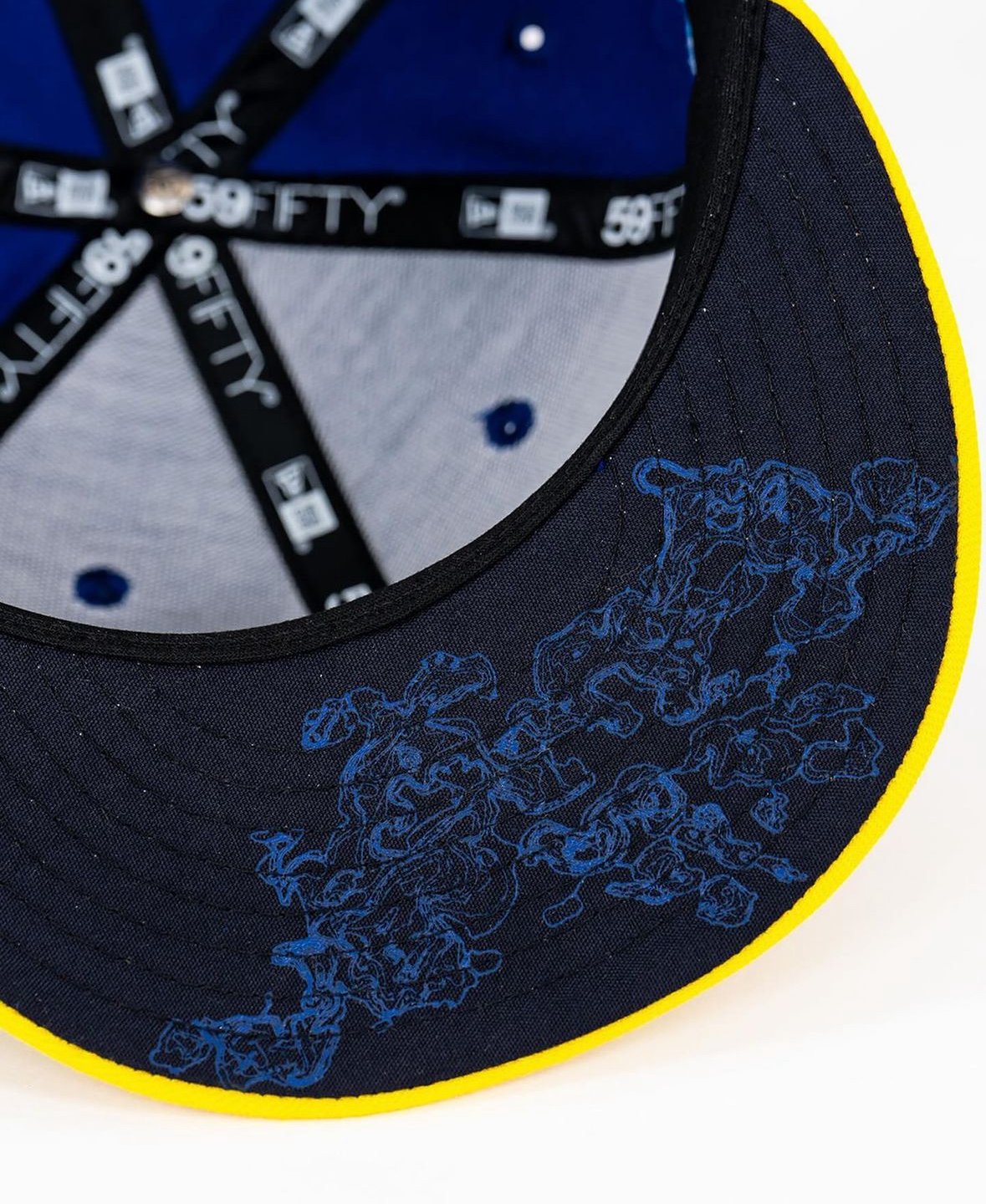
The caps also feature a "10,000 Lakes" decal and a topographical depth map of Lake Minnetonka under the brim—a nod to Prince’s iconic "Purple Rain" movie line.
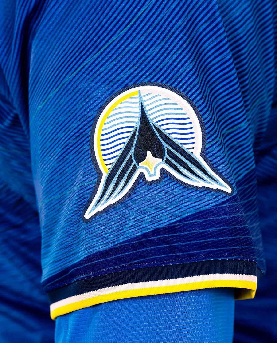
The jersey tops feature a sublimation pattern with various shades of blue and black striations, representing lake ripples. Instead of a traditional wordmark, the chest patch displays a white “MN” logo with the North Star motif, emphasizing the entire state rather than just Minneapolis and St. Paul. A loon logo on one sleeve, with baseball stitching for eyes and the North Star as its beak, adds another unique element.
The solid blue pants with neon yellow belts and multi-colored piping along the sides unify the look from head to toe. The piping, incorporating yellow, black, white, and pink, represents the varied colors of a sunset.
"That’s to reflect the hues of the sun setting over the lake," Hinkel said. "When you get that great sunset, it’s not just bright yellows. There’s some pink hues in there, so we’ve added the piping here."
While this year's iteration uses blue pants, the Twins are considering white pants for future seasons.
The Minnesota Twins have once again demonstrated their commitment to representing their state with pride, blending tradition with modern design in their new "State Connect" uniforms.
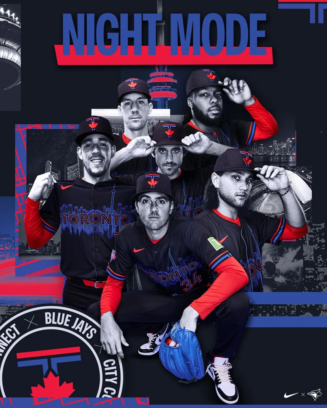
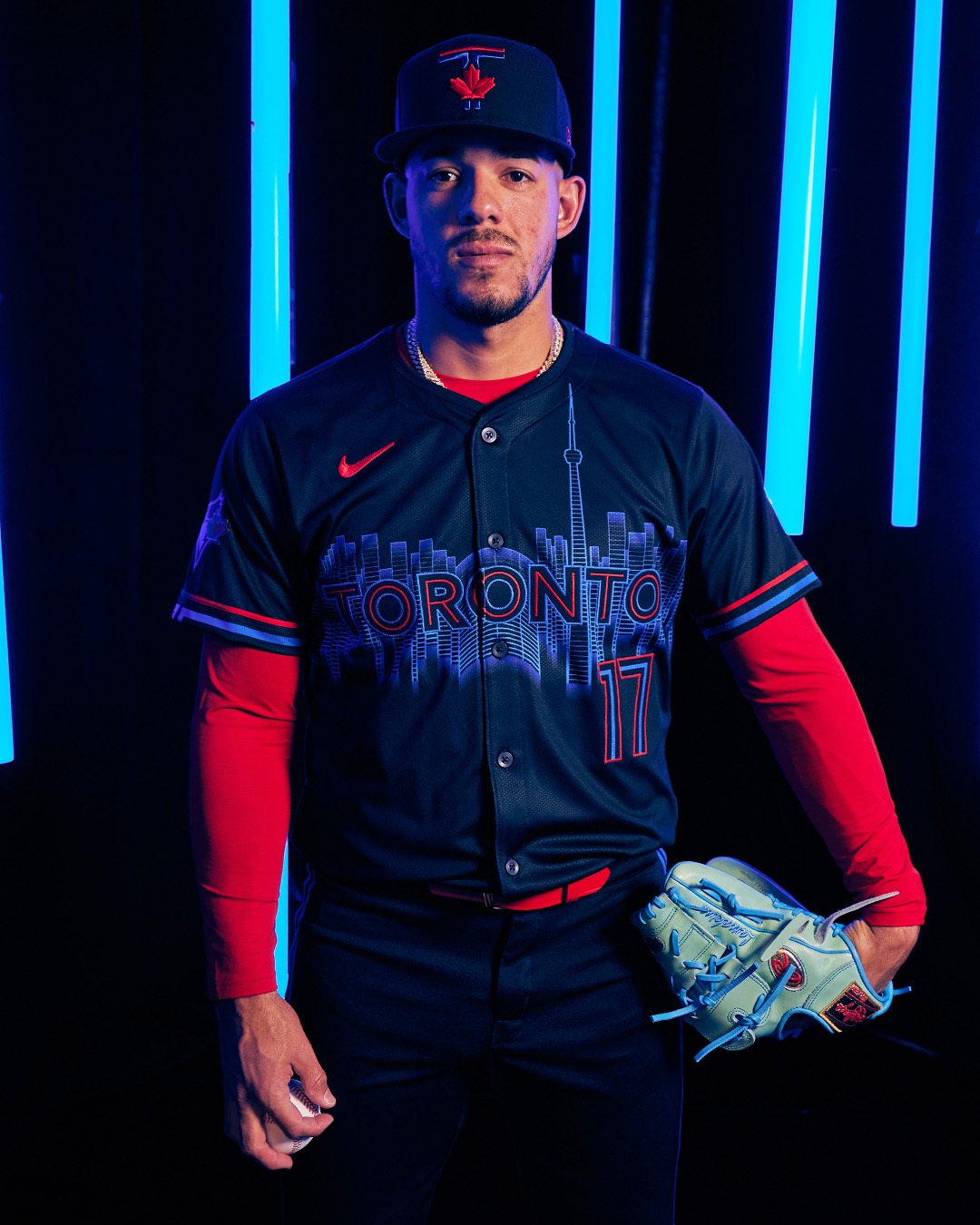
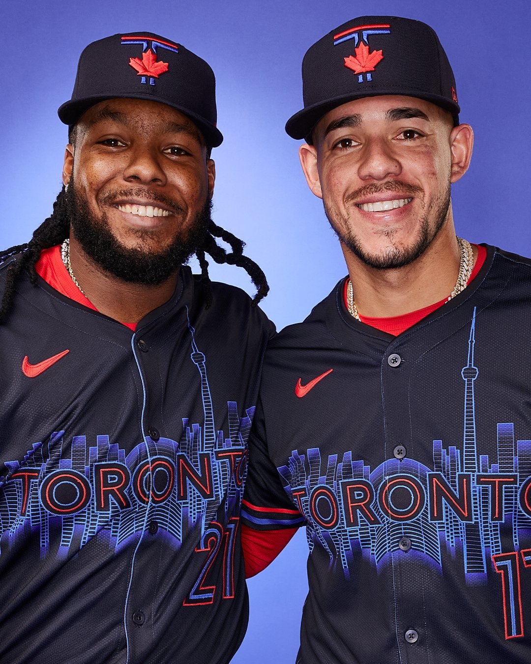
The Toronto Blue Jays are embracing the city's vibrant nightlife with their new "Night Mode" City Connect uniform. “The Blue Jays are at the core of the city, and those who call Toronto home know how the city comes alive at night," said Marnie Starkman, the Blue Jays’ executive vice president of business operations. "Our new City Connect uniform aims to emulate that ‘Night Mode’ feeling in the vibrant colours, the rhythmic skyline reflecting off the lake, and all the distinct details that make our city so dynamic."
With a darker blue base, complemented by pops of brighter blue and red, the new uniforms outline the Toronto skyline across the chest. This marks the first dark base for a Blue Jays jersey since 2011. The team has dubbed this color “pitch blue,” inspired by the reflection of Lake Ontario at night. The design is further enhanced with “hyper royal blue” and “speed red” accents, which are also featured on the cap, showcasing a “T” that emulates the pillars of city hall atop a maple leaf.
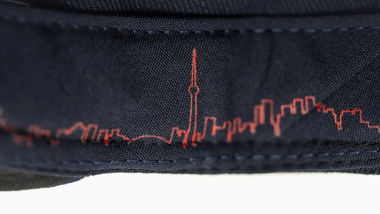
In the center of the chest, surrounded by the CN Tower and the buildings of downtown Toronto, rests Rogers Centre, a familiar sight for many Torontonians. "Toronto is a great city. It’s diverse. But Toronto also knows how to have fun, and a lot of that happens after hours,” said Blue Jays legend José Bautista, who was in town for the release. “There are definitely a lot of different options in the nightlife around the city. It’s good to live in a place where, if you choose to and you want to partake, you have plenty of options. Toronto does know how to have fun, and we experienced a little bit of that when we were here.”
The uniforms also feature some hidden details. Inside the cap, the Toronto skyline is depicted as a rhythmic heartbeat. Inside the collar of the jersey, where you’d find the tag on a shirt, it reads “Diversity is Our Strength,” a phrase from Toronto’s coat of arms.
Fans can look forward to seeing the new "Night Mode" uniforms during night games throughout the season. This decision keeps in line with the theme, highlighting the vibrant nightlife that inspired the design.
The Blue Jays’ new City Connect uniforms not only represent a bold fashion statement but also capture the essence of Toronto’s dynamic and diverse culture. Fans eagerly await to see their team shine under the night lights in these vibrant new kits.
— Nashville Sounds (@nashvillesounds) May 28, 2024
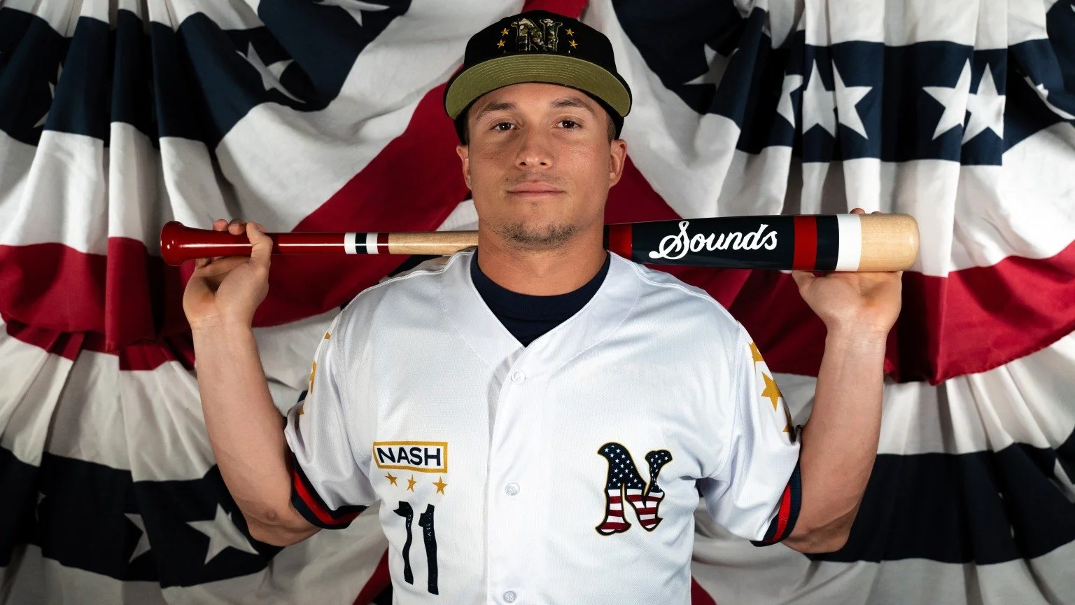
The Nashville Sounds announced that they will don specialty military jerseys for Military Appreciation Night on Thursday, June 6, and again on Friday, July 5, as part of the team’s Independence Day Weekend celebration. These game-worn jerseys will be auctioned off, with proceeds benefitting The Charlie and Hazel Daniels Veterans and Military Family Center at Middle Tennessee State University (MTSU).
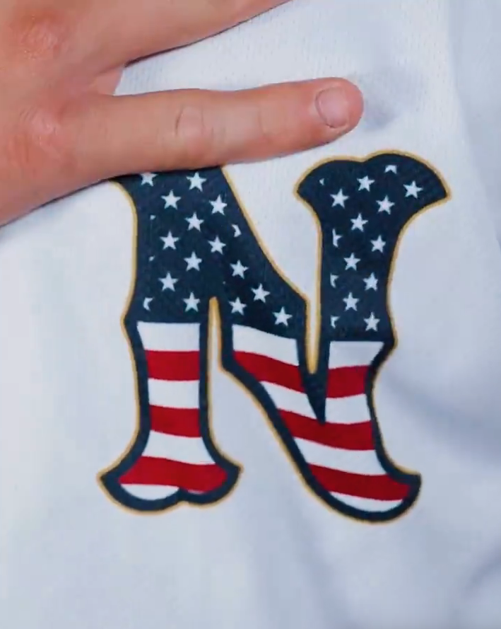
The special jerseys are rich with symbolic design elements that honor the service and sacrifice of military personnel. The Nashville ‘N’ logo, placed over the heart, is emblazoned with the American flag, representing the love for one’s country that is central to all who serve. Gold accents around the logo mirror the gold trim found in military service uniforms, adding a touch of elegance and reverence.
A distinctive "NASH" nameplate is positioned over the right chest, mimicking the nameplates on military service uniforms. This nameplate includes all who served in the Middle Tennessee area, providing a localized tribute to veterans and active-duty service members.
Each sleeve of the jersey features three gold stars, totaling six stars to represent the six branches of the United States Military: Army, Navy, Air Force, Marine Corps, Coast Guard, and Space Force. The three stars on each sleeve also pay homage to retired Army Lieutenant General Keith M. Huber’s rank. General Huber, who serves as senior advisor for veterans and leadership initiatives at MTSU, has been a key figure in supporting veteran services at the university.
“The Daniels Center is tremendously grateful for our partnership with the Nashville Sounds in support of our continuous efforts to serve all Veterans concerning their earned VA benefits as well as military-connected students and families through a variety of services to help them succeed both academically, professionally, and personally,” said General Huber. “And I’m deeply appreciative of the Sounds’ recognition of the military service of our Veterans through these commemorative jerseys.”
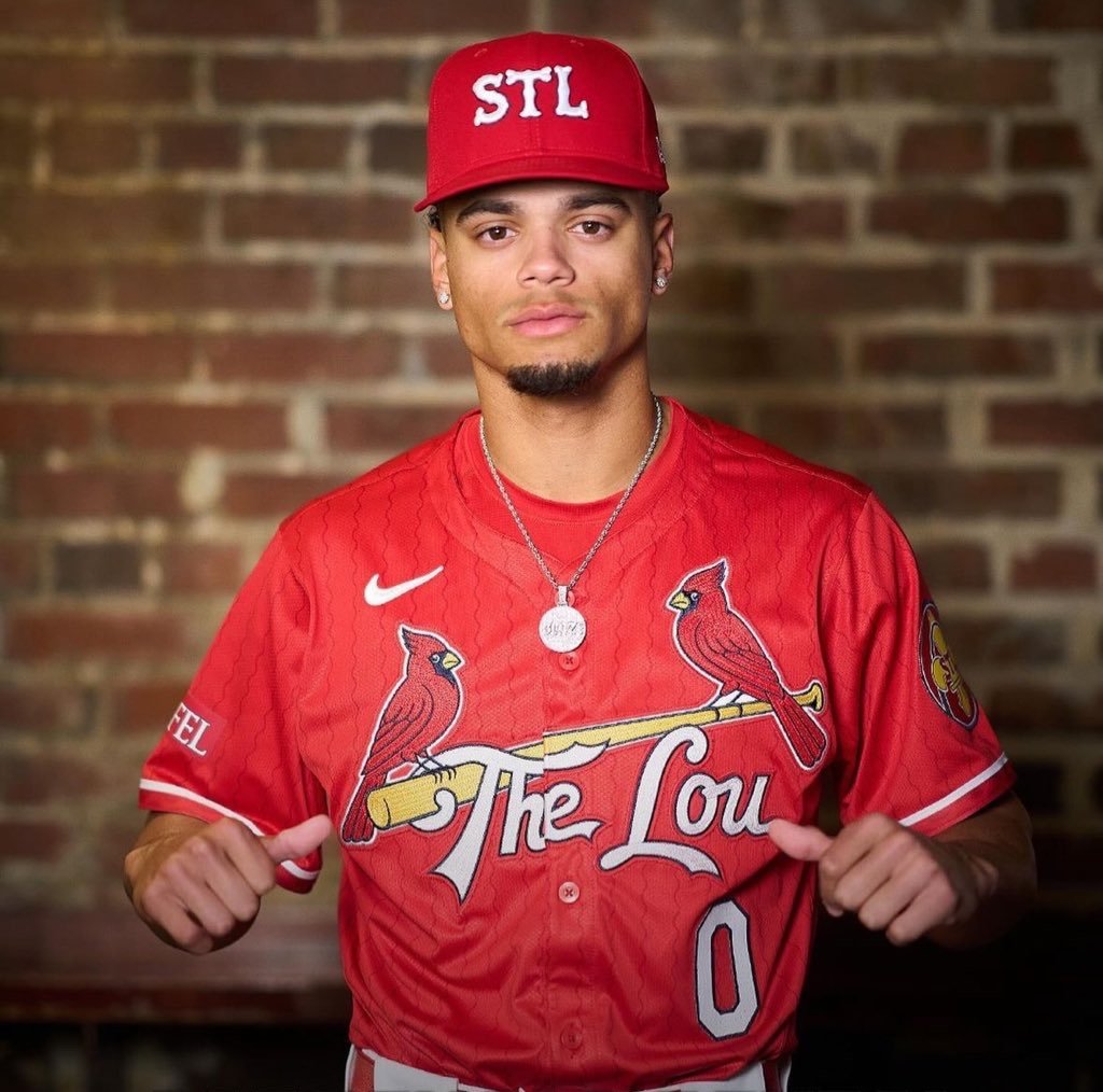
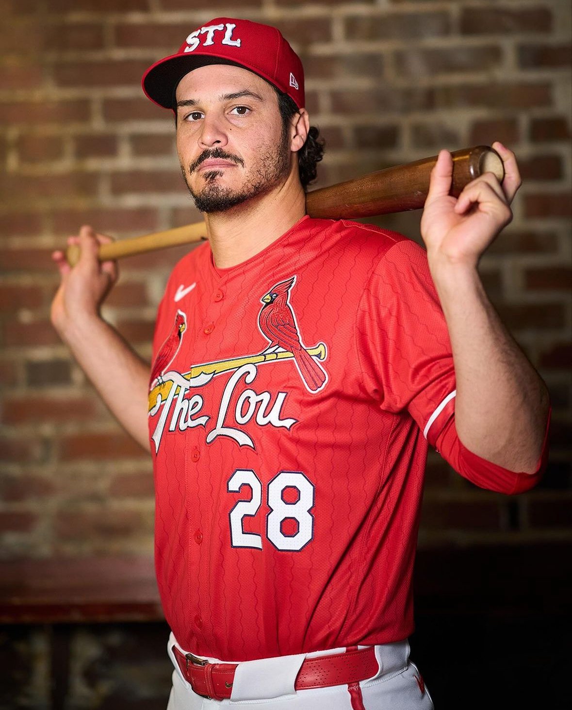
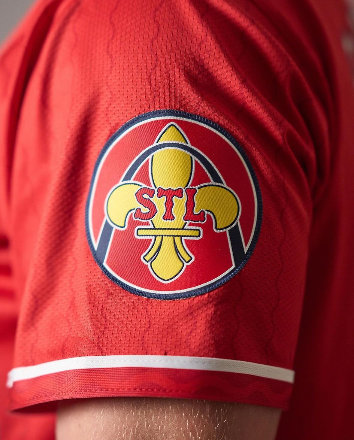
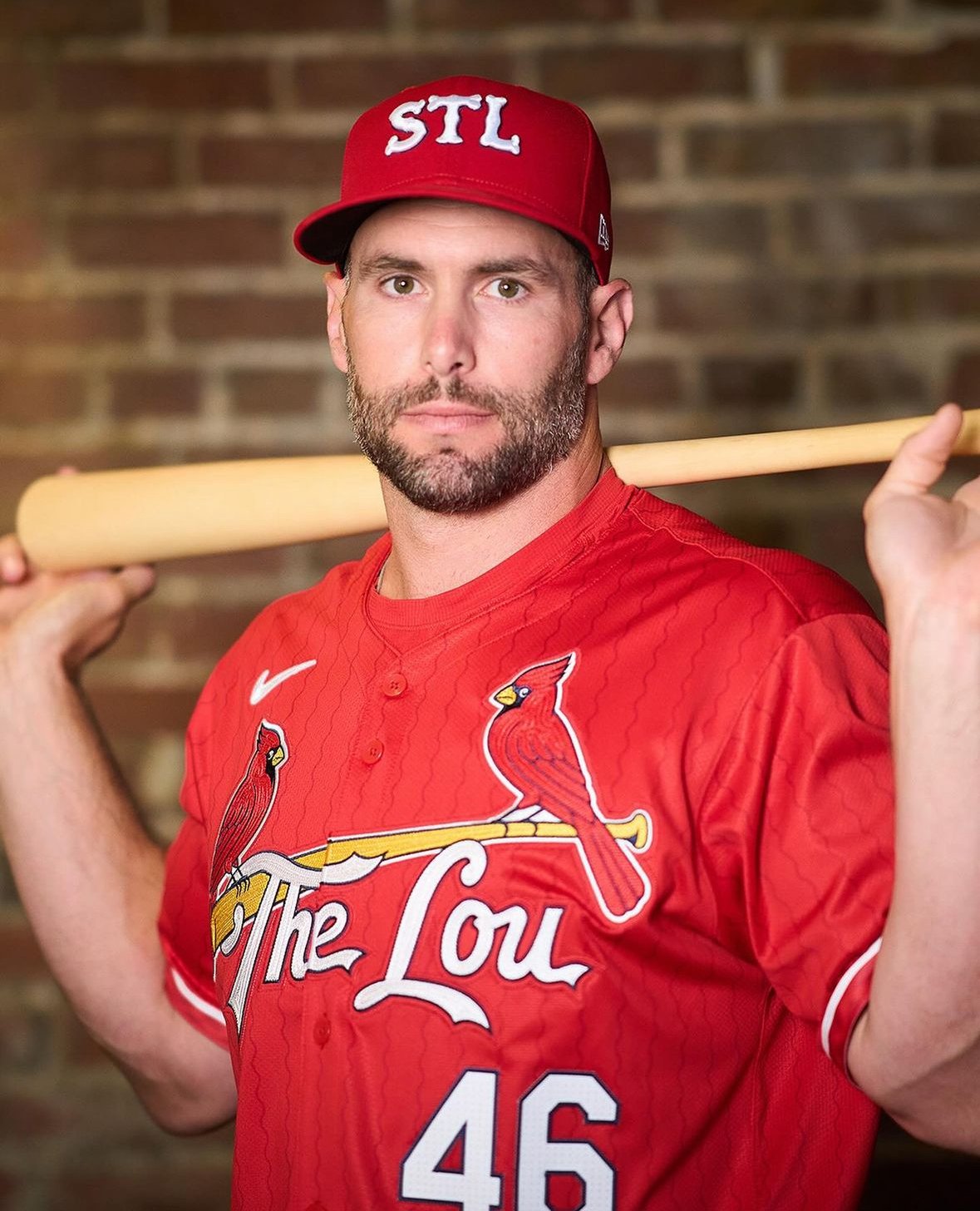
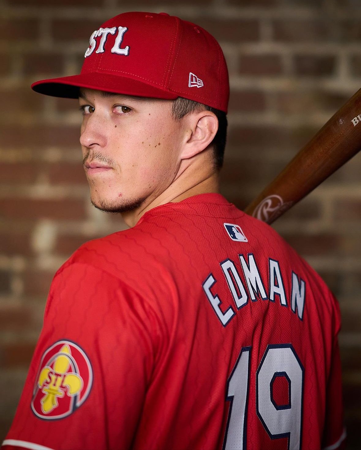
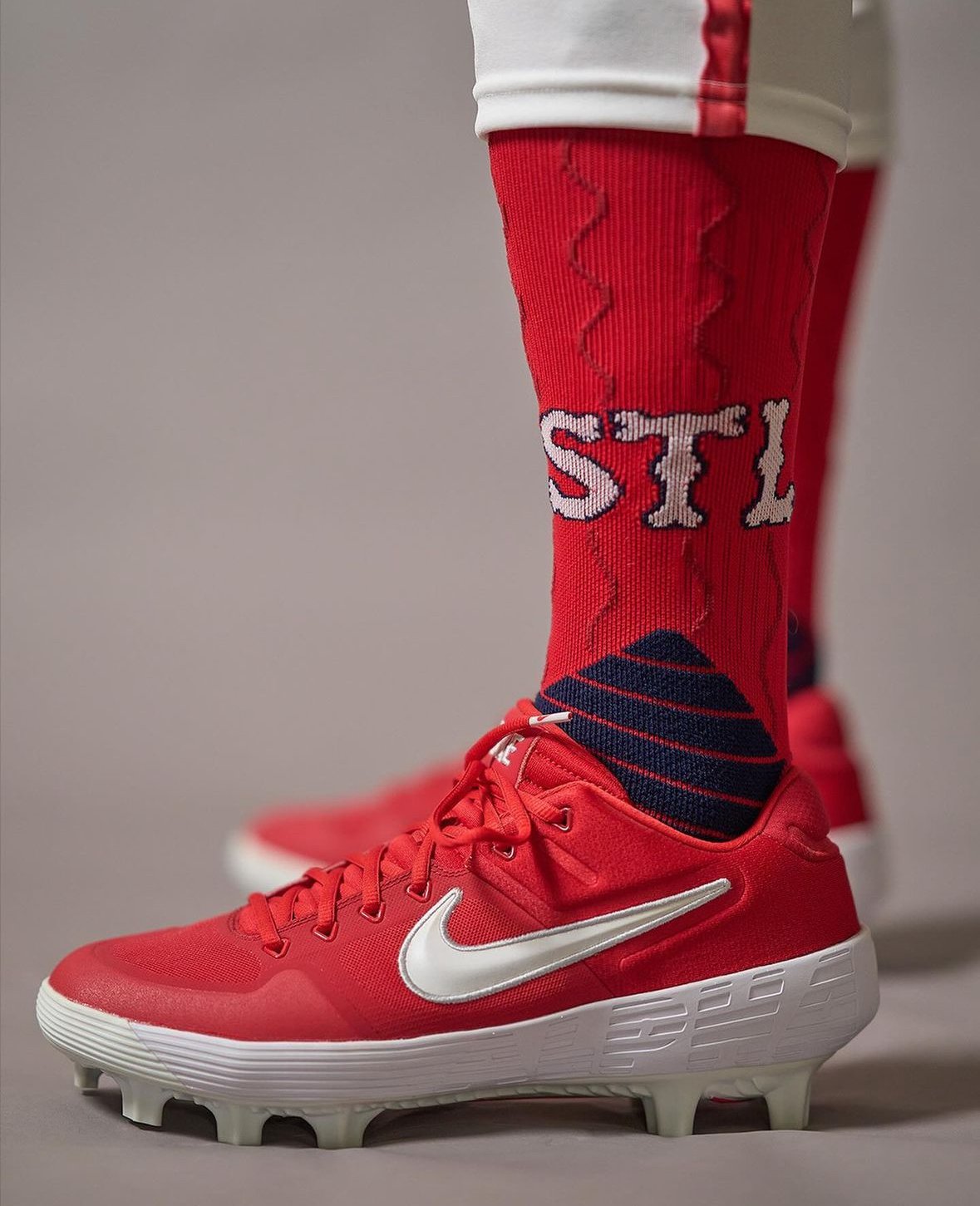
In a groundbreaking move steeped in history and homage, the St. Louis Cardinals have unveiled their much-anticipated City Connect uniform. A collaboration with Nike, over two years in the making, has birthed a bold design that encapsulates the essence of St. Louis while honoring the Cardinals' legendary legacy.
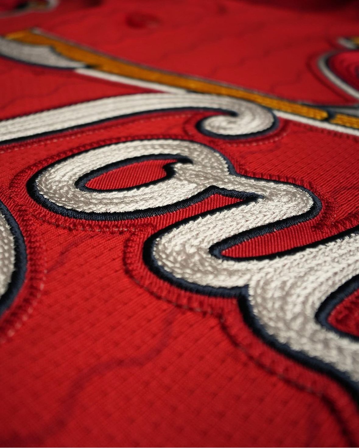
The centerpiece of the uniform remains the iconic "birds on the bat" logo, a symbol revered by Cardinals fans worldwide. However, the addition of the nickname "The Lou" emblazoned across the chest pays tribute to St. Louis native and rap legend, Nelly, immortalizing his love for his hometown in Cardinals lore.
Diving deeper into the design, wavy red pinstripes adorning the jerseys pay homage to the mighty Mississippi River, a symbol deeply intertwined with St. Louis' identity. These intricate details, coupled with a nod to the franchise's pre-birds-on-the-bat era through font choices, create a rich tapestry of history and innovation.
For Cardinals President Bill DeWitt III, the journey towards the City Connect uniform was both challenging and rewarding. "The iconography of Cardinals baseball and its history is endless," DeWitt remarked, emphasizing the meticulous process of distilling St. Louis' rich heritage into a singular design.
The Cardinals' decision to don red jerseys marks a significant departure from tradition, yet it's a move that resonates deeply with the team's ethos. While red has been reserved for Spring Training and batting practice, it now takes center stage in homage to the vibrant spirit of St. Louis.
The unveiling of the City Connect uniform represents more than just a sartorial choice; it's a celebration of community and collaboration. Launch parties and merchandise releases serve as beacons of excitement, bringing fans closer to the heart of the Cardinals' legacy.
Ultimately, the Cardinals' City Connect uniform stands as a testament to the enduring bond between team and city. As Nelly's resonant voice echoes through the halls of Busch Stadium, it's a reminder that some stories are timeless, and some connections are unbreakable.
— Indianapolis Indians (@indyindians) May 17, 2024
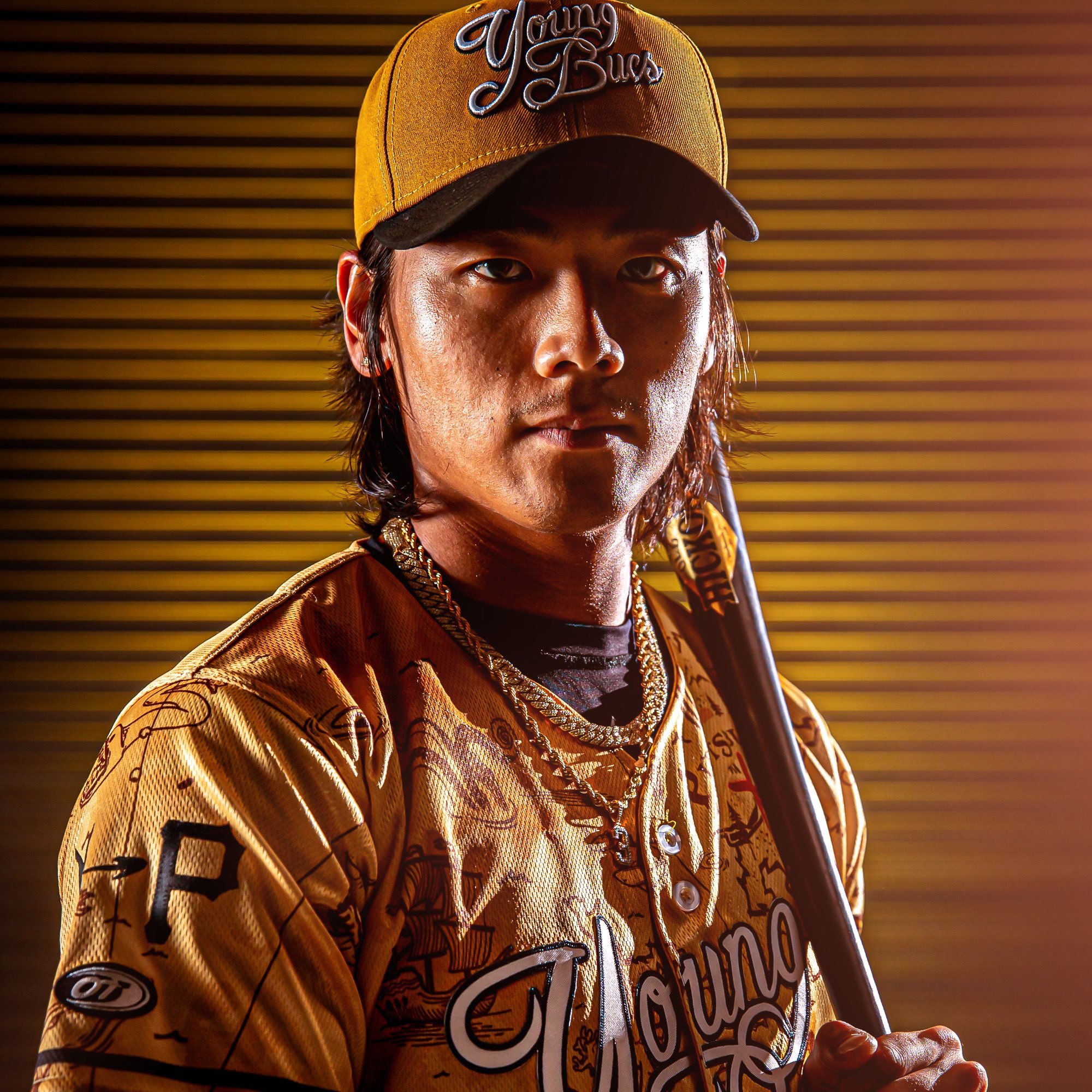
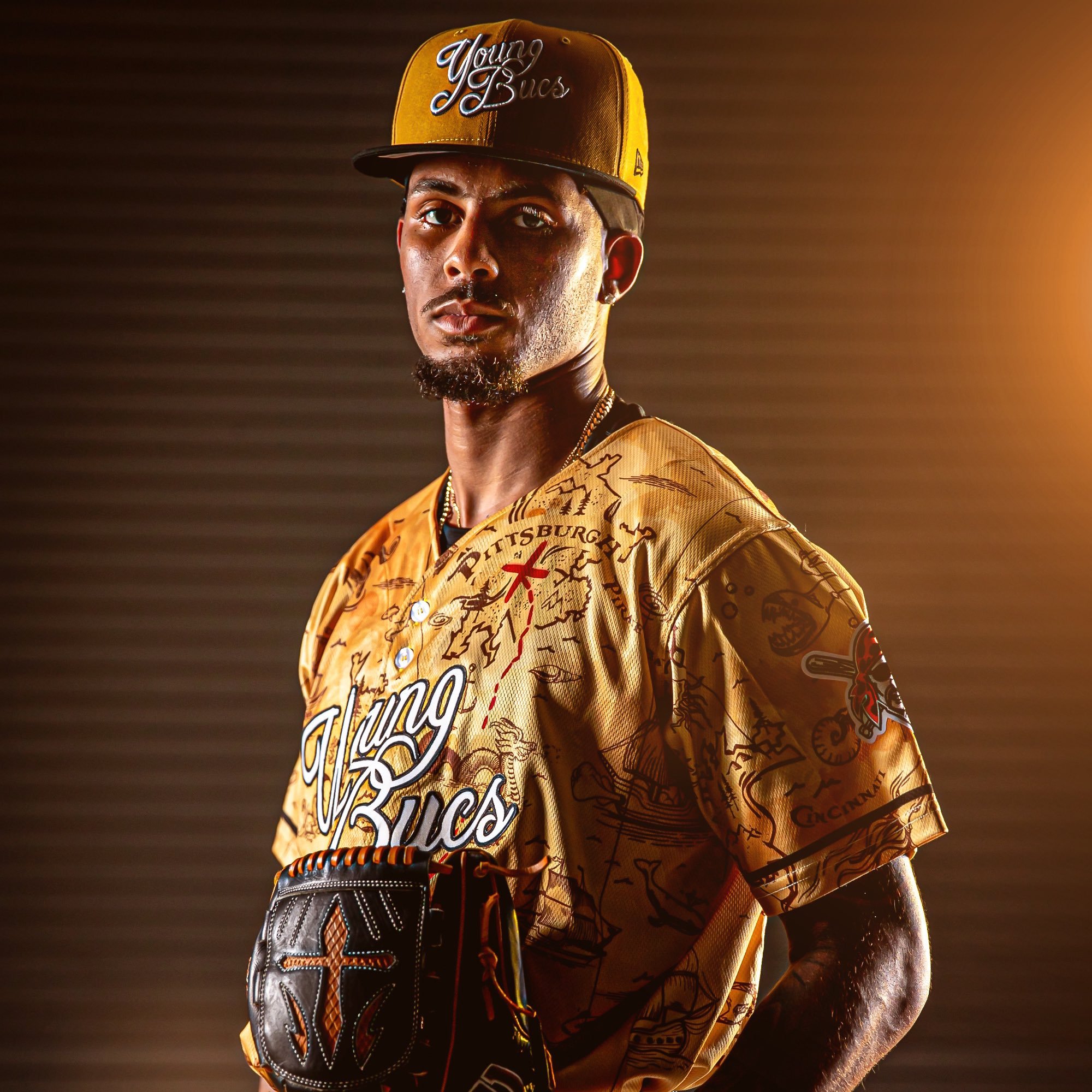
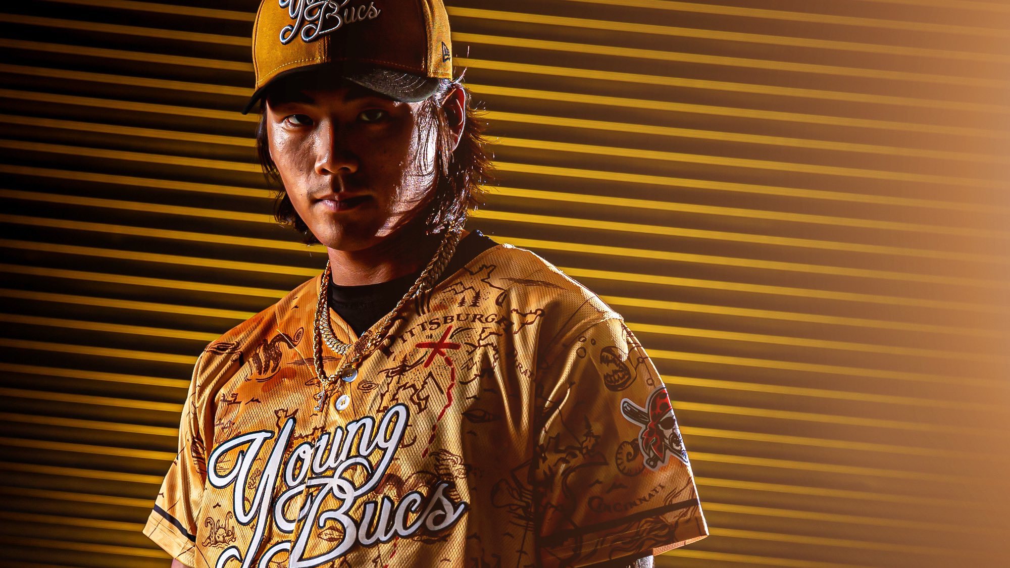
In a heartfelt tribute to their longstanding parent club, the Pittsburgh Pirates, the Triple-A Indianapolis Indians are set to don specialty "Young Bucs" jerseys and caps for select games this season. These unique uniforms will be showcased during Prospects Weekends in May and June, serving as a symbolic nod to the shared history and camaraderie between the two teams.
The Pittsburgh Pirates, affectionately known as the Bucs or Buccos, have a rich legacy steeped in the lore of pirates and adventure. The nickname "Young Buc" offers a playful twist on the term "Young Buck," signifying not only youthful vigor but also a spirit of exploration and daring. It's a fitting homage to both the Pirates' legacy and the vibrant energy of the players donning these special uniforms.
Adorned in striking yellow and black hues, the Young Bucs jerseys boast a captivating pirate map design that stretches across the fabric. Each detail tells a story, with intricate lines and markings tracing the paths of seafaring voyages. A bold red line leads the way to Pittsburgh, where an X marks the spot, symbolizing the goal of each players baseball journey.
Emblazoned proudly across the chest, the script "Young Bucs" serves as a rallying cry for players and fans alike. It's a declaration of unity and pride, encapsulating the spirit of adventure and camaraderie that defines both the Pirates and the Indianapolis Indians.
The front of the hats also features the distinctive Young Bucs logo, ensuring that every player is a part of this tribute to Pittsburgh's beloved baseball legacy. As the Indians take to the field in these special uniforms, they not only honor their parent club but also celebrate the enduring bonds of sportsmanship and tradition that unite baseball communities across the country.
— Cleveland Guardians (@CleGuardians) May 13, 2024
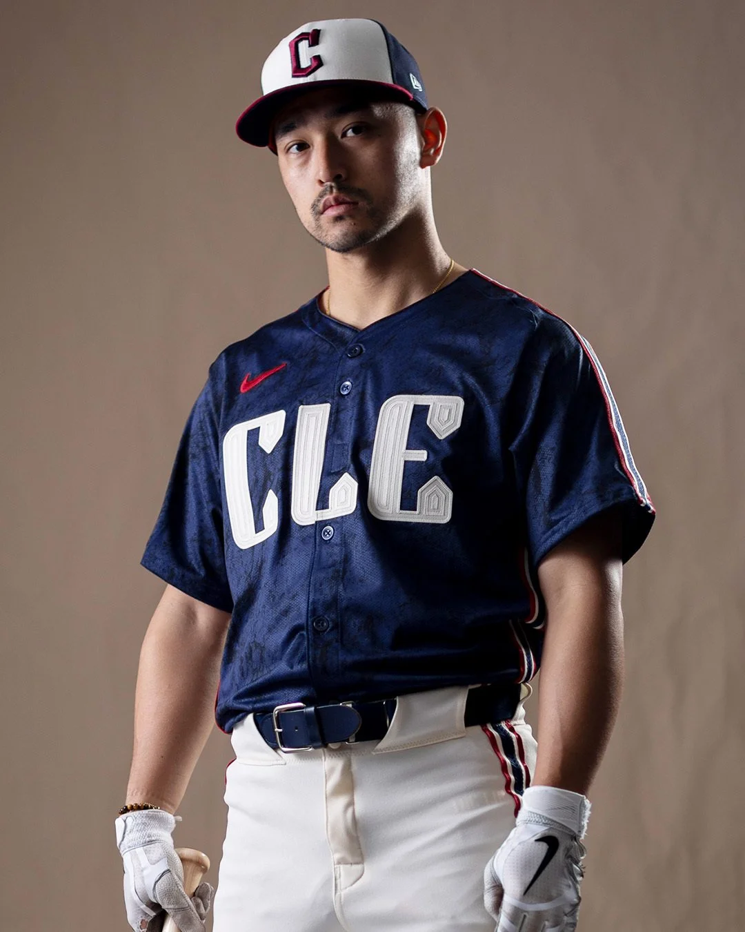
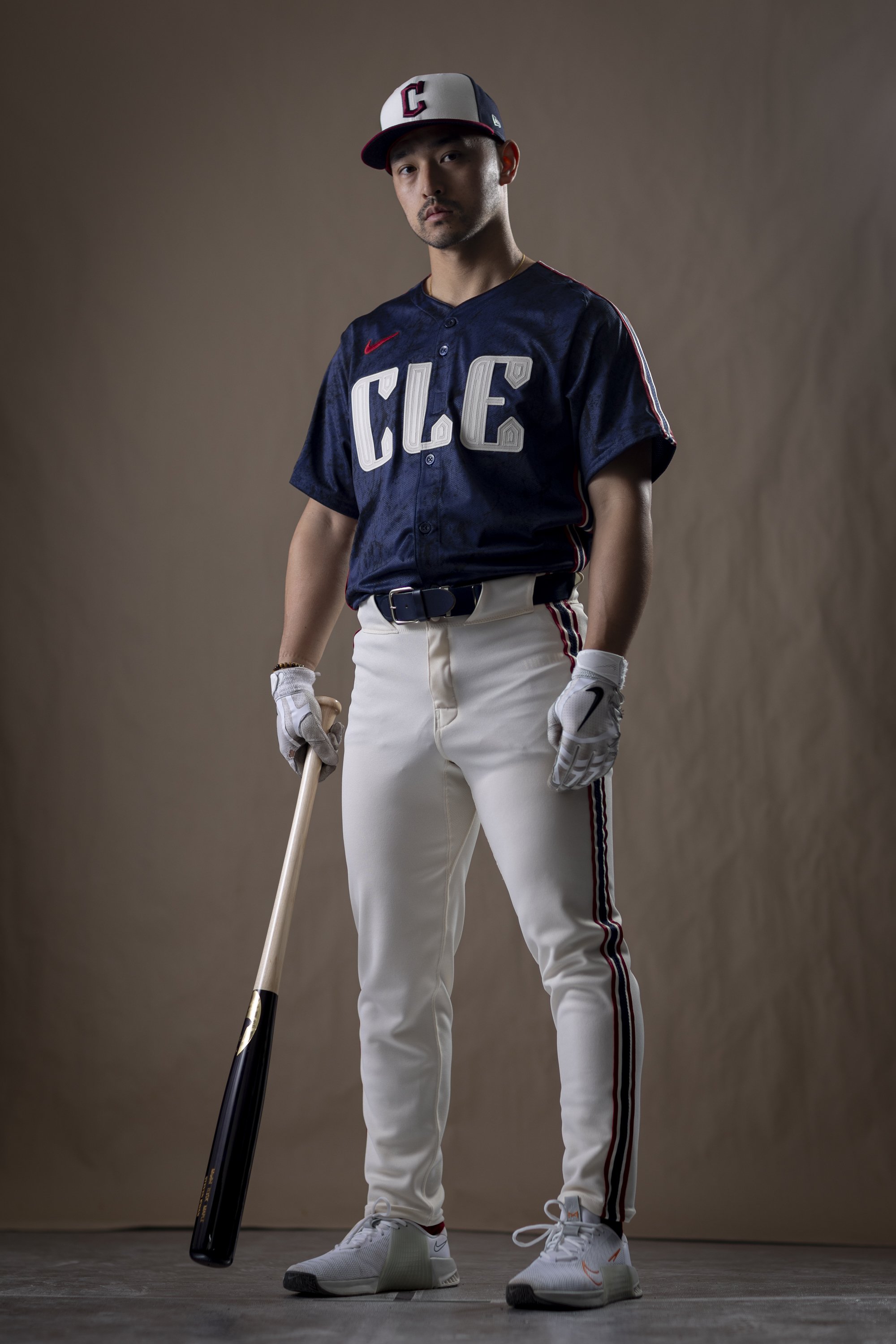
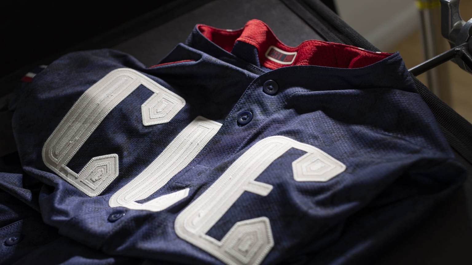
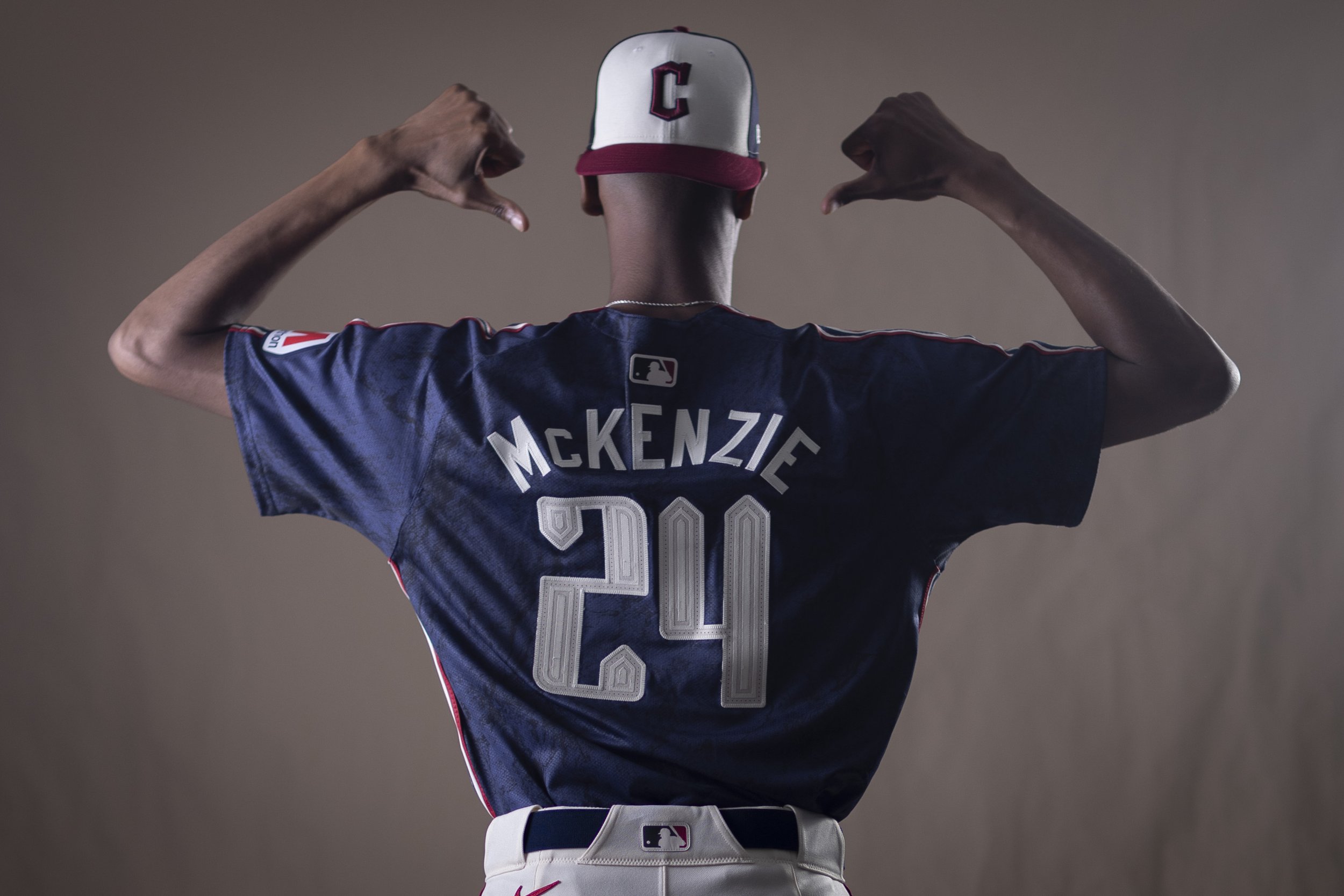
The Cleveland Guardians have delved deep into the city's rich history to craft the latest City Connect uniforms, paying homage to The Land's cultural heritage and spirit. The unveiling of these striking new threads has sparked excitement among players and fans alike, marking a significant moment in the franchise's evolution.
Josh Naylor's enthusiastic response upon seeing the new uniforms epitomizes the sentiment within the Guardians' clubhouse. His eagerness to don the City Connect uniforms for every home game speaks volumes about the team's admiration for the design.
The Guardians will make their on-field debut in their new uniforms against the Twins, showcasing the vibrant red and blue hues that pay homage to the club's storied history. The design concept draws inspiration from the iconic Guardians of Traffic statues on the Hope Memorial Bridge, serving as a poignant tribute to the city's identity.
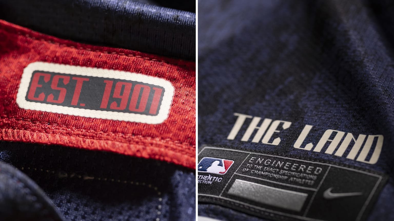
With simplicity and modern flair in mind, the Guardians have crafted a design that captures the essence of Cleveland. The prominent "CLE" across the chest symbolizes the city's pride, while the sandstone color of the jerseys and pants is a nod to the Berea sandstone that shaped the bridge pillars over 90 years ago. The inclusion of "EST 1901" on the collar honors the organization's founding year, while "THE LAND" emblazoned above the waistband tag reinforces Cleveland's beloved nickname.
Every detail of the uniform tells a story, from the art-deco-style font reminiscent of the Guardians of Traffic pylons to the intricate braiding inspired by the early 1990s teams. Even the socks bear sketches of the Guardian statues, serving as a constant reminder of the franchise's enduring legacy.
The journey to create these uniforms began in December 2021, with meticulous attention to detail guiding every step of the design process. Now, as the Guardians join the prestigious ranks of the 2024 City Connect series, they stand alongside other esteemed franchises in celebrating their city's heritage.
As these uniforms become a fixture of Friday home games and possibly more, they symbolize not only the Guardians' commitment to their roots but also their dedication to forging a bright future for Cleveland baseball. With each game, players and fans alike will proudly wear the colors of The Land, united in their love for the game and the city they call home.
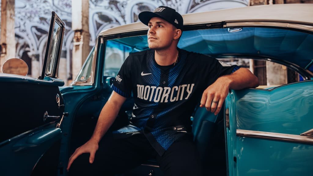
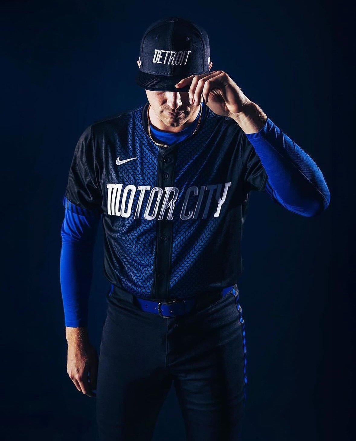
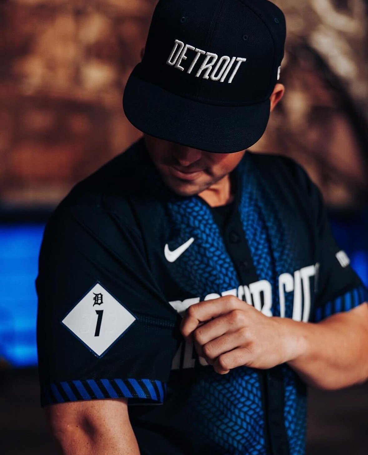
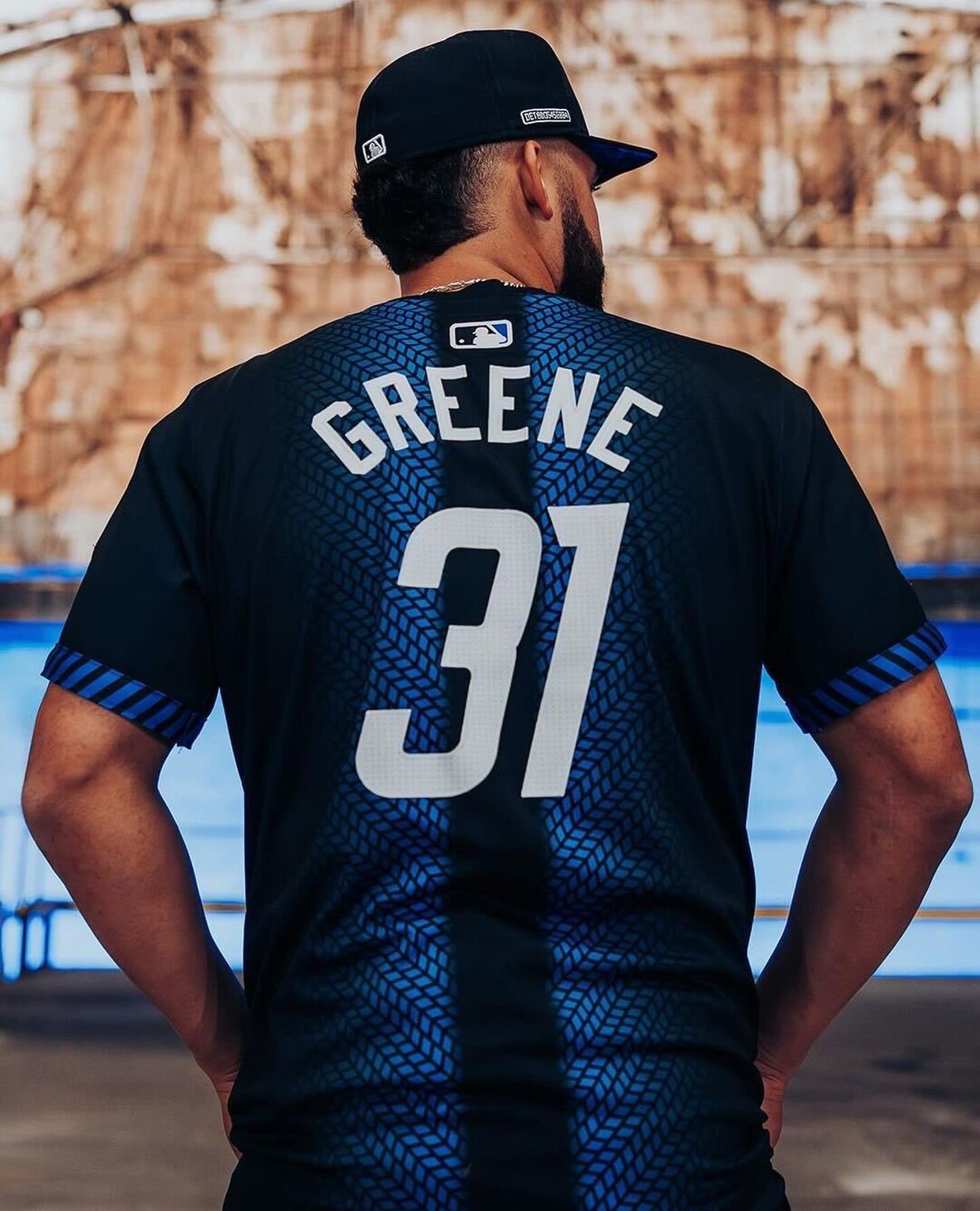
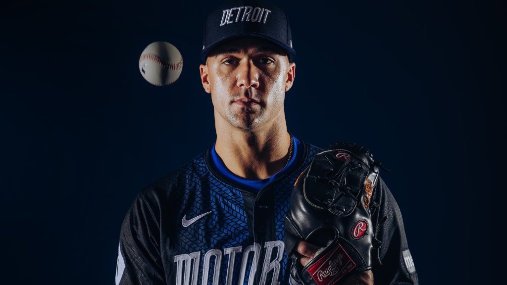
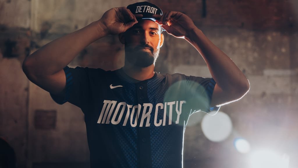
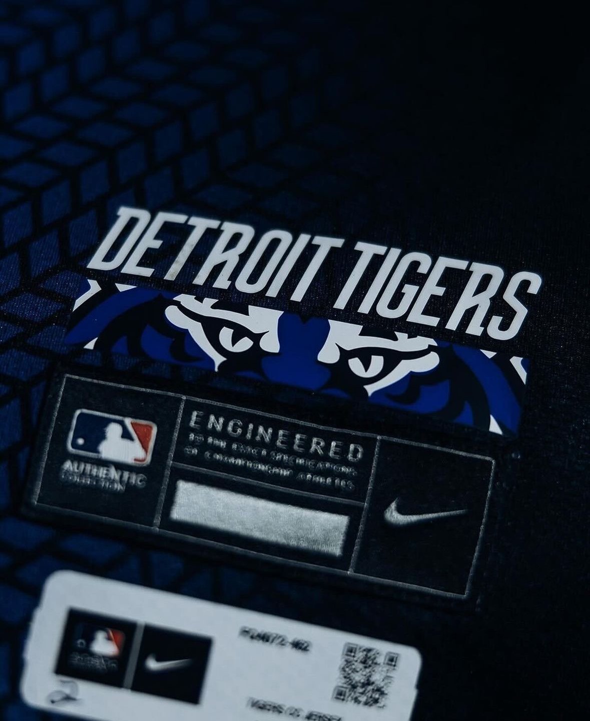
For decades, the Detroit Tigers stood firm amidst baseball's jersey revolution, donning their timeless home whites and road grays, proudly emblazoned with the iconic Olde English D. However, their recent leap into baseball's City Connect series signifies not only a tribute to Detroit's storied past but also a bold nod to the city's promising future.
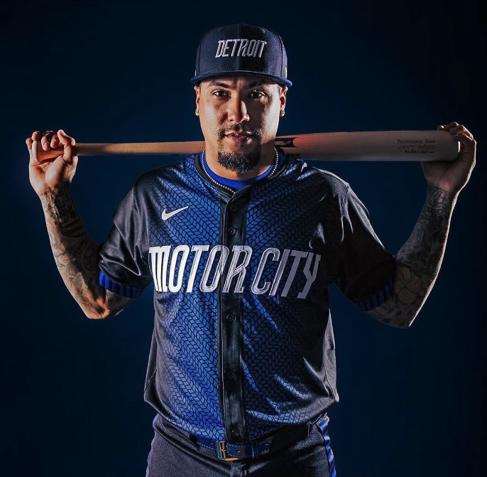
Unveiled Monday morning, the Tigers' interpretation of the Motor City theme represents a seamless fusion of tradition and innovation. Departing from their classic palette, the new uniforms, meticulously crafted over a year-long design process, feature a striking combination of dark navy and electric blue hues. But make no mistake, while these uniforms usher in a new era, they remain deeply rooted in the heritage of one of the American League's founding franchises.
With a shoulder patch paying homage to both the legendary Woodward Avenue and the iconic 313 area code, each element of the uniform resonates with the essence of the city.
Ryan Gustafson, President, and CEO of Ilitch Sports + Entertainment, encapsulated the sentiment, stating, "The City Connect uniforms represent Detroit’s unique combination of muscle and innovation and pay homage to the city that put the world on wheels."
Drawing parallels to the Astros' Space City jerseys, the Tigers' City Connects proudly display their hometown moniker on the front. The incorporation of a vibrant electric blue racing stripe adds a dynamic touch, mirroring the energy coursing through the city's streets. Meanwhile, the sleeve patch, featuring the iconic M-1 road sign, serves as a poignant reminder of Detroit's rich automotive legacy.
Notably, the uniform details extend beyond aesthetics, with symbolic nods to significant milestones in Tigers history. From the distinctive Vehicle Identification Number adorning the caps and batting helmets to the historic championship years immortalized on the jersey, every aspect tells a story of triumph and resilience.
Yet amidst the modernization, the traditional Tiger logo remains a steadfast presence, albeit rendered in a contemporary blue hue. From the fierce gaze of the Tiger's eyes to the subtle accents adorning the jersey, every detail is meticulously crafted to honor the team's legacy.
As the Tigers prepare to take the field in blue jerseys for the first time since 1995, the excitement is palpable. To mark the occasion, a vibrant block party outside Comerica Park awaits fans, featuring live music, local cuisine, mural artists, and a showcase of classic cars.
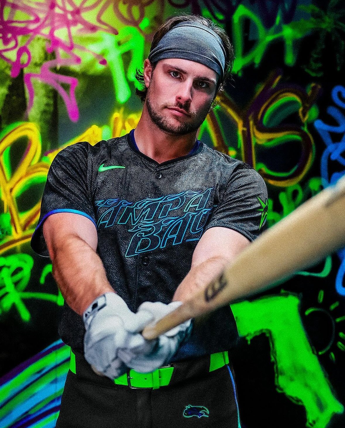
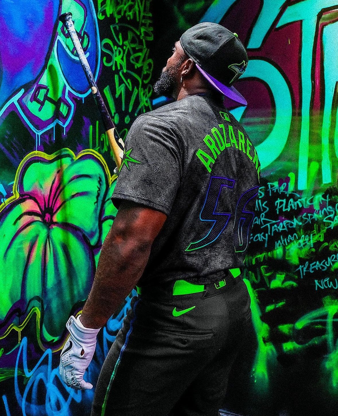
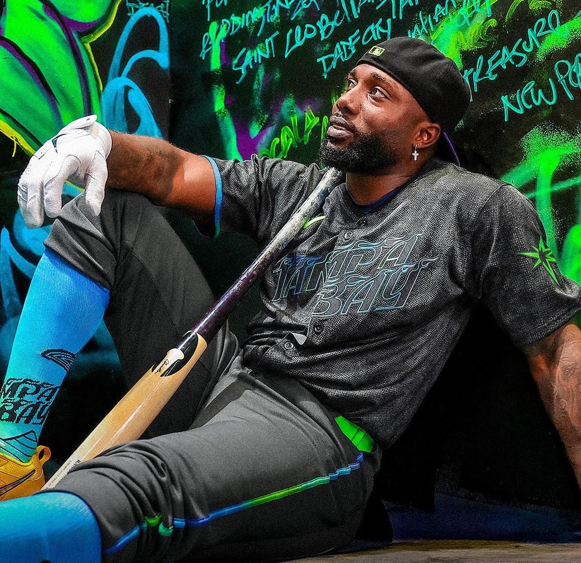
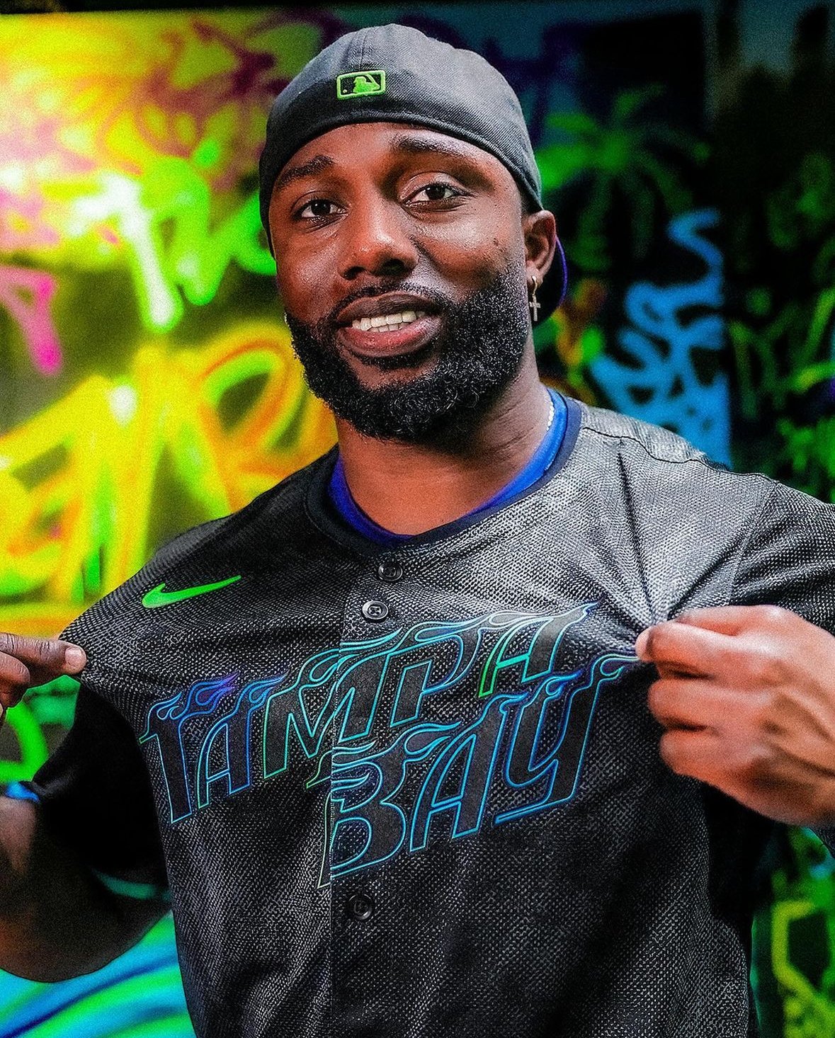
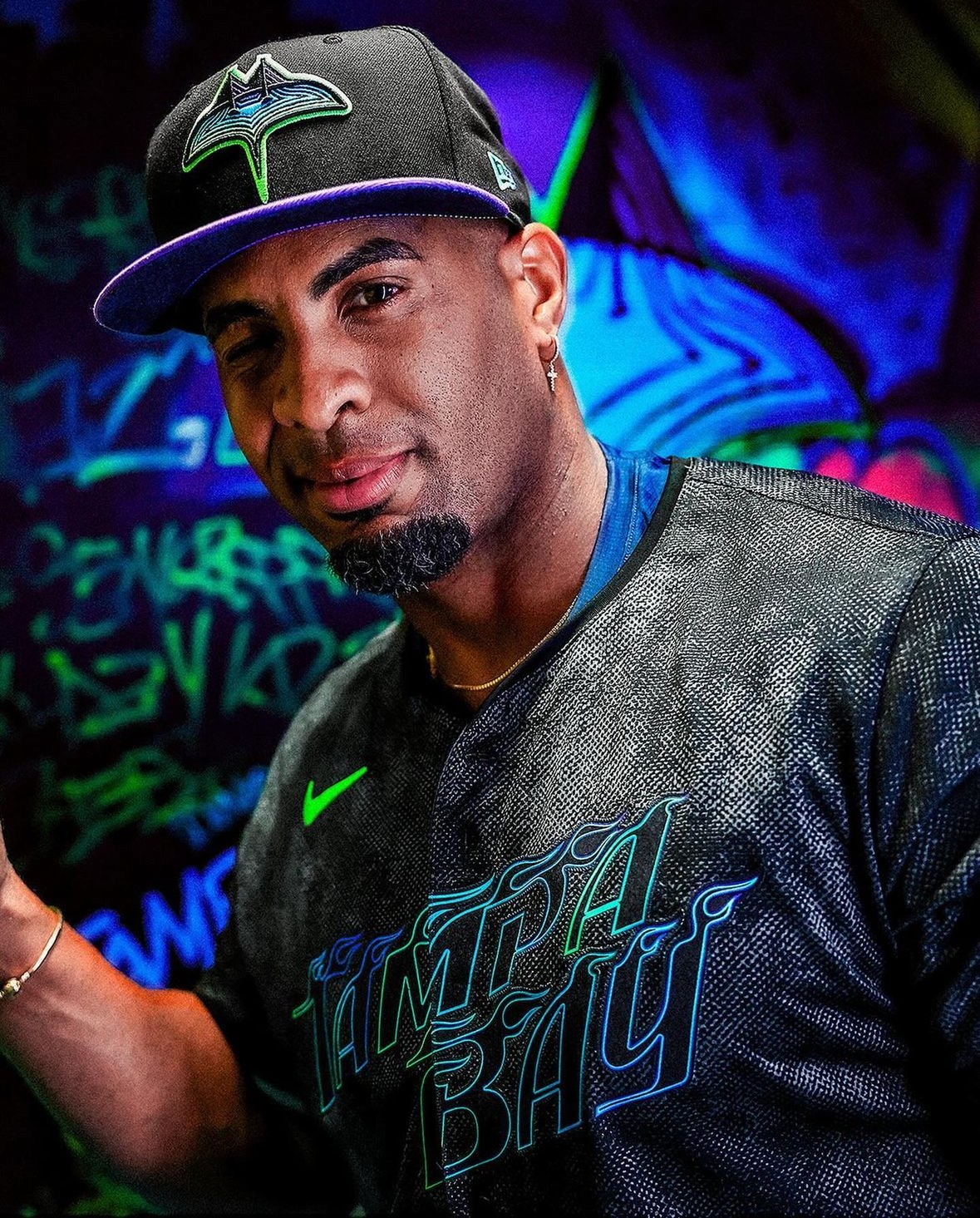
In a move that epitomizes their daring approach both on and off the field, the Tampa Bay Rays have unveiled their latest City Connect uniforms, igniting excitement among fans and fashion aficionados alike. This bold new look, pays homage to the vibrant culture and independent spirit of the Tampa Bay region, showcasing the Rays' unique identity in stunning fashion.
For the Rays, standing out has become second nature. As a small-market team that consistently defies conventional norms, they've carved out a niche as a modern example of success, all while staying true to their roots. Now, with the introduction of their City Connect uniforms, they're taking their boundary-pushing ethos to new heights.
Unlike many other teams participating in MLB's City Connect program, the Rays opted to delve beyond the obvious and explore the deeper essence of their community. Rather than focusing solely on picturesque beaches or iconic landmarks, they sought to capture the gritty, underground vibe synonymous with locales like St. Petersburg's Central Avenue and Tampa's Ybor City.
Drawing inspiration from the region's rich skateboarding culture, the Rays crafted a design that celebrates individuality and creativity. Dubbed the "Grit and Glow" uniforms, these Nike threads combine daring aesthetics with the vibrant hues of Tampa Bay's art scene and sunshine-soaked streets.
Every detail of the design reflects meticulous attention and thoughtful consideration. From the stylized flames adorning the "Tampa Bay" lettering on the jerseys to the cap logo featuring a ray melded with the Sunshine Skyway bridge, each element tells a story of Tampa Bay's eclectic charm.
Perhaps most striking is the inclusion of three palm trees and a pelican logo, paying homage to local landmarks and historical significance. The "skating ray" logo, depicting a ray on a skateboard executing a daring trick, captures the essence of the team's fearless spirit.
But it's not just about aesthetics—the uniforms are designed to evoke the weathered, sun-faded feel familiar to Gulf Coast residents. Even the smallest details, like the skateboarding grip tape texture on the cap bill and jersey lettering, contribute to the overall narrative of resilience and authenticity.
With their asymmetrical gradient accents and bold color scheme, the City Connect uniforms symbolize the Rays' commitment to doing things differently. It's a fitting tribute to a team that thrives on innovation and isn't afraid to challenge the status quo.
As the Rays take the field in their "Grit and Glow" uniforms, they're not just making a fashion statement—they're celebrating the vibrant spirit of Tampa Bay and inviting fans to join them on a journey of creativity, courage, and unwavering determination.
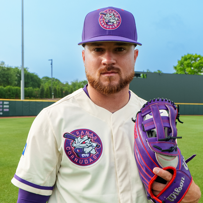
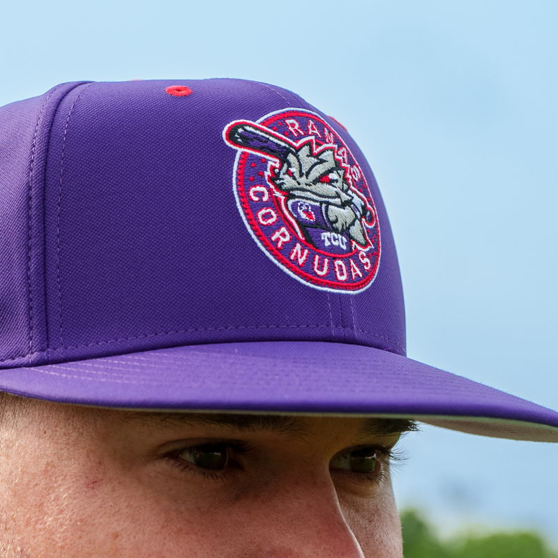
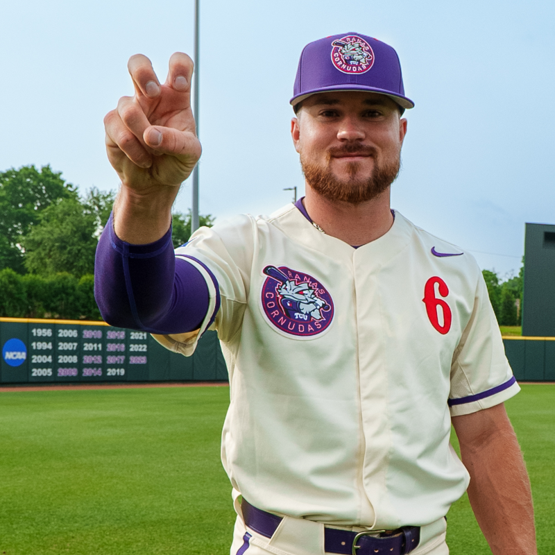
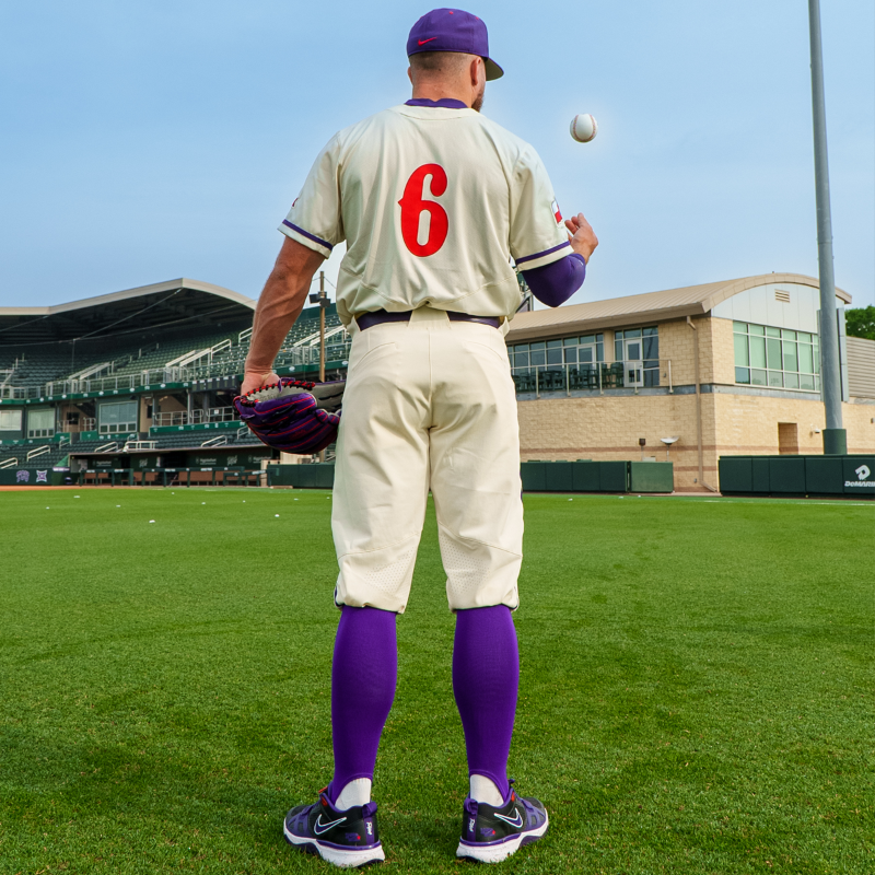
In a colorful display of unity and culture, TCU Baseball is set to wear special Ranas Cornudas jerseys during Sunday's game against Kansas State. Designed by Nike and inspired by Minor League Baseball's Copa de La Diversión initiative, these vibrant jerseys pay homage to the rich tapestry of Latin American heritage.
The genesis of the Ranas Cornudas logo stems from a collaboration between TCU's International Service Office and Nike, with the aim of celebrating diversity and inclusivity. Drawing inspiration from the native language of Spanish, which unites communities across Latin America, the concept of the frog (la rana) emerged from the iconic Lotería game.
Paloma Bermudez, Assistant Director of the International Services Office, shared insights into the creative process: "When we were brainstorming for colors and designs, we wanted colors to be inclusive to all of Latin America. Whenever you see vibrant colors of the Ranas Cornudas logo, let it be a reminder of a FIESTA, and in this FIESTA, we are celebrating the unique culture, unity, and traditions from all over Latin America."
Debuting during the 2023 campaign, the Ranas Cornudas logo quickly became synonymous with joy, community, and celebration. Its bold colors and playful design captured the essence of Latin American culture, resonating with fans far and wide.
The Ranas Cornudas jerseys serve as more than just attire for the TCU Baseball team; they represent a celebration of heritage and a tribute to the diverse Latin American communities. Each vibrant hue and intricate detail tells a story of resilience, unity, and pride.
As TCU Baseball prepares to showcase the Ranas Cornudas jerseys on Sunday, anticipation is high for a memorable game filled with excitement and camaraderie. Beyond the diamond, these jerseys symbolize the values of inclusivity, diversity, and unity that transcend borders and unite us all.