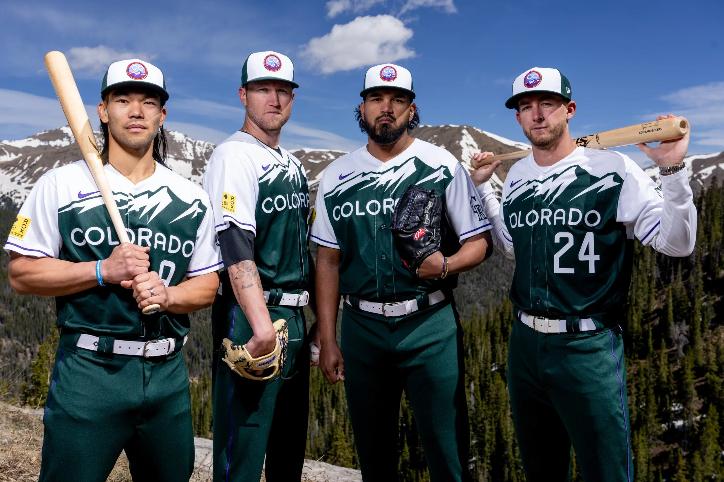
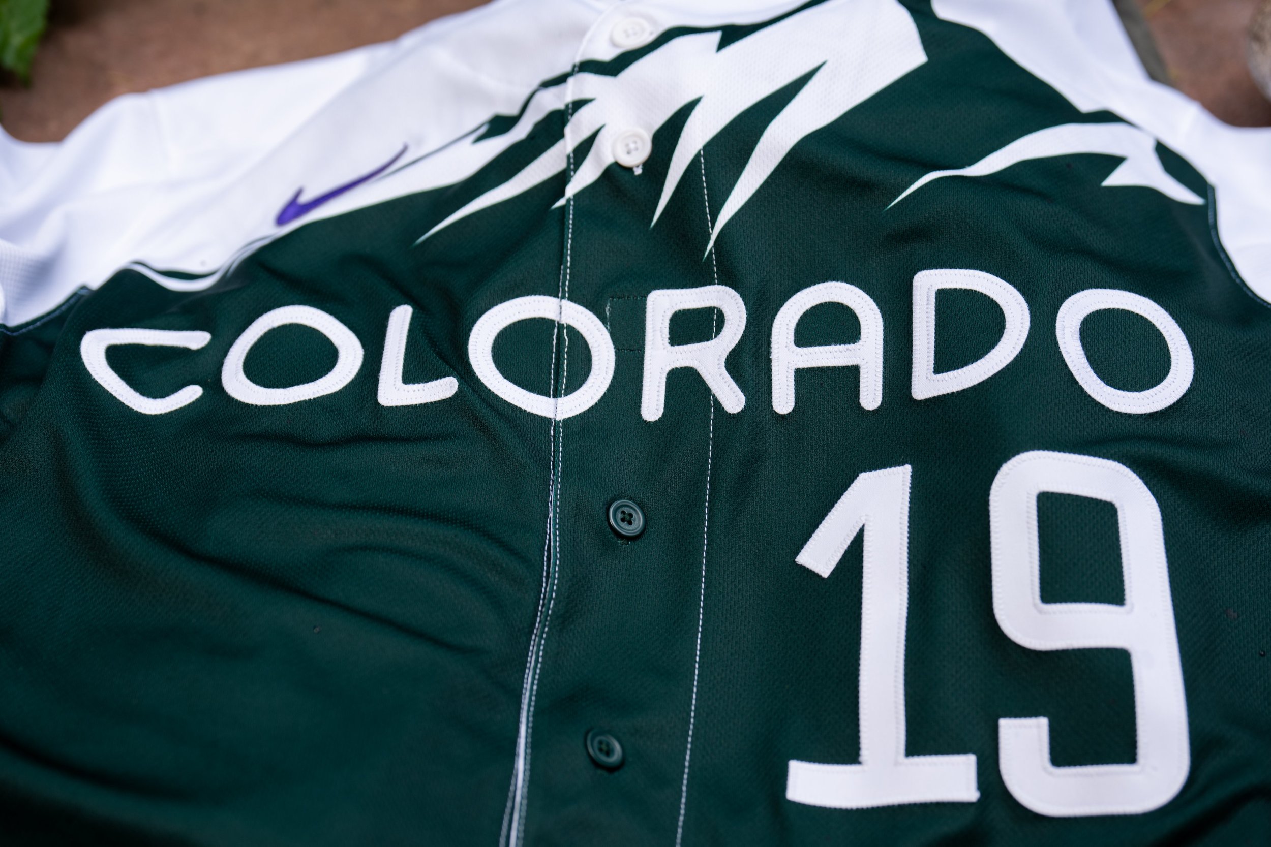
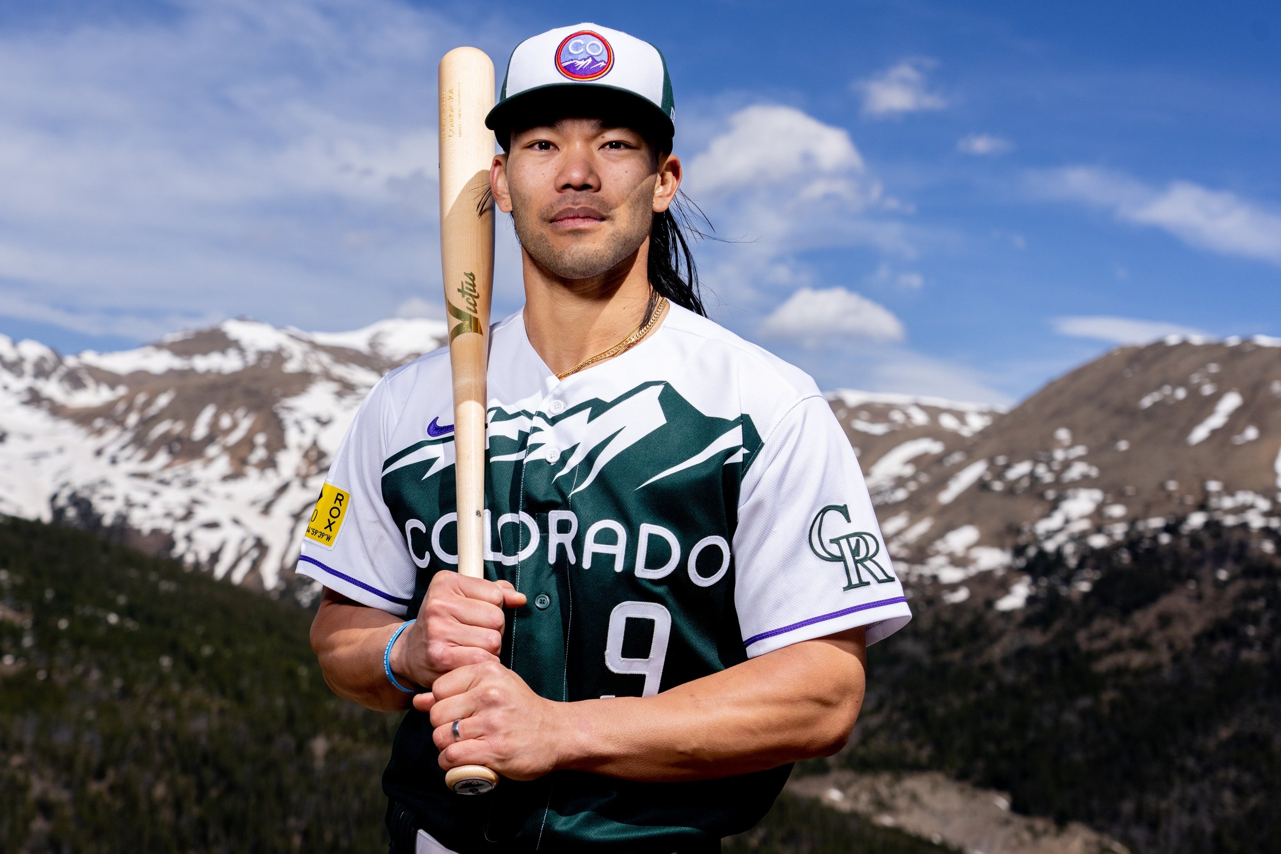
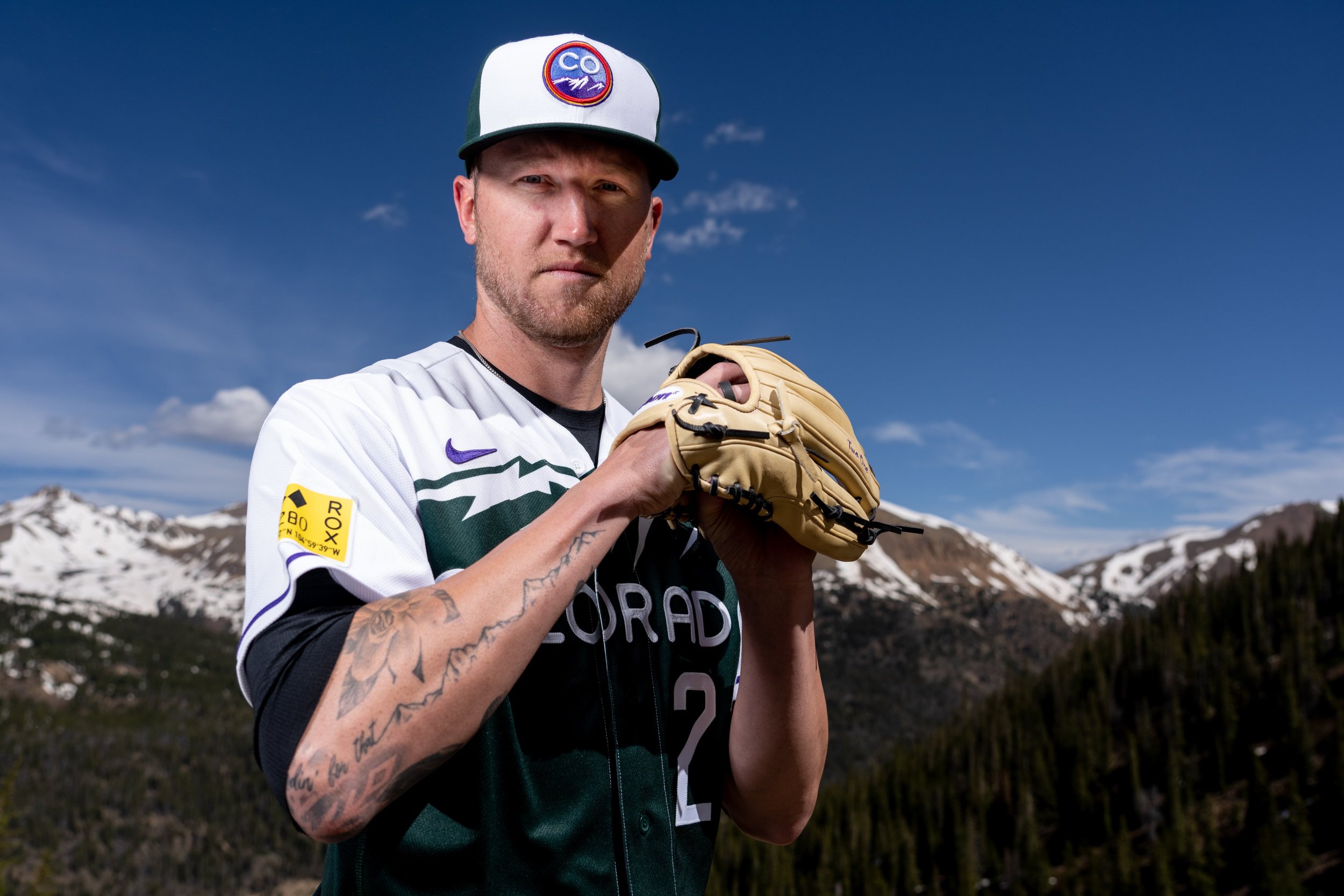
The Colorado Rockies have revealed their special City Connect uniform. The look of the uniform draws its inspiration from the Colorado license plate first introduced in 1960 with the green and white mountain range. The letters and numbers of the jersey are the same font that is used on the actual license plate. The sleeves and pants have purple trim, as well as the numbers on the back of the jersey, representing the row of purple seats at the club’s stadium which designates exactly one mile above sea level.
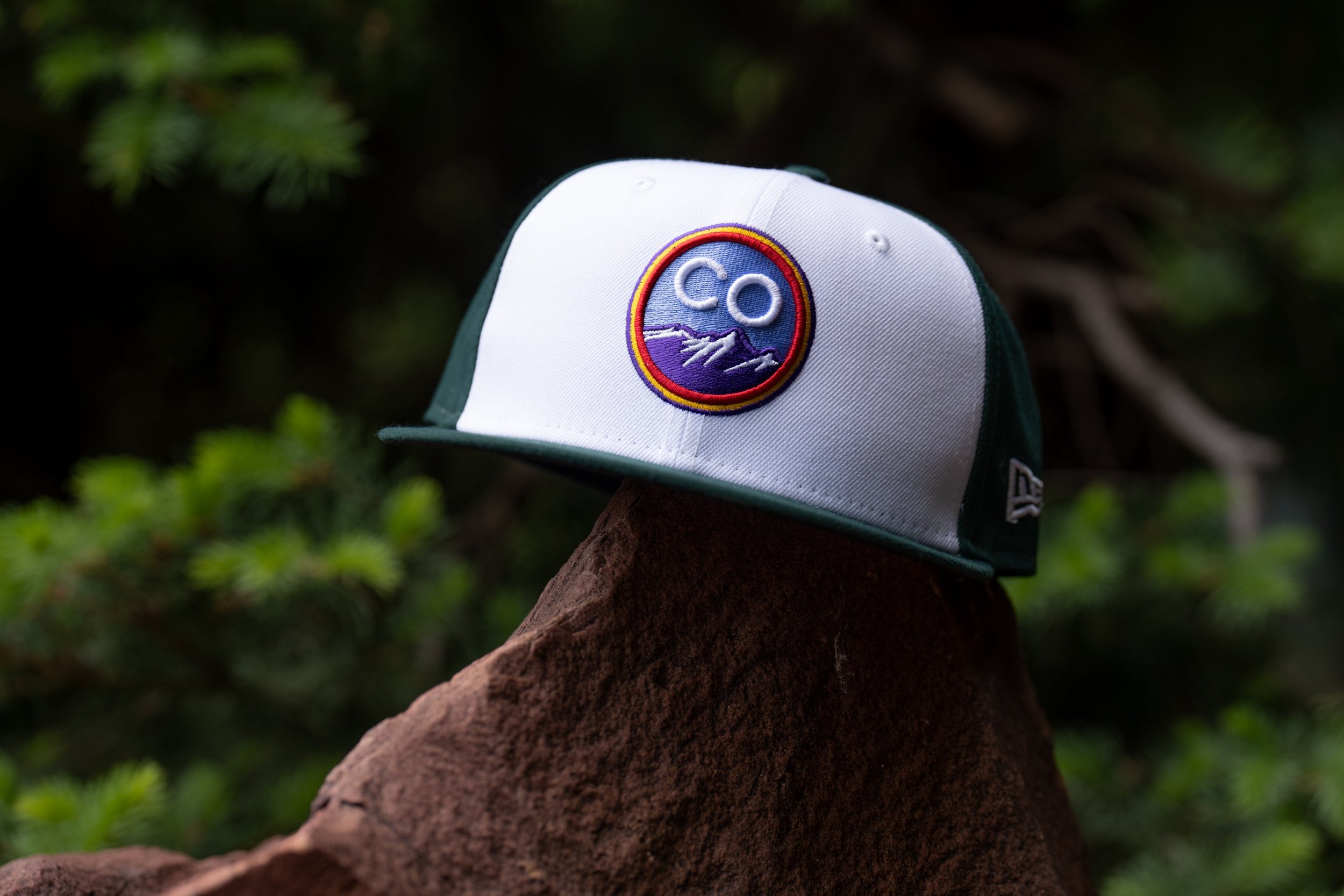
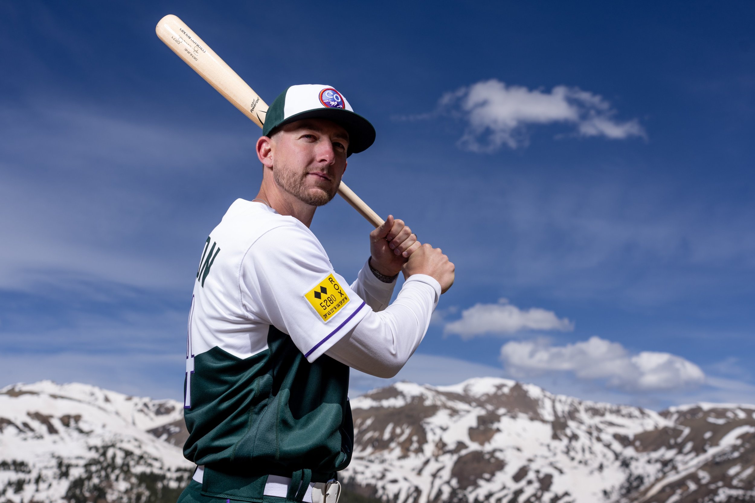
On the right sleeve is a salute to Denver’s mile-high nickname with 5280 emblazoned on a yellow “sticker”, above that we see two black diamonds, noting Double Black Diamond ski runs as a nod to Colorado’s vibrant ski and snowboard community, and with the coordinates of Coors Field seen below it.
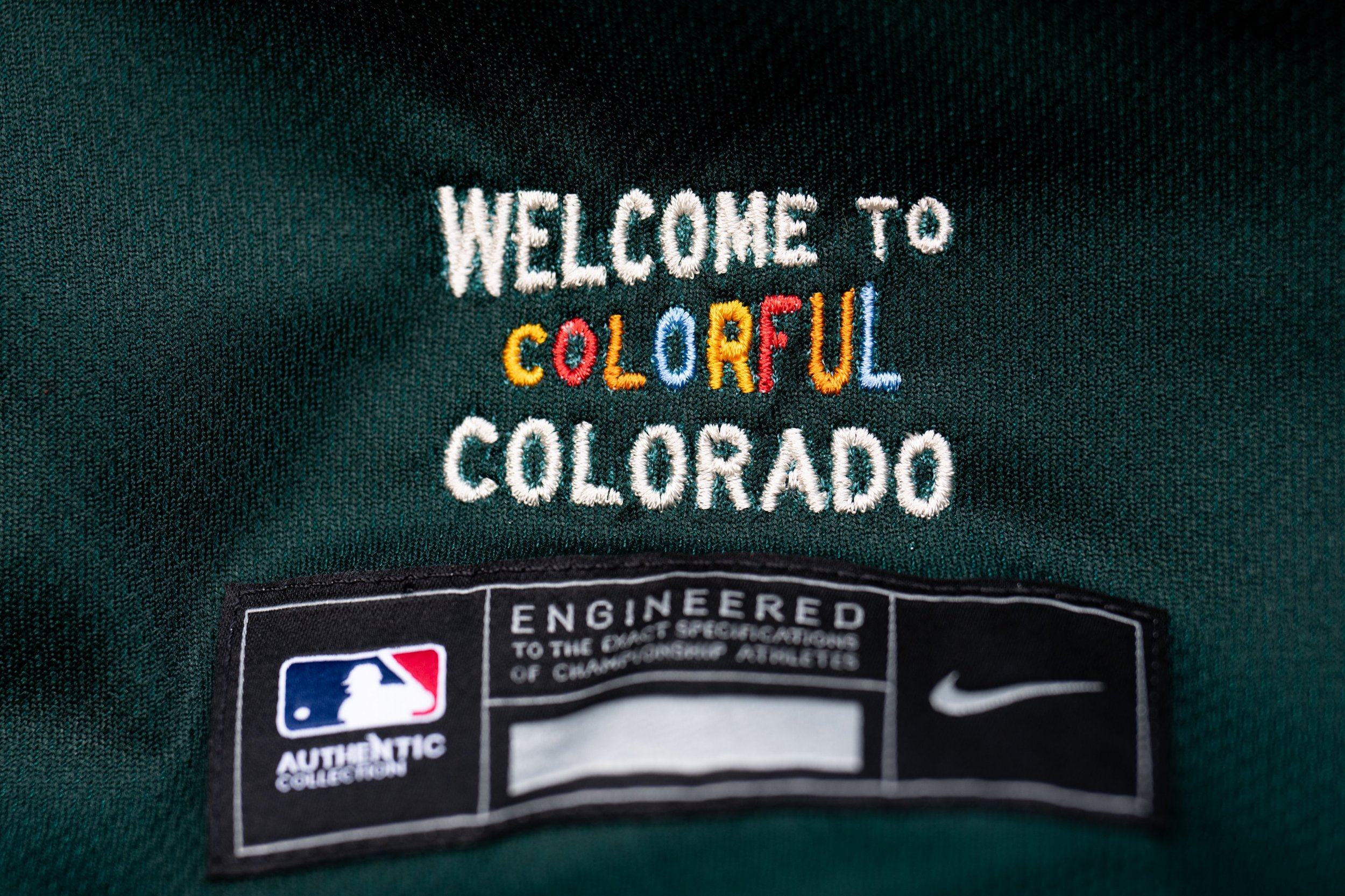
The finishing touch comes on the jock tag with the phrase “Welcome to Colorful Colorado” that was inspired by the highway signs welcoming you to the state.
“While the uniform series is called City Connect, it was important they represent fans across the state. As a Colorado native, I am proud that these uniforms embody the character of Colorado and the unique sense of pride we have in our home state. I am beyond excited to see them come to life on the field on June 4 at Coors Field.”- Rockies Owner, Chairman and CEO Dick Monfort
The Rockies will debut their look on June 4th against the Atlanta Braves and then they will wear them every Sunday home game for the rest of the season.
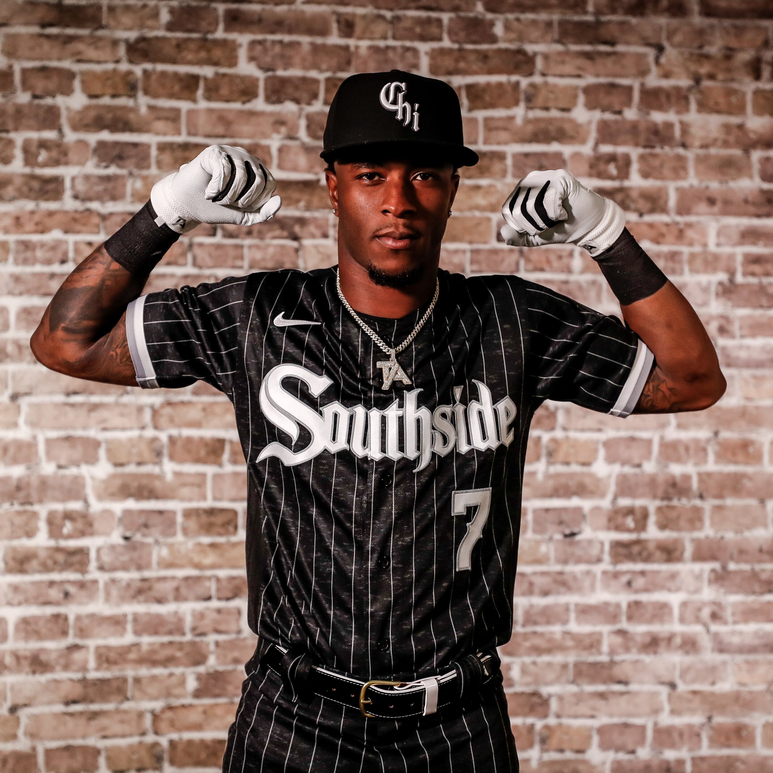
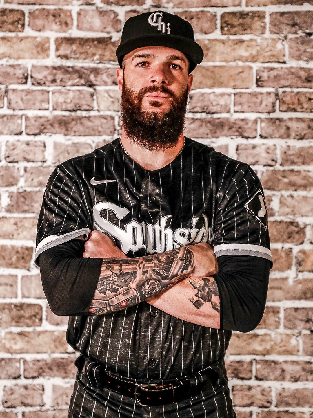
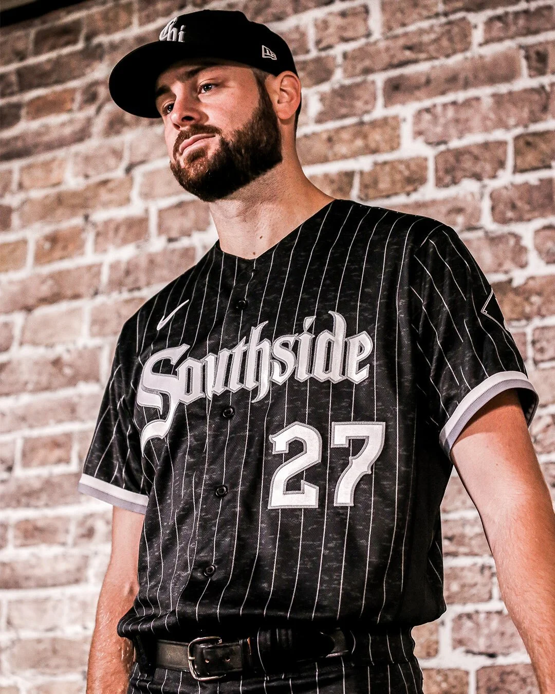
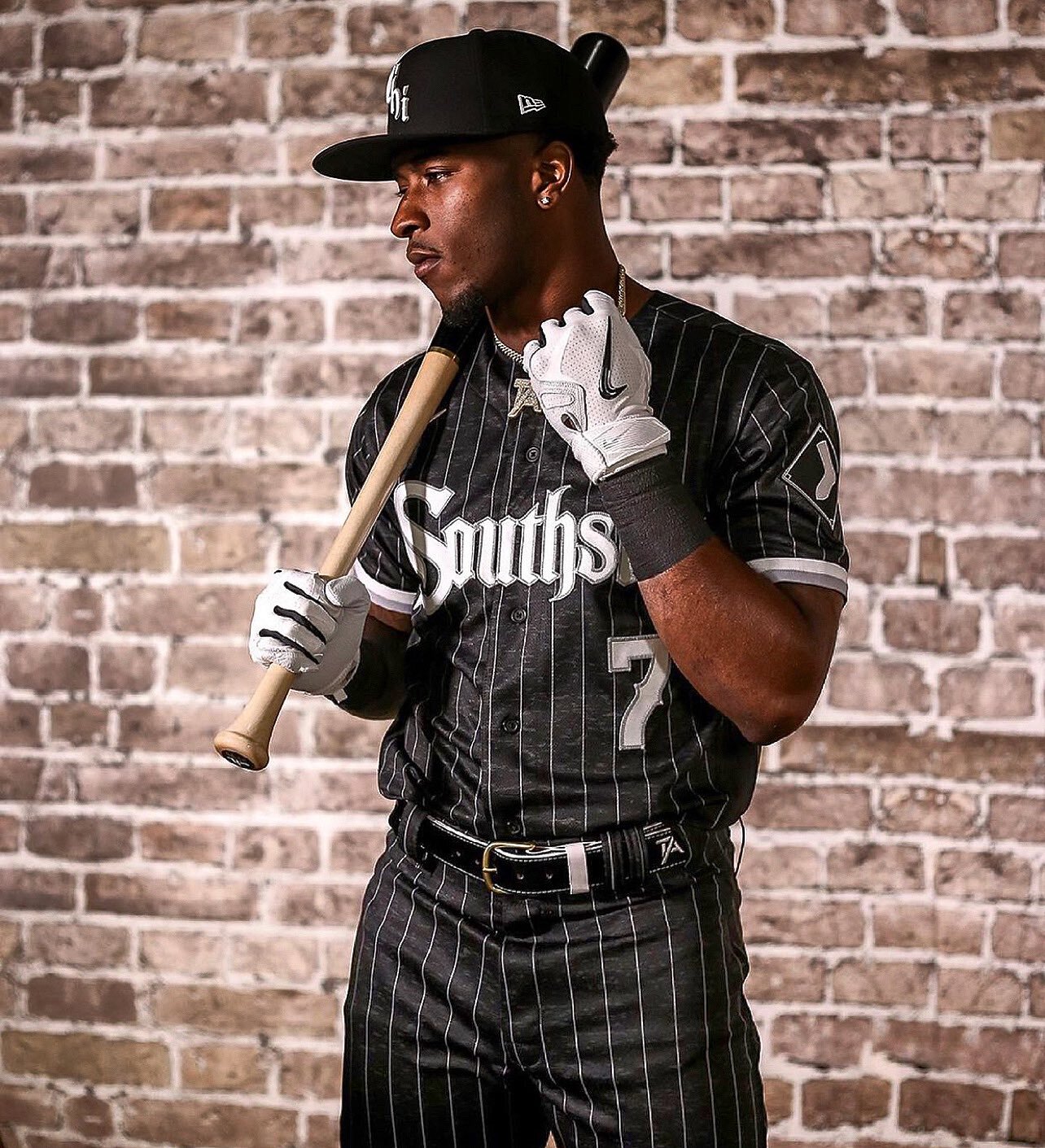
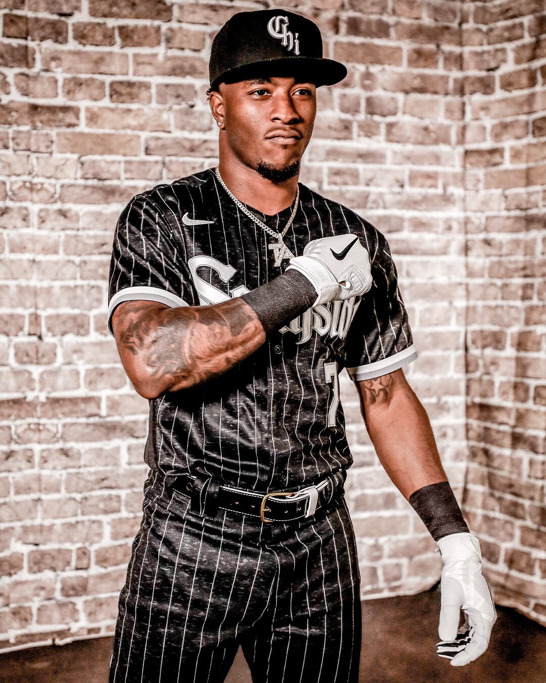
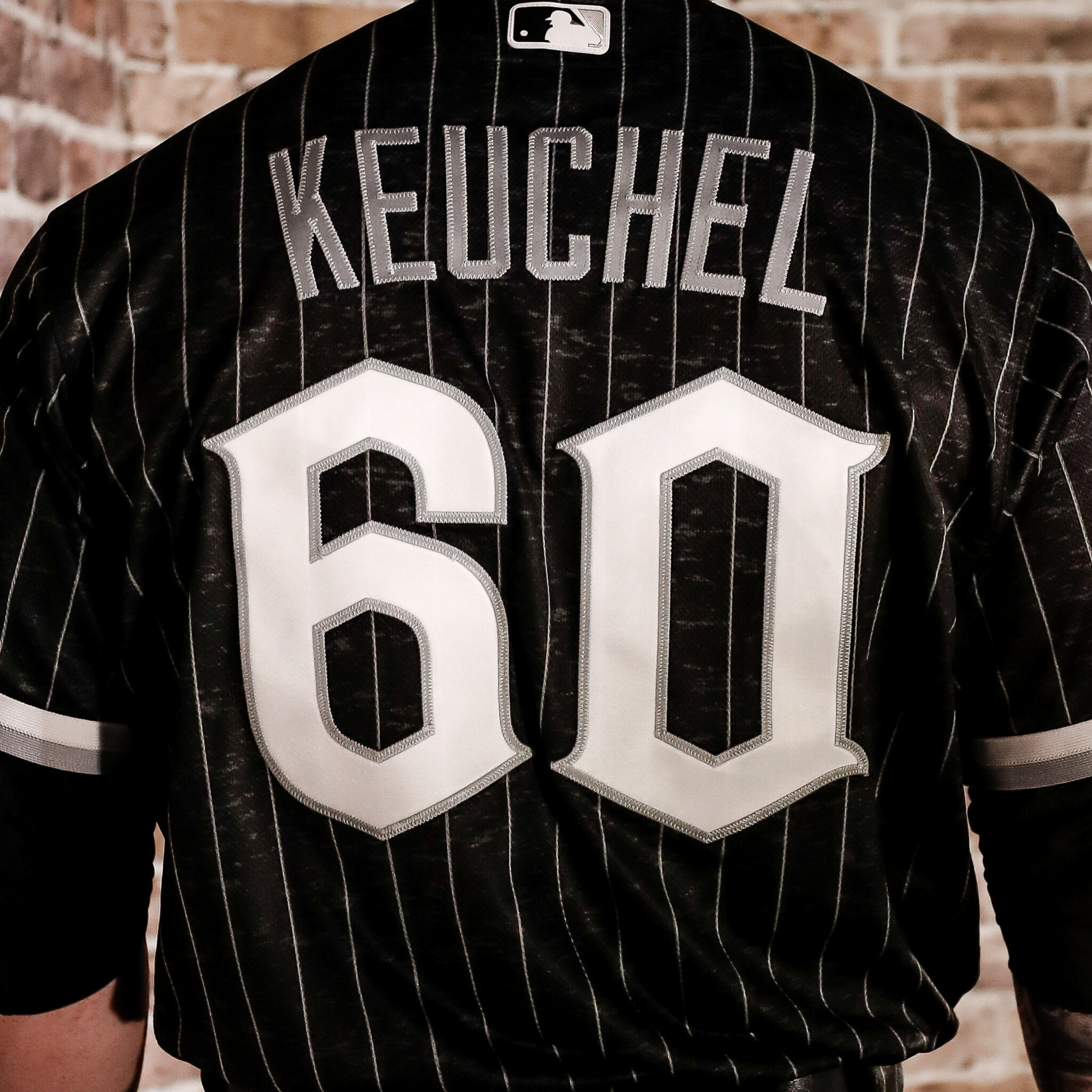
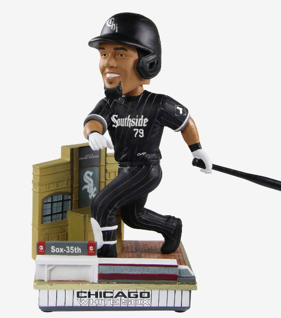
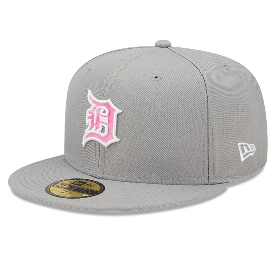
The Chicago White Sox have revealed their special edition ‘City Connect’ uniform. The uniforms inspiration is an ode to the hardworking and resilient mentality of Chicago’s Southside community. The dark grey uniform drew its inspiration from Chicago’s well-known Greystone architectural style. Across the chest of the jersey the word “Southside” is displayed in the White Sox gothic script. The team’s hats will feature CHI in the same iconic White Sox gothic script font.
“We wanted to do something cool and kind of be authentic. This is more authentic as it gets, having Southside on the front. It’s relatable. Just using that term definitely makes it a lot more realistic to people who actually grew up on the South Side and have been Sox fans their whole life. I think it’s definitely real relatable and think it’s really cool.” - White Sox shortstop Tim Anderson
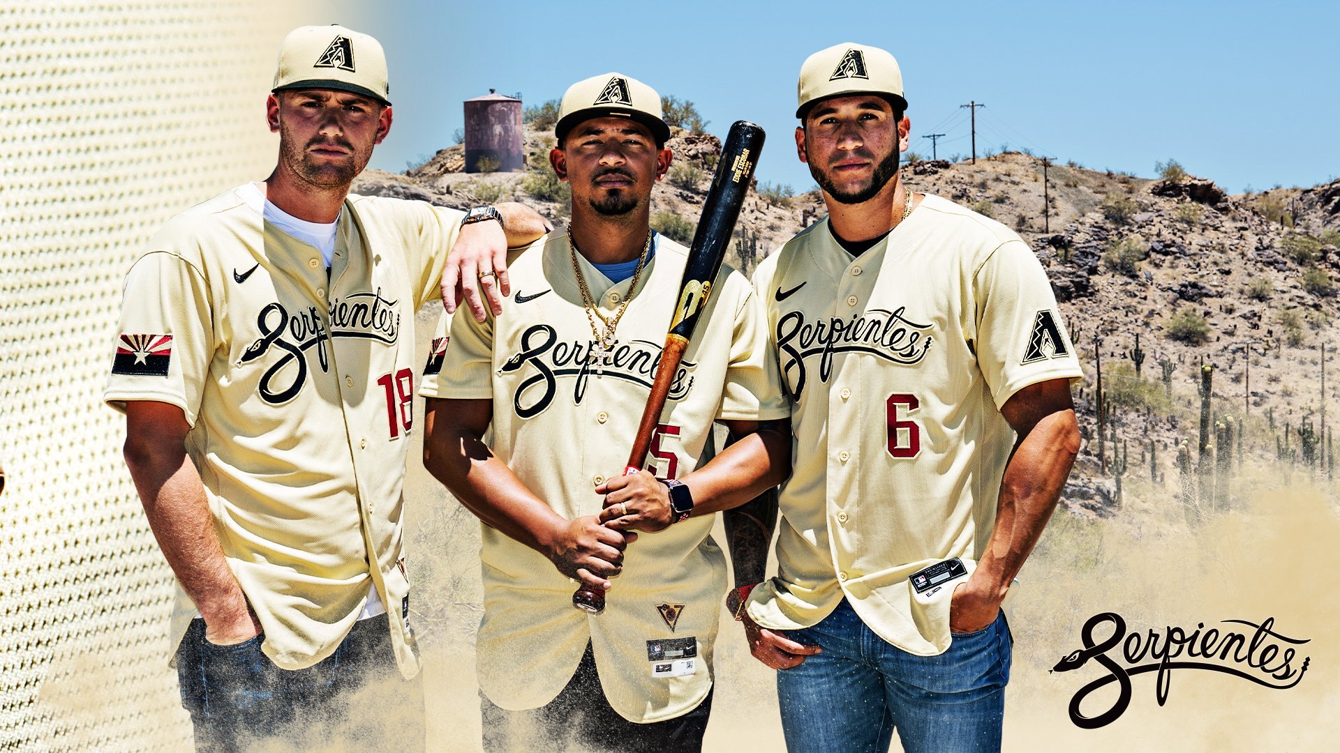
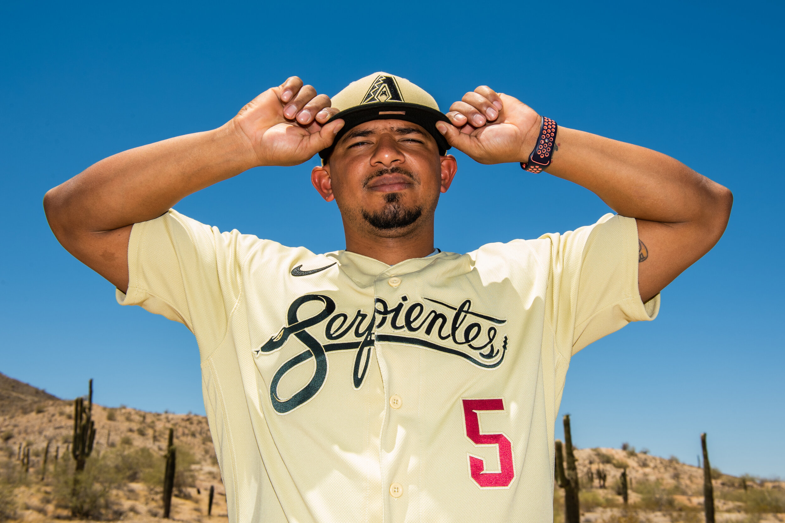
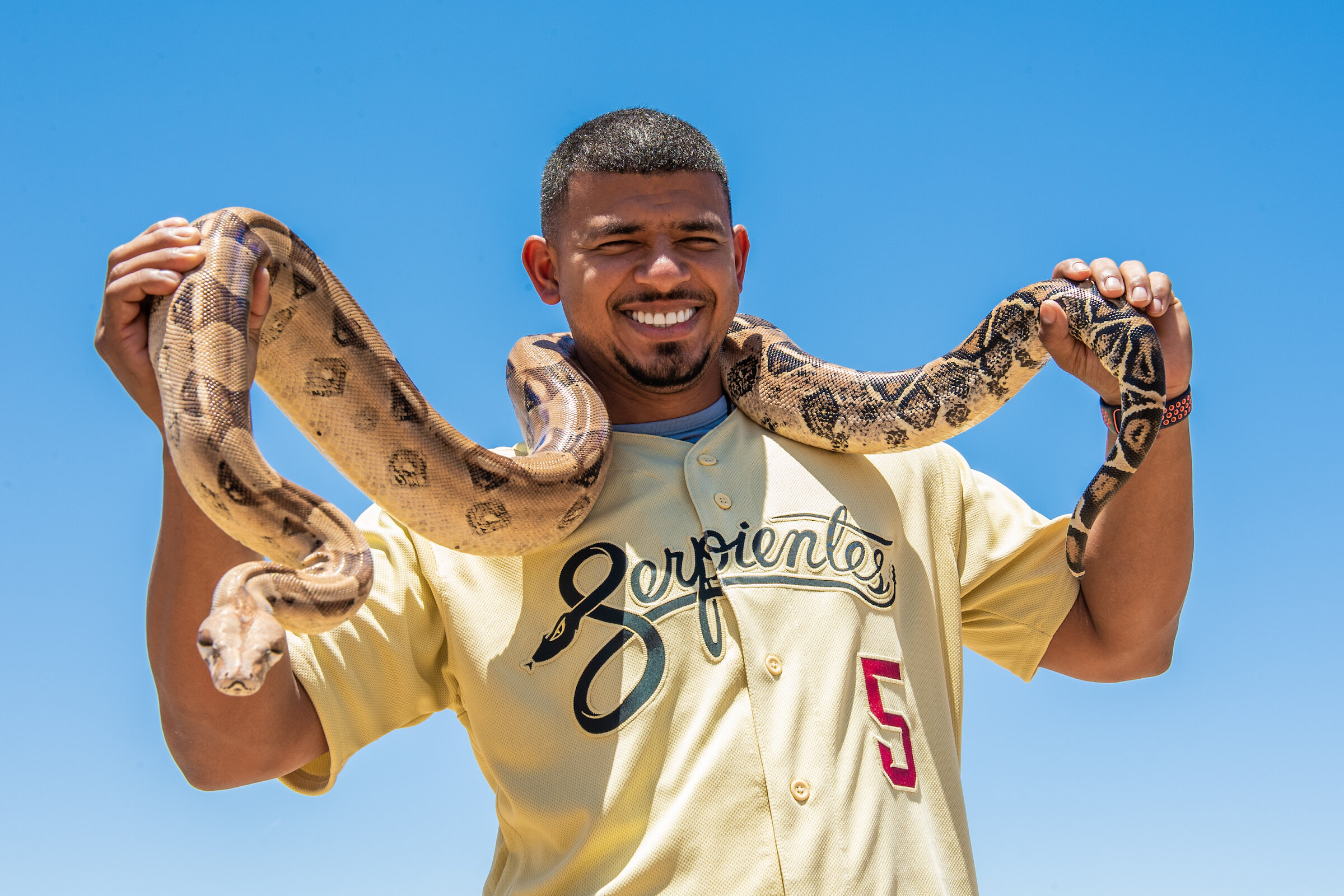
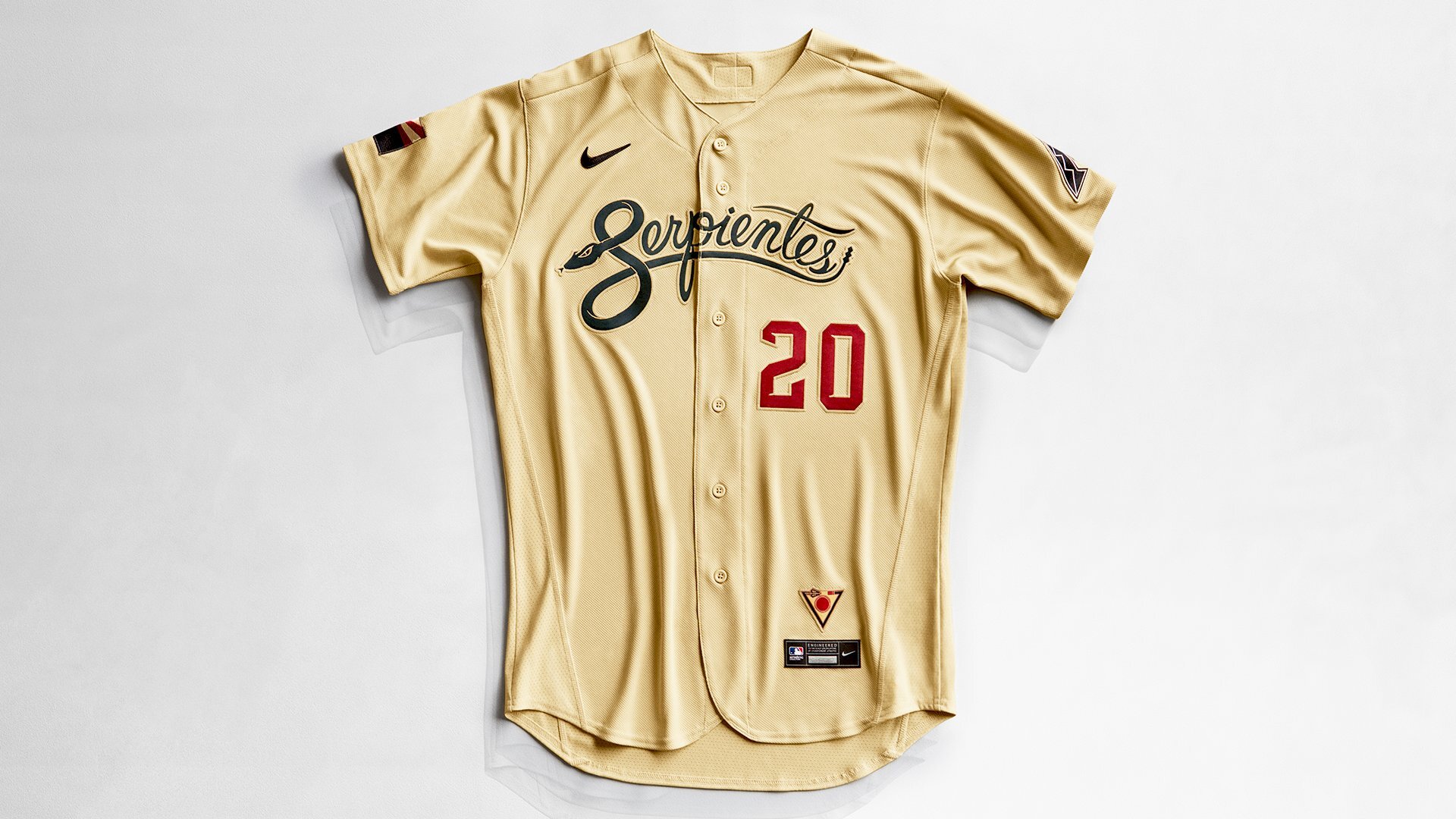
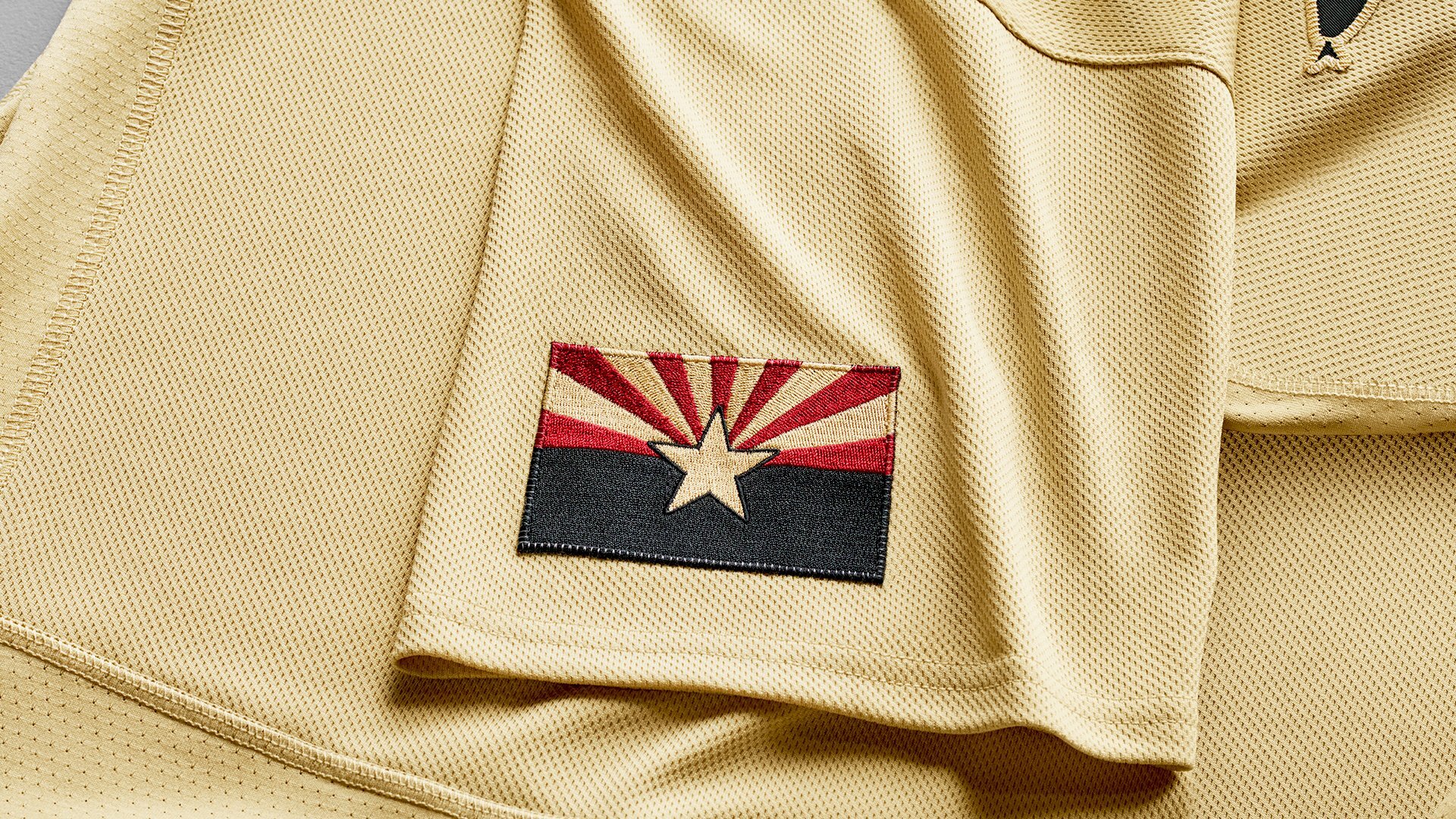
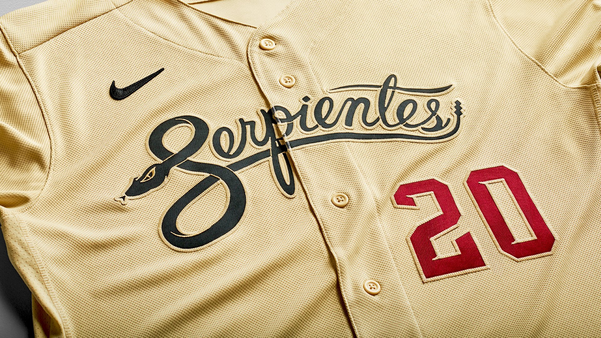
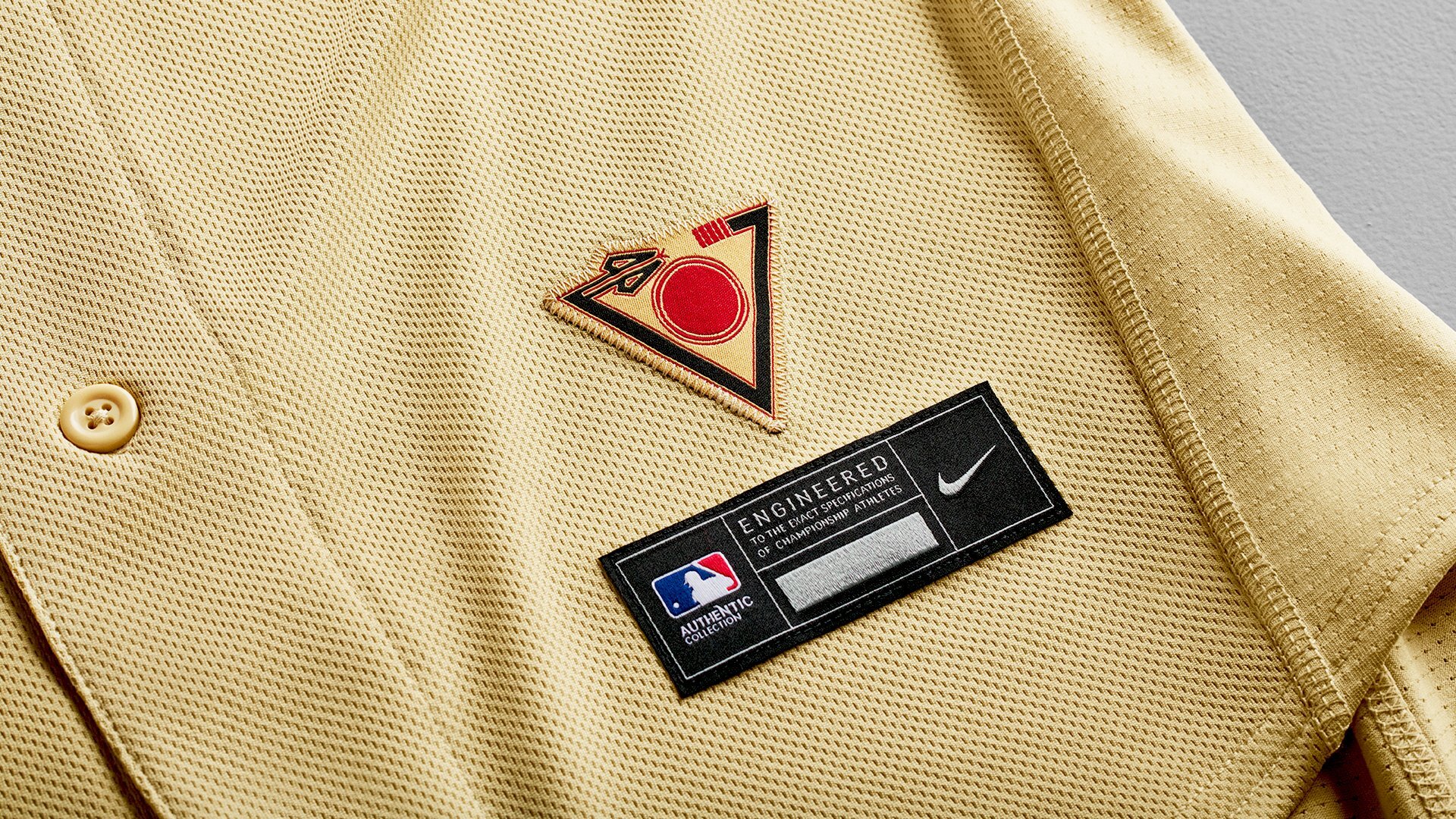
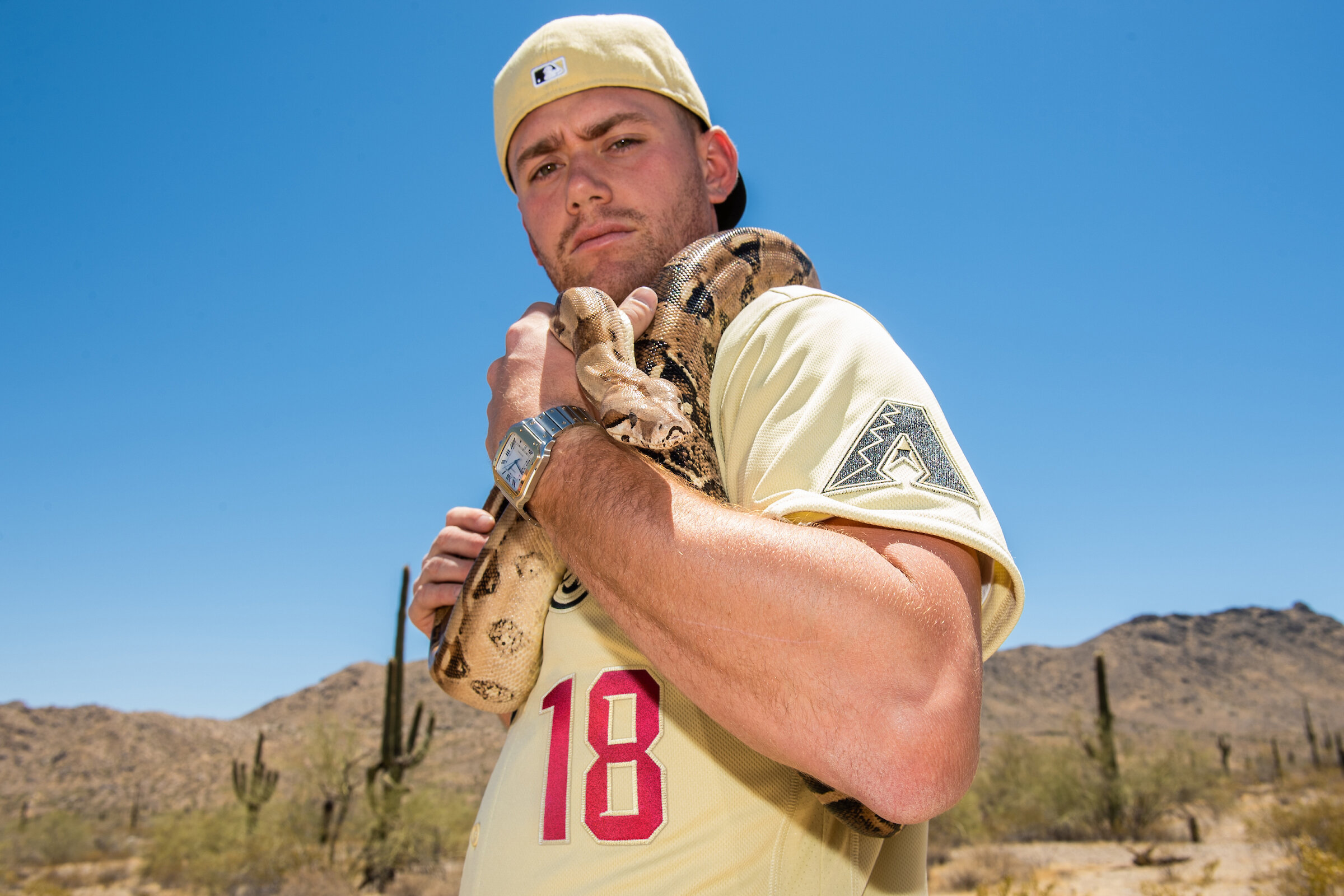
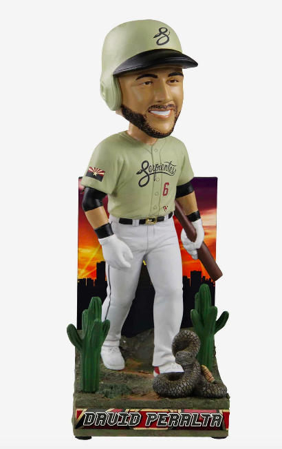
The Arizona Diamondbacks introduce their new ‘City Connect’ alternate uniform. The sand color of the jersey and hat are inspired by the Sonoran desert. Across the chest of the jersey reads ‘Serpientes’, which is Spanish for snake. Seen below the wordmark is the player’s number in the team’s standard font and colored Sedona Red. Additional detail of the Arizona state flag is found on the right sleeve is a re-coloured black, red, and sand.
“We are proud to be among the first teams to launch our City Connect uniforms that pay homage to so much of what makes life in Arizona unique. This concept is about bringing our community together, with respect for the past and an eye toward the future.” -D-backs President & CEO Derrick Hall
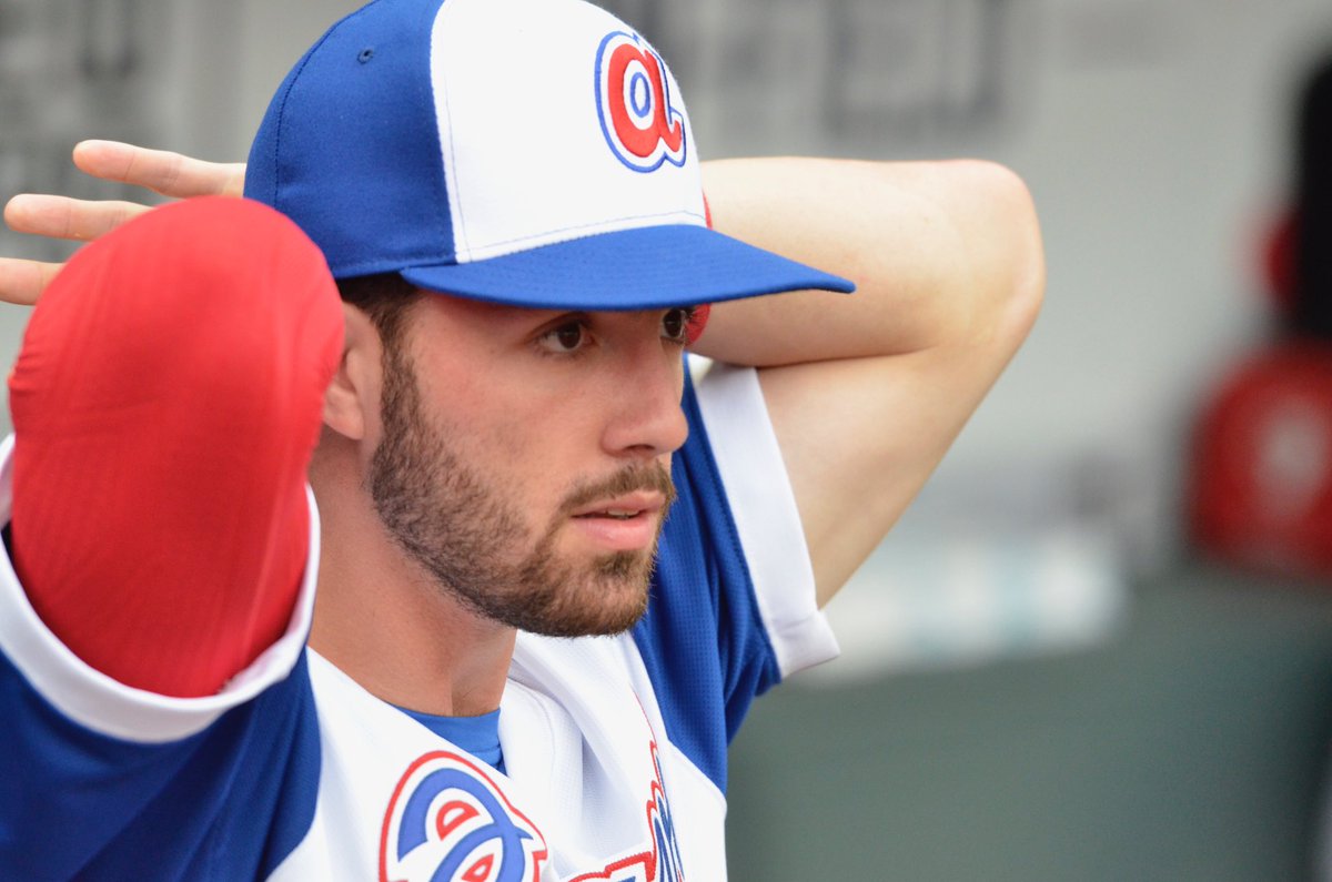
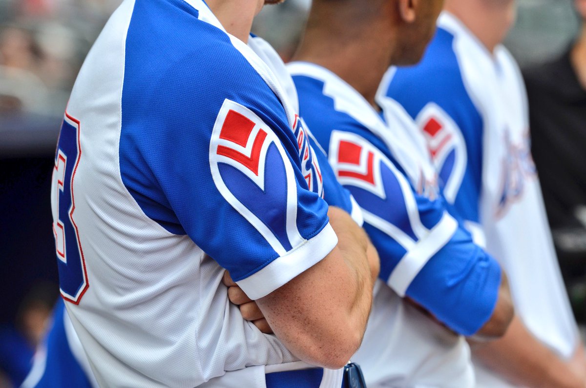
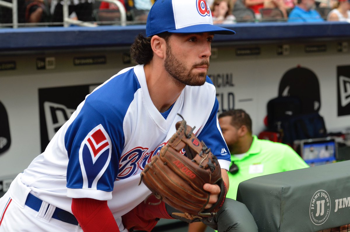
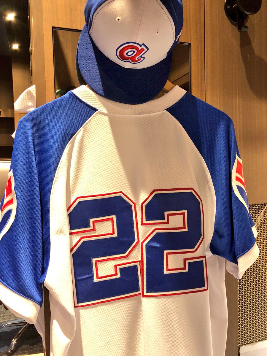
The Atlanta Braves are honoring the Hank Aaron with the 1974 throwback uniforms. The uniforms feature the old school lowercase script a on the front of the white panel hat. The front of the jersey features the Braves script mark without the tomahawk underneath it with the old school feather logo found on the sleeves.
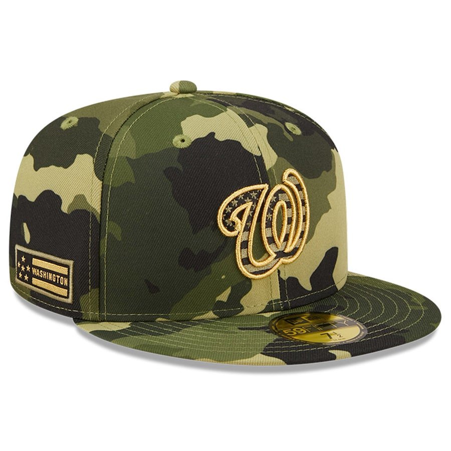
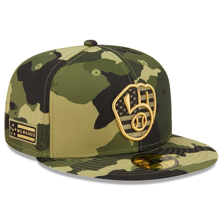
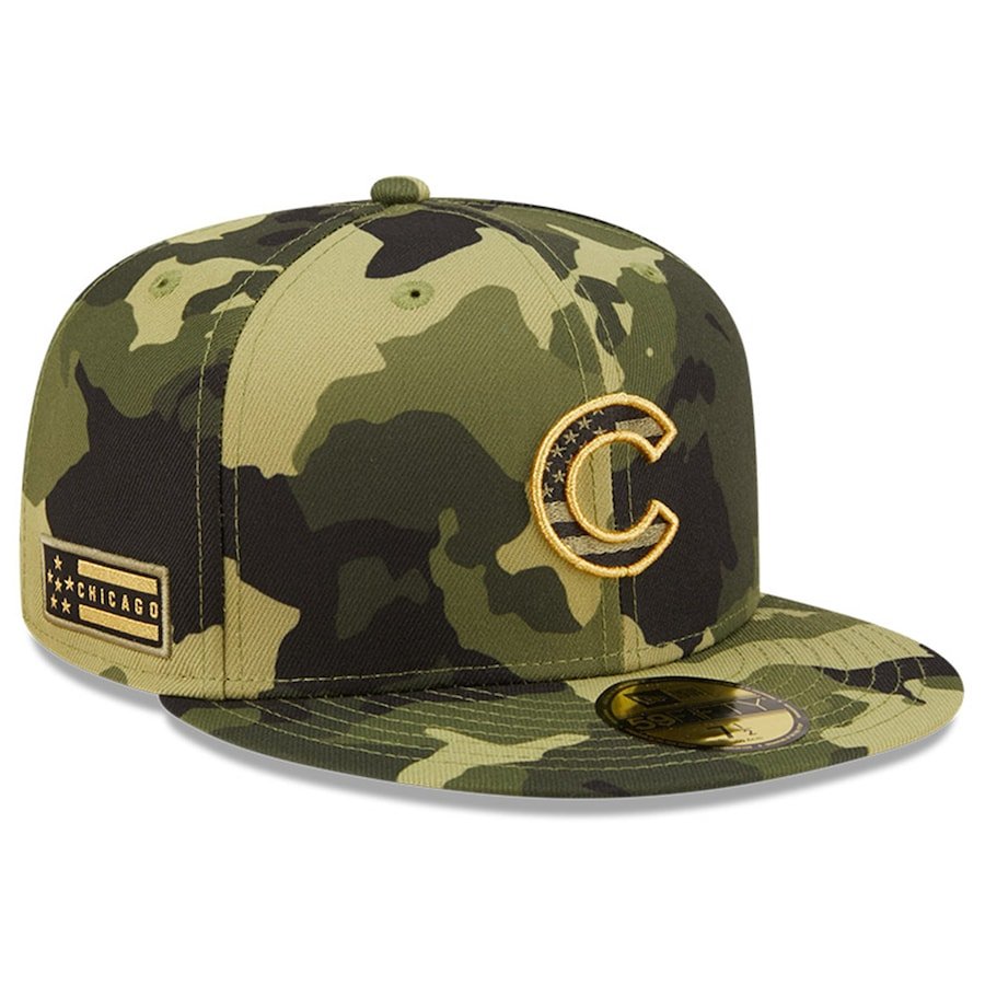
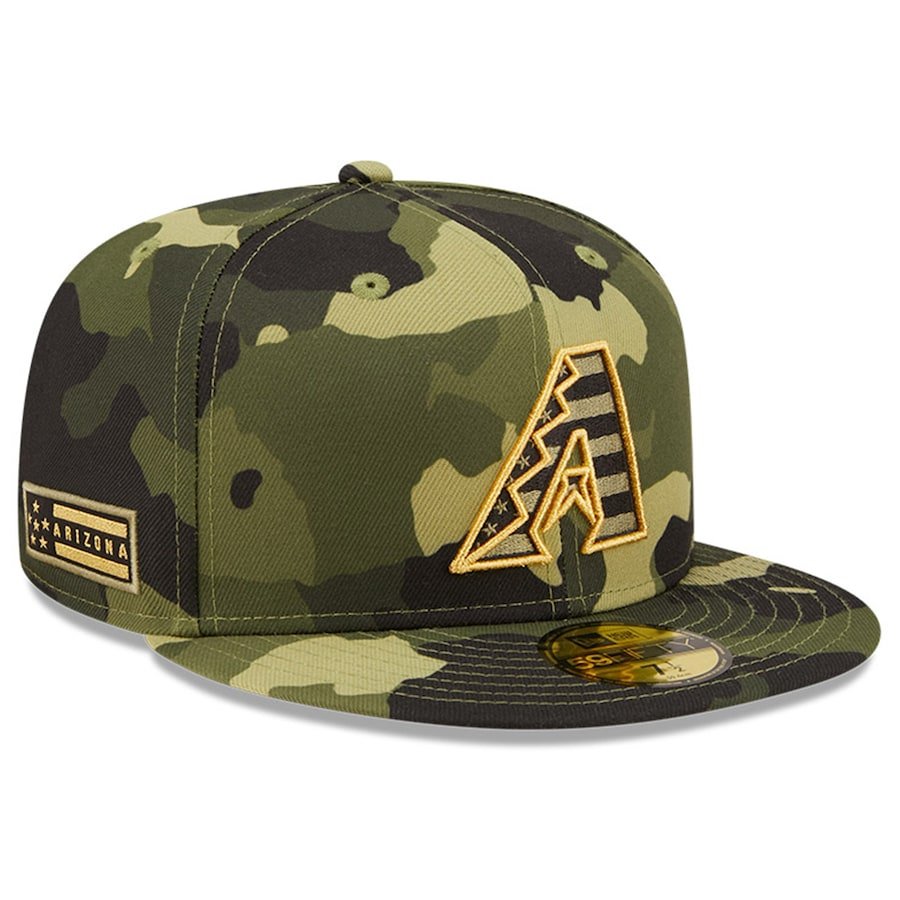
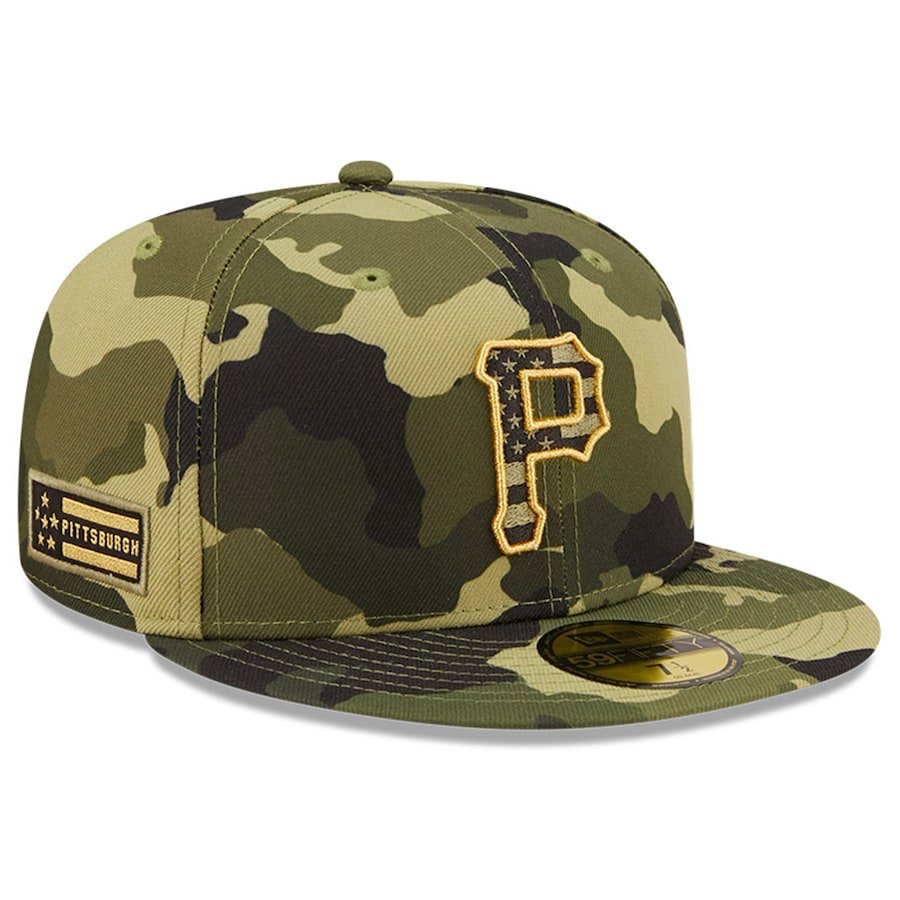
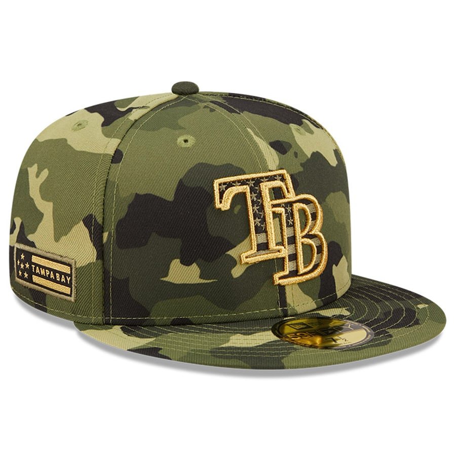
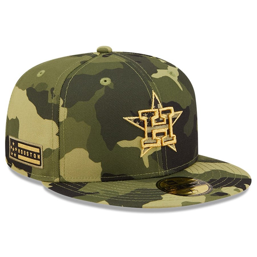
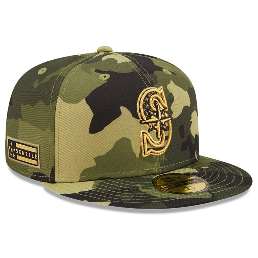
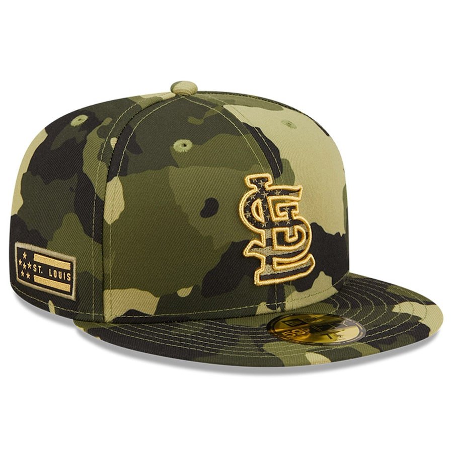
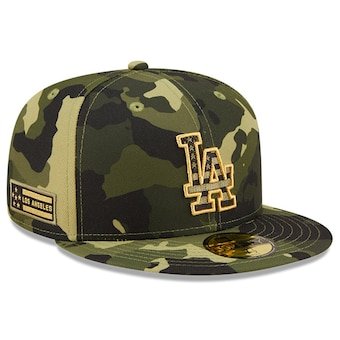
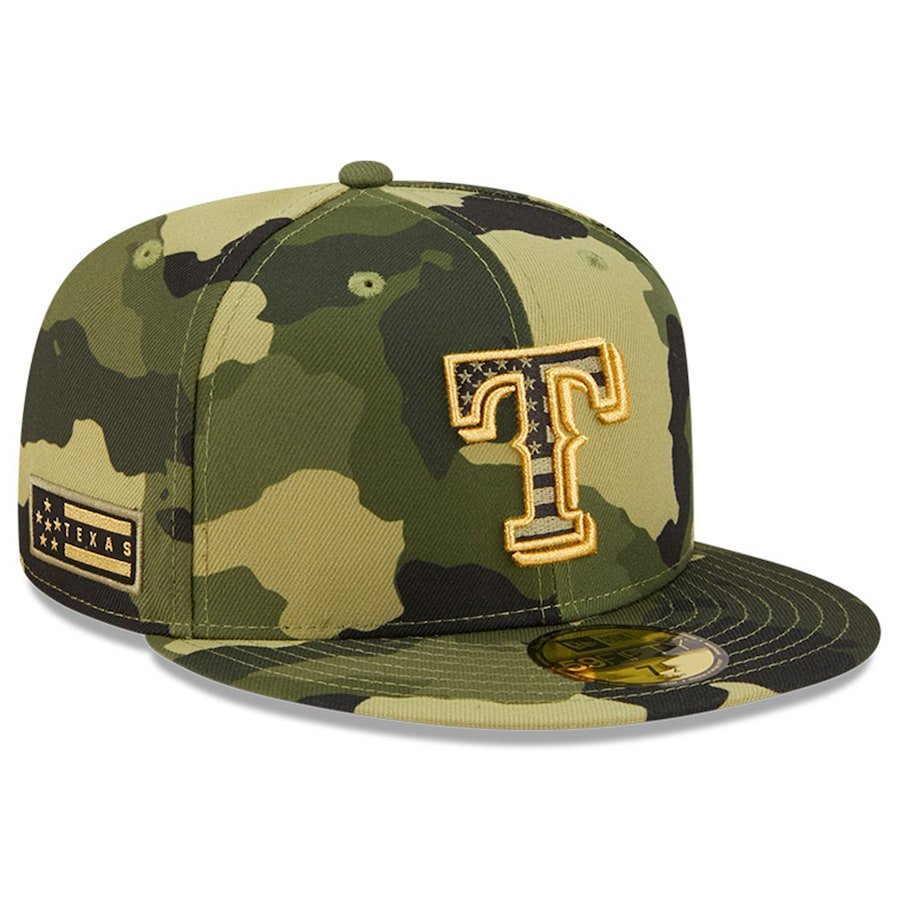
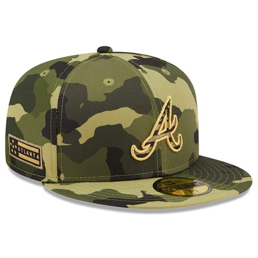
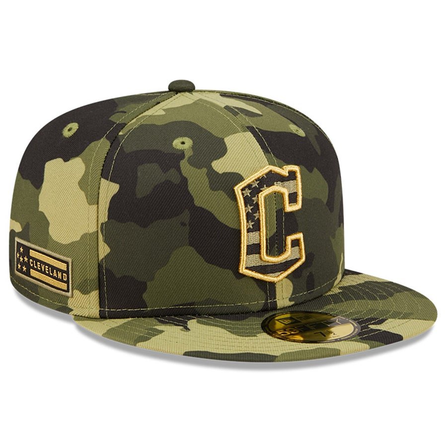
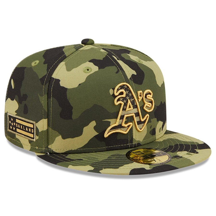
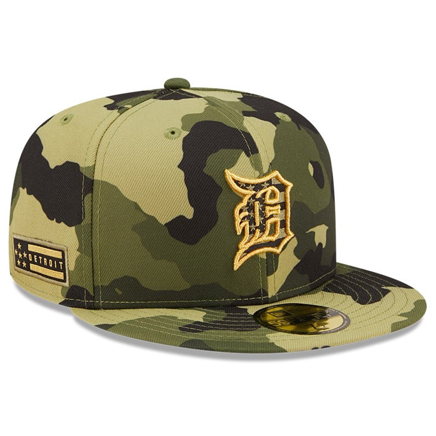
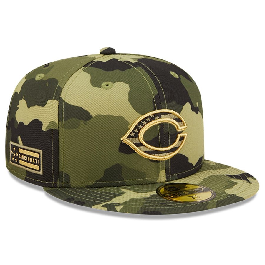
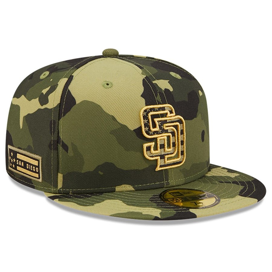
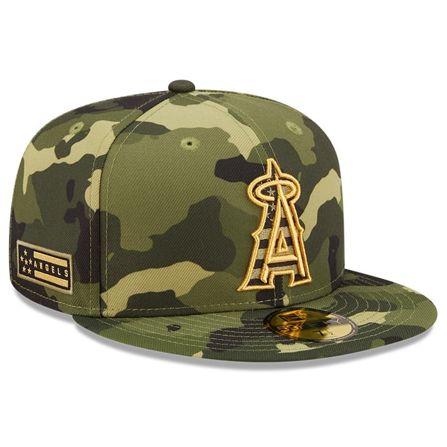
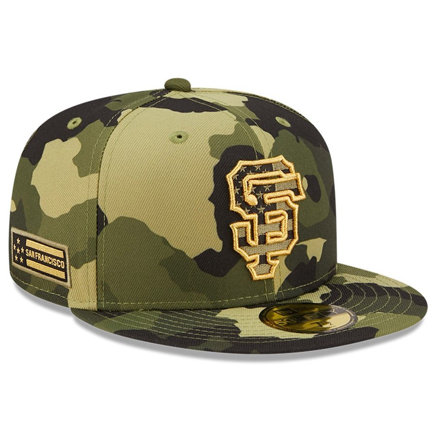
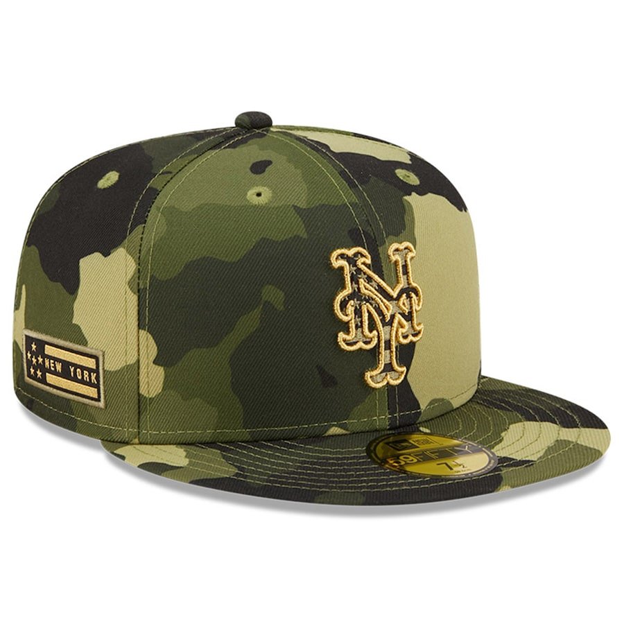
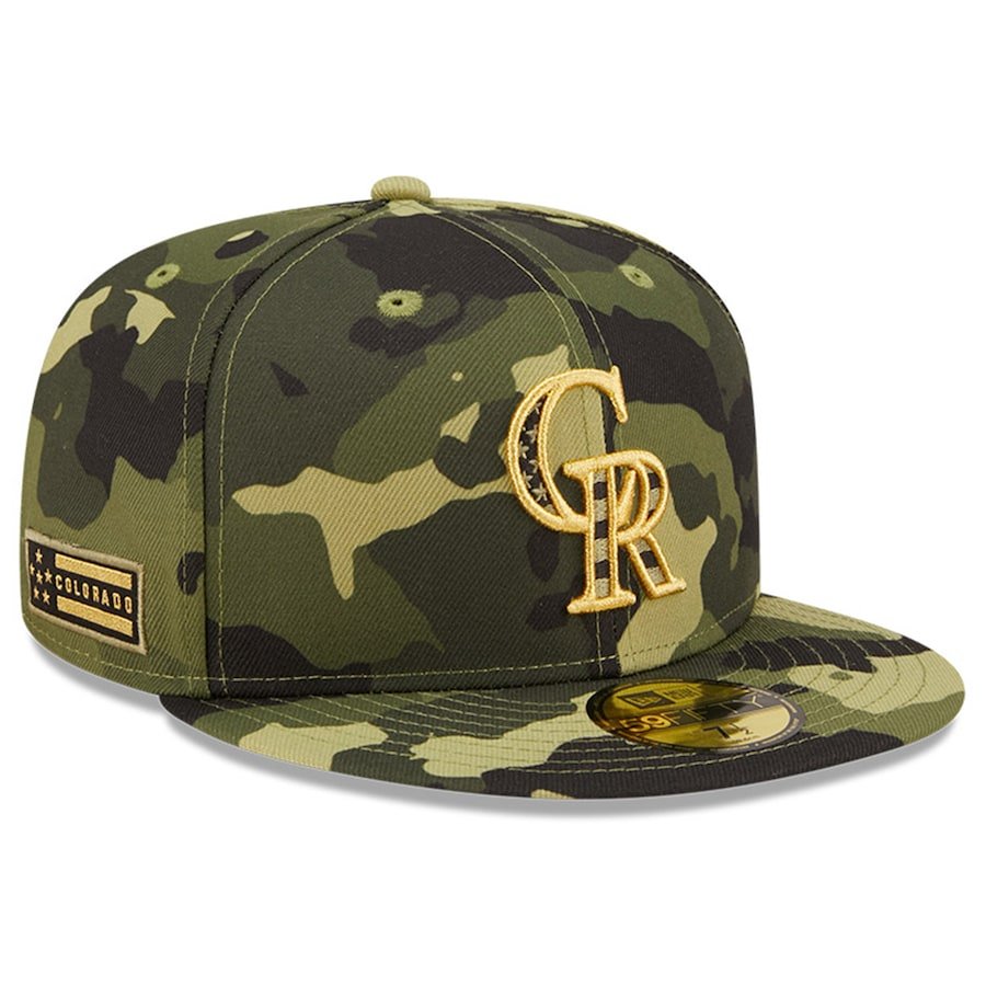
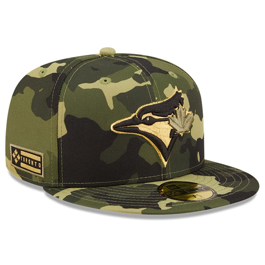
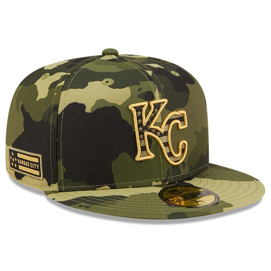
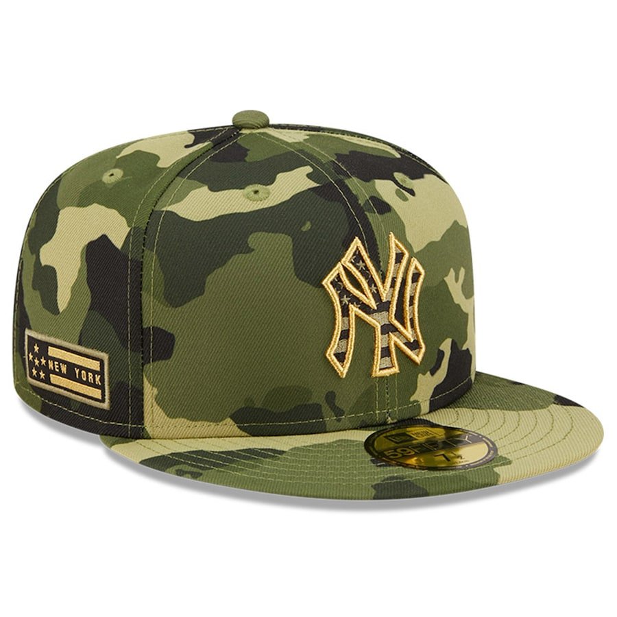
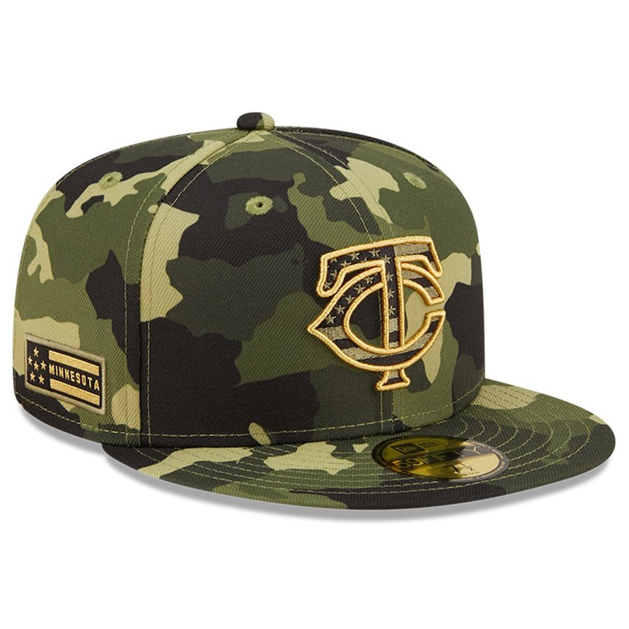
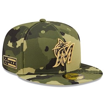
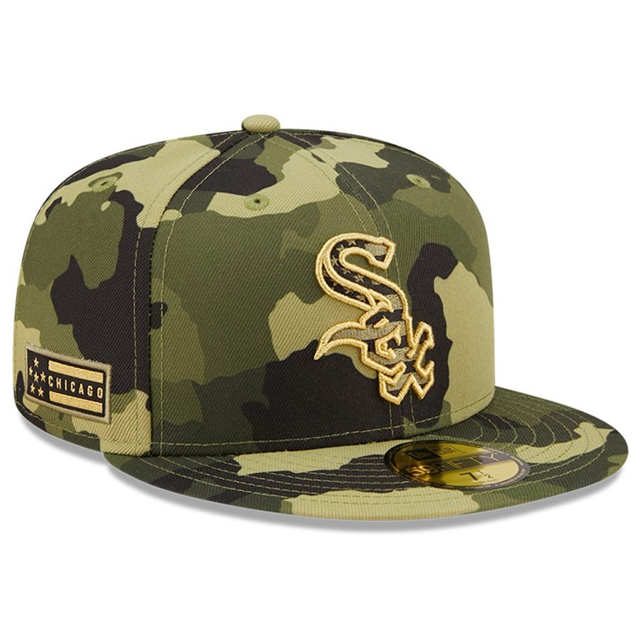
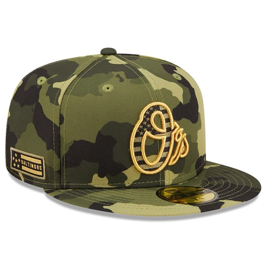
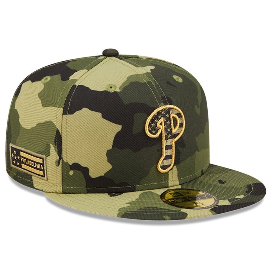
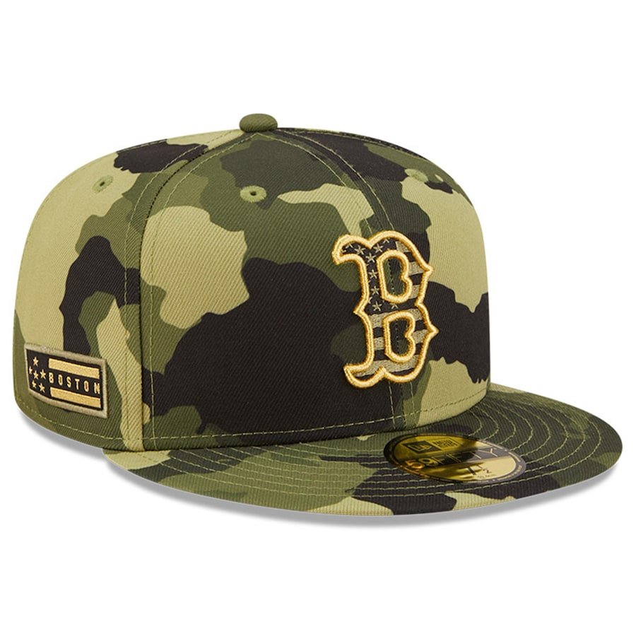
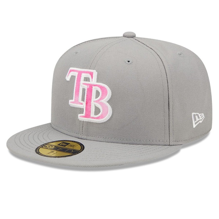
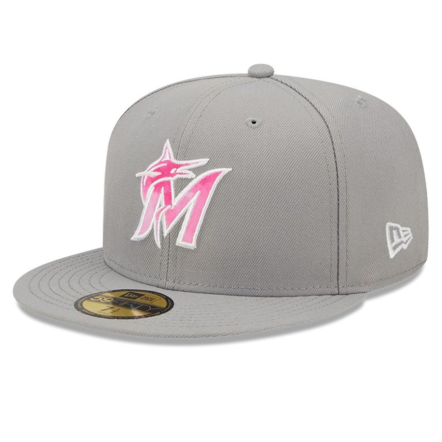
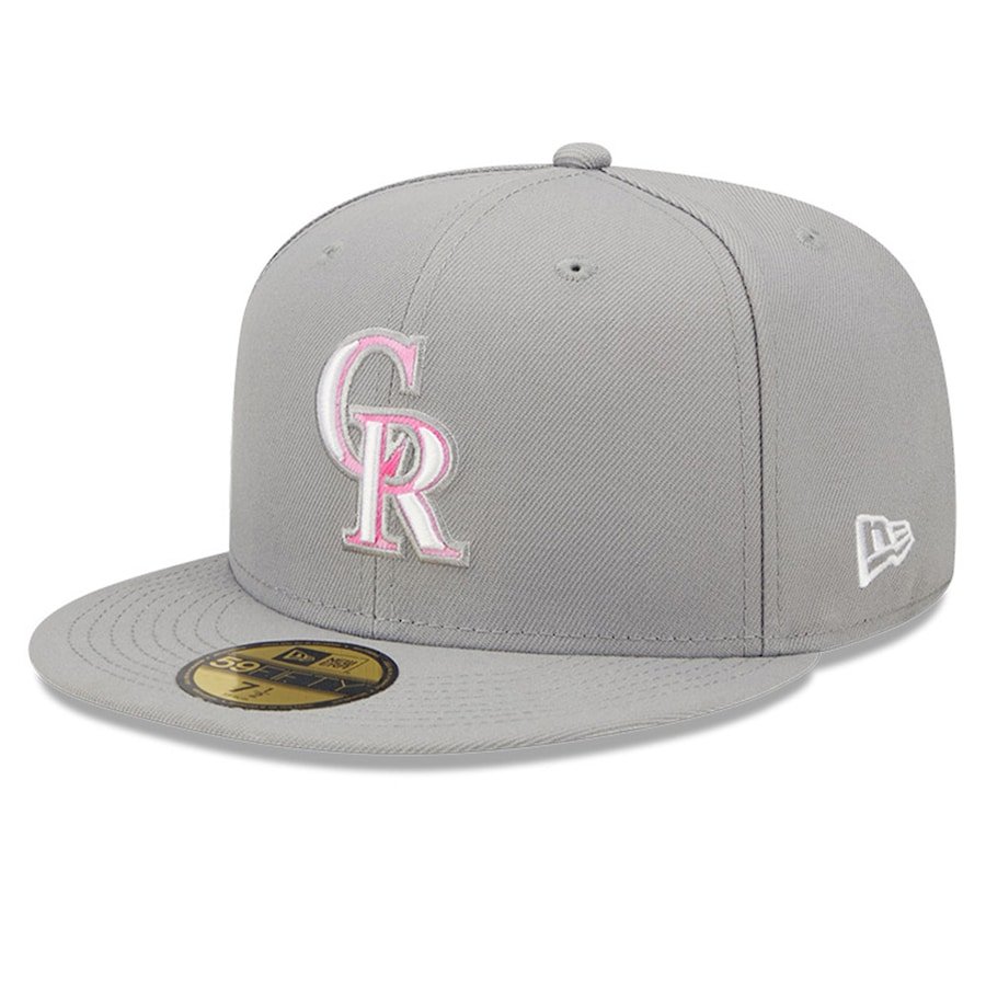
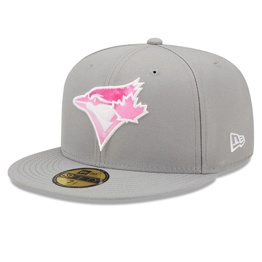
The 2022 MLB Armed Forces Day hats have been released. This year’s look features a green camo pattern with a gold outlined embroidered team logo on the front panel, while the right side has a military inspired team patch. Take a look at each team’s hat below.
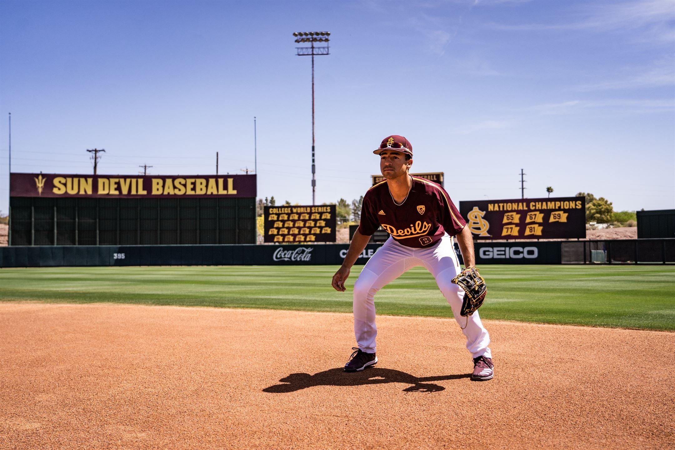
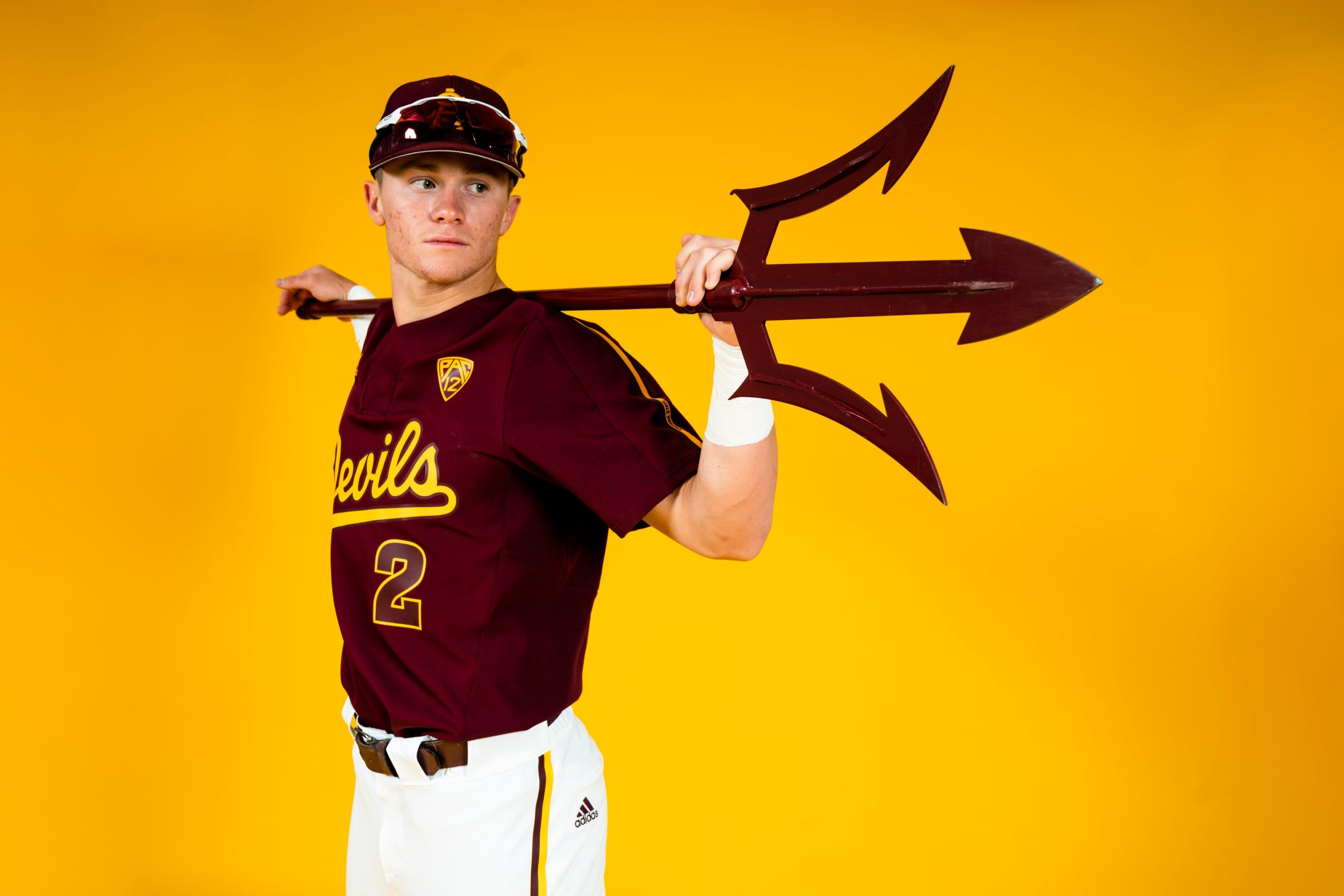
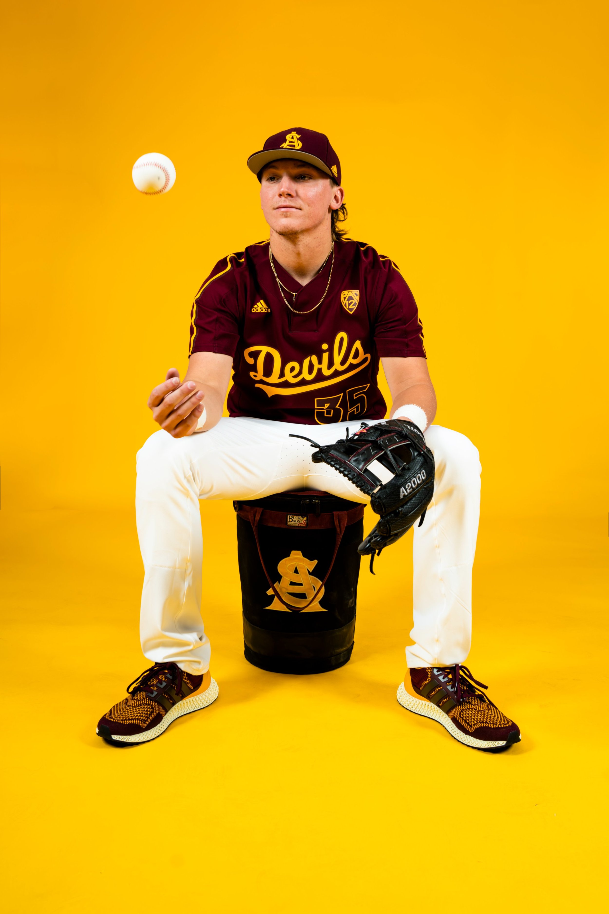
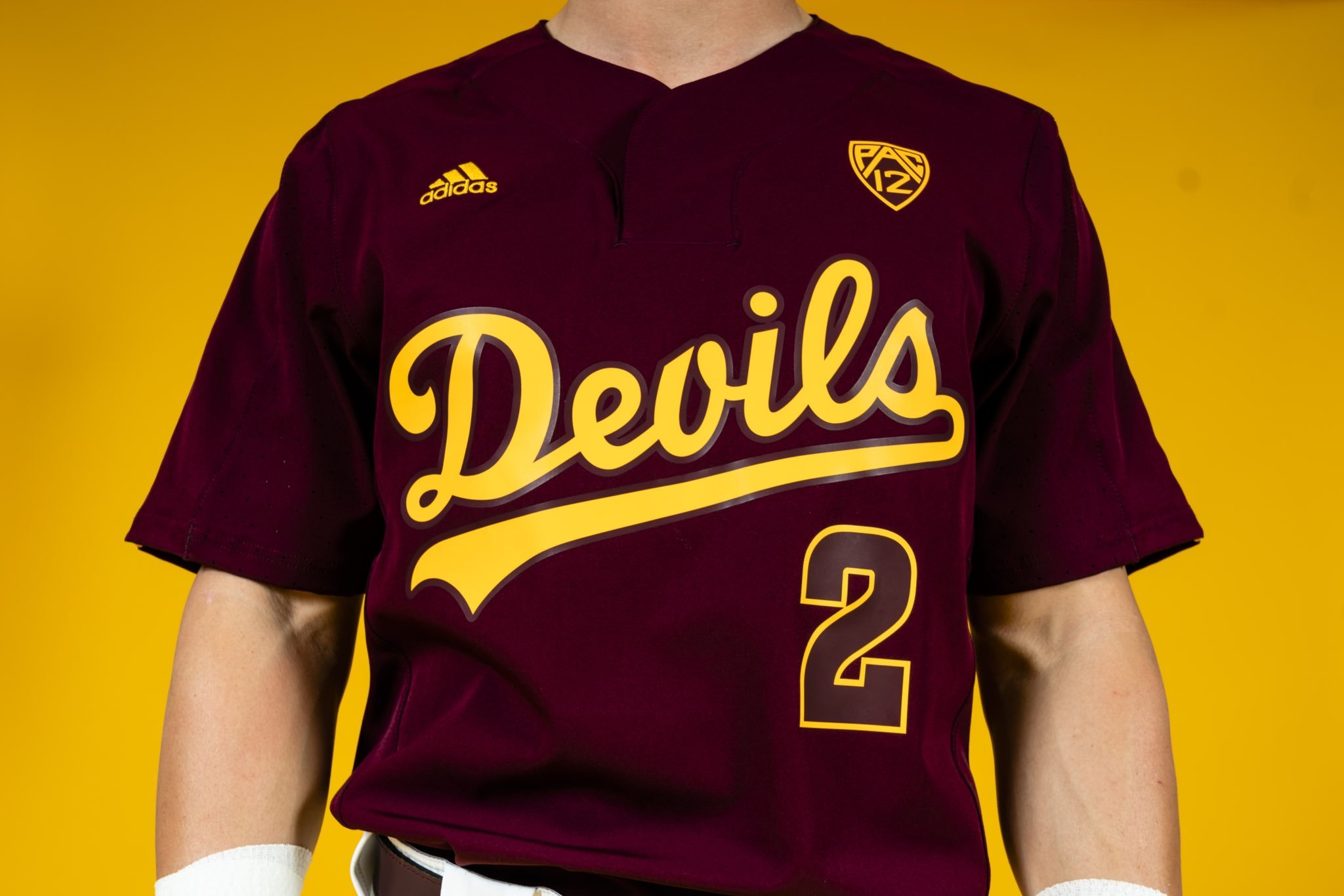
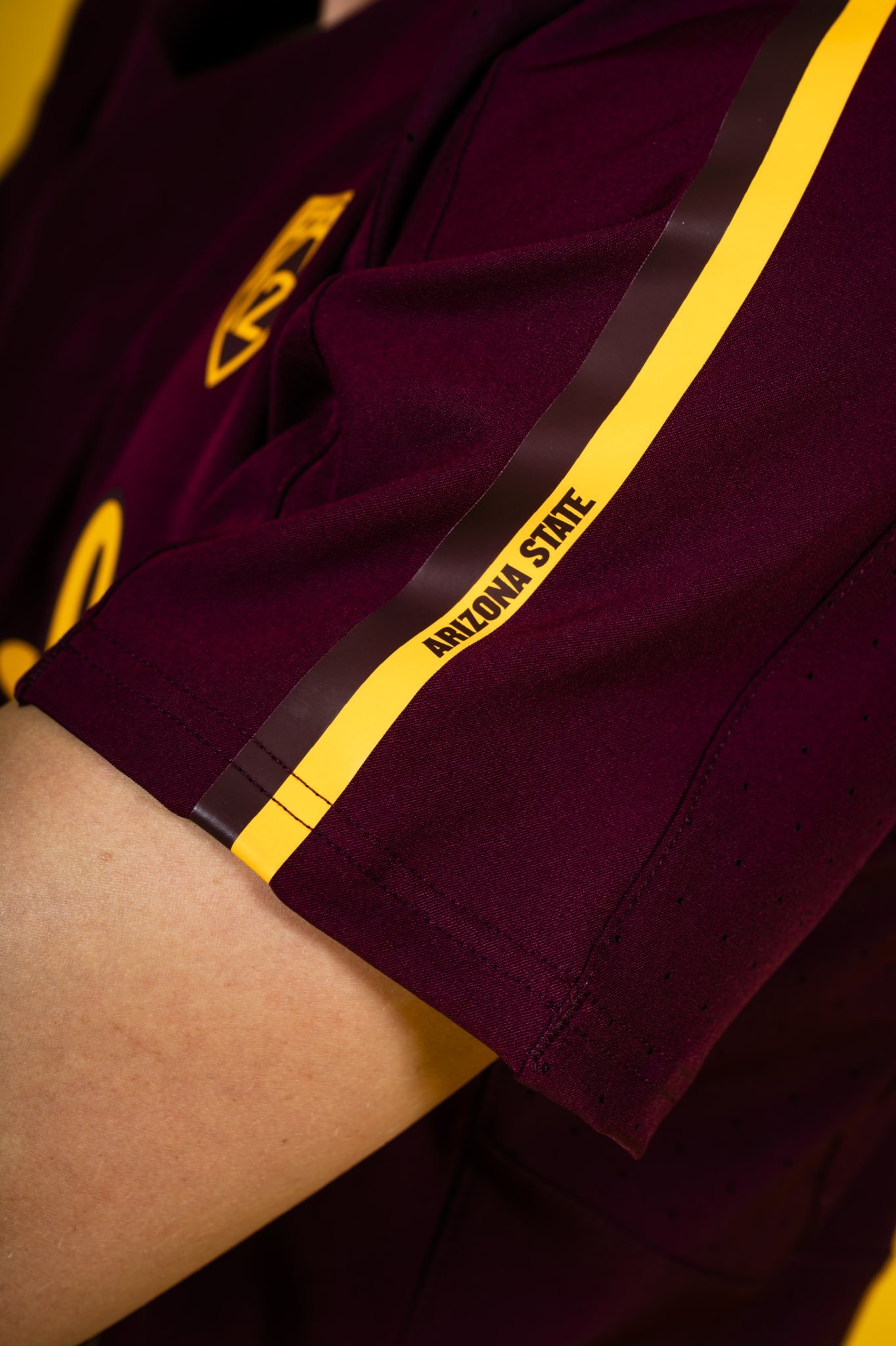
The Arizona State Sun Devils have revealed a new uniform. The Sun Devils will go with a maroon jersey that features Devils in script across the chest with the player number underneath. Running down the top of the shoulders and sleeves is a maroon and gold stripe that has the Arizona State wordmark on the within the stripes. The maroon jersey will be paired with a maroon hat and white pants to complete the look for ASU.
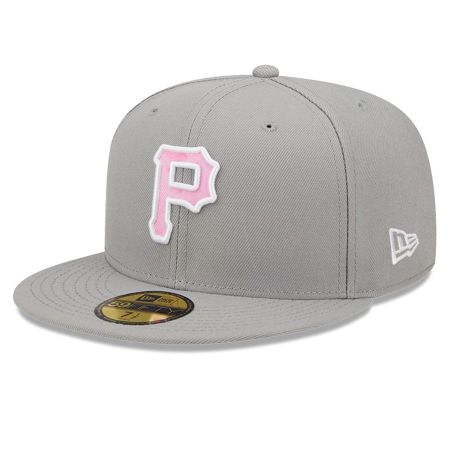
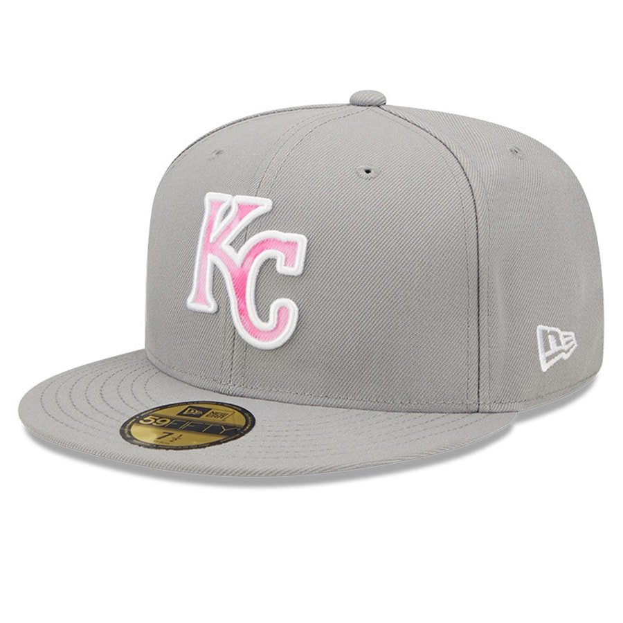
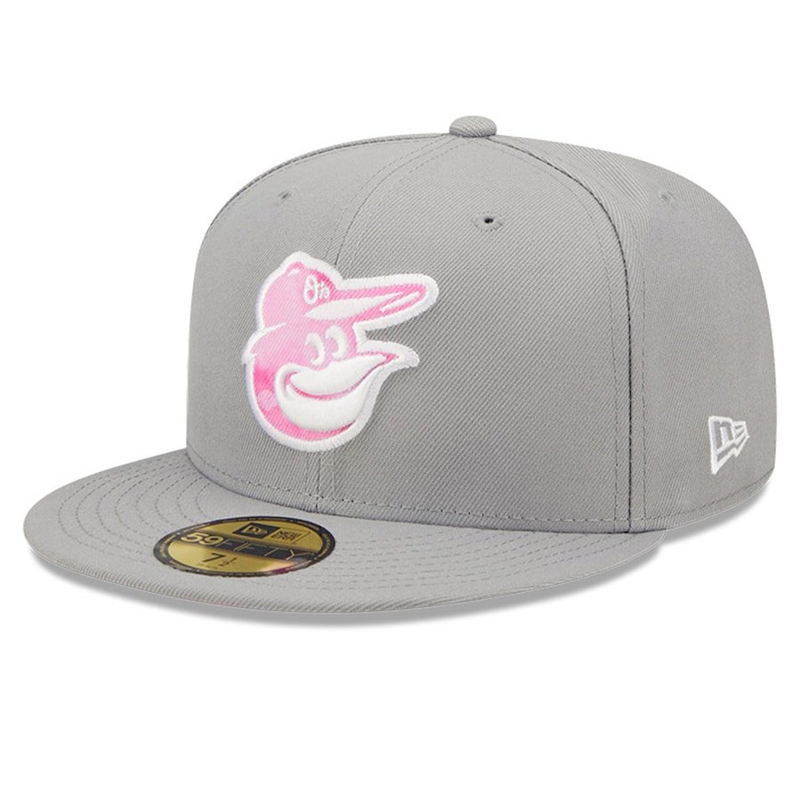
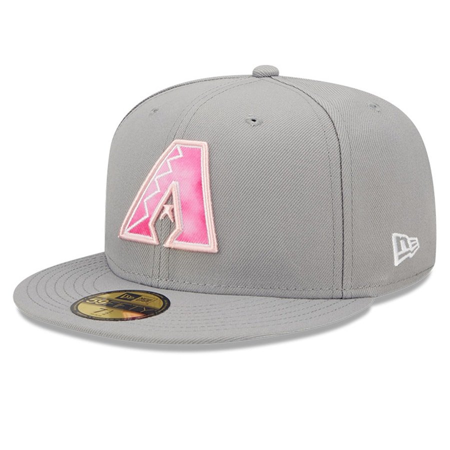
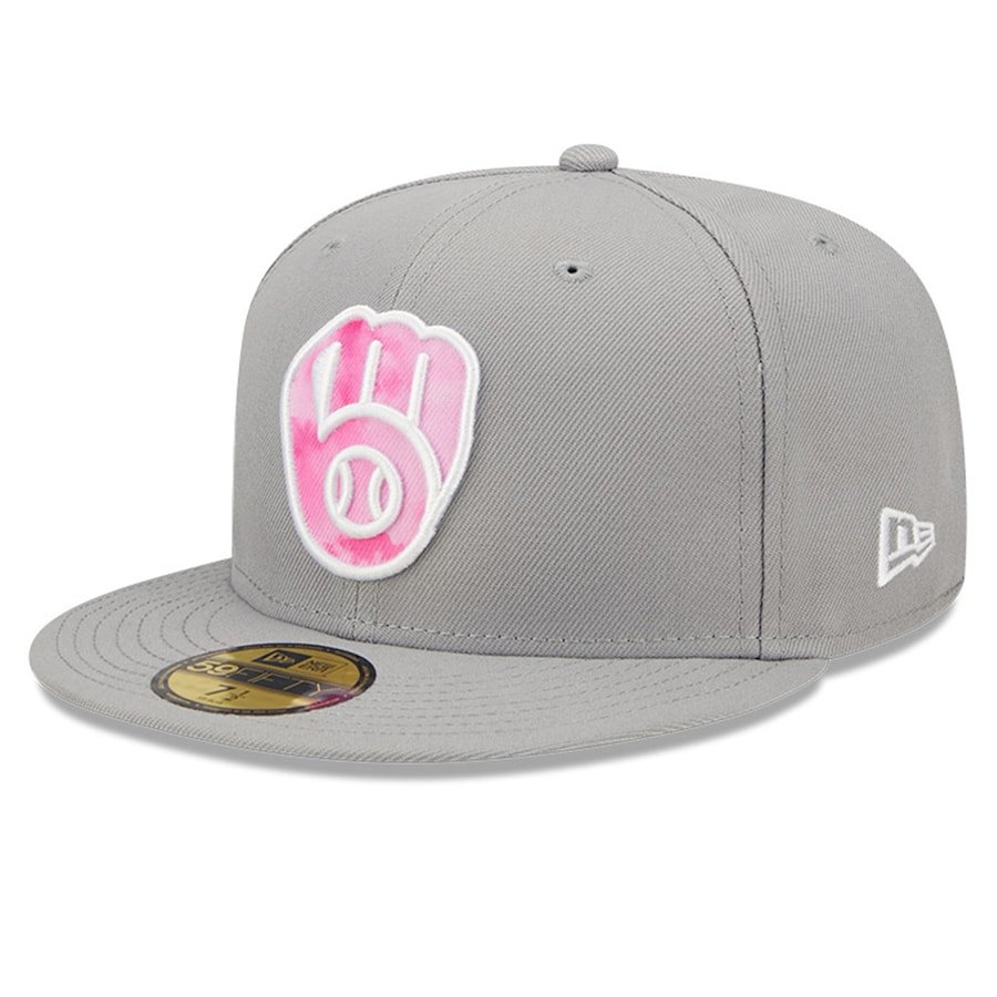
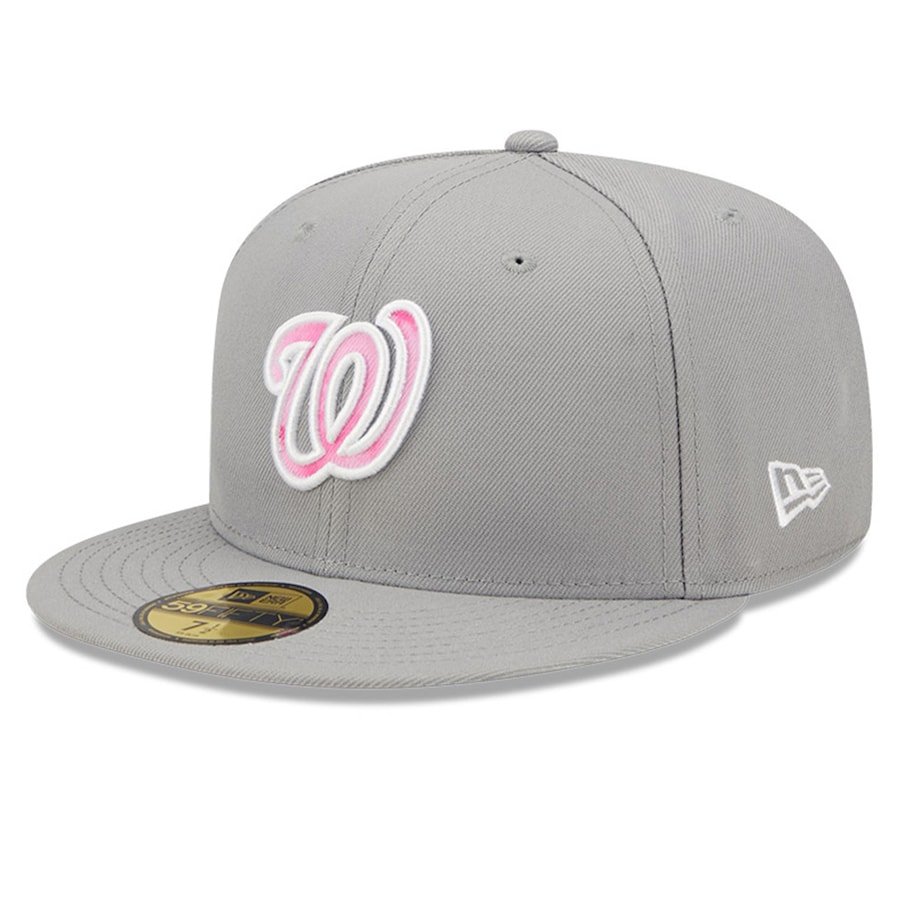
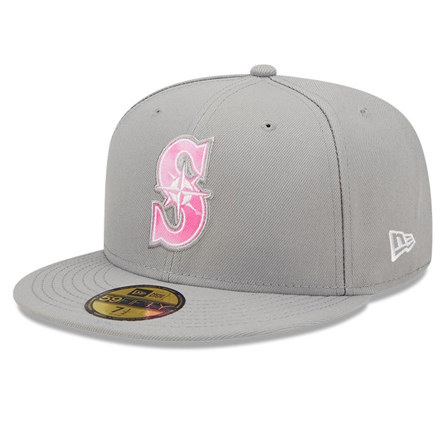
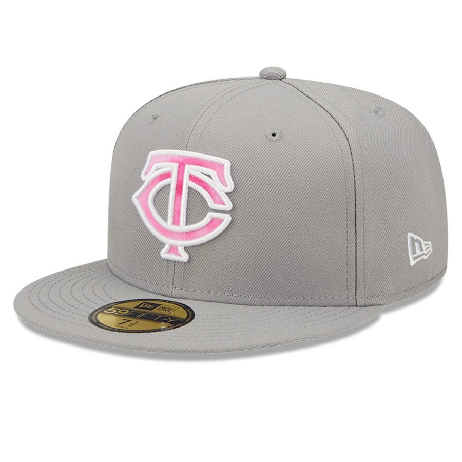
The 2022 MLB Mother’s Day hats have been released. This year’s look features a grey crown and visor with a pink tie dye undervisor and team logo outlined in white on the front of each cap. We will see each MLB team wear these for the Mother’s Day games.
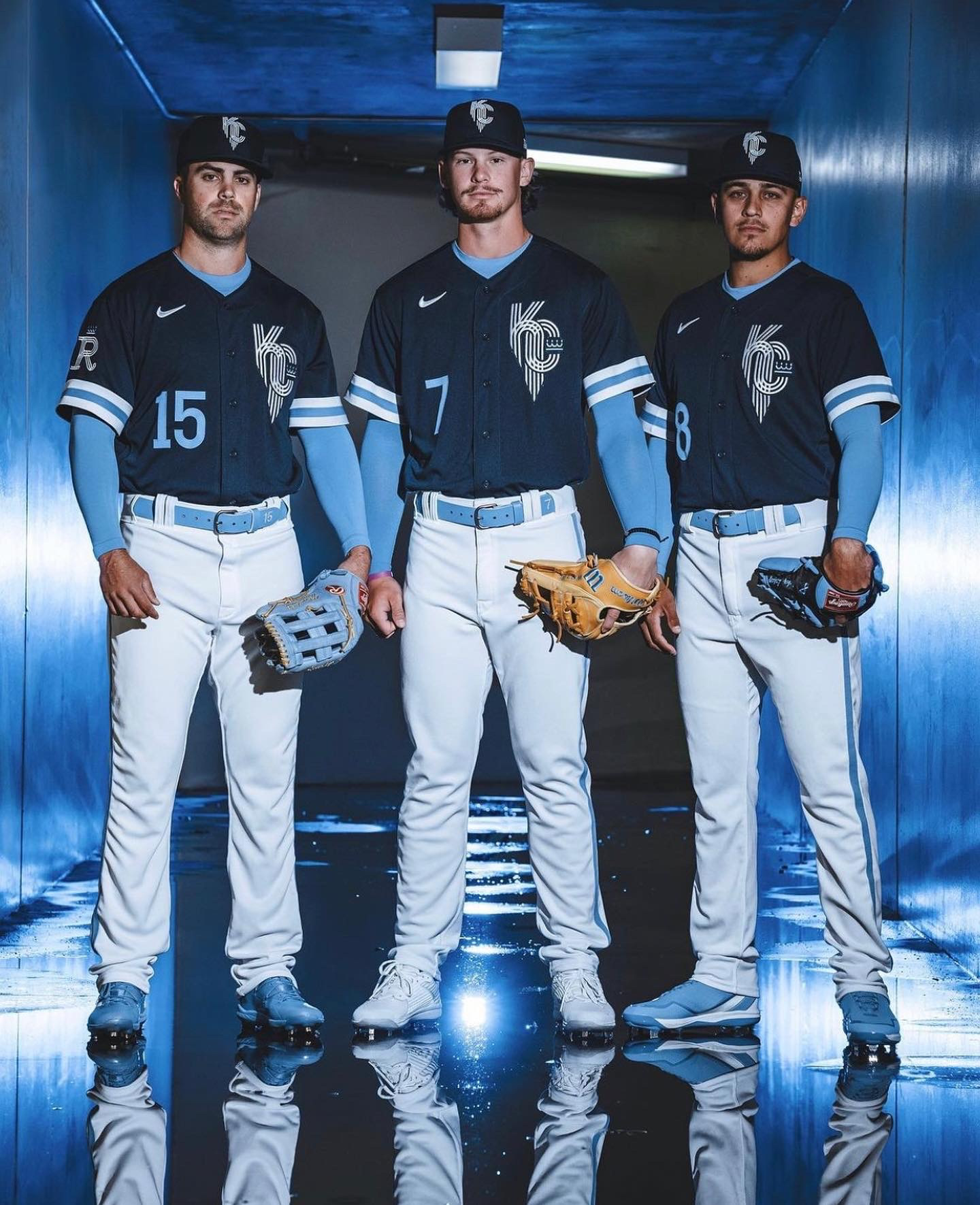
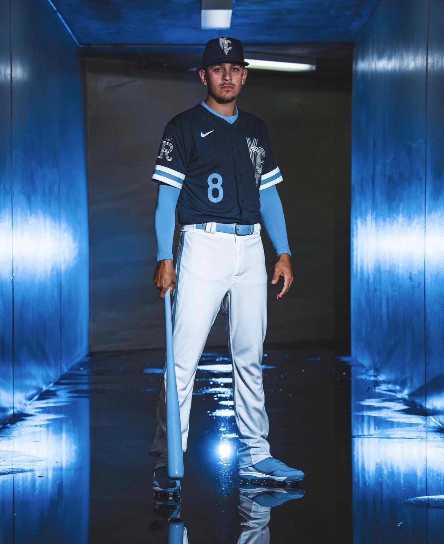
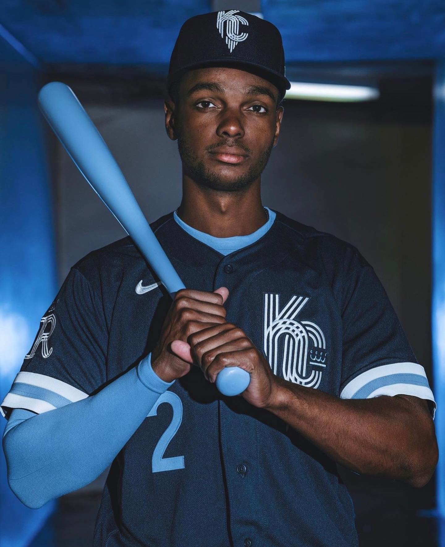
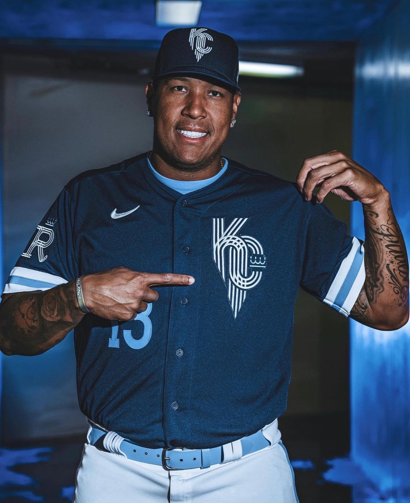
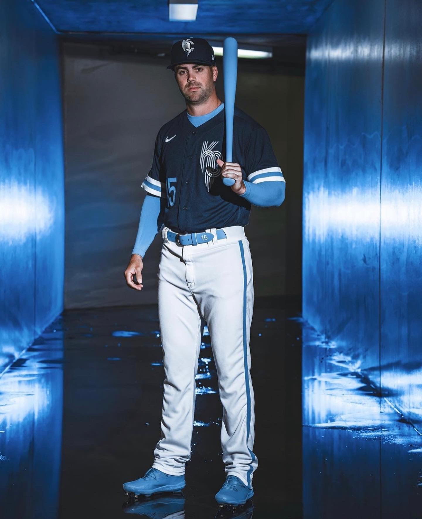
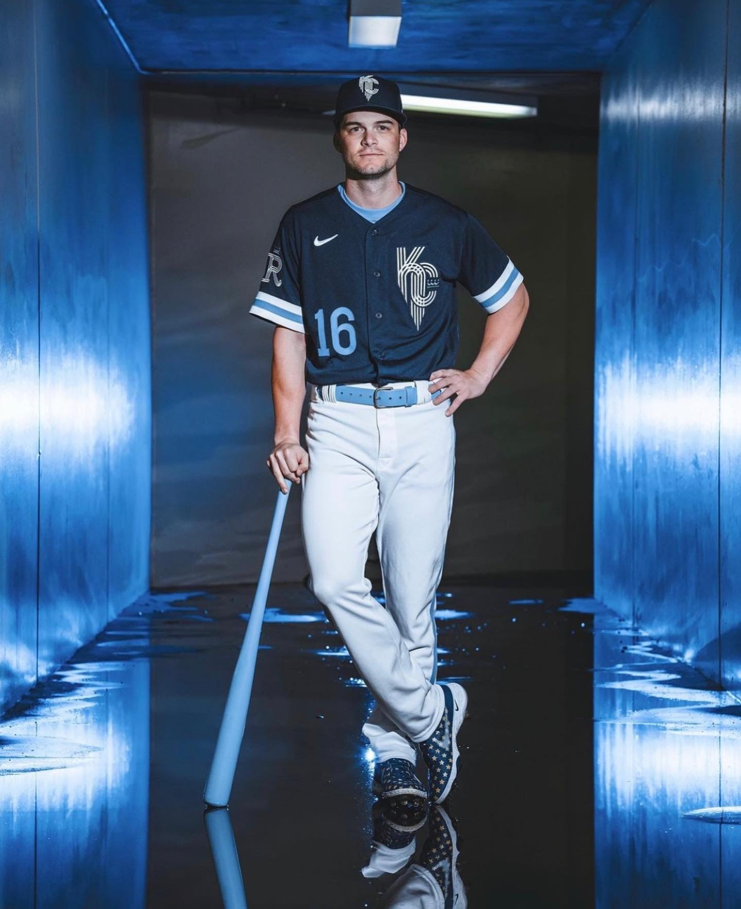
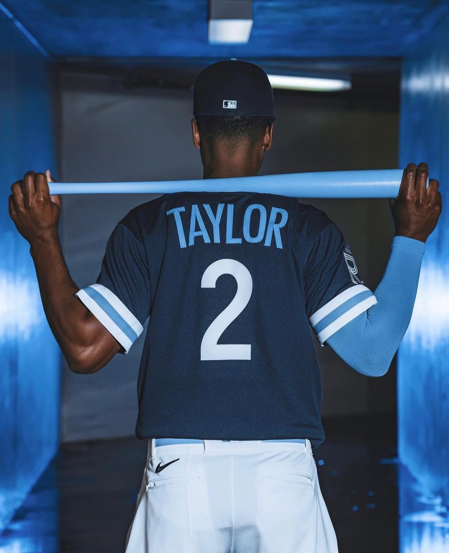
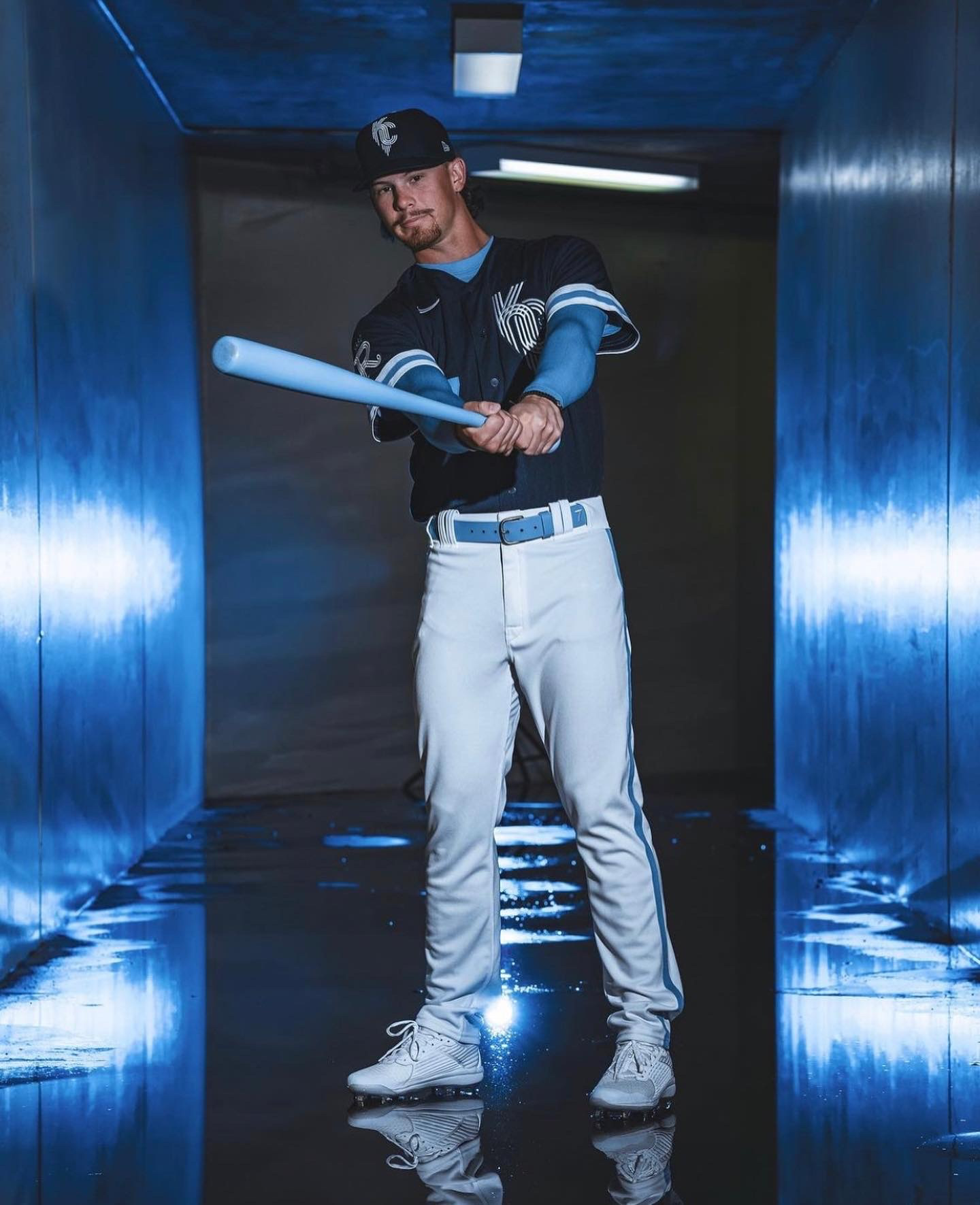
The Kansas City Royals have released their special ‘City Connect’ uniform. The threads pay tribute to one of the most iconic symbols of Kansas City, the fountains that have always adorned KC as a gesture of welcomeness and openness around the city.
The two-toned jersey features a dark blue base with powder blue logos and accents. Details found on the jersey give a nod to Royals history as well as the city itself. The sleeves have a striping pattern that is similar to the jerseys from the 1980s. On the right sleeve an “R” with a crown has been placed, paying homage to the Royals’ original script. Found on the inside of the collar is the phrase “HEY, HEY, HEY, HEY” meant to honor the Royals’ victory song by Paul McCartney. The team even had special letters and number scripts chosen to represent the Art Deco style that in seen throughout downtown and midtown KC.
“This design is one that fans of any age can truly appreciate. From the fountains, that are a part of Kansas City’s heritage, to the colors of the jersey signifying the rich history of baseball and the Kansas City Royals. The uniform showcases the distinct elements of our community."-Royals chairman/CEO John Sherman
We will see the Royals hit the field in the special uniforms for the first time on 4/30 vs the Yankees.
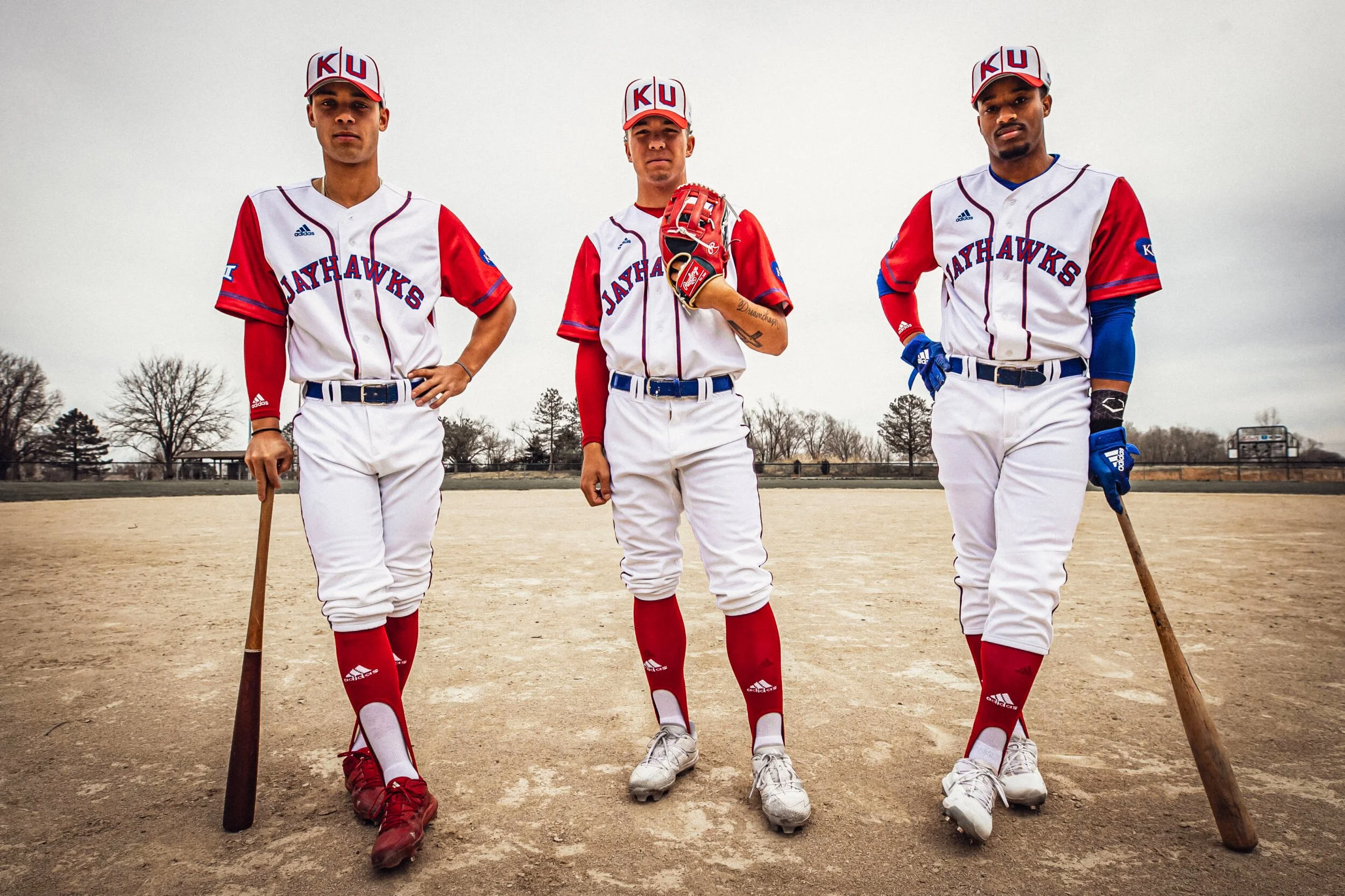
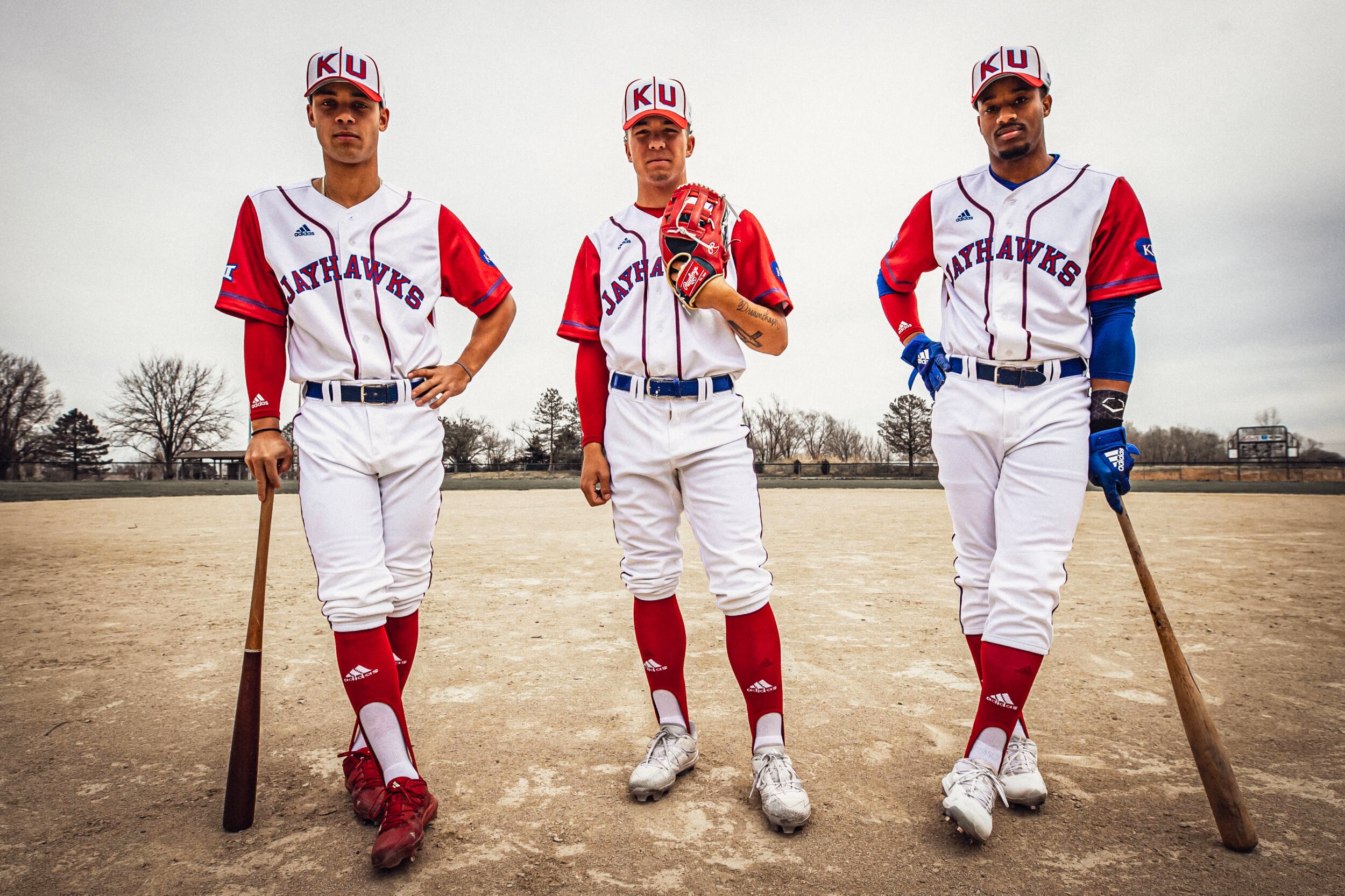
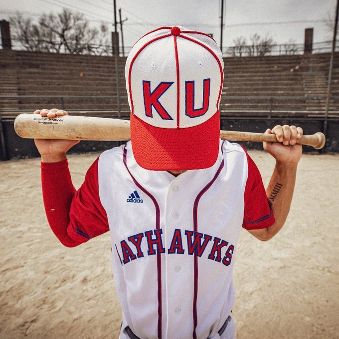
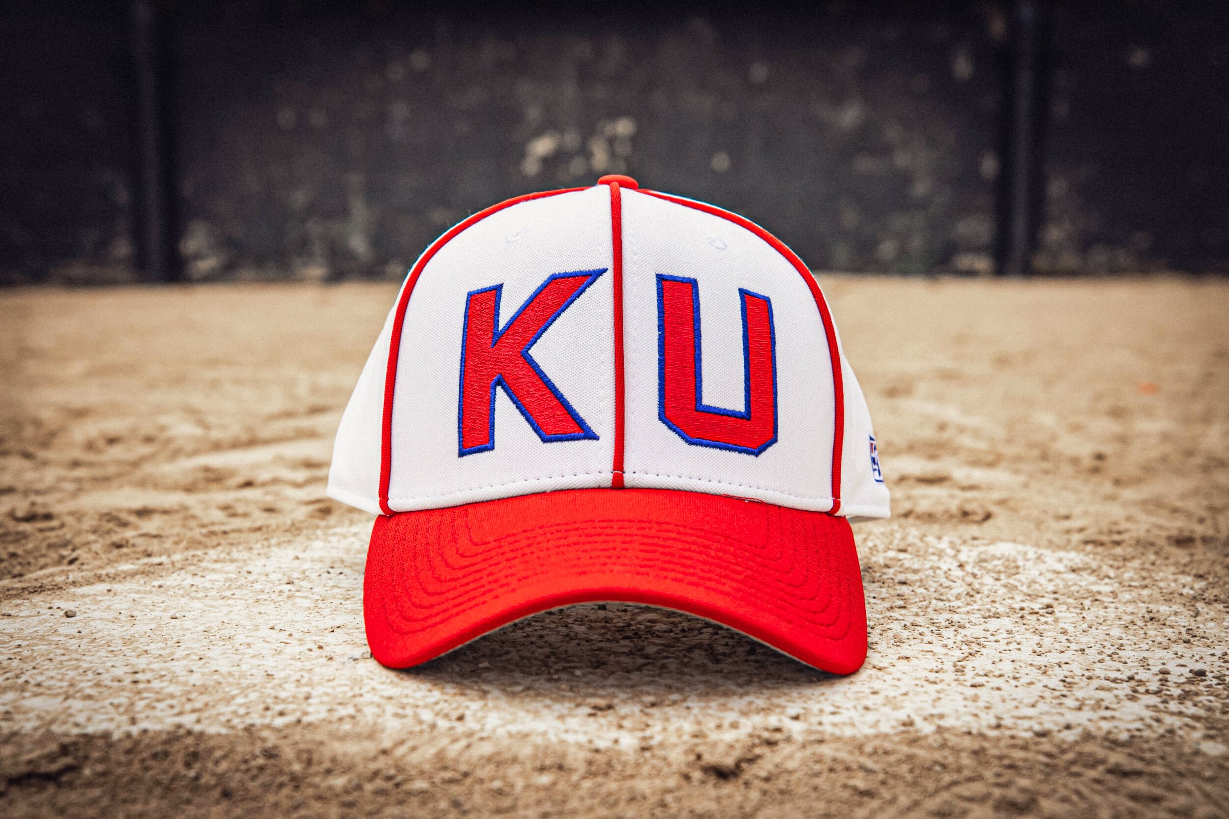
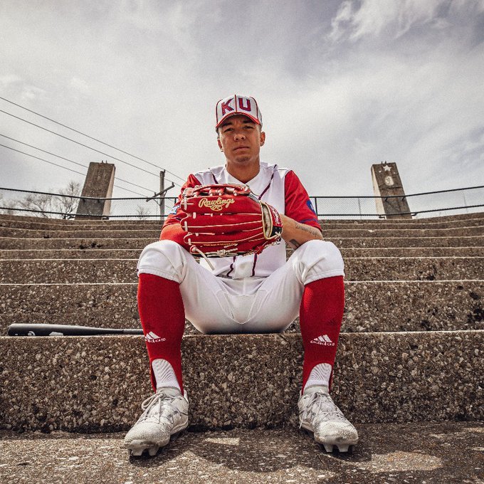
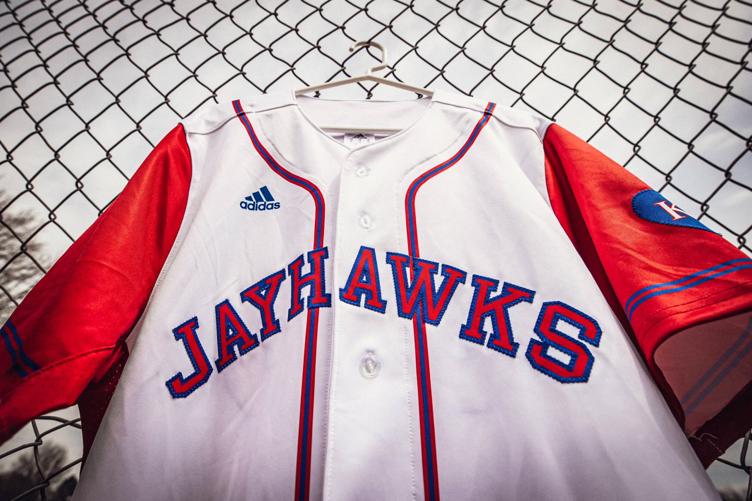
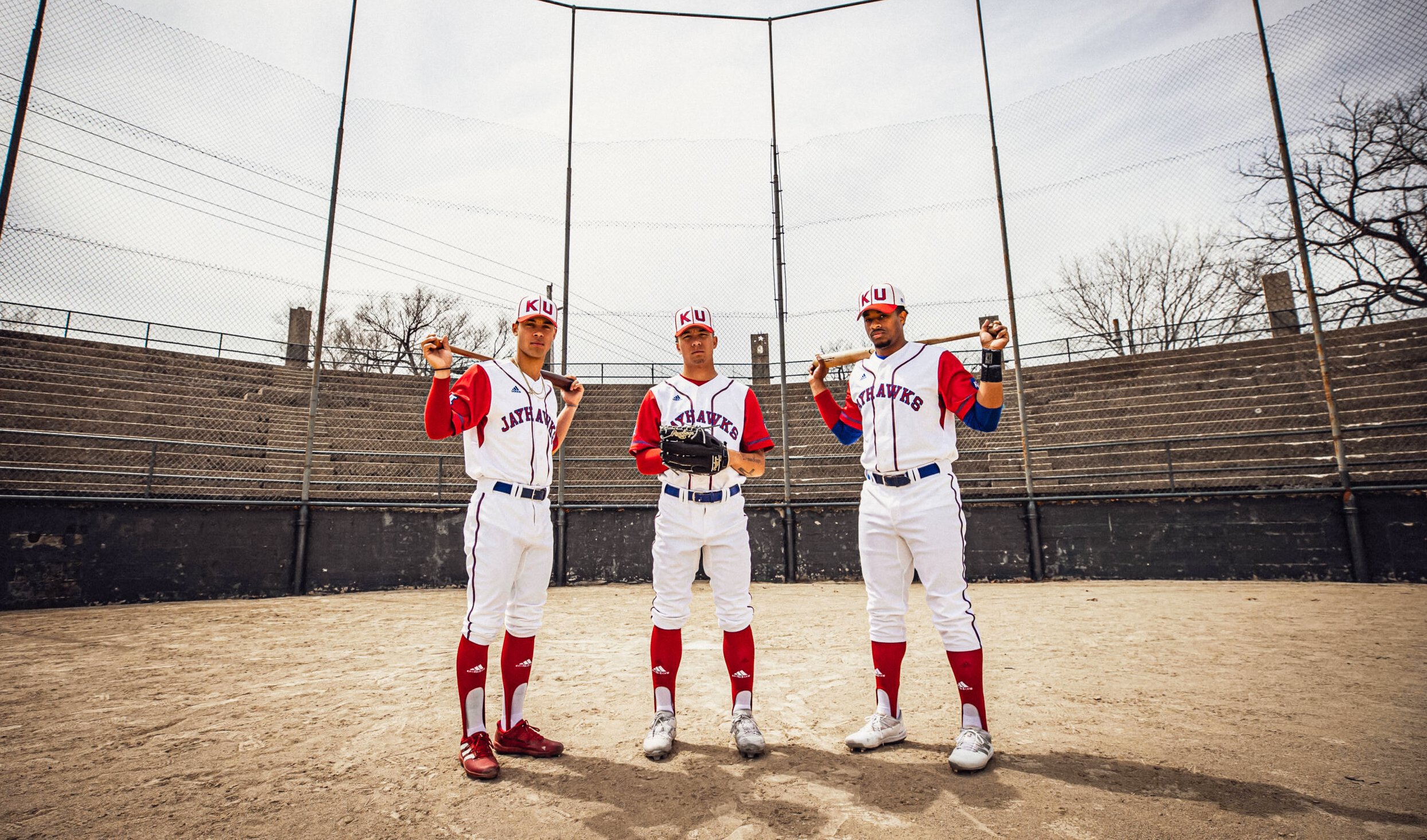
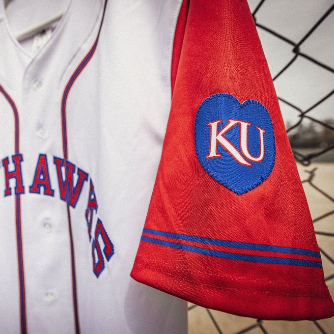
The Kansas Jayhawks baseball team has revealed a special throwback uniform that honors the historic Kansas City Monarchs. The retro unis are white base, with the jerseys featuring the Jayhawks wordmark arched across the front with red sleeves. The left sleeve of the jersey is highlighted by a blue heart with the KU logo inside. The hats feature an old school style with a large KU on the front. The special threads will be worn for the inaugural Buck O’Neil Classic.
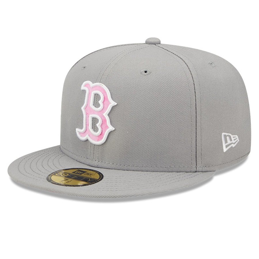
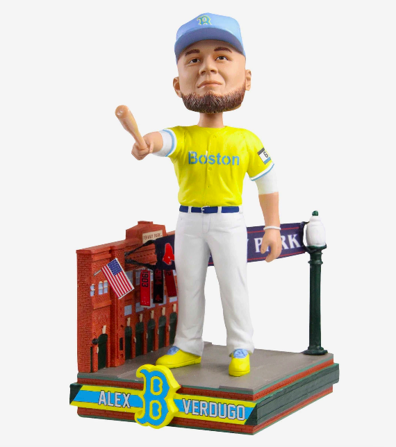
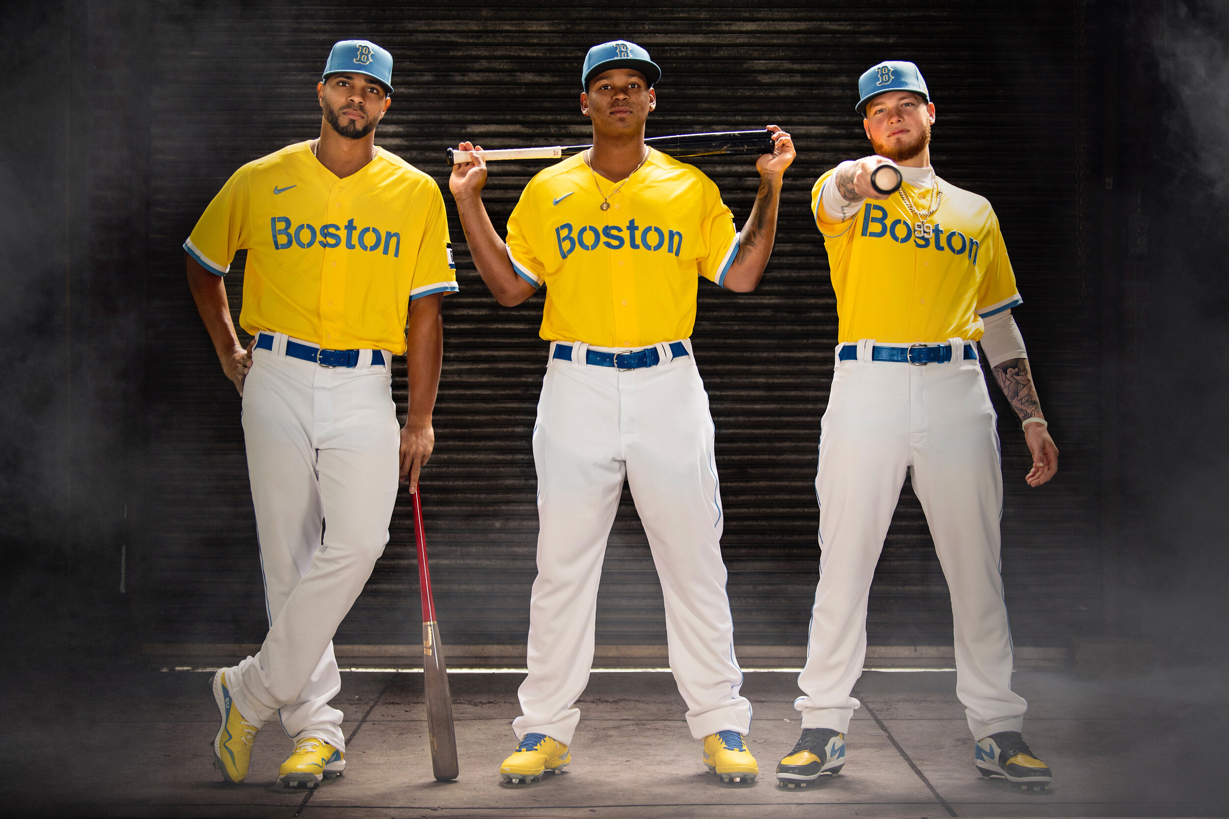
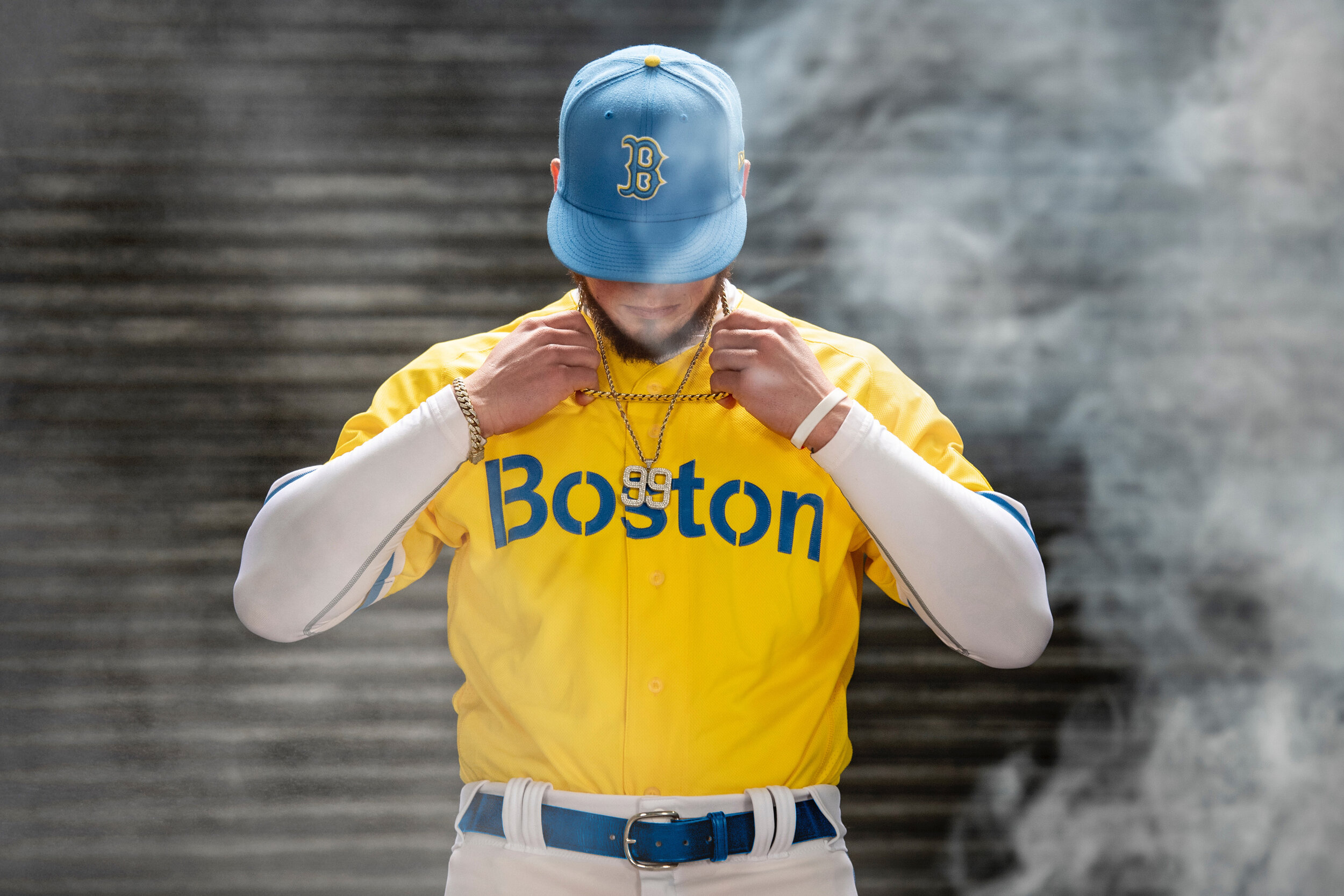
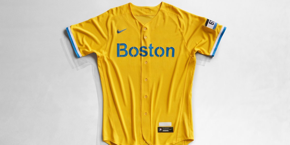
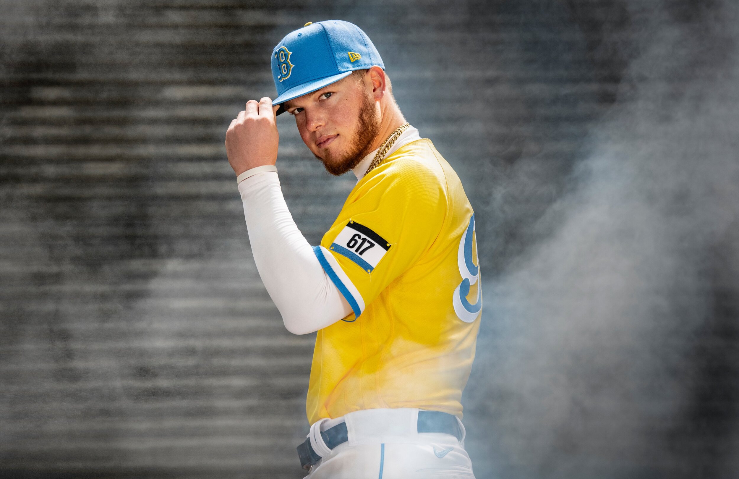
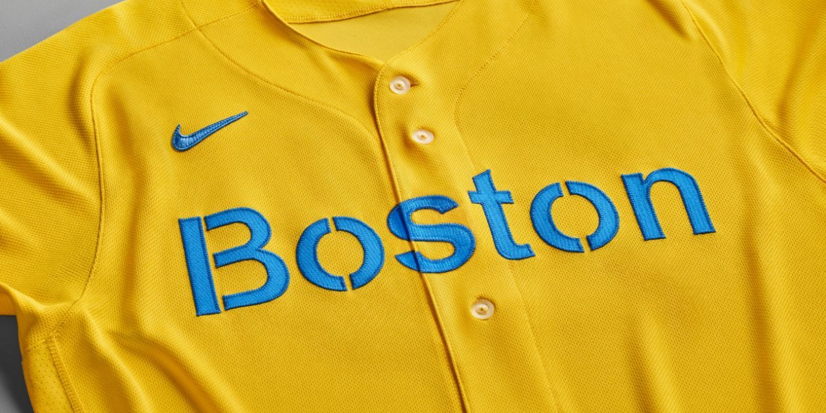
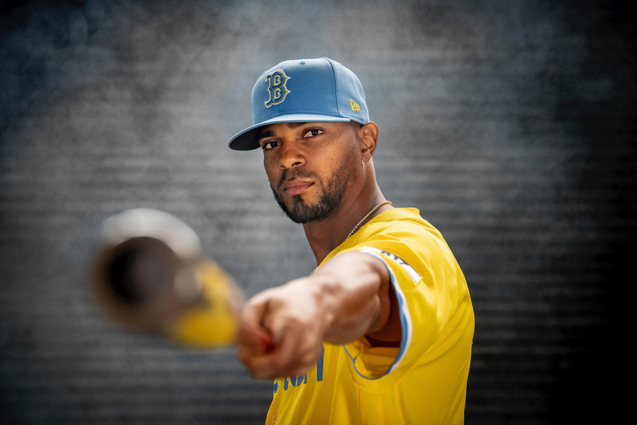
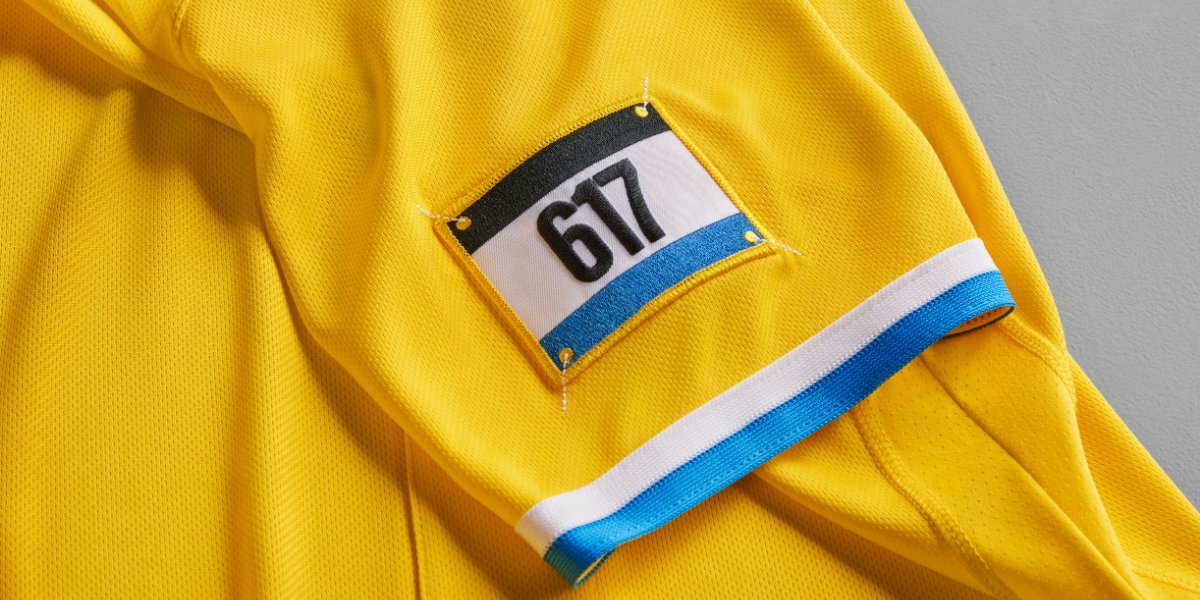
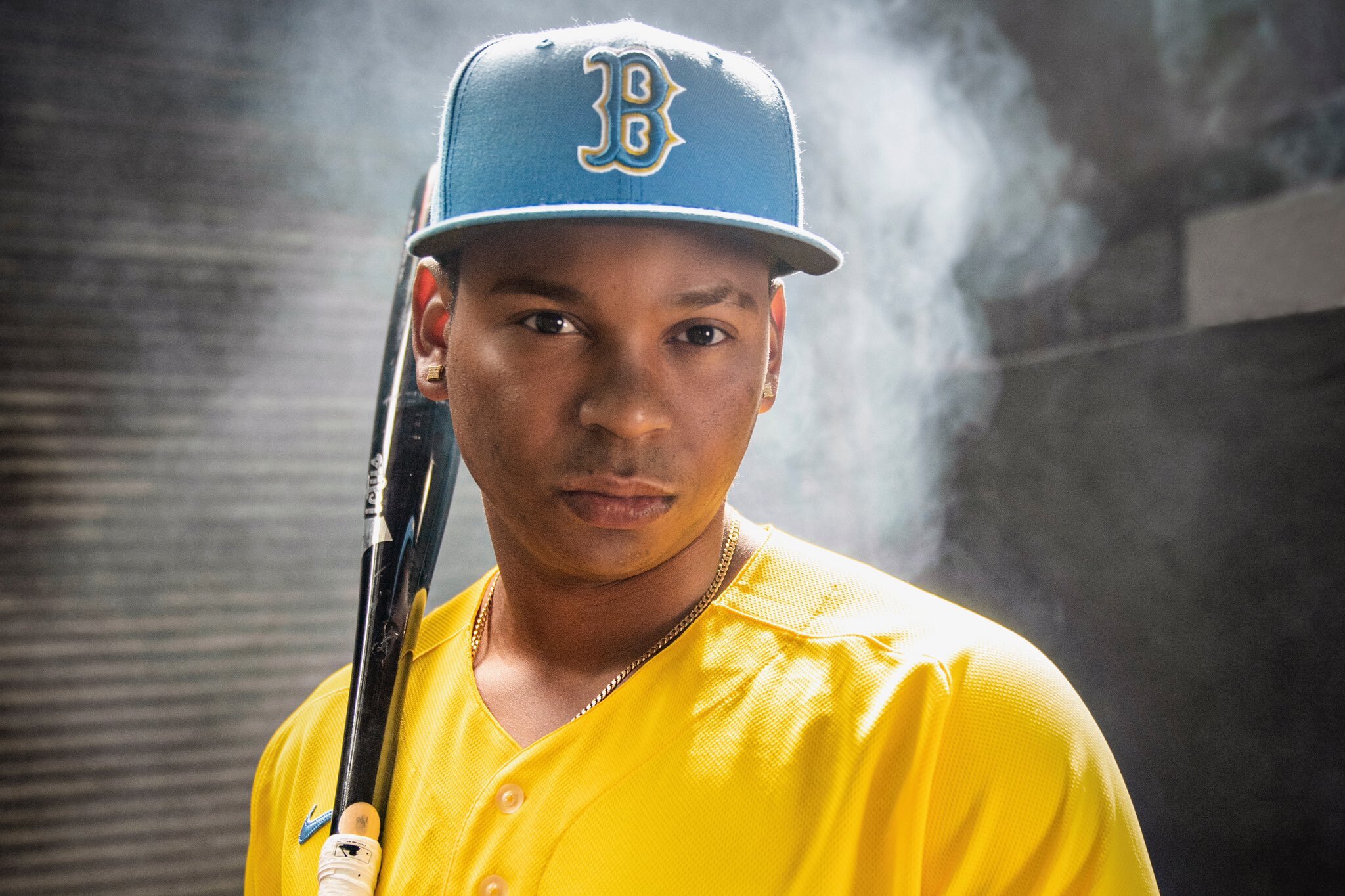
The MLB and Nike have announced a new uniform series dubbed the “City Connect Series”. The Red Sox are the first team to release their special uniform that is inspired by Patriots’ Day holiday and the Boston Marathon. The yellow and powder blue color way features Boston across the chest in a stencil font, inspired by the finish of the marathon at Boylston Street. The left sleeve of the jersey features a patch that mimics a marathon bib with the number "617," the area code for Boston and Fenway Park. Each player will wear the iconic B hat but in the powder blue and yellow color scheme.
"We wanted to be at the front of the line. We told them that we would love to collaborate in any way you see fit. That was two years ago, and that point, they said they were going to do the City Connect program that if we're going to do this, we are all-in, and even though we are a traditional historic franchise, we want to do something completely different. We want to push the envelope and be bold in this." -Red Sox chief marketing officer Adam Grossman
We will see the Red Sox wear the uniforms on April 17 and 18 when they play the Chicago White Sox.