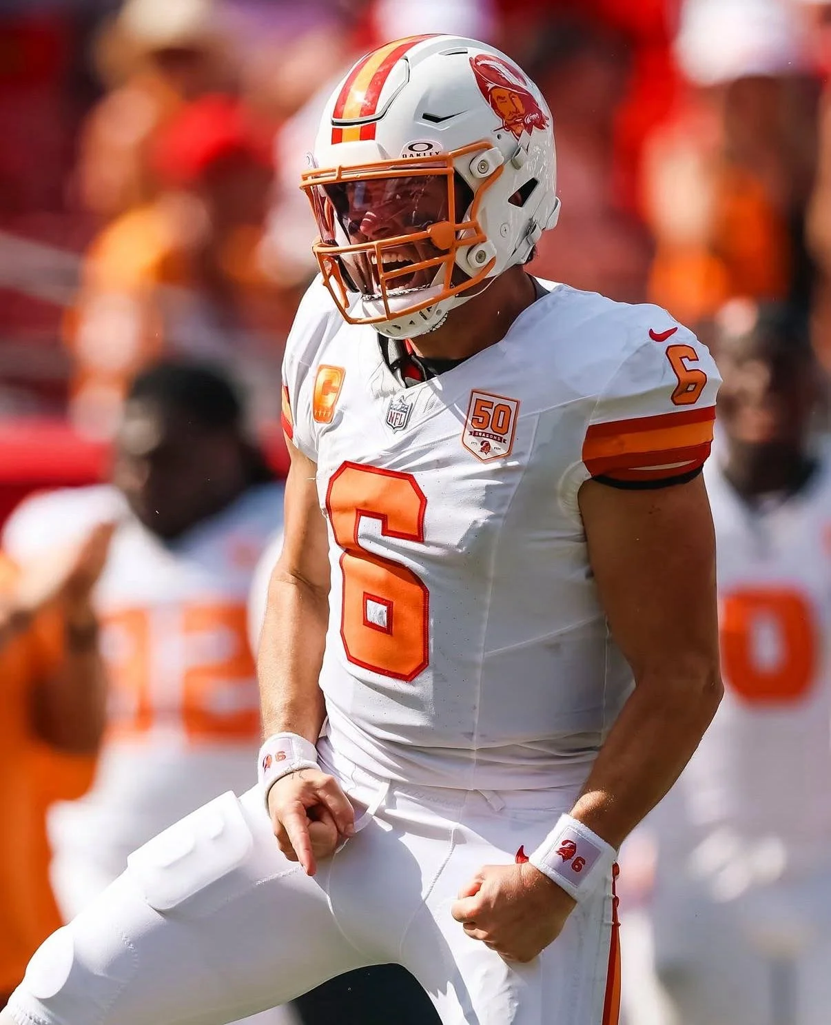
The Tampa Bay Buccaneers are running it back. After initially saying there were no plans to wear their iconic 1976 throwback uniforms beyond the franchise's 50th anniversary celebration, the Buccaneers announced that the beloved look will return once again during the 2026 season.
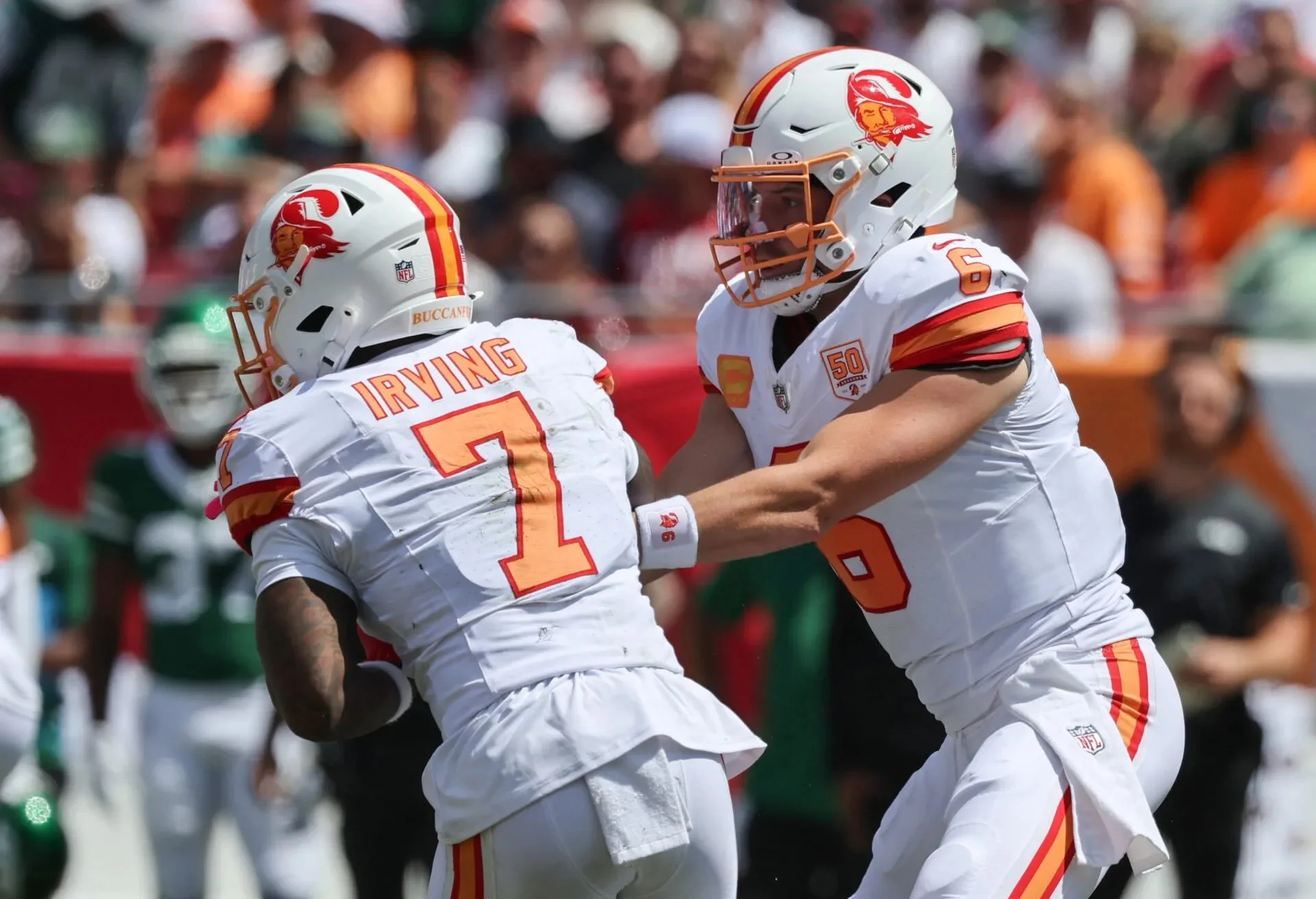
Tampa Bay will wear the original white throwback jerseys, white pants, and classic white helmets featuring the original "Bucco Bruce" logo when they host the Los Angeles Chargers in Week 13. The return comes after a memorable debut season for the uniforms in 2025.
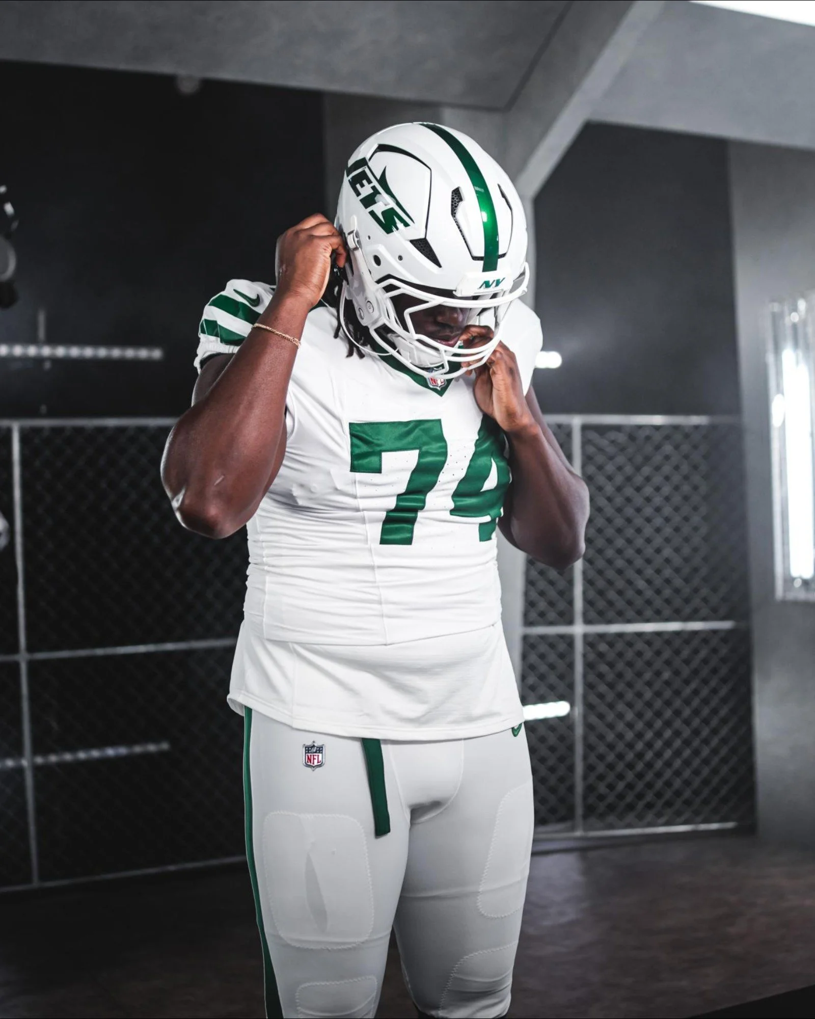
The Buccaneers wore the vintage look twice during their 50th anniversary season and came away victorious in both games. Tampa Bay edged the New York Jets 29-27 in Week 3 before defeating the Seattle Seahawks 38-35 in Week 5. Fittingly, Seattle also wore its own original 1976 throwback uniforms in that matchup, creating one of the best uniform showdowns of the NFL season.
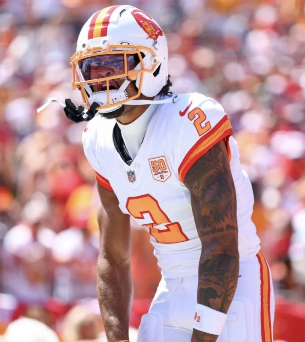
Originally introduced during the franchise's inaugural 1976 season, the uniforms remain one of the most recognizable throwback designs in football. From the white helmet featuring the smiling sword-carrying Bucco Bruce logo to the vibrant orange, red, and white color palette, the look has become a fan favorite and one of the NFL's most iconic retro uniforms.
Sometimes tradition is worth bringing back, and for the Buccaneers, the original 1976 uniforms continue to prove they're as timeless as ever.
SHOP Bucs gear HERE


See What Else Is New
Featured
Related Articles
Featured